
تتيح التطبيقات المصغّرة للمستخدم إمكانية عرض محتوى رئيسي سريع وسريع من التطبيق على شاشاته الرئيسية والمساحات المشابهة. يؤدي تحسين قابلية اكتشاف الأداة إلى ضمان إلمام المستخدمين بهذه الإضافات القوية لتطبيقك.
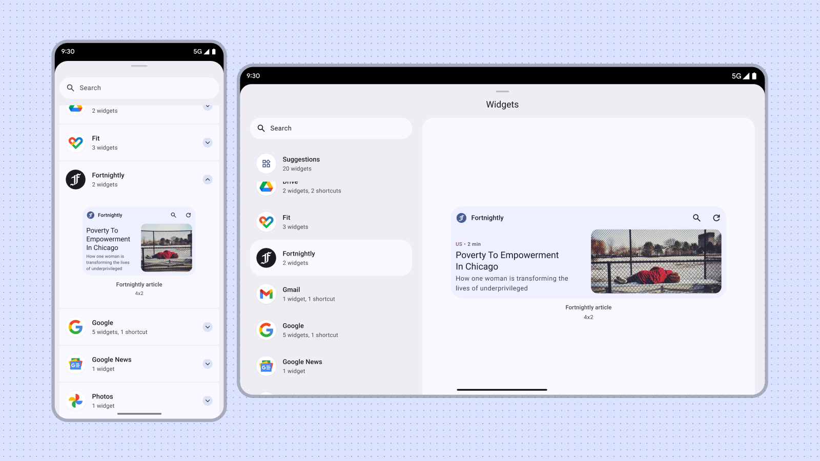
يكتشف المستخدمون أداتك ويضيفونها من خلال منتقي الأدوات، كما هو موضح من قائمة التطبيقات المصغَّرة التي تظهر عند الضغط مع الاستمرار على الشاشة الرئيسية أو على رمز التطبيق. على بعض الأجهزة، تعرض أداة اختيار التطبيقات المصغّرة قسمًا للاقتراحات الذي يعرض جودة التطبيقات المصغّرة بالإضافة إلى ذلك، يمكنك الترويج لتطبيقك المصغّر في الأوقات المناسبة عندما تكون وظيفة الأداة أكثر صلة باهتماماتك. يصف هذا الدليل كيفية الترويج لتطبيقاتك المصغّرة بفعالية.
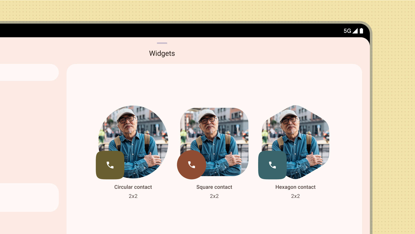
مقاسات الشعار
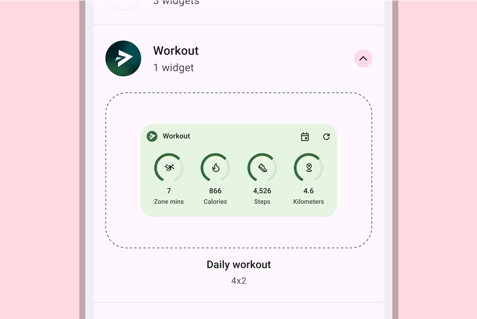
تخيَّل أداة اختيار التطبيقات المصغّرة كنافذة تسوّق. يكون الحجم الافتراضي للأداة هو عرضها الأولي، مما يترك انطباعًا أوليًا يمكن أن يؤثر بشكل كبير في عملية الاختيار. استخدِم حجمًا يعرض وظائف الأداة بشكل فعّال بدون إرباك العرض.
لمزيد من المعلومات حول اختيار حجم تلقائي مناسب للأداة، راجِع المقاس.
عند التصميم بالحجم الافتراضي، ضع في اعتبارك عوامل شكل مختلفة مثل الهواتف والأجهزة اللوحية والأجهزة القابلة للطي.
الإجراءات غير المُوصى بها
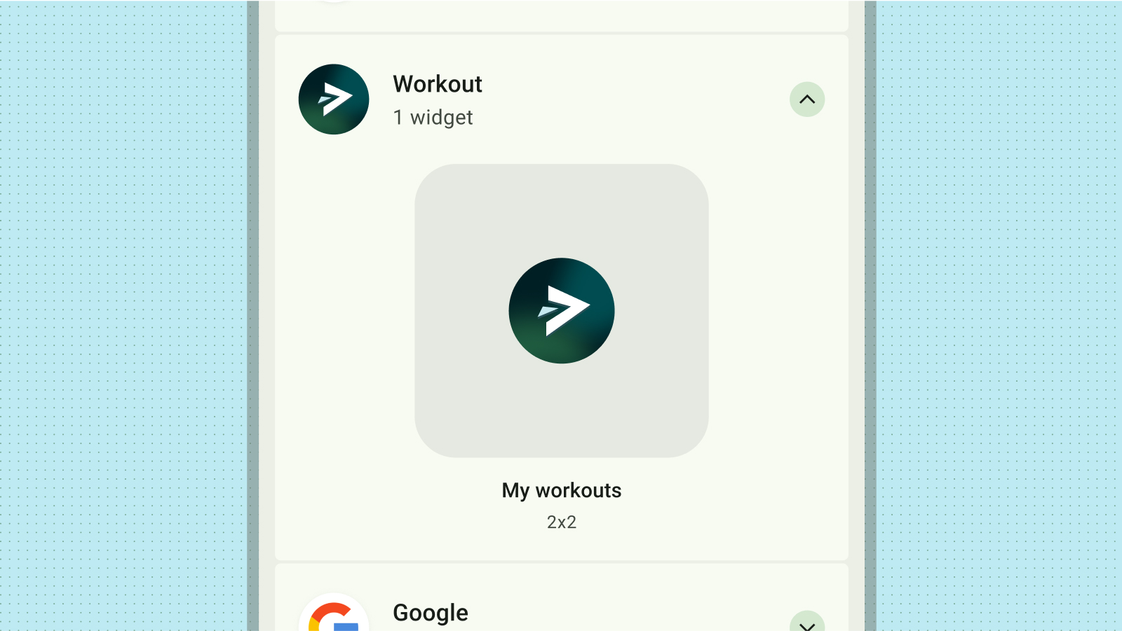
تجنَّب نشر إصدارات متعددة من حجم التطبيق المصغّر نفسه لعرض ألوان أو أشكال مختلفة فقط. بدلاً من ذلك، يمكنك دمج نشاط إعداد داخل التطبيق المصغّر للسماح للمستخدمين بتخصيص الألوان وتعزيز المرونة وتبسيط أداة اختيار التطبيقات المصغّرة.
الإجراءات غير المُوصى بها
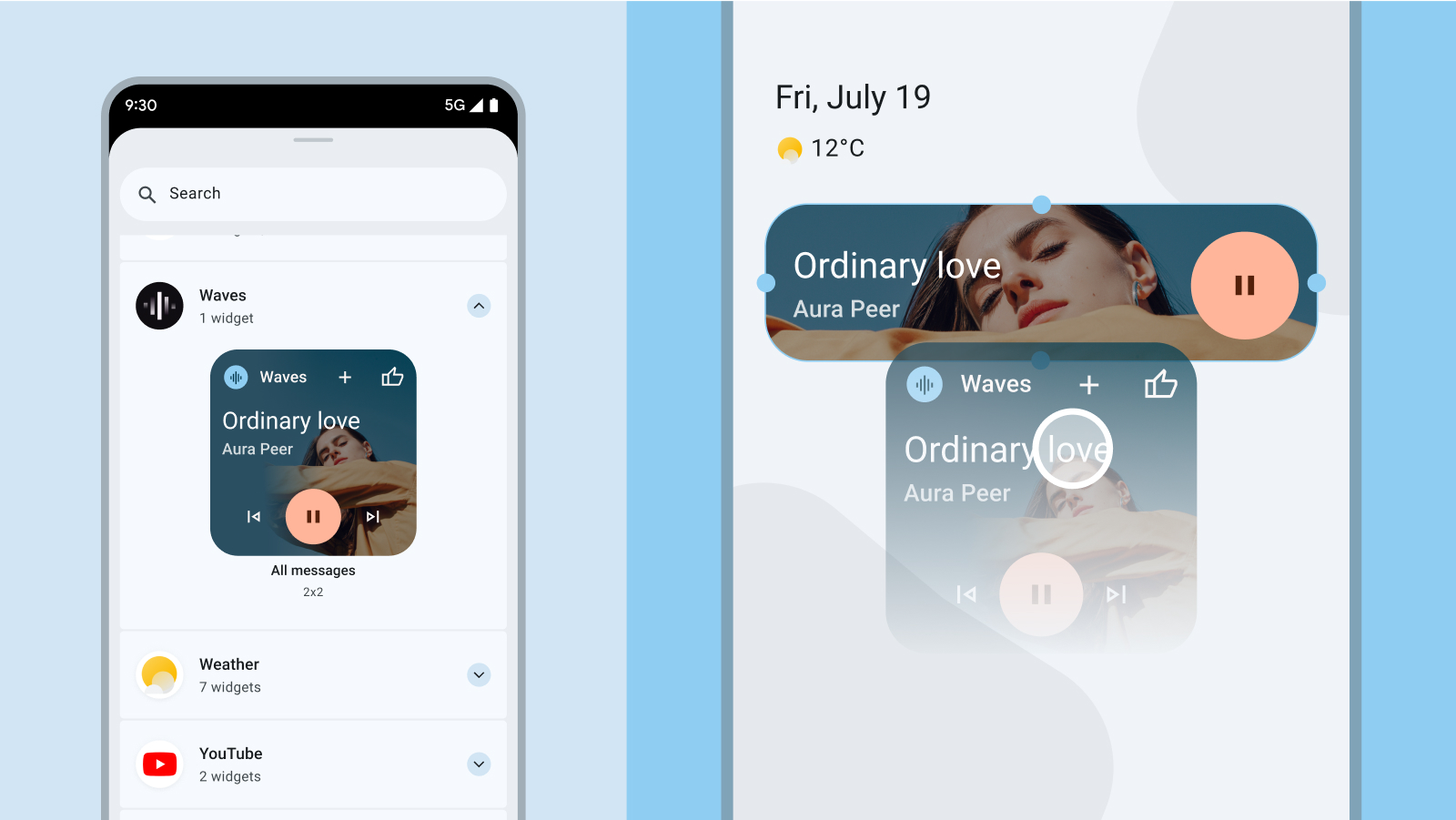
معاينة المحتوى
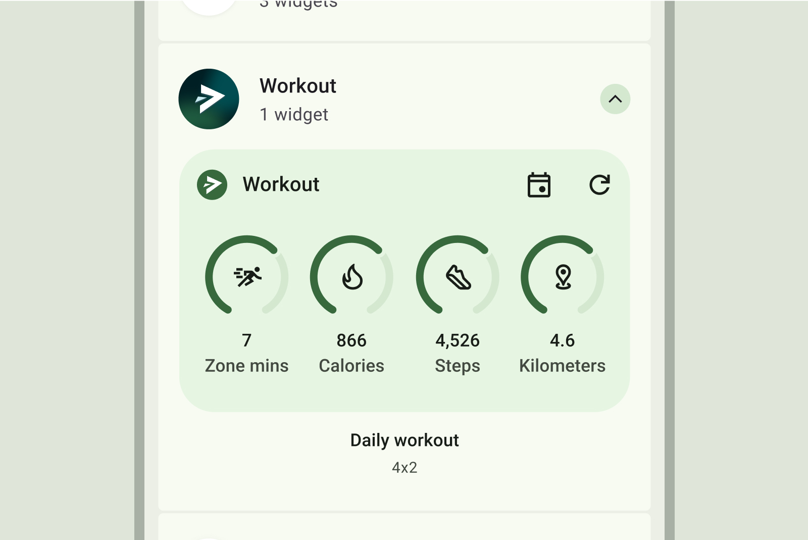
يمكنك زيادة معدّل استخدام التطبيق المصغّر من خلال تقديم معاينة دقيقة وغنية بالمعلومات للمحتوى. من خلال النسخ المطابق للتخطيط والوظيفة الفعلية للأداة في المعاينة، يمكنك تزويد المستخدمين بفهم واضح لما يمكن توقعه بمجرد إضافته إلى شاشتهم الرئيسية.
الإجراءات غير المُوصى بها
الإجراءات التي يُنصح بها
الإجراءات غير المُوصى بها
الإجراءات غير المُوصى بها
إذا كان التطبيق المصغّر متوافقًا مع الألوان الديناميكية، عليك تصميم المعاينات بحيث يتم عرضها أيضًا بتلك الألوان. قم بصياغة وصف واضح وموجز للتطبيق المصغّر يقدم عرض قيمة واضح للمستخدم.
اكتشاف أداتك داخل التطبيق
يمكنك عرض خيار تثبيت التطبيقات المصغّرة ذات الصلة بشكل استباقي في اللحظات المناسبة للسياق في تطبيقك. وعند إجراء ذلك، يُرجى مراعاة العوامل التالية:
- يمكنك عرض خيار تثبيت التطبيق المصغّر إذا كان ذلك مناسبًا أكثر استنادًا إلى إجراءات المستخدم داخل التطبيق. على سبيل المثال، بعد أن يكمل المستخدم إحدى المهام بنجاح من خلال تطبيق مصغّر مطابق، أو عندما يصل المستخدم بشكل متكرر إلى ميزة يمكن تبسيطها باستخدام تطبيق مصغّر.
- استخدِم تلميحات مرئية بسيطة مثل رمز أو صورة متحركة موجزة للفت الانتباه إلى خيار تثبيت تطبيق مصغّر.
- يجب ألا يؤدي اقتراح تثبيت التطبيق المصغّر إلى حظر أو عرقلة إجراءات المستخدم الأساسية داخل تطبيقك.

لمزيد من المعلومات، اطّلِع على مقالة السماح للمستخدمين بتثبيت أداة لضبط تثبيت الأداة من داخل تطبيقك.