
앱 위젯을 사용하면 사용자가 홈 화면 및 유사한 노출 영역에 앱의 한눈에 확인할 수 있는 주요 콘텐츠와 빠른 작업을 제공할 수 있습니다. 위젯의 검색 가능성을 개선하면 사용자가 앱의 이 강력한 확장 프로그램을 인식할 수 있습니다.
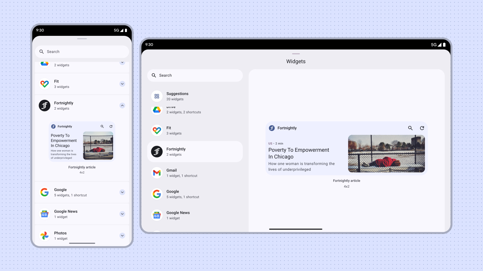
사용자는 홈 화면이나 앱 아이콘을 길게 누를 때 표시되는 위젯 메뉴에 표시된 위젯 선택 도구를 통해 위젯을 검색하고 추가합니다. 일부 기기에서는 위젯 선택 도구에 품질 위젯을 보여주는 추천 섹션이 표시됩니다. 또한 위젯의 기능이 가장 관련성이 높은 적절한 순간에 앱 내에서 위젯을 승격할 수 있습니다. 이 가이드에서는 위젯을 효과적으로 홍보하는 방법을 설명합니다.
크기 조정
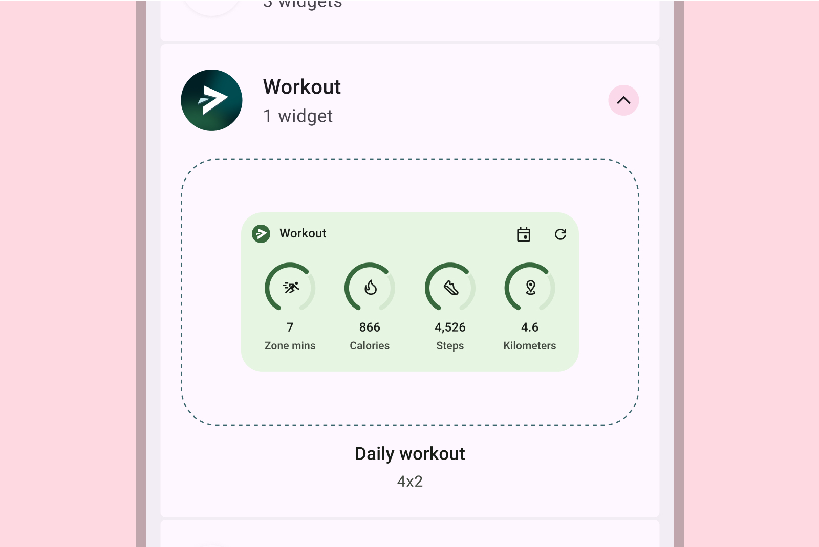
위젯 선택 도구를 쇼핑 창이라고 가정해 보겠습니다. 위젯의 기본 크기는 초기 표시이므로 선택에 큰 영향을 줄 수 있는 첫인상을 줄 수 있습니다. 뷰를 복잡하게 하지 않으면서 위젯의 기능을 효과적으로 보여주는 크기를 사용합니다.
위젯의 적절한 기본 크기를 선택하는 방법에 관한 자세한 내용은 크기 조정을 참고하세요.
기본 크기로 디자인할 때는 스마트폰, 태블릿, 폴더블과 같은 다양한 폼 팩터를 고려하세요.
부적절한 예
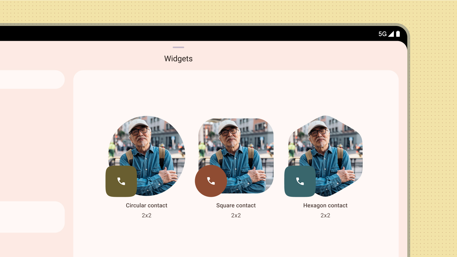
단지 다른 색상이나 모양을 제공하기 위해 동일한 위젯 크기의 여러 버전을 게시하지 마세요. 대신 위젯 내에 구성 활동을 통합하여 사용자가 색상을 맞춤설정할 수 있도록 하여 유연성을 향상하고 위젯 선택 도구를 간소화하세요.
부적절한 예
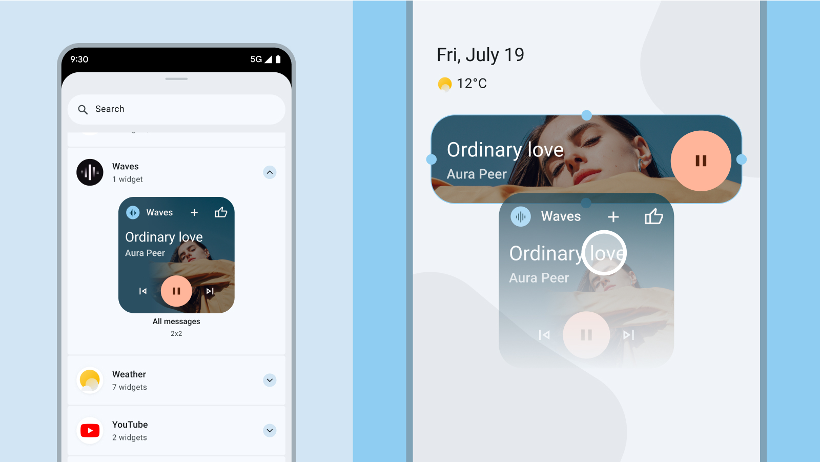
콘텐츠 미리보기
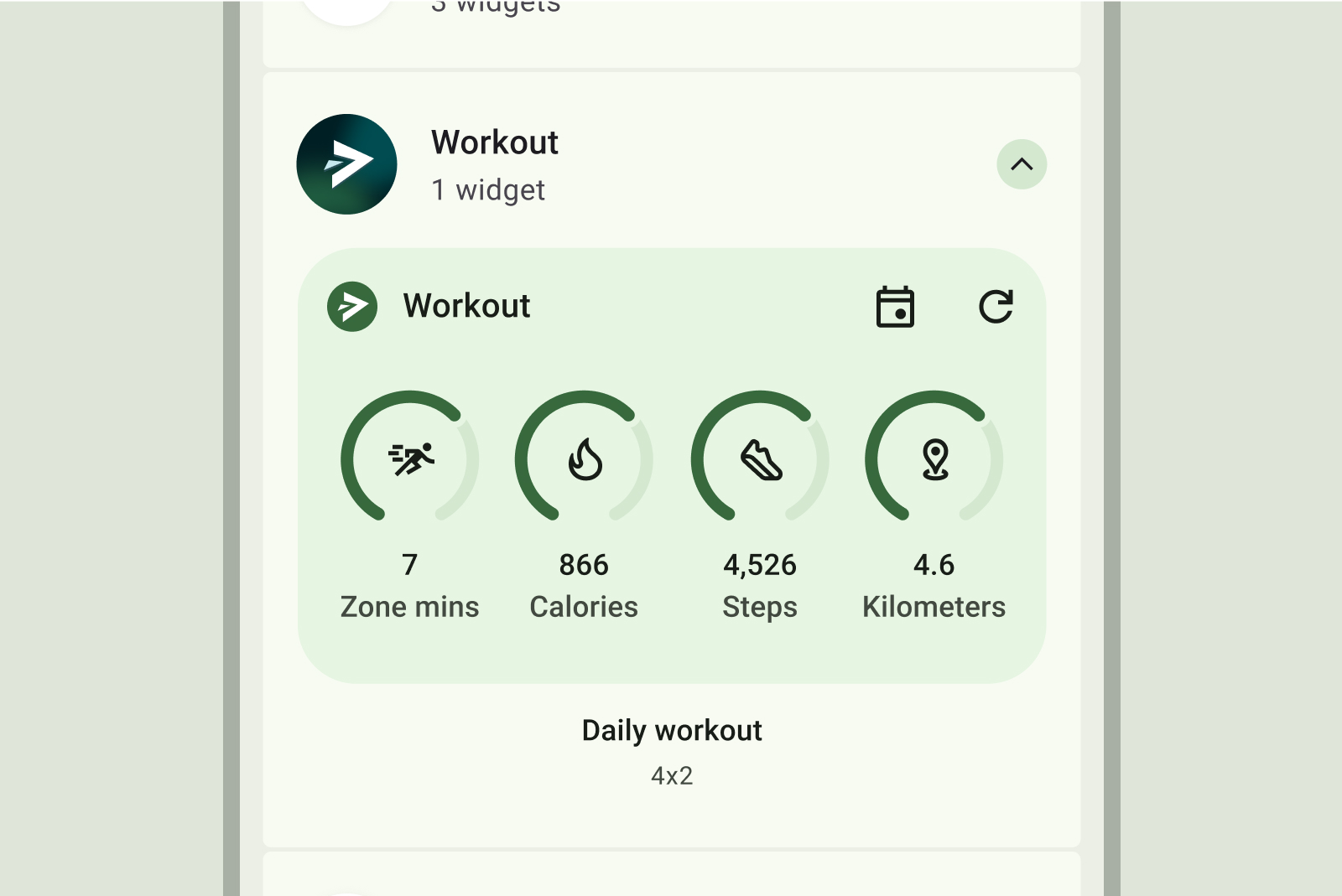
정확하고 유용한 콘텐츠 미리보기를 제공하여 사용자의 위젯 채택을 유도합니다. 미리보기에서 위젯의 실제 레이아웃과 기능을 미러링하면 사용자가 홈 화면에 위젯을 추가한 후 예상되는 결과를 명확하게 파악할 수 있습니다.
부적절한 예
의견을 제시하지
부적절한 예
부적절한 예
위젯이 동적 색상을 지원하는 경우 이러한 색상으로도 표시되도록 미리보기를 디자인합니다. 사용자에게 명확한 가치 제안을 제공하는 위젯에 관한 명확하고 간결한 설명을 작성합니다.
위젯의 인앱 검색
앱에서 상황상 적절한 순간에 관련 위젯을 고정하는 옵션을 사전에 표시할 수 있습니다. 이 경우 다음 요소를 염두에 두세요.
- 앱 내의 사용자 작업에 따라 가장 적합한 경우에 고정 위젯 옵션을 표시합니다. 예를 들어 사용자가 상응하는 위젯이 있는 작업을 완료한 후 또는 사용자가 위젯으로 간소화할 수 있는 기능에 반복적으로 액세스하는 경우입니다.
- 아이콘 또는 간단한 애니메이션과 같은 미묘한 시각적 힌트를 사용하여 위젯 고정 옵션에 주의를 끕니다.
- 위젯 고정 추천은 앱 내에서 사용자의 기본 작업을 차단하거나 방해해서는 안 됩니다.

자세한 내용은 사용자가 위젯을 고정하도록 허용을 참고하여 앱 내에서 위젯 고정을 구성합니다.