Theo báo cáo năm 2011 của Tổ chức Y tế Thế giới (WHO) và Ngân hàng Thế giới, khoảng 15% dân số toàn cầu (tức là khoảng 1/6 số người) mắc một chứng khuyết tật nghiêm trọng hoặc tạm thời trong đời. Do đó, khả năng tiếp cận trong thiết kế là yếu tố cơ bản để tạo ra một ứng dụng chất lượng cao, dễ sử dụng và mang tính toàn diện – yếu tố này mang lại kết quả tốt nhất cho người dùng và có thể ngăn chặn việc phải làm lại tốn kém. Android đi kèm với nhiều tính năng giúp bạn tạo ứng dụng hỗ trợ các lựa chọn hỗ trợ tiếp cận theo mặc định.
Thiết kế cho tầm nhìn
Đảm bảo nội dung trong ứng dụng của bạn dễ đọc nhất có thể bằng cách kiểm tra độ tương phản màu và kích thước văn bản, đồng thời đảm bảo các thành phần dễ hiểu về mặt hình ảnh và dễ phân biệt với nhau.
Hãy tuân theo các nguyên tắc này để thiết kế nhằm hỗ trợ tiếp cận cho người khiếm thị.
- Để cho phép người dùng điều chỉnh cỡ chữ, hãy chỉ định cỡ chữ bằng pixel có thể mở rộng (sp)
- Không được giảm kích thước nội dung xuống dưới 12 sp. Nguyên tắc này phù hợp với thang kiểu chữ Material theo mặc định.
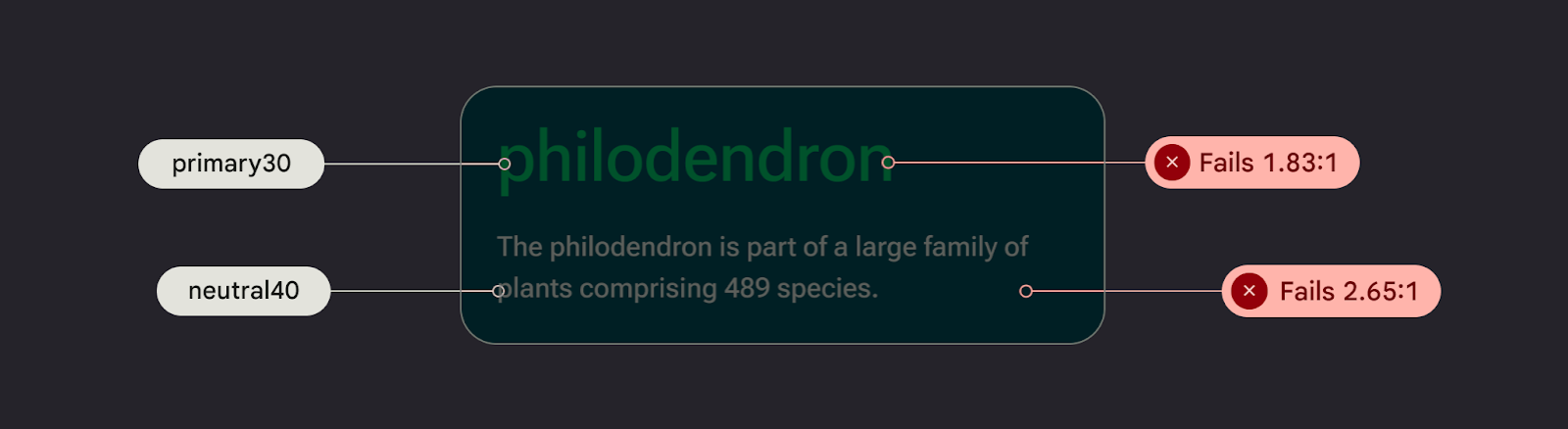
- Đảm bảo độ tương phản giữa nền và văn bản tối thiểu là 4,5:1. Tìm hiểu cách kiểm tra độ tương phản màu.
- Sử dụng tỷ lệ 3:1 giữa các bề mặt và phần tử không phải văn bản. Ví dụ: tỷ lệ giữa nền và biểu tượng sẽ là 3:1.
- Sử dụng nhiều chỉ báo trực quan cho các thao tác như đường liên kết.
Sử dụng Hệ màu hỗ trợ tiếp cận của Material. Hệ thống màu này dựa trên bảng sắc độ và là yếu tố trung tâm để giúp bảng phối màu có thể tiếp cận theo mặc định.
Thiết kế cho âm thanh
TalkBack là trình đọc màn hình của Google có sẵn trên thiết bị Android, giúp người dùng điều khiển thiết bị mà không cần nhìn vào màn hình. Bạn có thể kiểm thử việc này theo cách thủ công bằng cách khám phá ứng dụng của mình bằng TalkBack hoặc bằng trình quét hỗ trợ tiếp cận.
Hãy làm theo các nguyên tắc sau để đảm bảo ứng dụng của bạn đã sẵn sàng cho trình đọc màn hình:
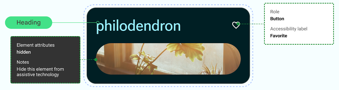
- Mô tả các phần tử trên giao diện người dùng trong mã của bạn. Compose sử dụng thuộc tính Ngữ nghĩa để thông báo cho các dịch vụ hỗ trợ tiếp cận về thông tin hiển thị trong các phần tử giao diện người dùng.
- Để đáp ứng các yêu cầu của khung Android, hãy cung cấp thêm nội dung mô tả bằng văn bản về biểu tượng và hình ảnh.
- Đặt nội dung mô tả mặt hàng trang trí thành giá trị rỗng.
- Để cho phép bỏ qua giữa các khối hành động và nội dung, hãy cân nhắc độ chi tiết của giao diện người dùng và nhóm các phần tử giao diện người dùng.
Hãy xem Hướng dẫn thiết kế đến triển khai của Material. Hướng dẫn này sẽ giúp bạn tìm hiểu các yếu tố cần cân nhắc về khả năng tiếp cận và ký hiệu theo Nguyên tắc hỗ trợ tiếp cận nội dung web (WCAG).
Thiết kế cho âm thanh
Android cung cấp các tính năng cho phép người dùng tương tác với thiết bị thông qua nhiều lệnh thoại và truy vấn.
Ứng dụng Điều khiển bằng giọng nói dành cho Android giúp bạn điều khiển thiết bị bằng khẩu lệnh. Hãy dùng giọng nói của bạn để mở ứng dụng, di chuyển và chỉnh sửa văn bản mà không cần dùng tay.
Thiết kế để phát triển kỹ năng vận động
Tính năng Tiếp cận bằng công tắc cho phép người dùng tương tác với thiết bị Android bằng một hoặc nhiều thiết bị. Tính năng này có thể hữu ích đối với người không thể cử động tay một cách linh hoạt và gặp khó khăn khi tương tác trực tiếp với màn hình cảm ứng.
Kiểm thử theo cách thủ công bằng cách khám phá tính năng tiếp cận bằng công tắc.
- Đừng dựa vào cử chỉ để hoàn thành mọi thao tác; hãy tạo thao tác hỗ trợ tiếp cận để hỗ trợ tất cả luồng người dùng trong ứng dụng của bạn.
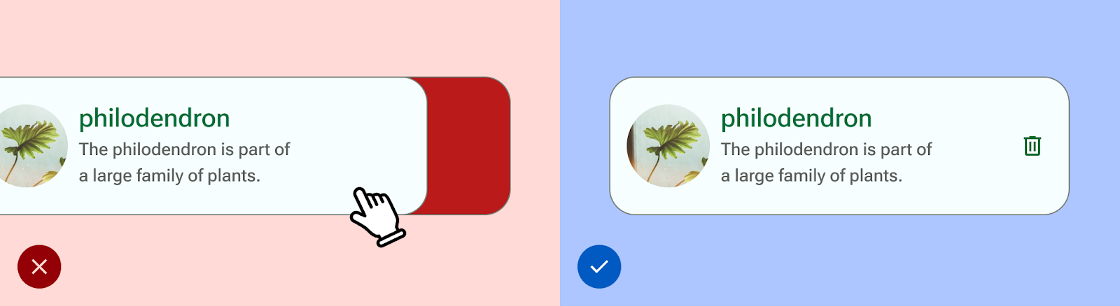
- Đảm bảo tất cả đích chạm đều có kích thước ít nhất là 48 dp, ngay cả khi kích thước này vượt quá hình ảnh của phần tử trên giao diện người dùng.
- Cân nhắc sử dụng phản hồi xúc giác để cung cấp cho người dùng thêm thông tin đầu vào cảm giác theo thời gian thực.