اشکال مختلف ساعت را مدیریت کنید
با مجموعهها، منظم بمانید
ذخیره و طبقهبندی محتوا براساس اولویتهای شما.
روش Compose را امتحان کنید
Jetpack Compose on Wear OS جعبه ابزار UI توصیه شده برای Wear OS است.
برنامههای Wear OS از تکنیکهای چیدمان مشابه سایر دستگاههای Android استفاده میکنند، اما باید با محدودیتهای خاص ساعت طراحی شوند.
توجه: عملکرد و رابط کاربری دقیق یک برنامه تلفن همراه را به Wear OS منتقل نکنید و انتظار یک تجربه کاربری خوب را داشته باشید.
اگر برنامه خود را برای یک دستگاه مستطیل شکل دستی طراحی می کنید، ممکن است محتوای نزدیک گوشه های صفحه در ساعت های گرد بریده شود. اگر از یک لیست عمودی قابل پیمایش استفاده می کنید، این موضوع کمتر مشکلی ایجاد می کند، زیرا کاربر می تواند در مرکز محتوا پیمایش کند. با این حال، برای صفحه نمایش های تک، می تواند تجربه کاربری بدی را ارائه دهد.
اگر از تنظیمات زیر برای طرحبندی خود استفاده میکنید، متن به اشتباه در دستگاههایی با صفحهنمایش گرد نمایش داده میشود:
<androidx.constraintlayout.widget.ConstraintLayout
xmlns:android="http://schemas.android.com/apk/res/android"
xmlns:app="http://schemas.android.com/apk/res-auto"
xmlns:tools="http://schemas.android.com/tools"
android:layout_width="match_parent"
android:layout_height="match_parent">
<TextView
android:id="@+id/text"
android:layout_width="0dp"
android:layout_height="0dp"
android:text="@string/very_long_hello_world"
app:layout_constraintBottom_toBottomOf="parent"
app:layout_constraintEnd_toEndOf="parent"
app:layout_constraintStart_toStartOf="parent"
app:layout_constraintTop_toTopOf="parent" />
</androidx.constraintlayout.widget.ConstraintLayout>
برای حل این مشکل، از طرحبندیهایی در کتابخانه رابط کاربری Wear OS استفاده کنید که از دستگاههای گرد پشتیبانی میکنند.
- میتوانید از
BoxInsetLayout
برای جلوگیری از بریده شدن نماها در نزدیکی لبههای صفحههای گرد استفاده کنید. - وقتی میخواهید فهرست عمودی موارد بهینهشده برای صفحهنمایشهای گرد را نمایش دهید و دستکاری کنید، میتوانید از
WearableRecyclerView
برای ایجاد یک طرح منحنی استفاده کنید.
برای اطلاعات بیشتر درباره طراحی برنامهها، دستورالعملهای طراحی Wear OS را بخوانید.
از BoxInsetLayout استفاده کنید
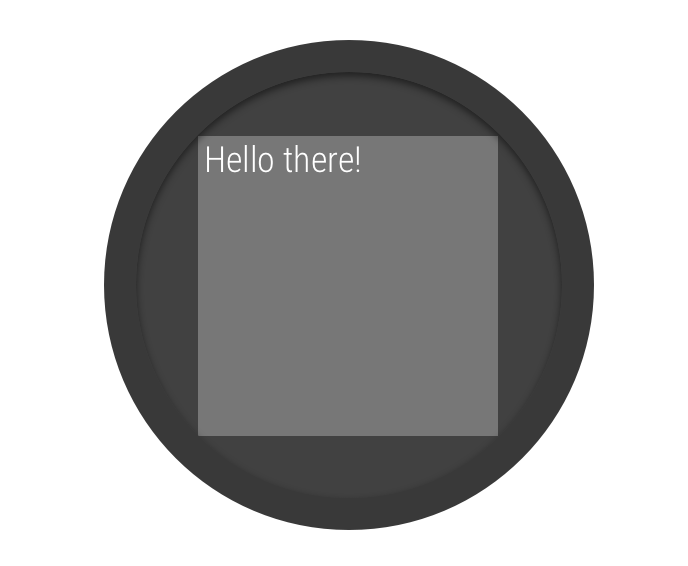
شکل 2. ورودی های پنجره روی یک صفحه گرد.
کلاس BoxInsetLayout
در کتابخانه Wear OS UI به شما امکان می دهد طرحی را تعریف کنید که برای صفحات گرد کار می کند. این کلاس به شما امکان می دهد به راحتی نماها را در مرکز یا نزدیک لبه های صفحه تراز کنید.
مربع خاکستری در شکل 2 ناحیه ای را نشان می دهد که BoxInsetLayout
می تواند به طور خودکار نماهای فرزند خود را پس از اعمال ورودی های پنجره مورد نیاز بر روی صفحه های گرد قرار دهد. برای نمایش در این ناحیه، نماهای فرزند ویژگی layout_boxedEdges
با مقادیر زیر مشخص میکنند:
- ترکیبی از
top
، bottom
، left
و right
. به عنوان مثال، یک مقدار "left|top"
لبه های چپ و بالای کودک را در داخل مربع خاکستری در شکل 2 قرار می دهد. - مقدار
"all"
تمام محتوای کودک را در داخل مربع خاکستری شکل 2 قرار می دهد. این رایج ترین رویکرد با ConstraintLayout
در داخل است.
طرح نشان داده شده در شکل 2 از عنصر <BoxInsetLayout>
استفاده می کند و روی صفحه های گرد کار می کند:
<androidx.wear.widget.BoxInsetLayout
xmlns:android="http://schemas.android.com/apk/res/android"
xmlns:app="http://schemas.android.com/apk/res-auto"
android:layout_height="match_parent"
android:layout_width="match_parent"
android:padding="15dp">
<androidx.constraintlayout.widget.ConstraintLayout
android:layout_width="match_parent"
android:layout_height="match_parent"
android:padding="5dp"
app:layout_boxedEdges="all">
<TextView
android:layout_height="wrap_content"
android:layout_width="match_parent"
android:text="@string/sometext"
android:textAlignment="center"
app:layout_constraintEnd_toEndOf="parent"
app:layout_constraintStart_toStartOf="parent"
app:layout_constraintTop_toTopOf="parent" />
<ImageButton
android:background="@android:color/transparent"
android:layout_height="50dp"
android:layout_width="50dp"
app:layout_constraintBottom_toBottomOf="parent"
app:layout_constraintStart_toStartOf="parent"
android:src="@drawable/cancel" />
<ImageButton
android:background="@android:color/transparent"
android:layout_height="50dp"
android:layout_width="50dp"
app:layout_constraintBottom_toBottomOf="parent"
app:layout_constraintEnd_toEndOf="parent"
android:src="@drawable/ok" />
</androidx.constraintlayout.widget.ConstraintLayout>
</androidx.wear.widget.BoxInsetLayout>
به قسمت هایی از طرح بندی که با پررنگ مشخص شده اند توجه کنید:
android:padding="15dp"
این خط padding را به عنصر <BoxInsetLayout>
اختصاص می دهد.
android:padding="5dp"
این خط padding را به عنصر ConstraintLayout
داخلی اختصاص می دهد.
app:layout_boxedEdges="all"
این خط تضمین میکند که عنصر ConstraintLayout
و فرزندان آن در داخل ناحیهای که توسط ورودیهای پنجره در صفحههای گرد تعریف شده است، قرار میگیرند.
از طرح منحنی استفاده کنید
کلاس WearableRecyclerView
در کتابخانه Wear OS UI به شما امکان می دهد یک طرح منحنی بهینه شده برای صفحه نمایش های گرد را انتخاب کنید. برای فعال کردن طرحبندی منحنی برای لیستهای قابل پیمایش در برنامهتان، به ایجاد فهرستها در Wear OS مراجعه کنید.
محتوا و نمونه کدها در این صفحه مشمول پروانههای توصیفشده در پروانه محتوا هستند. جاوا و OpenJDK علامتهای تجاری یا علامتهای تجاری ثبتشده Oracle و/یا وابستههای آن هستند.
تاریخ آخرین بهروزرسانی 2025-07-29 بهوقت ساعت هماهنگ جهانی.
[[["درک آسان","easyToUnderstand","thumb-up"],["مشکلم را برطرف کرد","solvedMyProblem","thumb-up"],["غیره","otherUp","thumb-up"]],[["اطلاعاتی که نیاز دارم وجود ندارد","missingTheInformationINeed","thumb-down"],["بیشازحد پیچیده/ مراحل بسیار زیاد","tooComplicatedTooManySteps","thumb-down"],["قدیمی","outOfDate","thumb-down"],["مشکل ترجمه","translationIssue","thumb-down"],["مشکل کد / نمونهها","samplesCodeIssue","thumb-down"],["غیره","otherDown","thumb-down"]],["تاریخ آخرین بهروزرسانی 2025-07-29 بهوقت ساعت هماهنگ جهانی."],[],[],null,["# Handle different watch shapes\n\nTry the Compose way \nJetpack Compose on Wear OS is the recommended UI toolkit for Wear OS. \n[Try Compose on Wear OS →](/training/wearables/compose) \n\n\nApps on Wear OS use the same layout techniques as other Android devices\nbut need to be designed with watch-specific constraints.\n\n\n**Note:** Don't port the exact functionality and UI from a mobile app to Wear OS and expect\na good user experience.\n\n\nIf you design your app for a rectangular handheld device, content near the corners of the screen\nmight be cropped on round watches. If you are using a scrollable vertical list, this is less of\nan issue, as the user can scroll to center the content. However, for single screens, it can\nprovide a bad user experience.\n\n\nIf you use the following settings for your layout, text displays incorrectly on devices\nwith round screens: \n\n```xml\n\u003candroidx.constraintlayout.widget.ConstraintLayout\n xmlns:android=\"http://schemas.android.com/apk/res/android\"\n xmlns:app=\"http://schemas.android.com/apk/res-auto\"\n xmlns:tools=\"http://schemas.android.com/tools\"\n android:layout_width=\"match_parent\"\n android:layout_height=\"match_parent\"\u003e\n\n \u003cTextView\n android:id=\"@+id/text\"\n android:layout_width=\"0dp\"\n android:layout_height=\"0dp\"\n android:text=\"@string/very_long_hello_world\"\n app:layout_constraintBottom_toBottomOf=\"parent\"\n app:layout_constraintEnd_toEndOf=\"parent\"\n app:layout_constraintStart_toStartOf=\"parent\"\n app:layout_constraintTop_toTopOf=\"parent\" /\u003e\n\n\u003c/androidx.constraintlayout.widget.ConstraintLayout\u003e\n```\n\n\nTo solve this problem, use layouts in the [Wear OS UI Library](/training/wearables/views) that support round devices.\n\n- You can use a [`BoxInsetLayout`](/reference/androidx/wear/widget/BoxInsetLayout) to prevent views from being cropped near the edges of round screens.\n- You can use a [WearableRecyclerView](/reference/androidx/wear/widget/WearableRecyclerView) to create a curved layout when you want to display and manipulate a vertical list of items optimized for round screens.\n\n\nFor more information about designing apps, read the\n[Wear OS design guidelines](/training/wearables/design).\n\nUse a BoxInsetLayout\n--------------------\n\n\n**Figure 2.** Window insets on a round screen.\n\n\nThe [`BoxInsetLayout`](/reference/androidx/wear/widget/BoxInsetLayout) class in the Wear OS UI Library lets\nyou define a layout that works for round screens. This class lets you\neasily align views on the center or near the edges of the screen.\n\n\nThe gray square in figure 2 shows the area where the `BoxInsetLayout`\ncan automatically place its child views on round screens after applying\nthe required window insets. To be displayed inside this area, child\nviews specify the `layout_boxedEdges` attribute with the following values:\n\n- A combination of `top`, `bottom`, `left`, and `right`. For example, a `\"left|top\"` value positions the child's left and top edges inside the gray square in figure 2.\n- The `\"all\"` value positions all the child's content inside the gray square in figure 2. This is the most common approach with a [`ConstraintLayout`](/reference/androidx/constraintlayout/widget/ConstraintLayout) inside.\n\n\nThe layout shown in figure 2 uses the `\u003cBoxInsetLayout\u003e`\nelement and works on round screens: \n\n```xml\n\u003candroidx.wear.widget.BoxInsetLayout\n xmlns:android=\"http://schemas.android.com/apk/res/android\"\n xmlns:app=\"http://schemas.android.com/apk/res-auto\"\n android:layout_height=\"match_parent\"\n android:layout_width=\"match_parent\"\n android:padding=\"15dp\"\u003e\n\n \u003candroidx.constraintlayout.widget.ConstraintLayout\n android:layout_width=\"match_parent\"\n android:layout_height=\"match_parent\"\n android:padding=\"5dp\"\n app:layout_boxedEdges=\"all\"\u003e\n\n \u003cTextView\n android:layout_height=\"wrap_content\"\n android:layout_width=\"match_parent\"\n android:text=\"@string/sometext\"\n android:textAlignment=\"center\"\n app:layout_constraintEnd_toEndOf=\"parent\"\n app:layout_constraintStart_toStartOf=\"parent\"\n app:layout_constraintTop_toTopOf=\"parent\" /\u003e\n\n \u003cImageButton\n android:background=\"@android:color/transparent\"\n android:layout_height=\"50dp\"\n android:layout_width=\"50dp\"\n app:layout_constraintBottom_toBottomOf=\"parent\"\n app:layout_constraintStart_toStartOf=\"parent\"\n android:src=\"@drawable/cancel\" /\u003e\n\n \u003cImageButton\n android:background=\"@android:color/transparent\"\n android:layout_height=\"50dp\"\n android:layout_width=\"50dp\"\n app:layout_constraintBottom_toBottomOf=\"parent\"\n app:layout_constraintEnd_toEndOf=\"parent\"\n android:src=\"@drawable/ok\" /\u003e\n\n \u003c/androidx.constraintlayout.widget.ConstraintLayout\u003e\n\n\u003c/androidx.wear.widget.BoxInsetLayout\u003e\n```\n\n\nNotice the parts of the layout marked in bold:\n\n-\n `android:padding=\"15dp\"`\n\n\n This line assigns padding to the `\u003cBoxInsetLayout\u003e`\n element.\n-\n `android:padding=\"5dp\"`\n\n\n This line assigns padding to the inner `ConstraintLayout` element.\n-\n `app:layout_boxedEdges=\"all\"`\n\n\n This line ensures that the `ConstraintLayout` element\n and its children are boxed inside the area defined by the window\n insets on round screens.\n\nUse a curved layout\n-------------------\n\nThe [WearableRecyclerView](/reference/androidx/wear/widget/WearableRecyclerView) class in the Wear OS UI Library\nlets you opt-in to a curved layout optimized for round screens.\nTo enable a curved layout for scrollable lists in your\napp, see [Create lists on Wear OS](/training/wearables/ui/lists#creating)."]]