Google Photos הגדילה את מספר המשתמשים הפעילים ביום באמצעות פיתוח למסכים גדולים
קל לארגן דפים בעזרת אוספים
אפשר לשמור ולסווג תוכן על סמך ההעדפות שלך.
Google Photos הוא הבית של הזיכרונות שלכם, וצוות הפיתוח שלו מאמין שאנשים צריכים ליהנות מהזיכרונות האלה בכל המכשירים. כדי לוודא שהתכונות של האפליקציה פועלות היטב בטאבלטים עם Android, במכשירים מתקפלים ובמכשירי ChromeOS, הם השקיעו בפיתוח פריסות רספונסיביות בכל המסכים.
מה הם עשו
צוות הפיתוח של Google Photos חשב איך לשנות את הפריסה שלו למסכים גדולים. הם הסתמכו על שיטות מומלצות לשיפור השימושיות ועל מחקר כדי להחליט איך לשנות את הפריסות שלהם למסכים גדולים. קודם כל, הם שיפרו את פריסת הרשת על ידי הפחתת הצפיפות כשהמסכים גדלים מעבר ל-600dp בטאבלטים, ומעבר ל-1008dp במחשבים ניידים. כך קל יותר למשתמשים לצפות בתמונות ולגלול ביניהן בגודל הגדול יותר.
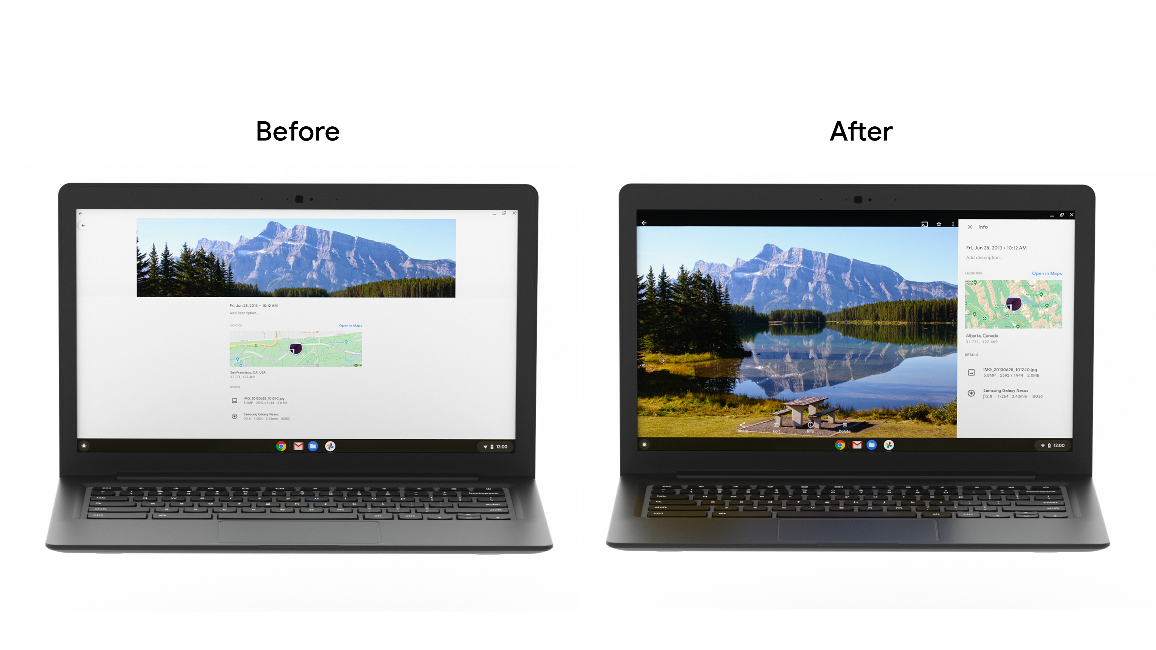
לאחר מכן הם החליפו את המגירה התחתונה של חלונית המידע בסרגל צד. מכיוון שבדרך כלל משתמשים בטאבלטים ובמסכים של מחשבים שולחניים במצב לרוחב, השינוי הזה בגישה מפחית את המתיחה במסכים רחבים יותר ומשפר את הארגונומיה של האופן שבו משתמשי טאבלטים מחזיקים את המכשירים. בנוסף, הם שיפרו את תיבת הדו-שיח של הגיליון התחתון והוסיפו סרגלים אינטראקטיביים כדי להציג הודעות למשתמשים בצורה קלה יותר במסכים גדולים.
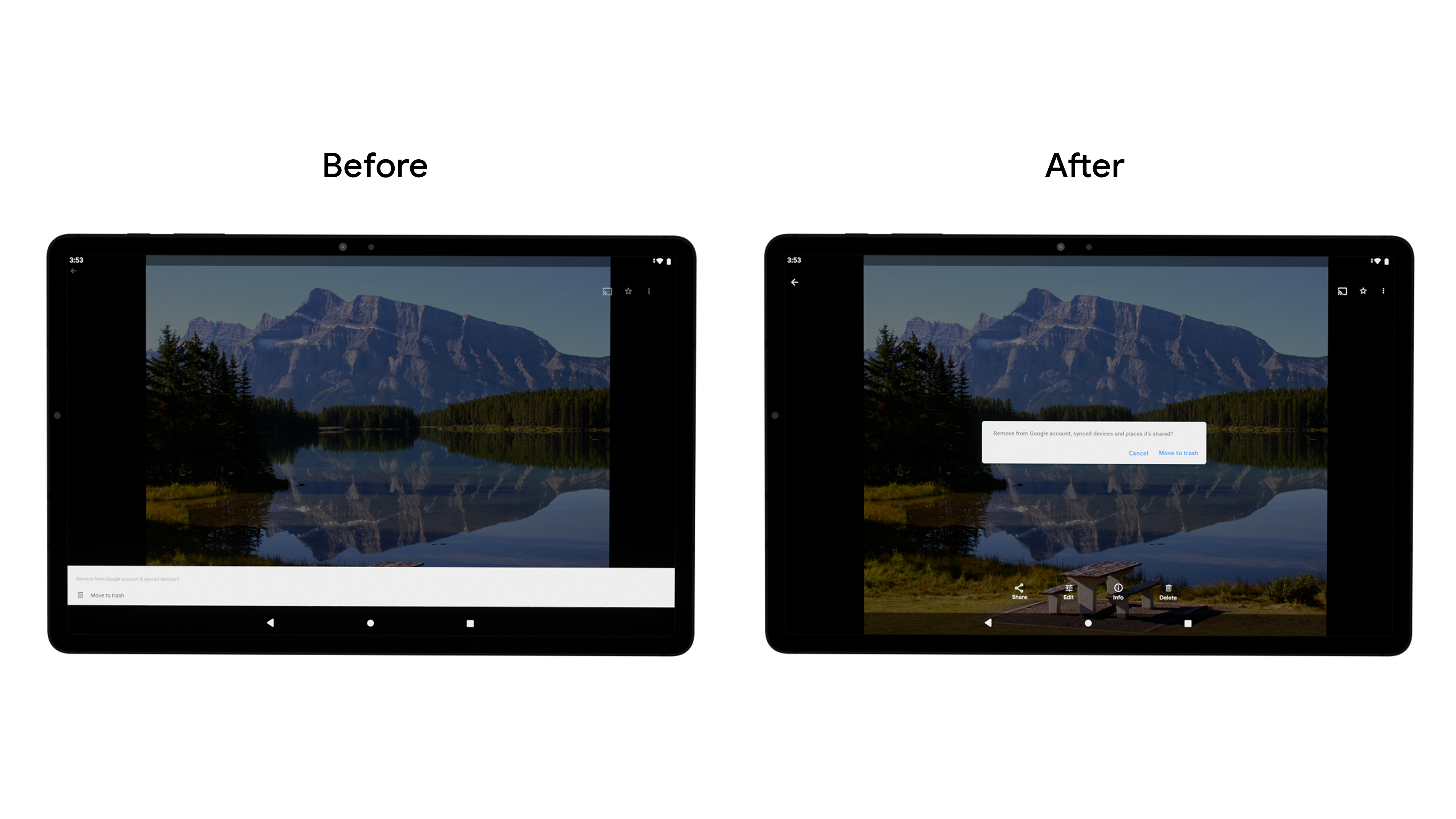
הם שינו את רכיב הניווט מסרגל תחתון לסרגל אנכי, כדי להקל על המשתמשים לנווט ולהשלים משימות. צוות Google Photos השתמש בטכנולוגיה הזו בבסיס הקוד שלו, אבל מפתחים יכולים להשתמש ברכיב החדש של Navigation rail כדי לשפר את הארגונומיה, לצמצם את המאמץ שנדרש מהמשתמשים ולהגדיל את שטח המסך באפליקציות עם גלילה אנכית.
צוות הפיתוח גם שינה את הגודל של הרשת באופן דינמי כדי לייעל את המעבר בין תנוחות שונות וגדלים שונים של מסכים, ושיפר את התמיכה שהוא מספק באביזרים כמו מקלדות ועטים אלקטרוניים. לאור הגידול במספר הצרכנים שמשתמשים במכשירי ChromeOS לצורכי פרודוקטיביות, חשוב יותר ויותר לוודא שהאפליקציות תומכות במגוון שיטות קלט, כולל מקלדת, עכבר ומסך מגע.
תוצאות
הצוות הטמיע את השינויים האלה באמצעות בדיקת A/B, והבחין בעלייה כללית ב-DAU של תכונות מוצר מרכזיות במסכים גדולים, כאשר השימוש בארכיון עלה ב-53%. צוות Google Photos ימשיך להשקיע בשיפור חוויית המשתמש בכל גדלי המסך, כדי להבטיח חוויה נהדרת בכל המכשירים.
שנתחיל?
איך מתחילים באופטימיזציה של האפליקציה למסכים גדולים יותר
דוגמאות התוכן והקוד שבדף הזה כפופות לרישיונות המפורטים בקטע רישיון לתוכן. Java ו-OpenJDK הם סימנים מסחריים או סימנים מסחריים רשומים של חברת Oracle ו/או של השותפים העצמאיים שלה.
עדכון אחרון: 2021-09-02 (שעון UTC).
[[["התוכן קל להבנה","easyToUnderstand","thumb-up"],["התוכן עזר לי לפתור בעיה","solvedMyProblem","thumb-up"],["סיבה אחרת","otherUp","thumb-up"]],[["חסרים לי מידע או פרטים","missingTheInformationINeed","thumb-down"],["התוכן מורכב מדי או עם יותר מדי שלבים","tooComplicatedTooManySteps","thumb-down"],["התוכן לא עדכני","outOfDate","thumb-down"],["בעיה בתרגום","translationIssue","thumb-down"],["בעיה בדוגמאות/בקוד","samplesCodeIssue","thumb-down"],["סיבה אחרת","otherDown","thumb-down"]],["עדכון אחרון: 2021-09-02 (שעון UTC)."],[],[],null,["# Google Photos increased daily active users by building for large screens\n\nGoogle Photos is the home for your memories, and their development team believes people should be able to enjoy those memories across all devices. To make sure the app's features worked well across Android tablet, foldable, and ChromeOS devices, they invested in developing responsive layouts across all screens.\n\nWhat they did\n-------------\n\nThe Google Photos development team thought through how to modify their layout for large screens. They leaned on [usability best practices](https://material.io/blog/material-design-for-large-screens) and research to determine how they wanted to modify their layouts for large screens. First they improved the grid layout by reducing the density when screens increase beyond 600dp for tablets, and 1008 dp for laptops. This made it easier for users to view and scroll through their photos on the larger form factor. \n\nThen they replaced the info panel bottom drawer with a sidebar. Since tablets and desktop screens are often used in landscape, this approach change reduces stretching across wider screens and provides better ergonomics for the way tablet users hold devices. They also improved the [bottom sheet dialog](https://developer.android.com/reference/com/google/android/material/bottomsheet/BottomSheetDialog), and added [snackbars](https://developer.android.com/reference/com/google/android/material/snackbar/Snackbar) to display user messages easier on large screens. \n\nThey changed the navigation component from a bottom bar to a vertical rail, to make it easier for users to navigate and complete tasks. While Google Photos built this within their own codebase, developers can build this using the new [Navigation rail material component](https://material.io/components/navigation-rail) to improve ergonomics, reduce stretching, and increase the screen real estate for vertical scrolling apps.\n\nThe development team also made grid resizing dynamic to streamline transitioning between different postures and screen sizes, and improved the support they provide for accessories such as keyboards and stylus pens. Given the growth we've seen amongst consumers using ChromeOS devices for productivity, it is increasingly important to ensure apps support a variety of input methods, including keyboard, mouse, and touch.\n\nResults\n-------\n\nThe team rolled out these changes through an A/B test, and noticed an overall **increase in DAU for key product features on large screens, with Archive seeing as much as a 53% usage increase**. The Google Photos team will continue investing in improving the user experience across all screen sizes to ensure a great experience on all devices.\n\nGet Started\n-----------\n\nLearn more about how you can get started with [optimizing your app for larger screens](https://developer.android.com/large-screens)."]]