
This guide describes creating banners and launcher icons for Android TV.
Key takeaways
The following are the key takeaways from this page:
- There are two icon types for Android TV OS apps in AndroidManifest.xml:
android:icon(standard, mandatory)android:banner(banner, mandatory)
- Adaptive icons are highly recommended.
- Both the icon and banner must comply with the design guidelines outlined in this guide.
- Use the official figma template for generating the banner & icons
- Android TV OS doesn't support themed icons.
Overview
Google TV and Android OS make use of iconography provided through your
AndroidManifest.xml in three ways:
- Launcher icon (1x1 aspect ratio)
- Round launcher icon (1x1 aspect ratio, but circular)
- Banner logo (16x9 aspect ratio)
These are used in different places for different use cases, such as the Your apps row, Settings, or installation progress.
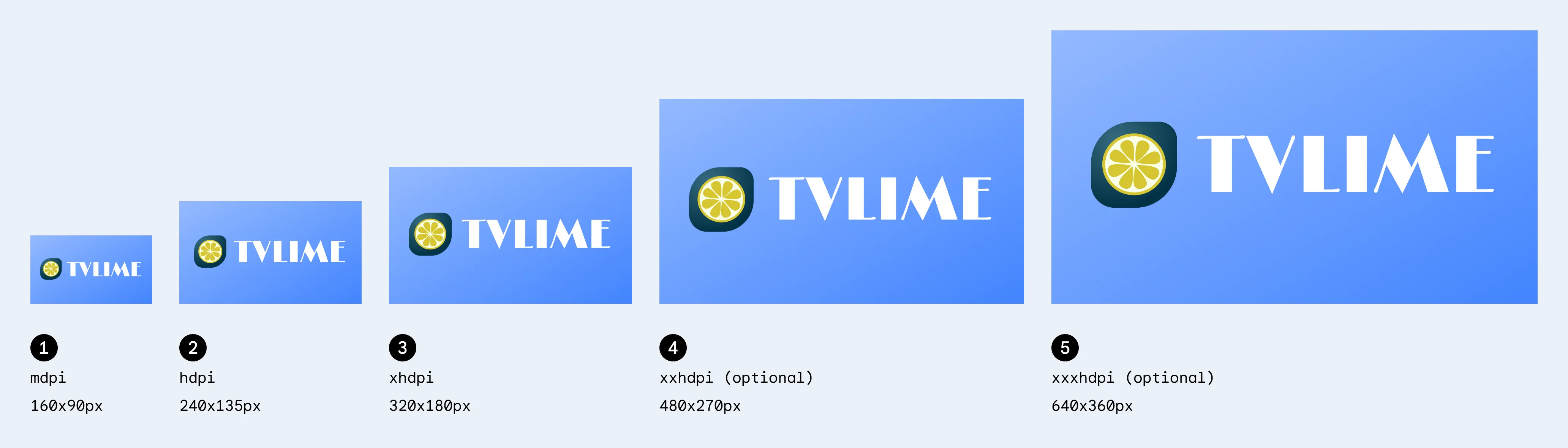
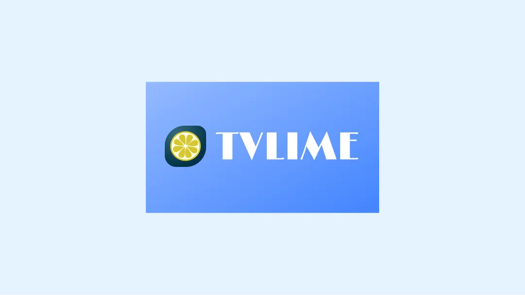
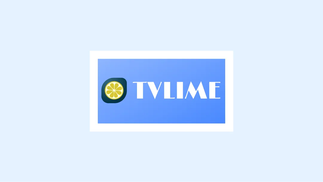
Banner
The Banner logo is a 16x9 aspect ratio logo that is used in Android TV OS to
show your app launcher. We recommend that TV apps provide an adaptive
16:9 banner with the following specifications. You can also provide
xhdpi resources with size of 320 x 180px when using API level 25 or lower.
| Density | Min Size | Folder location (under res) | Pixel Ratio |
|---|---|---|---|
| mdpi | 160x90 px | mipmap-mdpi | 1 |
| hdpi | 240x135 px | mipmap-hdpi | 1.5 |
| xhdpi | 320x180 px | mipmap-xhdpi | 2 |
| xxhdpi | 480x270 px | mipmap-xxhdpi | 3 |
| xxxhdpi | 640x360 px | mipmap-xxxhdpi | 4 |
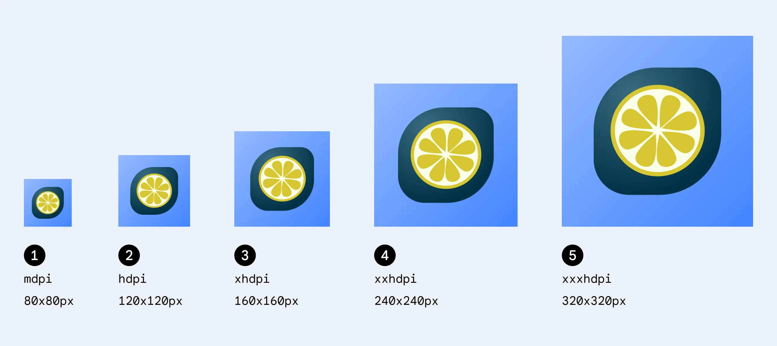
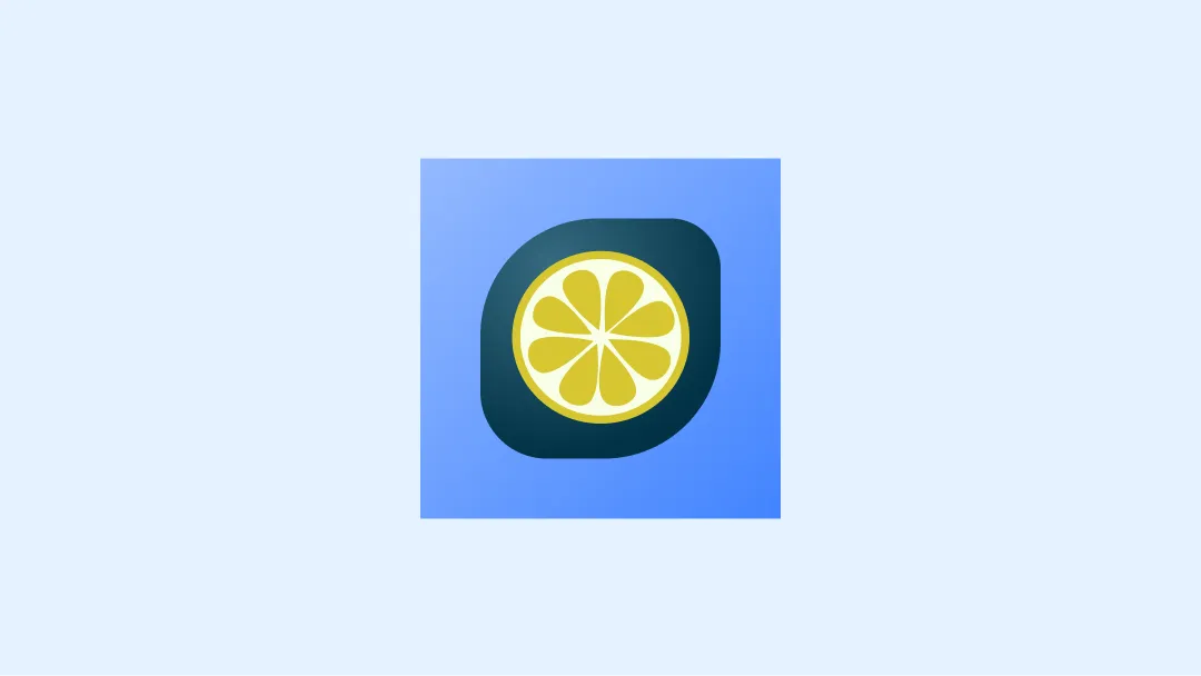
Launcher icon
The Launcher icon is a 1x1 aspect ratio resource that is used in multiple places such as Settings and Media session integrations (Now playing card) on Android TV. The launcher icon can also be used in Your apps row on Google TV.
| Density | Min Size | Folder location (under res) | Pixel Ratio |
|---|---|---|---|
| mdpi | 80x80 px | mipmap-mdpi | 1 |
| hdpi | 120x120 px | mipmap-hdpi | 1.5 |
| xhdpi | 160x160 px | mipmap-xhdpi | 2 |
| xxhdpi | 240x240 px | mipmap-xxhdpi | 3 |
| xxxhdpi | 320x320 px | mipmap-xxxhdpi | 4 |
Adaptive icons
As of the Android 8.0 release (API level 26), there is support for adaptive launcher icons, which allows for more flexibility and interesting visual effects when it comes to app icons. For developers, that means that your app icon is made up of two layers: a foreground and a background layer.
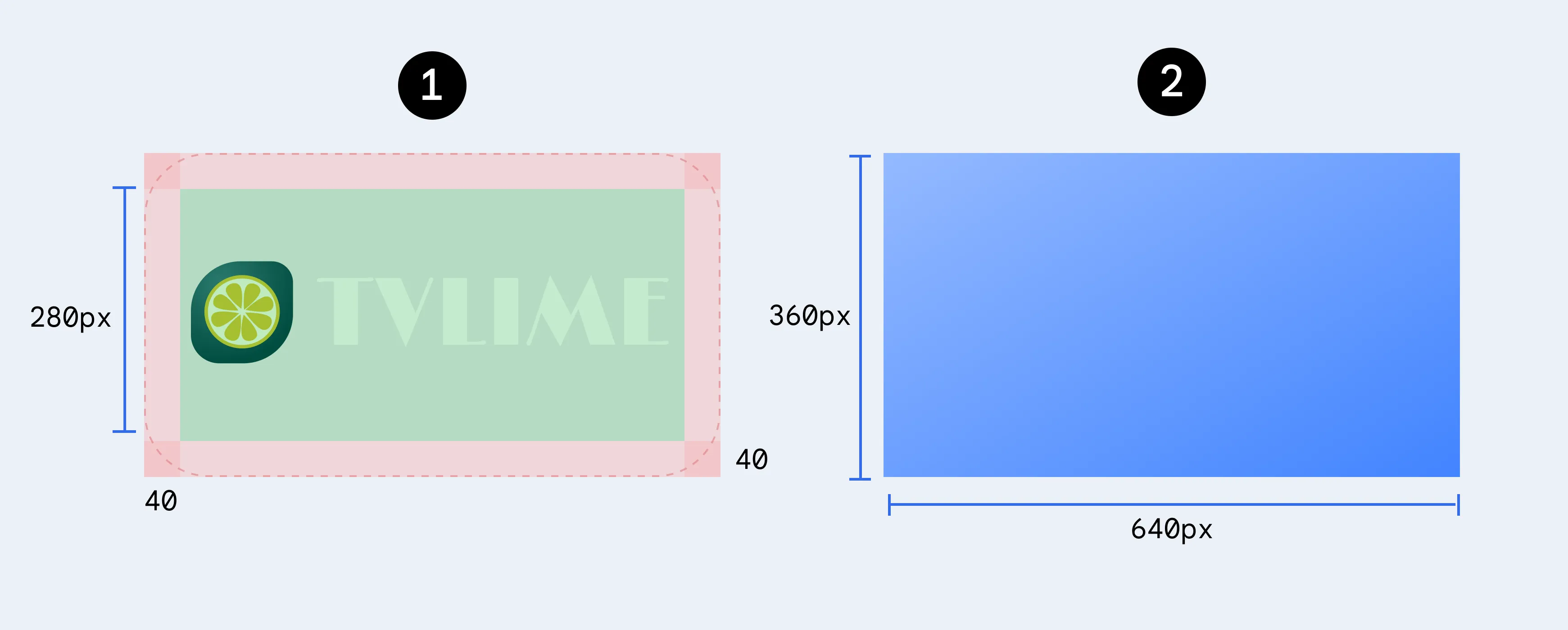
Adaptive banner
You can also provide an adaptive banner along with a legacy banners, similar to launcher icon banners that also have two layers.
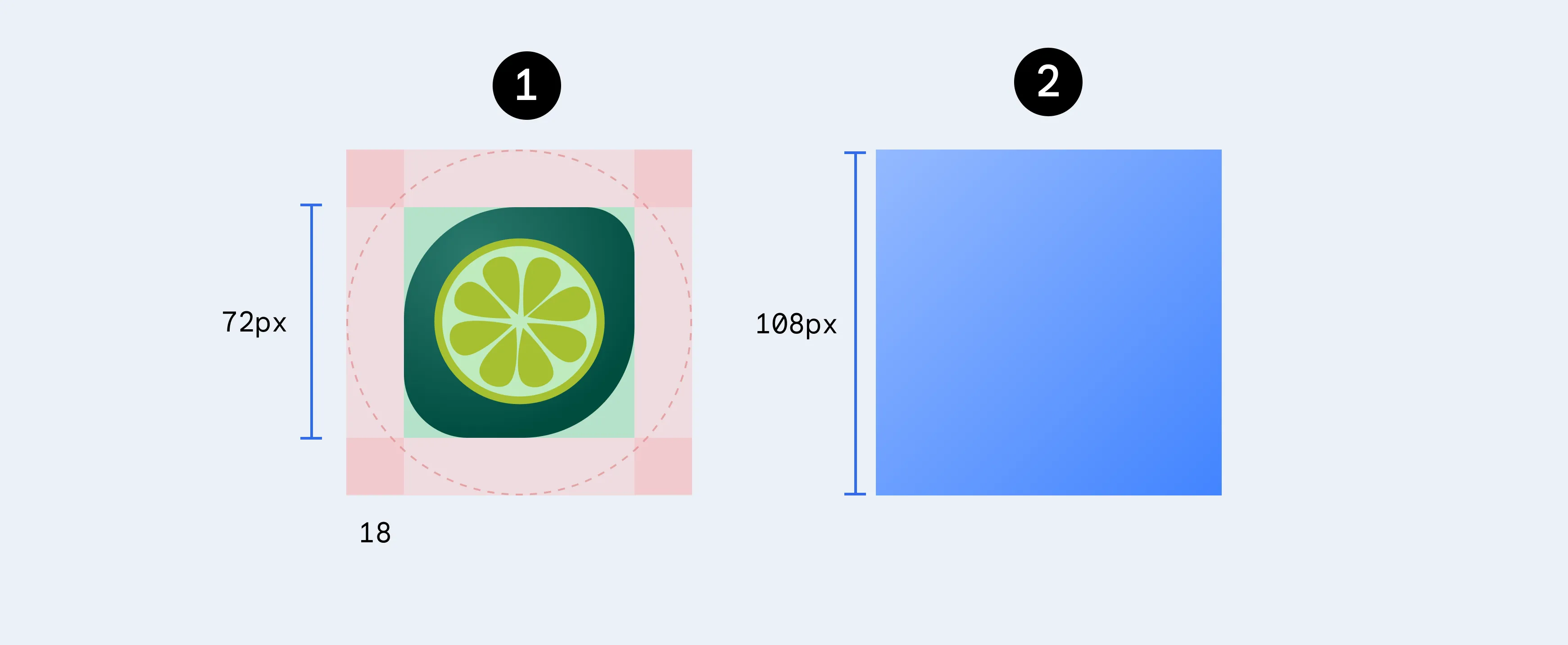
Adaptive launcher icon
To ensure that your adaptive icon supports different shapes, and visual effects the design must meet the following requirements:
Provide two layers for the color version of the icon: one for the foreground, and one for the background.
Adaptive icons are defined using foreground and background layers. The 72 x 72 safe zone in the first image shows where your icon and foreground layers are never be clipped by a shaped mask.
A monochrome version of the icon is not required as Android TV does not support themed icons.
Examples
Below are some do's and don'ts to consider when designing a TV app icon.
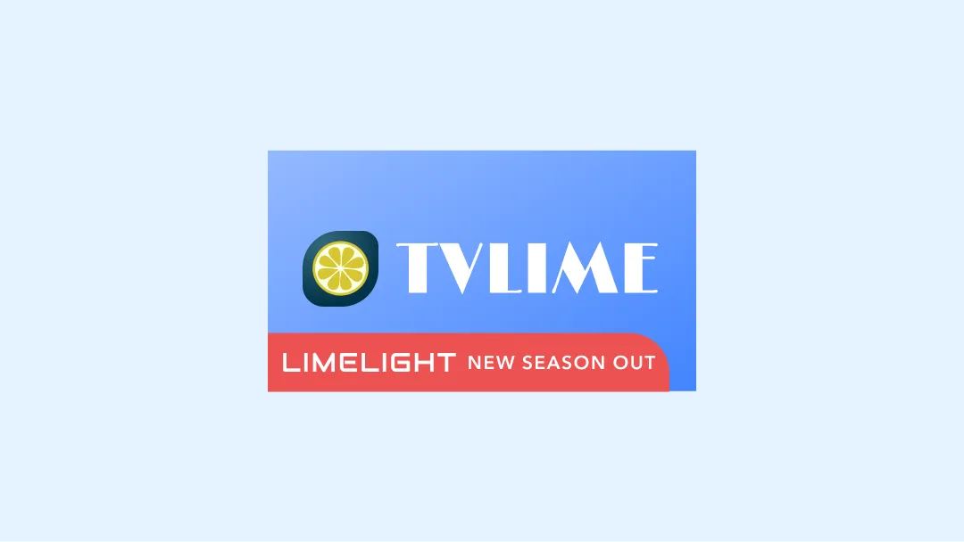
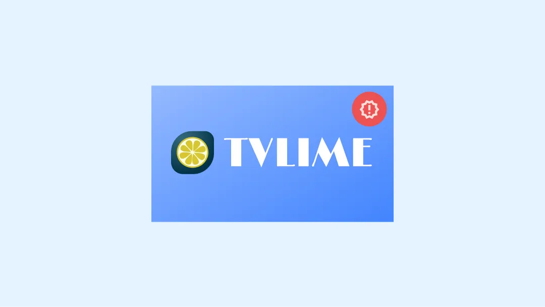
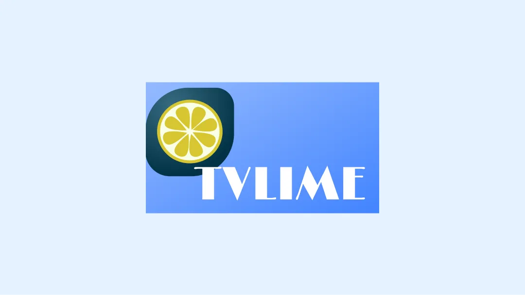
Banner examples
Do
Don't
Don't
Don't
Don't
Don't
Caution
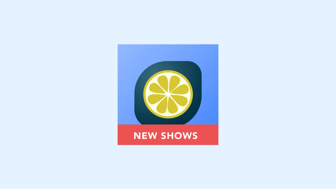
Launcher examples
Do
Don't
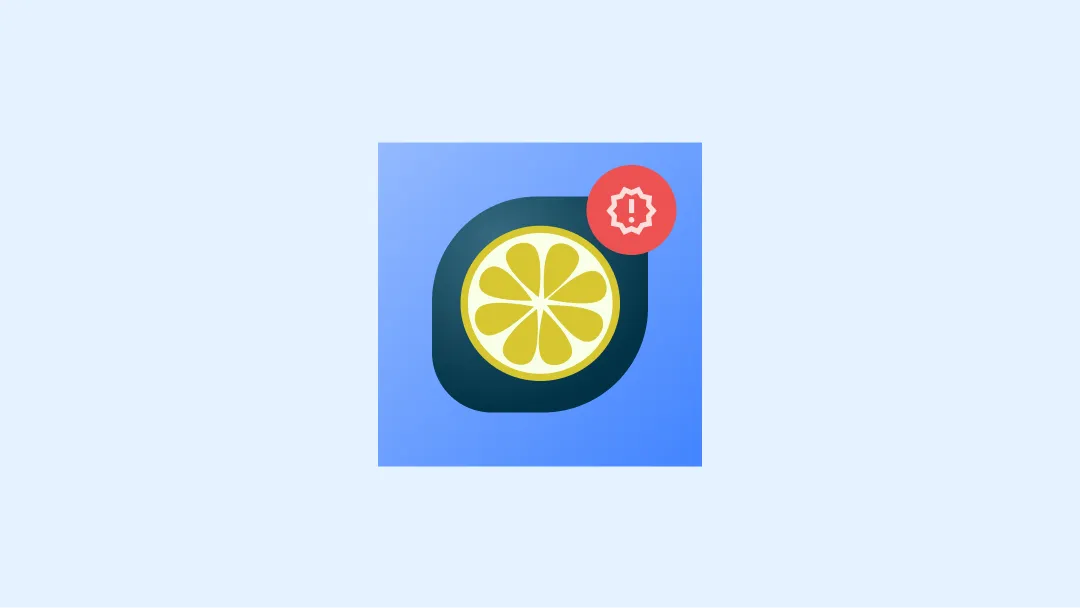
Don't
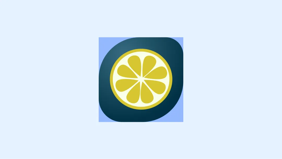
Don't
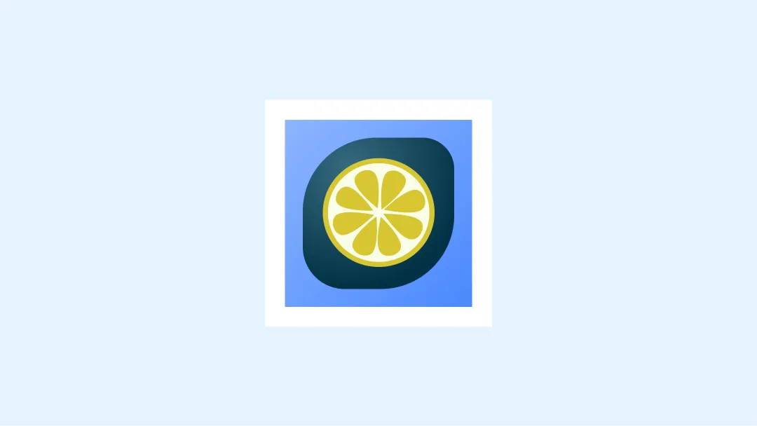
Don't
Don't
Resources
- Official figma template for banner & icons