版面配置
透過集合功能整理內容
你可以依據偏好儲存及分類內容。
版面配置是結構化範本,可提供架構,讓您在應用程式中維持視覺一致性。定義視覺格線、間距和區段,即可建立一致且有條理的結構,用於呈現資訊和 UI 元素。
重點特色
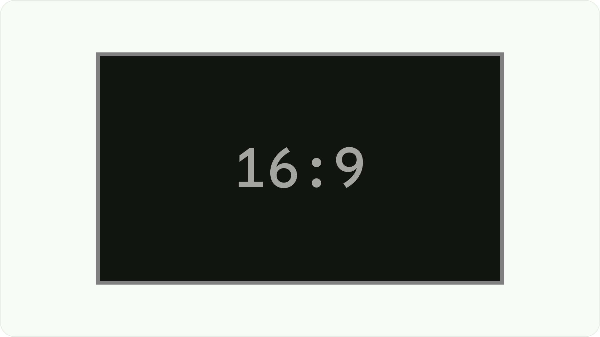
- 與網頁或行動裝置不同,電視的螢幕顯示比例固定為 16:9。
- 沿著水平和垂直軸調整版面配置,方便使用者操作和控制。
原則
設計電視版面配置時,可遵循的規範,協助您做出設計決策。
針對大螢幕設計
自從高畫質電視 (HDTV) 普及以來,長寬比為 16:9 的矩形電視已成為主流。以往電視機的製造方式是採用正方形,也就是 4:3 或 1.33 至 1 的顯示比例。
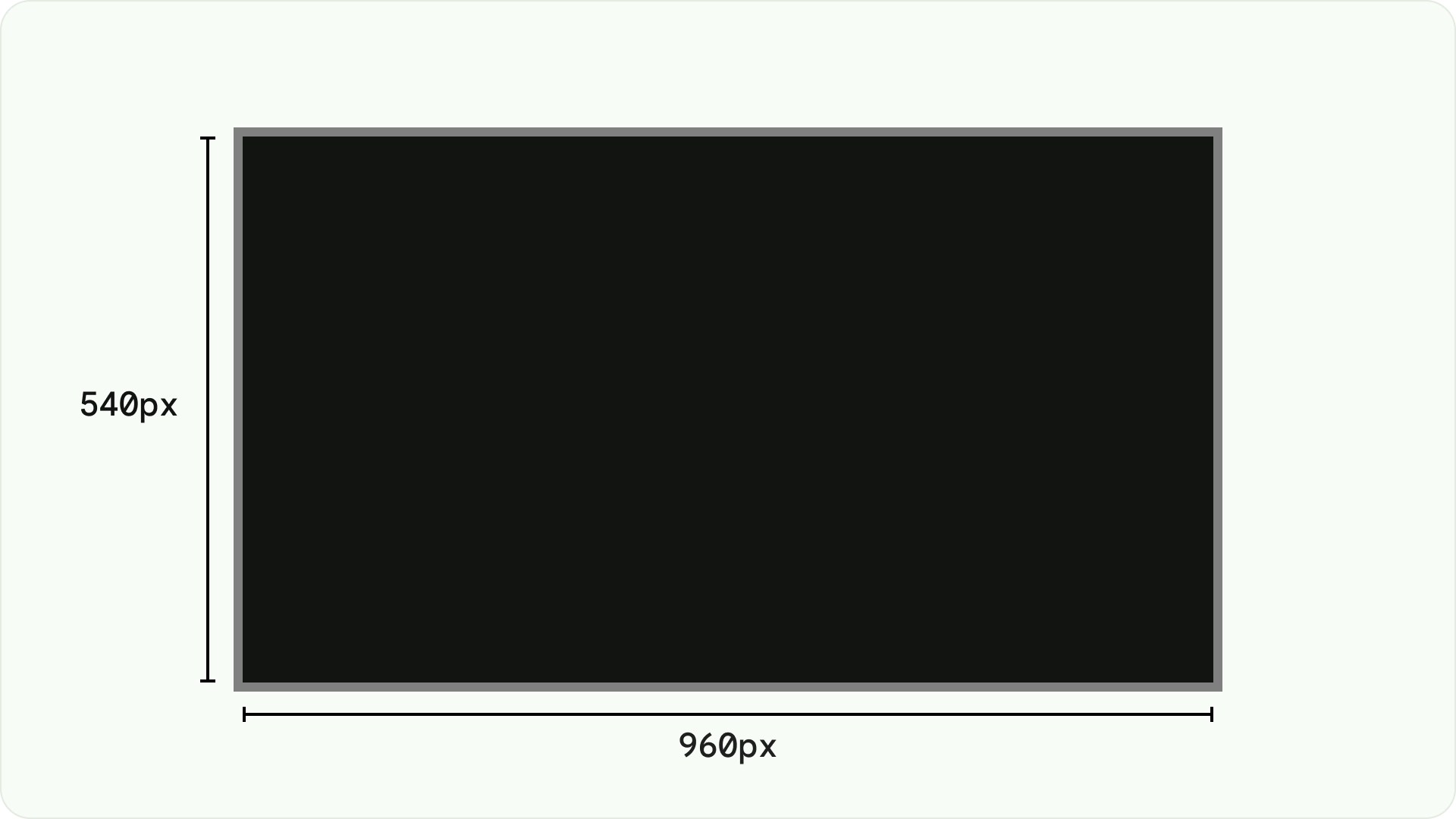
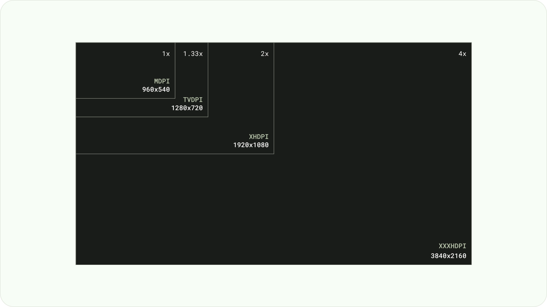
設計時,請使用 dp 在不同密度的螢幕上以相同方式顯示元素,就像任何其他 Android 裝置一樣。一律以 960 像素 x 540 像素的 MDPI 解析度進行設計。
在 MDPI 中,1 px = 1dp。
素材資源必須以 1080p 為目標。這可讓 Android 系統在必要時將版面配置元素縮小至 720p。
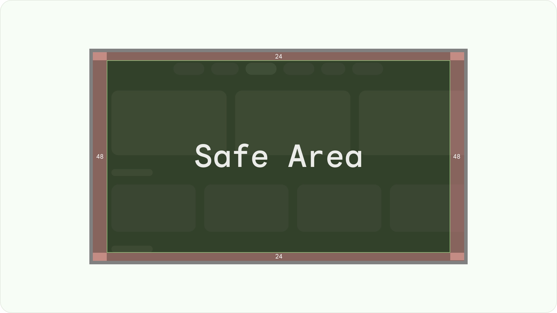
確保可見度和過掃安全性
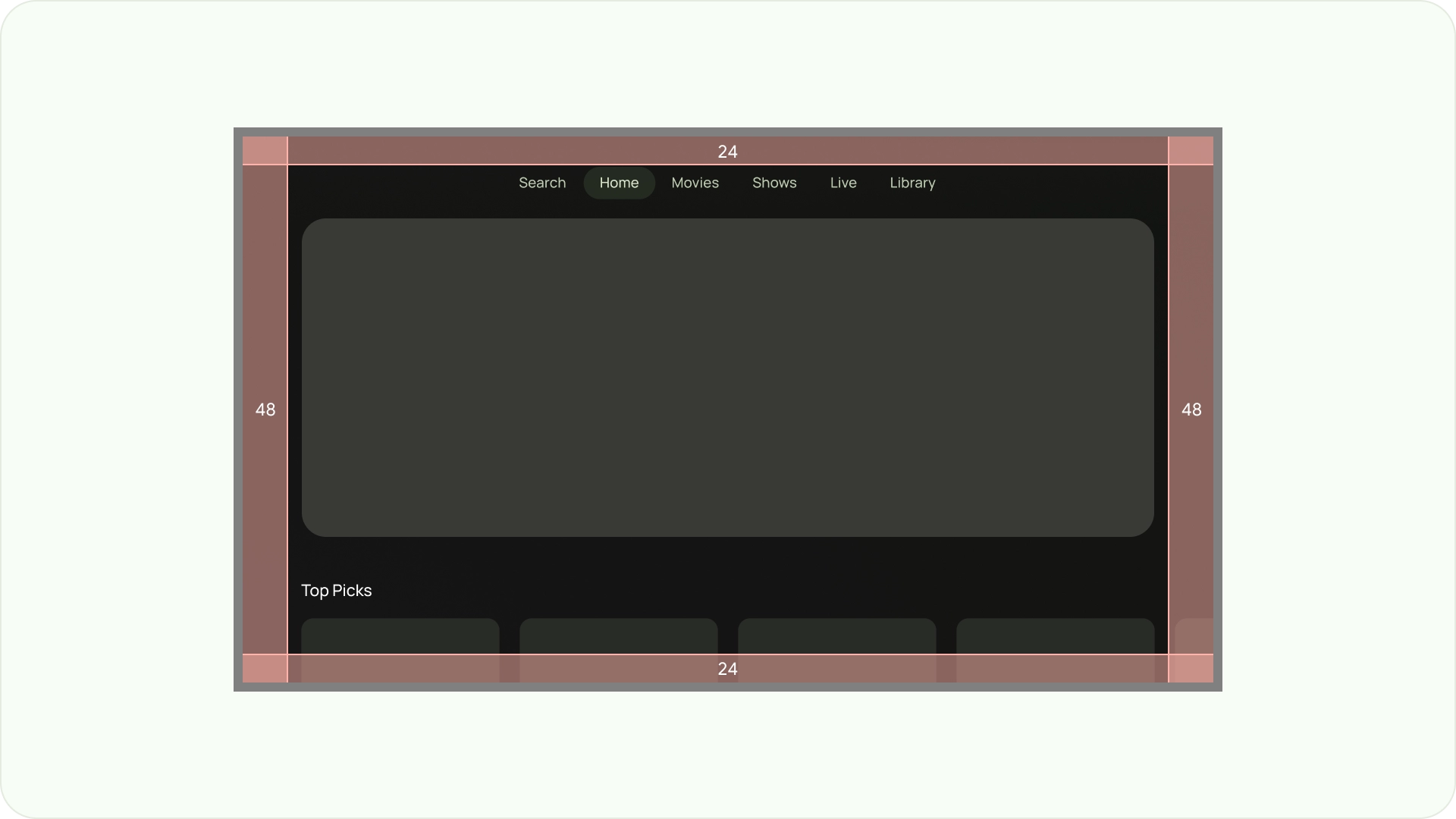
確保使用者一律能看到重要元素。如要這麼做,請將元素置中,並在左右兩側留出 5% 的邊界 (48dp),在版面配置的頂端和底部留出 27dp 的邊界。這可確保版面配置的螢幕元素位於超掃範圍內。
填滿整個螢幕
請勿調整或裁剪背景畫面元素,以免超出安全區。請改為允許部分顯示畫面外元素。這可確保所有螢幕正確顯示背景和畫面外元素。
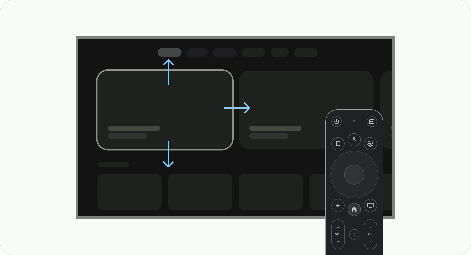
使用軸線進行最佳化
請考量使用者如何使用電視遙控器。請確認電視介面可透過遙控器輕鬆操作。設計每個方向 (向上、向下、向左、向右) 時,請確保有明確的用途和導覽模式,協助使用者瞭解如何瀏覽大量選項。
版面配置
電視螢幕大小因裝置而異。由於新型電視的顯示比例為 16:9,建議您以 960 像素 x 540 像素的螢幕大小設計應用程式。這樣一來,所有元素都能依 HD 或 4K 螢幕的比例調整大小。

遮視區域邊界
過掃邊界是指內容與螢幕左側和右側邊緣之間的空間。
960 * ~5% = 48dp
540 * ~5% = 27dp round off to 24dp
這些邊框邊界可保護主要元素,避免發生超掃問題。為確保內容和資訊安全無虞,請使用 5% 邊界間距版面配置 (兩側為 58dp,頂部和底部邊緣為 28dp)。
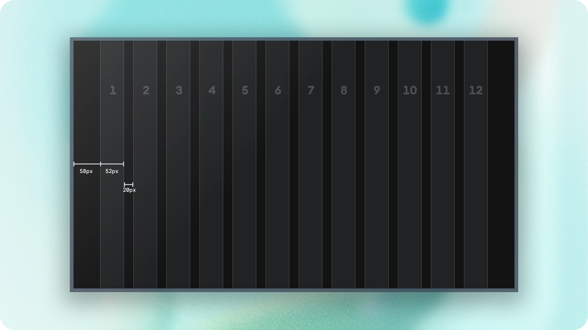
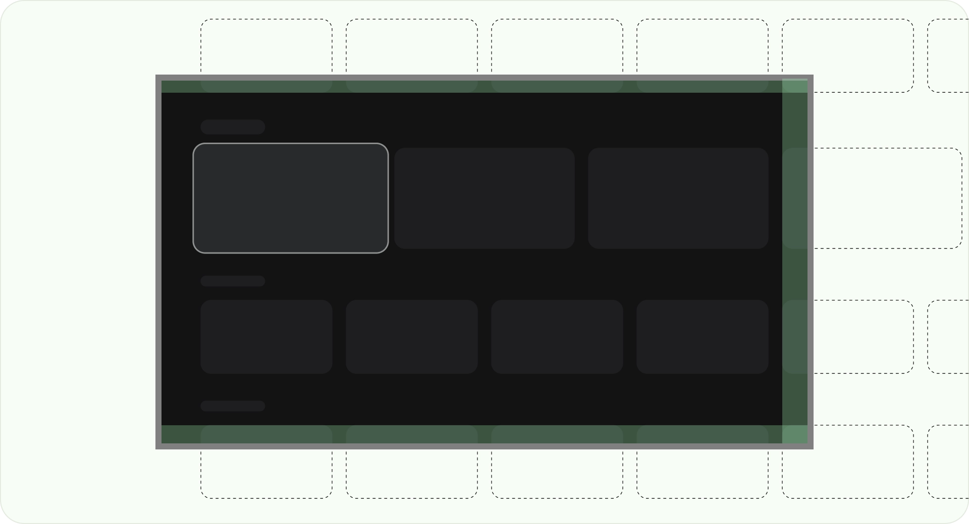
欄和 gutter
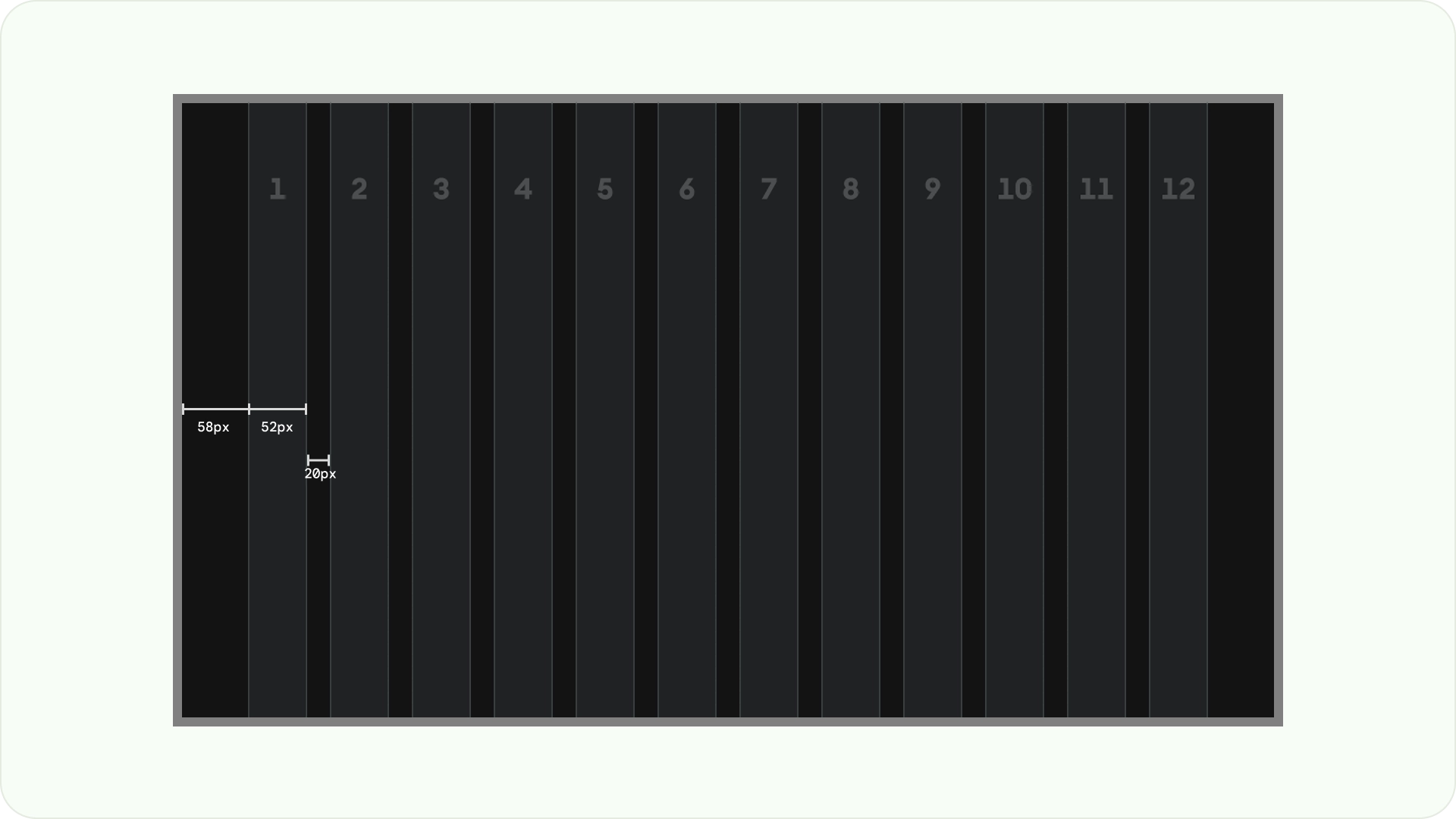
內容會放置在螢幕上有欄位和邊距的區域。這個格線系統有 12 個欄。空白是指用於分隔內容的欄間空白。
使用 12 個寬度為 52dp 的欄,並在各欄之間留出 20dp 的空間。兩側必須有 58dp 的空間,而行與行之間的垂直間距則為 4dp。

版面配置模式
根據您的用途和顯示裝置,您可以使用三種版面配置模式:水平堆疊版面配置、垂直堆疊版面配置和格狀版面配置。
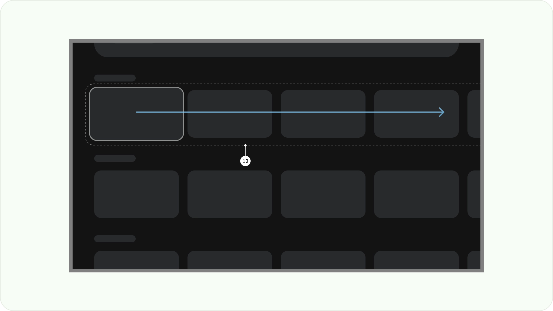
水平堆疊版面配置
水平堆疊版面配置會將元件水平排列。尺寸、比例或格式可能會有所不同。這個版面配置通常用於將內容和元件分組。
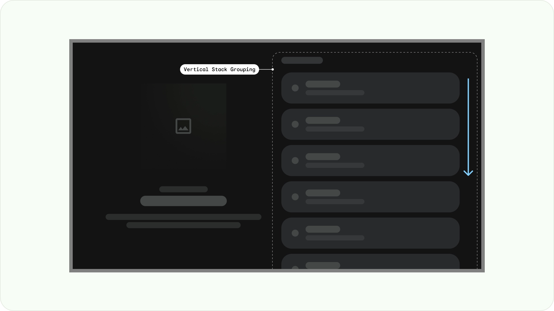
垂直堆疊版面配置
垂直堆疊版面配置會以垂直方式排列元件,可靈活調整大小、比例和格式。通常用於將不同類型的文字、互動元件和版面配置模式分組。

格線版面配置
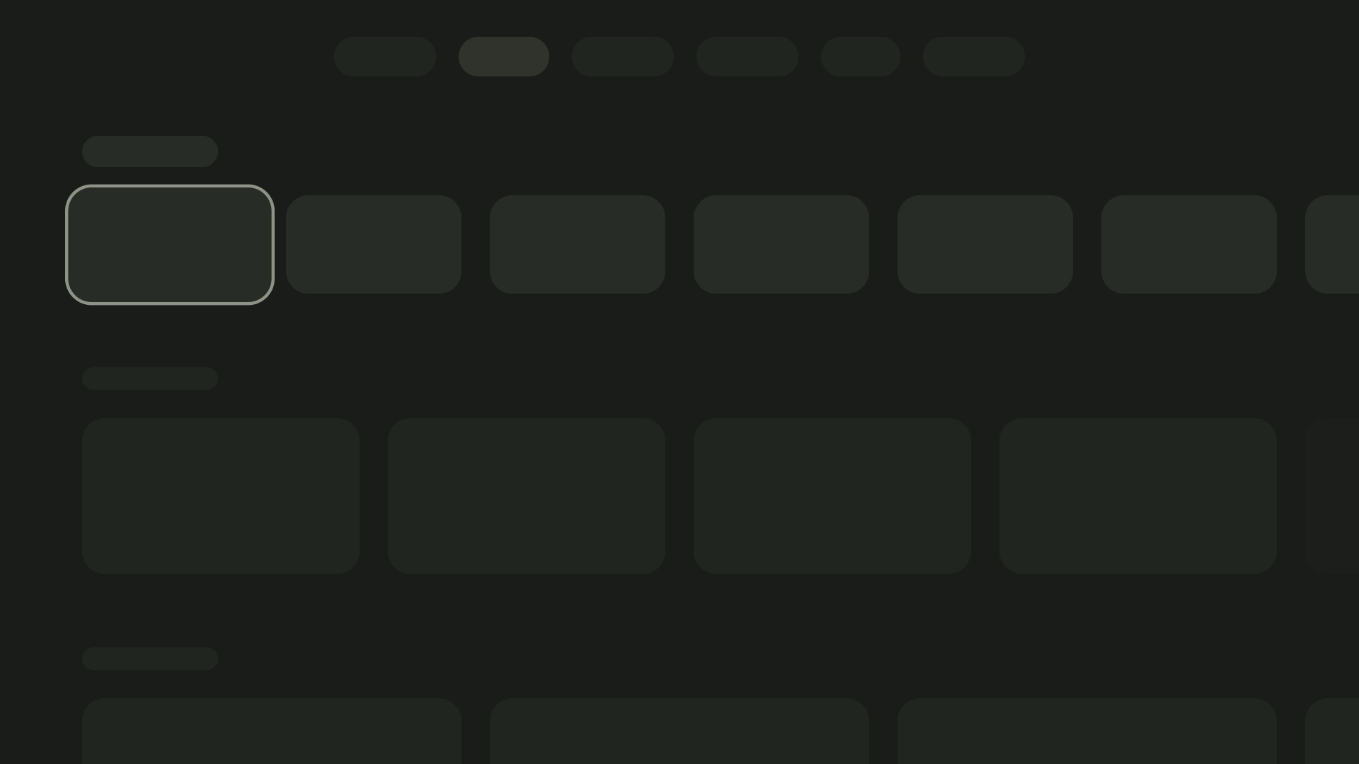
格線是交錯的欄和列組合,而格線版面配置會在這個格線中顯示內容。並以有條理的方式安排內容,方便使用者瀏覽及瀏覽。

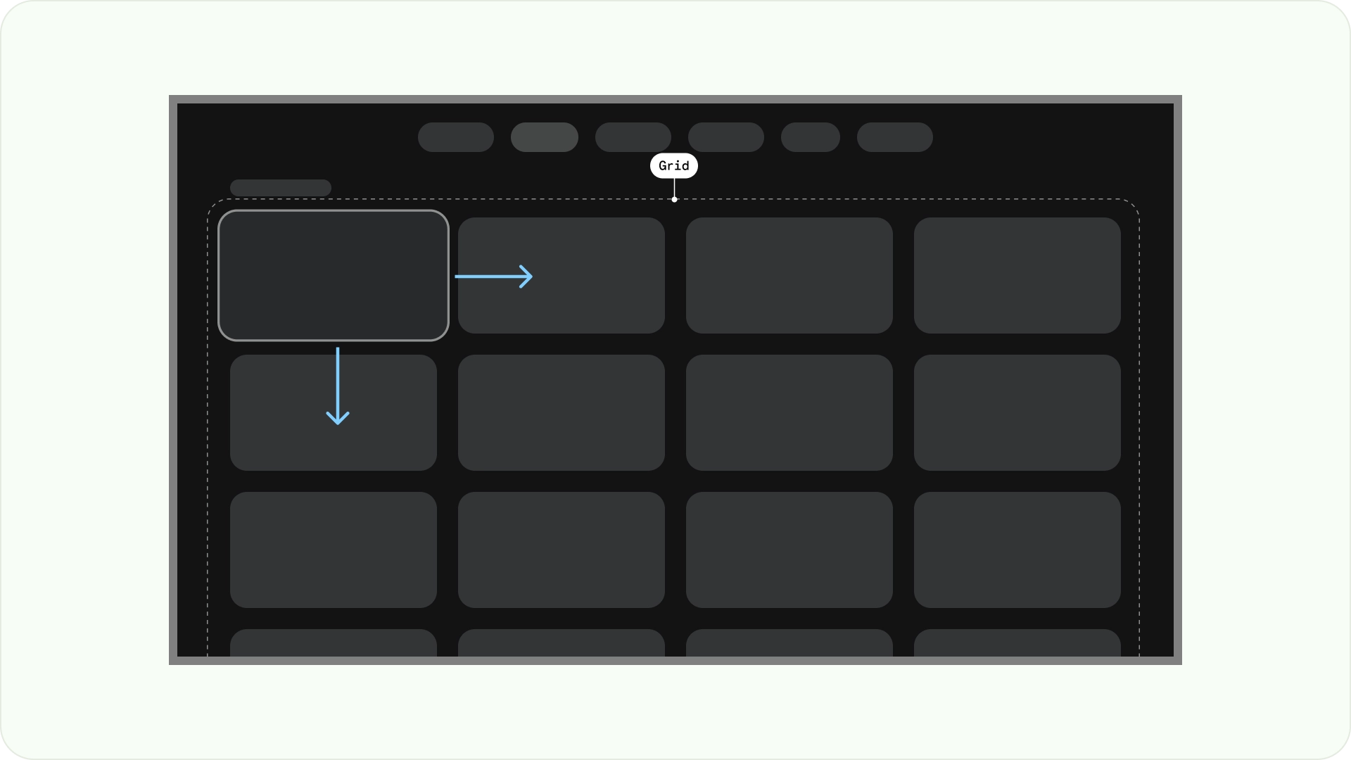
為避免重疊,請務必考量項目間的邊距,以及聚焦狀態的大小增加幅度。舉例來說,當聚焦的元件 (例如資訊卡) 醒目顯示時。如果您採用我們建議的格狀版面配置 (52dp 的 12 個欄,邊距為 20dp),請參閱「資訊卡」,瞭解建議的元件版面配置和預覽畫面。
版面配置結構
以下提供一些版面配置結構,協助您在設計電視版面配置時做出更明智的決策。將電視螢幕水平分割,有助於區分不同類型的元件、傳達資訊層級和導覽邏輯。一個窗格可包含多個單位欄。每個面板都可以容納不同的版面配置模式,例如堆疊版面配置和格線版面配置。
單一窗格版面配置
單一窗格版面配置可將注意力集中在主要內容上。請搭配內容導向體驗和重要資訊頁面使用。
雙窗格版面配置
當網頁顯示階層式內容時,2 個窗格版面配置的成效會更好。這項功能廣泛用於工作轉交體驗。
認知負荷過重
複雜且不清楚的內容可能會造成混淆、惱人,並導致參與度下滑。設計時,請確保內容簡潔易讀,並只顯示必要資訊。
請避免使用過多面板來分組內容。這會為使用者帶來不必要的認知負擔和階層。
check_circle
正確做法
將相關內容放入同一面板。這有助於使用者瞭解內容分組。
cancel
錯誤做法
請避免使用過多面板來分組內容。這會為使用者帶來不必要的認知負擔和階層。
表達階層和導覽
面板可視覺化區隔及整理內容。這類功能可協助引導使用者,並打造更直覺的介面,提升使用體驗。
check_circle
正確做法
根據使用者的閱讀路徑將內容分組。確保焦點路徑與階層或決策邏輯一致。
cancel
錯誤做法
請勿讓使用者在面板之間來回切換。這會產生不自然的焦點路徑,不符合使用者的閱讀習慣。
版面配置範本
版面配置範本可促進秩序、一致性和熟悉度。這項設計可打造舒適的 UI 體驗,清楚說明使用者目前所在位置,以及可前往的頁面。
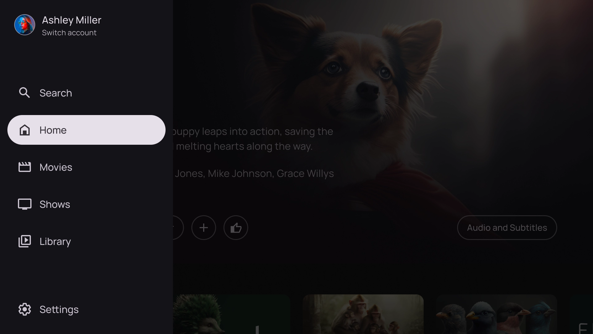
瀏覽
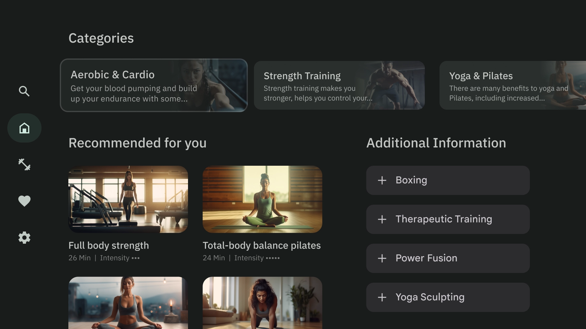
瀏覽器範本會在垂直堆疊中顯示媒體內容「叢集」或列。使用者可向上下瀏覽資料列,並向左向右瀏覽特定資料列的內容。
左側疊加層
左側導覽範本會在畫面左側顯示疊加面板。通常會顯示與背景內容相關的導覽或項目,讓您採取行動。
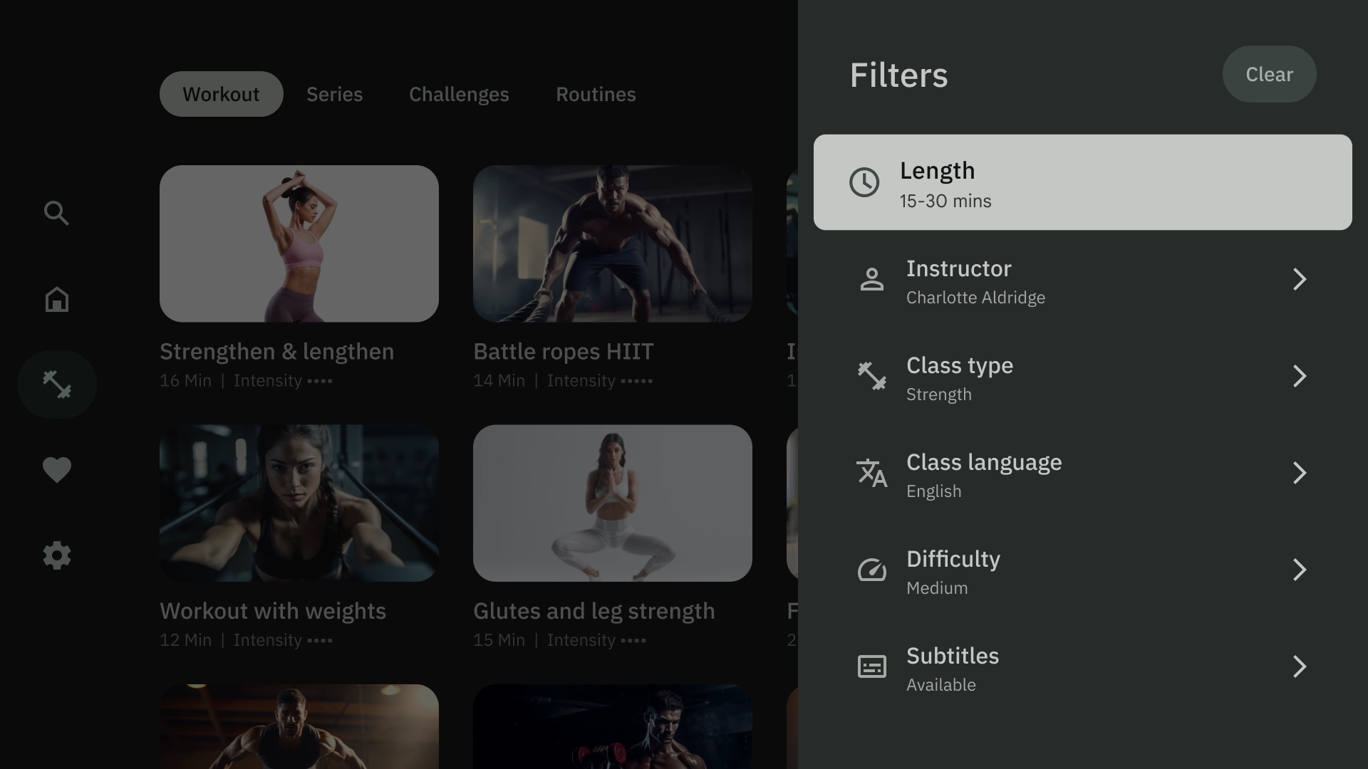
右上疊加畫面
正確的疊加模板會在畫面右側顯示疊加面板。通常會顯示您可在背景中獨立於內容採取行動的項目。
置中疊加層
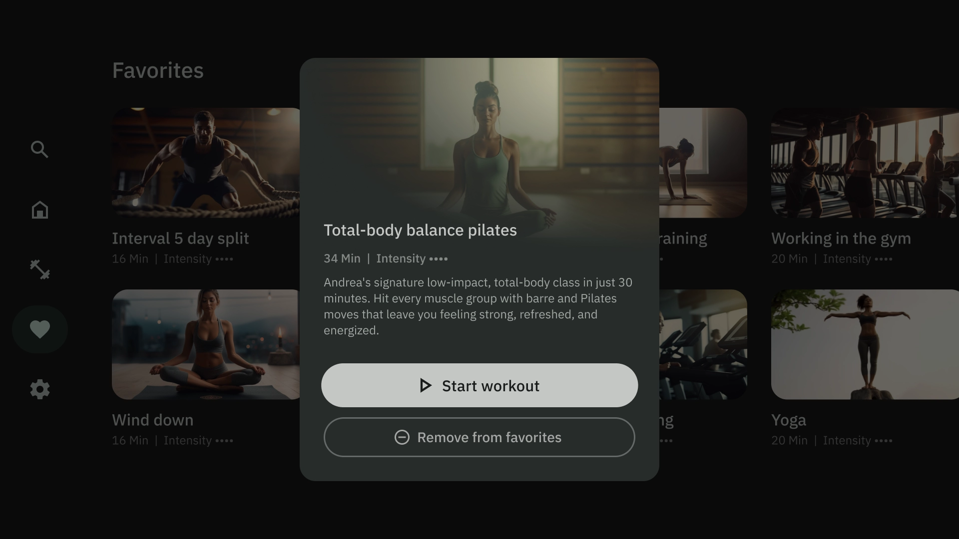
中心疊加範本會顯示疊加在現有檢視畫面上的模式元素。用於傳達緊急資訊或促使用戶做出決策。
底部疊加層
底部疊加範本通常用於底部資訊卡。底部資訊頁面是指固定在畫面底部的表面,其中包含補充內容。您可以使用這些功能建立迷你流程,而不必放棄目前網頁的內容。
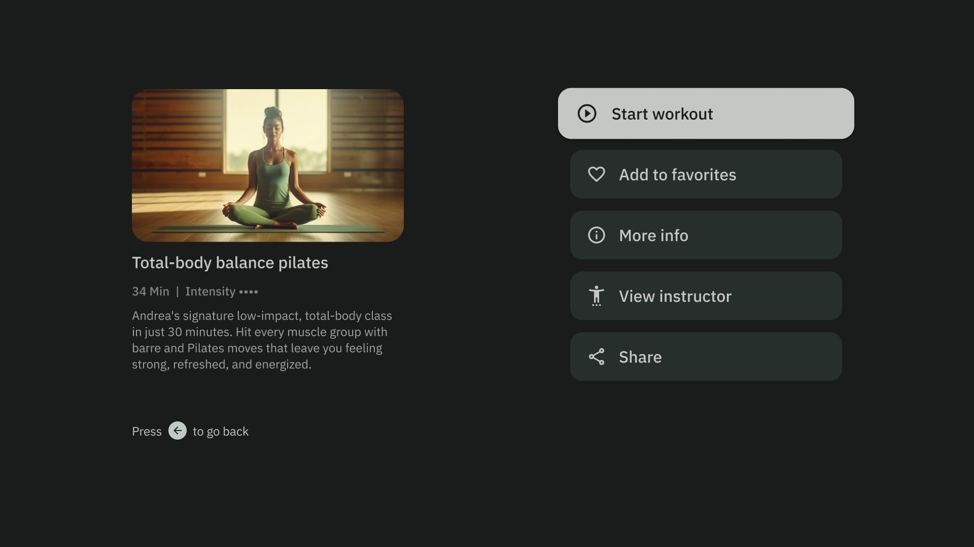
動作
動作範本的左側會顯示標題和副標題,右側則顯示選項或動作。使用者通常會被要求透過這個範本選擇選項或執行動作。
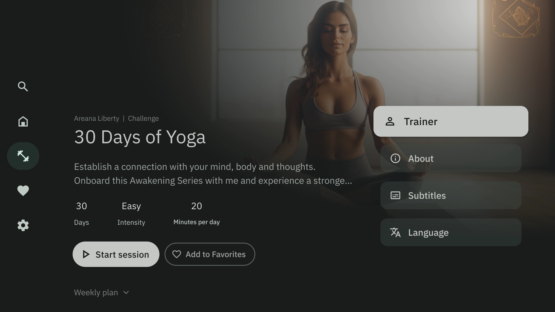
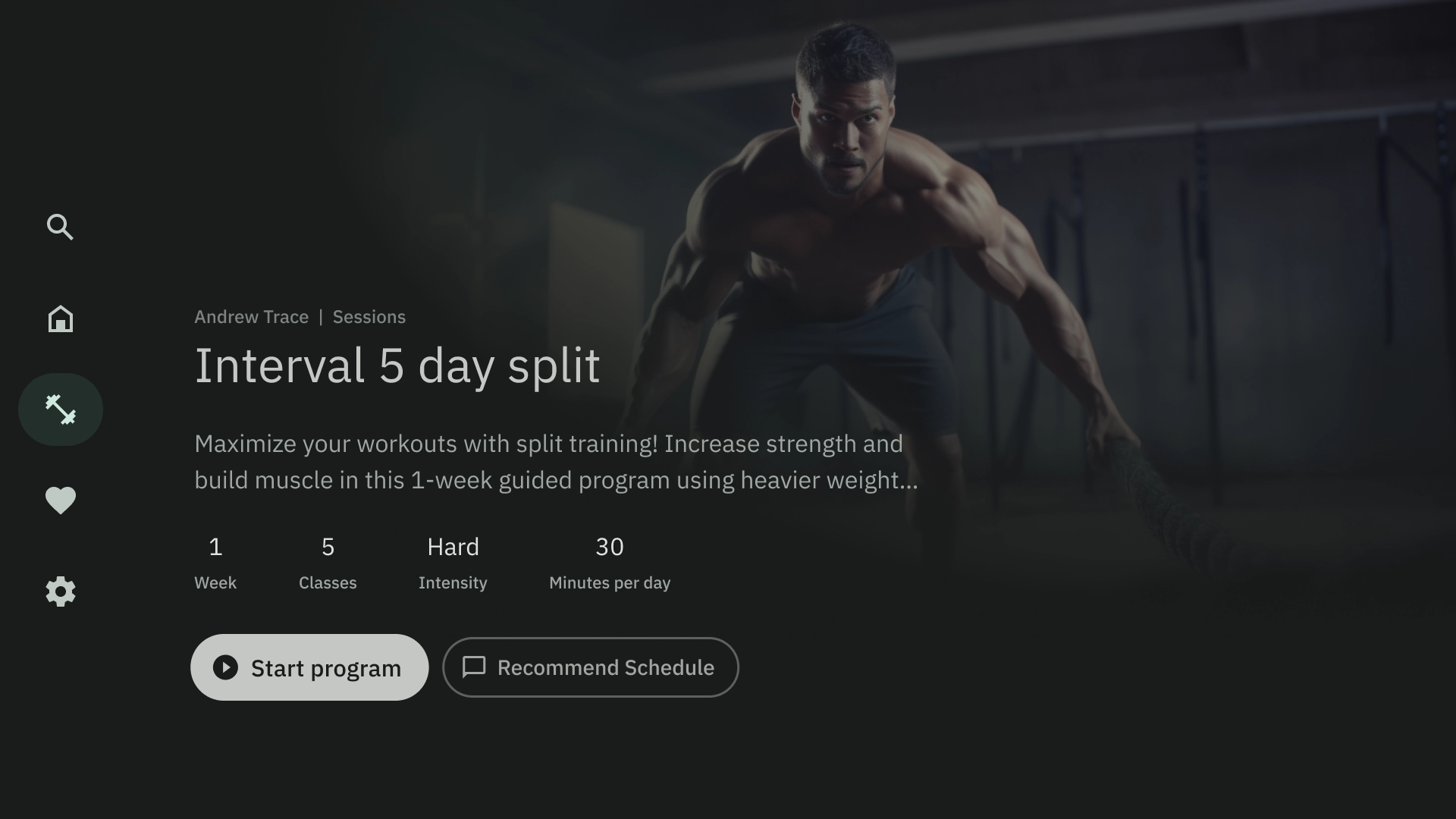
內容詳情
內容詳細資料範本會以水平堆疊版面配置顯示內容。內容通常包括標題、中繼資料、簡短說明、快速操作和相關資訊叢集。
編譯
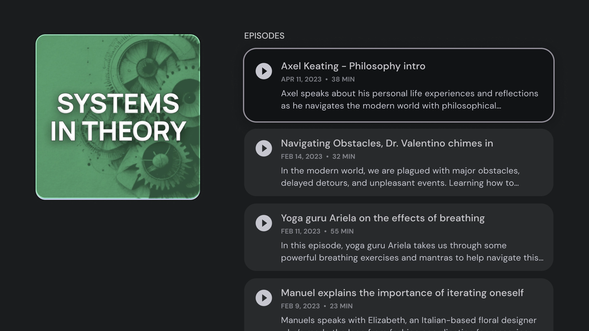
匯集範本會在畫面左側顯示項目詳細資料 (例如 Podcast),並在右側面板顯示其元素 (例如 Podcast 集數)。
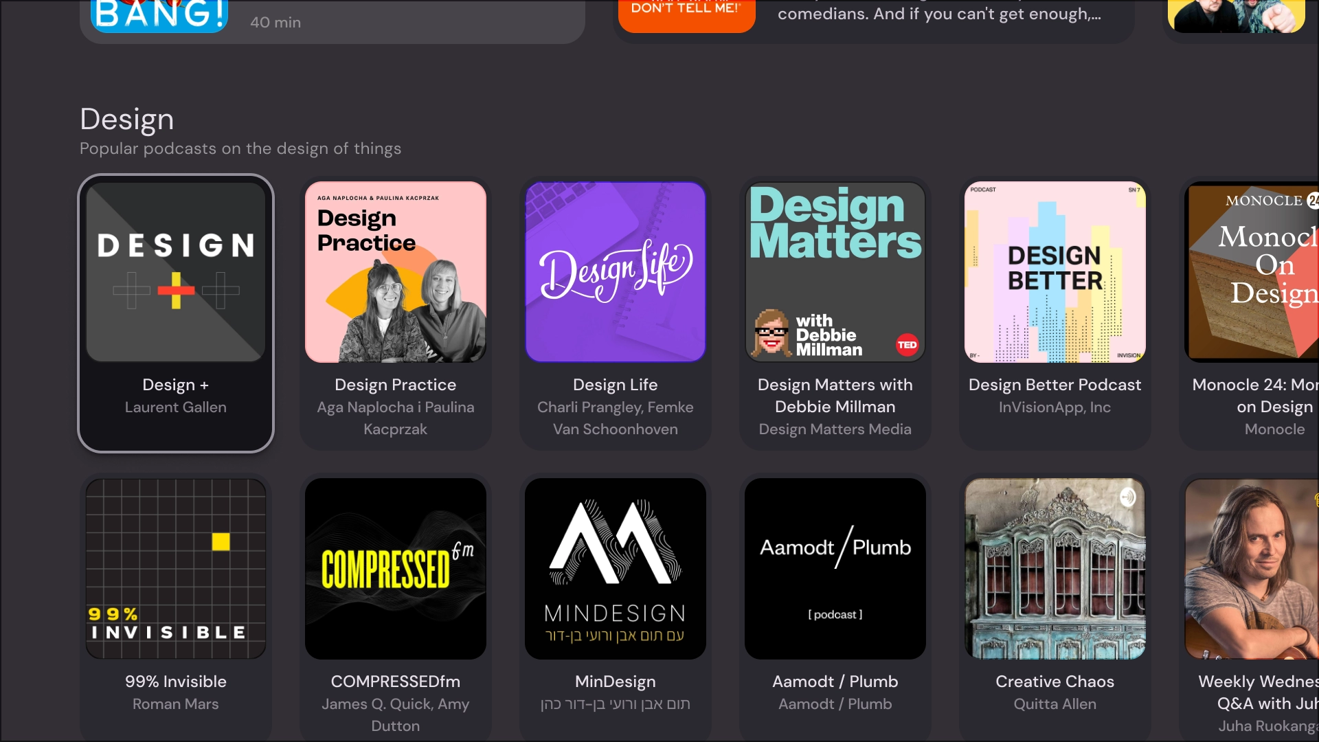
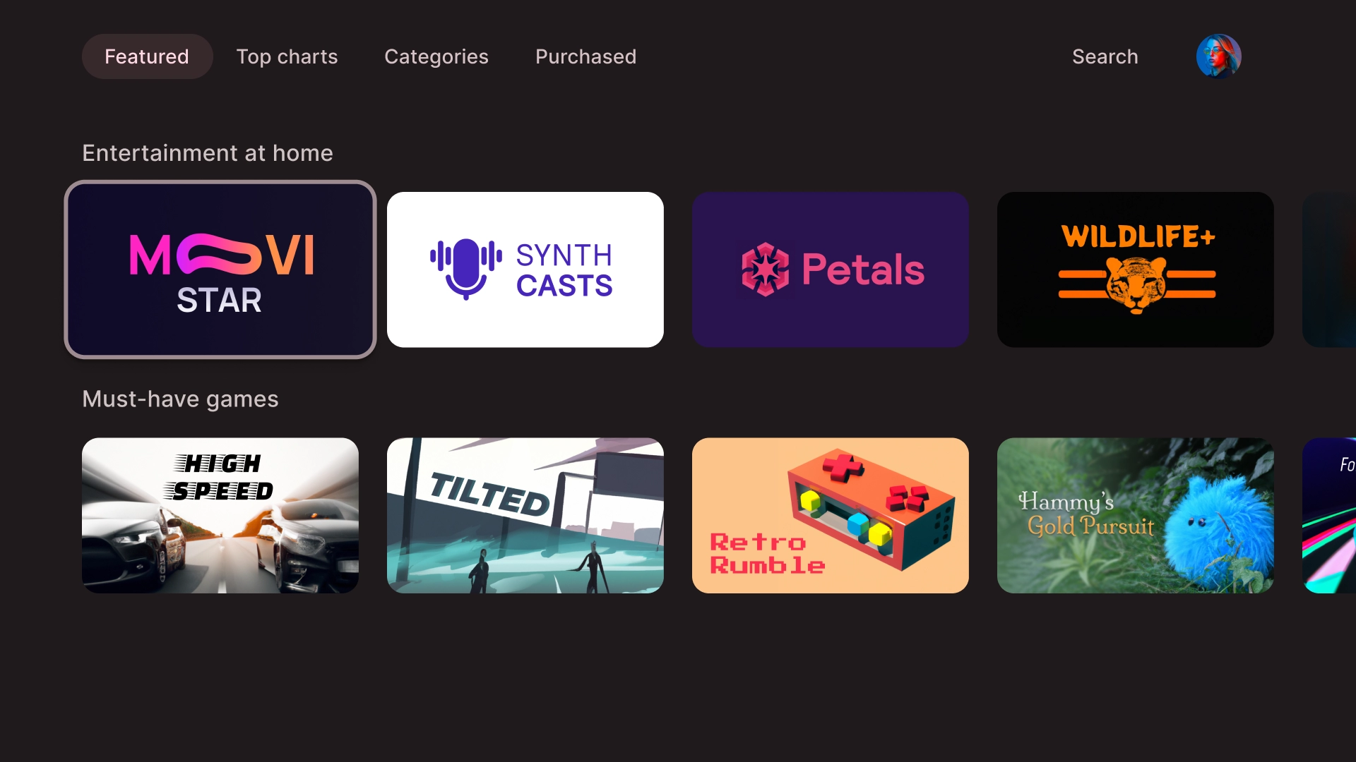
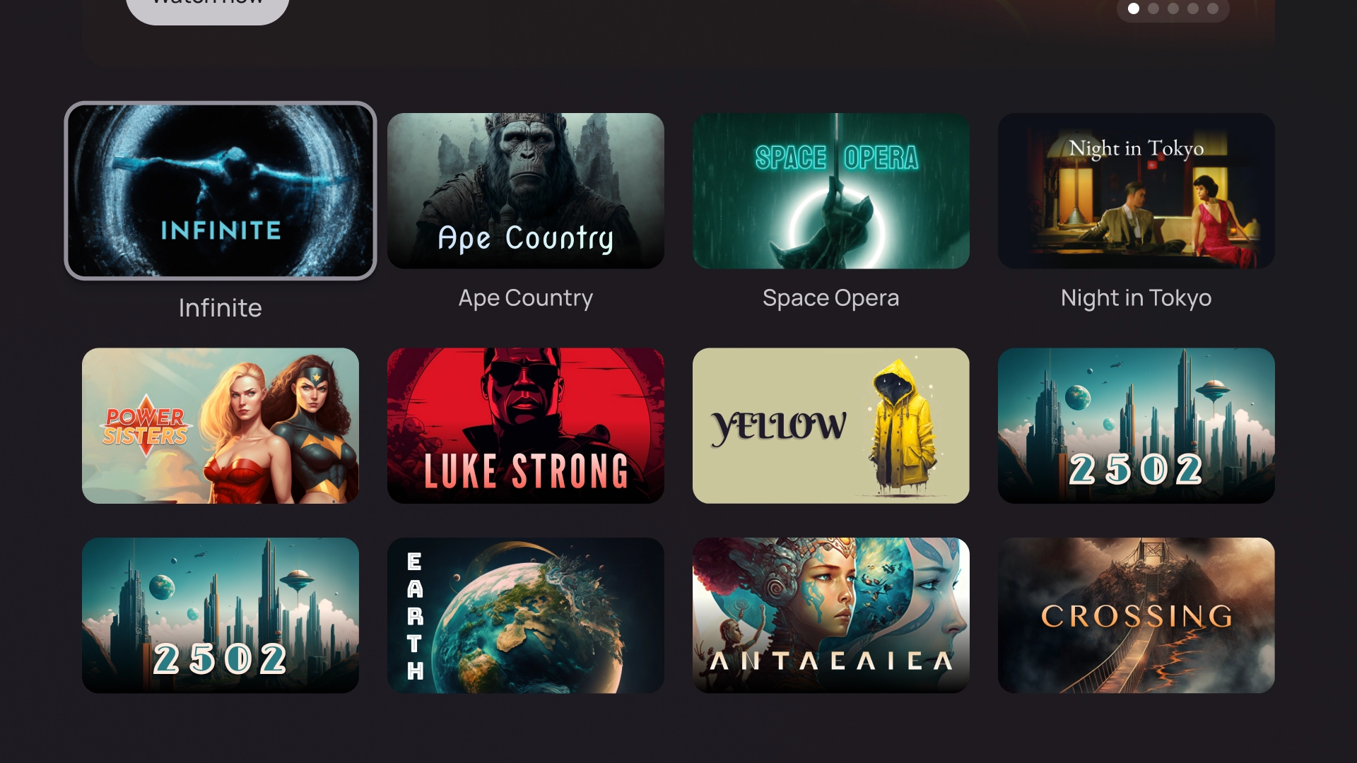
格線
格狀範本會以有條理的格狀方式顯示內容集合。這類廣告會以清楚的遠端導覽邏輯展示內容,並提供最佳的瀏覽體驗。
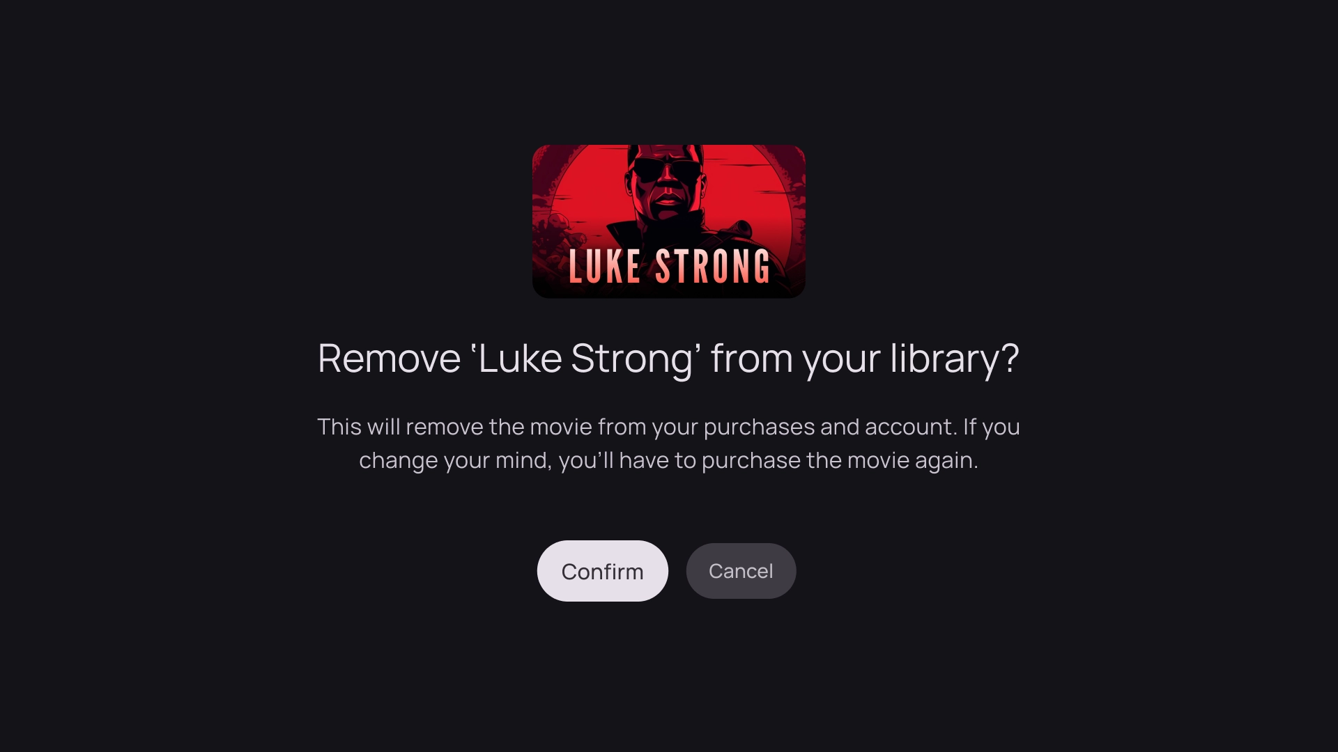
快訊
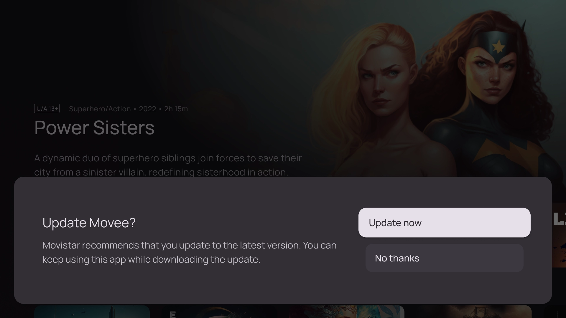
警示範本會顯示全螢幕訊息。通常需要採取動作才能解除封鎖警示,並返回上一個畫面。
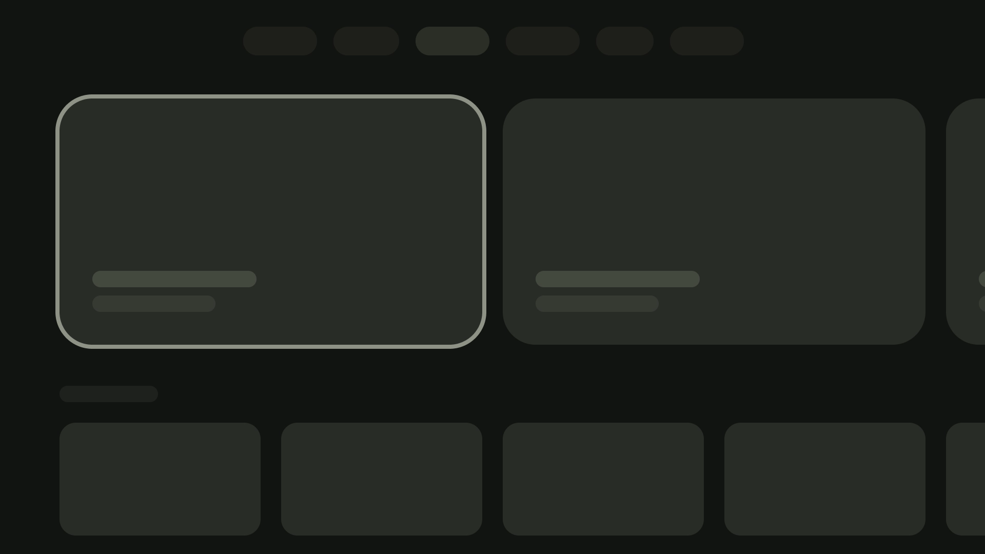
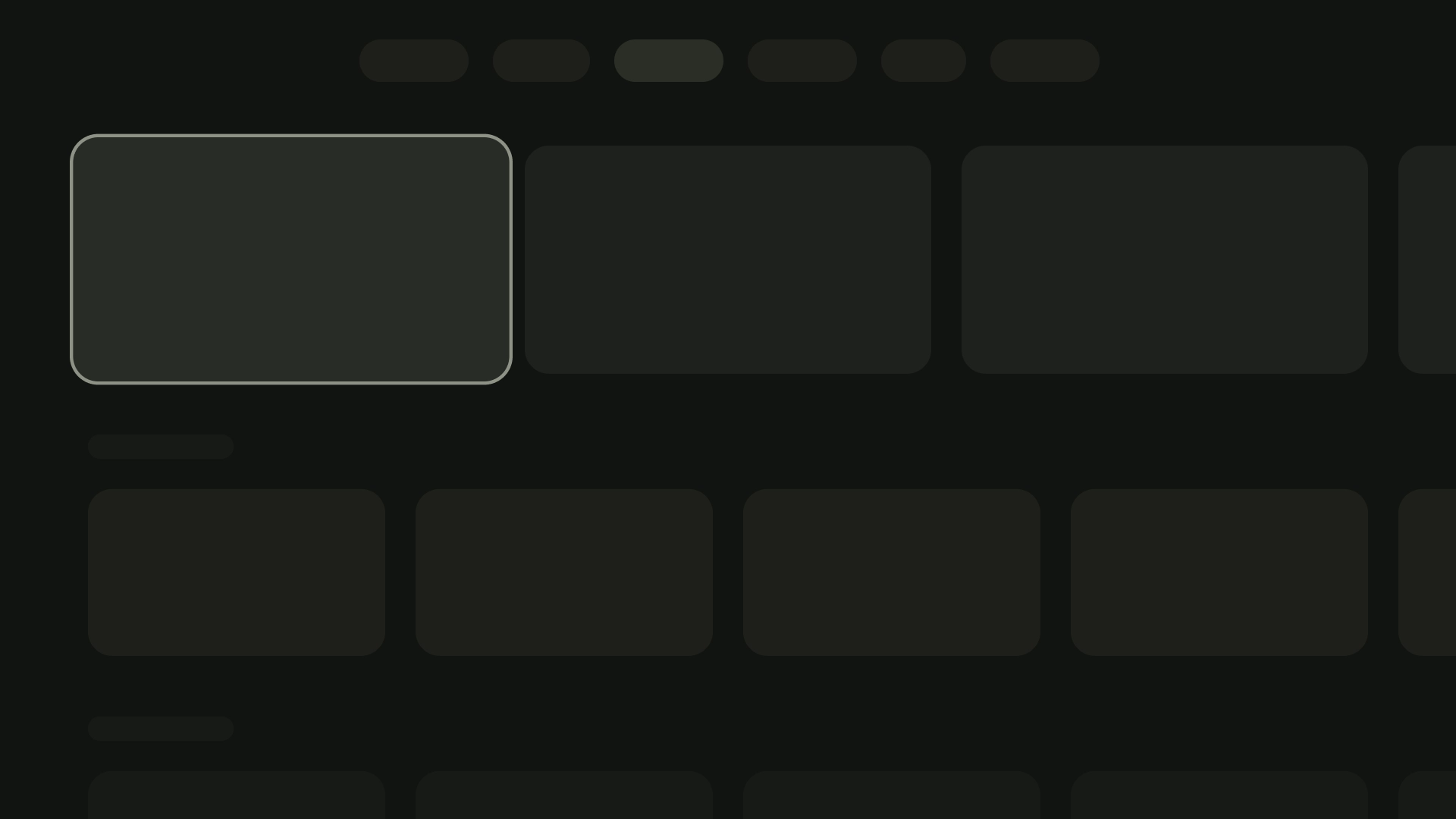
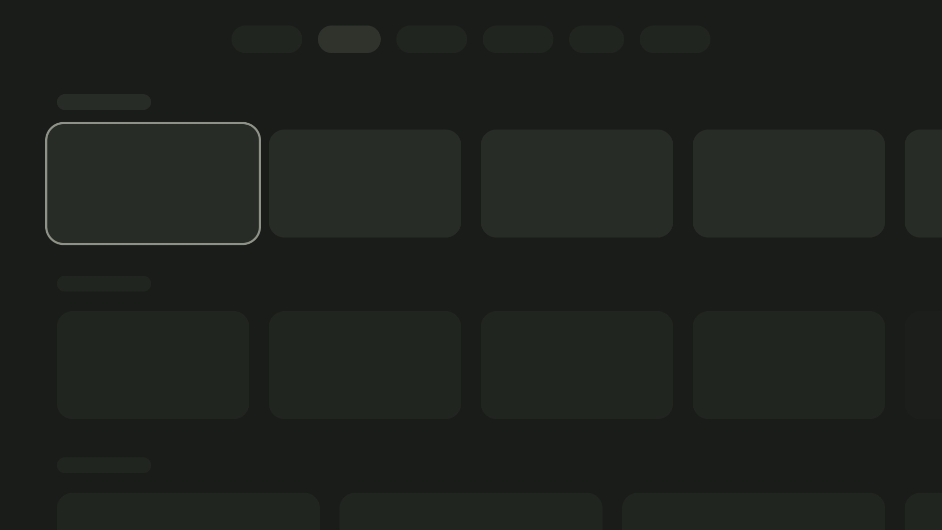
資訊卡欄
1 張資訊卡版面配置
資訊卡寬度:844dp
2 張資訊卡版面配置
資訊卡寬度:412dp
3 張資訊卡版面配置
資訊卡寬度:268dp
4 張資訊卡版面配置
資訊卡寬度:196dp
5 張資訊卡版面配置
資訊卡寬度:124dp
這個頁面中的內容和程式碼範例均受《內容授權》中的授權所規範。Java 與 OpenJDK 是 Oracle 和/或其關係企業的商標或註冊商標。
上次更新時間:2025-07-27 (世界標準時間)。
[[["容易理解","easyToUnderstand","thumb-up"],["確實解決了我的問題","solvedMyProblem","thumb-up"],["其他","otherUp","thumb-up"]],[["缺少我需要的資訊","missingTheInformationINeed","thumb-down"],["過於複雜/步驟過多","tooComplicatedTooManySteps","thumb-down"],["過時","outOfDate","thumb-down"],["翻譯問題","translationIssue","thumb-down"],["示例/程式碼問題","samplesCodeIssue","thumb-down"],["其他","otherDown","thumb-down"]],["上次更新時間:2025-07-27 (世界標準時間)。"],[],[],null,["# Layouts are structural templates that provide a framework for maintaining\nvisual consistency across your application. By defining visual grids, spacing,\nand sections, layouts establish a cohesive and organized structure for the\npresentation of information and UI elements. \n\nHighlights\n----------\n\n- Unlike web or mobile, TVs have a fixed screen aspect ratio of 16:9.\n- Optimize layouts along horizontal and vertical axes for ease of use and control.\n\nPrinciples\n----------\n\nGuidelines to help you make design decisions when designing TV layouts.\n\n\n### Design for large screens\n\nSince the popularization of HDTV, rectangular TVs with an aspect ratio of 16:9\nhave become the norm. Historically, televisions were manufactured in a square\nshape known as 4:3 or 1.33 to 1 aspect ratio.\n\n\u003cbr /\u003e\n\n\n### Design on Android platform\n\nWhen designing, use dp to display elements uniformly on screens with different\ndensities, as with any other Android-powered device. Always design at MDPI\nresolution at 960px \\* 540px.\n\nAt MDPI 1px = 1dp.\n\nAssets need to aim for 1080p. This allows the Android system to downscale layout\nelements to 720p, if necessary.\n\n\u003cbr /\u003e\n\n\n### Ensure visibility and overscan safety\n\nEnsure important elements are always visible to users. To do this, position the\nelements with a 5% margin of 48dp on the left and right sides, and 27dp on the\ntop and bottom of a layout. This ensures that the layout's screen elements are\nwithin the overscan.\n\n\u003cbr /\u003e\n\n\n### Fill the full screen\n\nDon't adjust or clip background screen elements to the overscan safe area.\nInstead, allow partial display of offscreen elements. This ensures that all\nscreens correctly display the background and offscreen elements.\n\n\u003cbr /\u003e\n\n\n### Optimize with axes\n\nConsider how people use the remote control with their TV. Make sure your TV\ninterface is simple to use with the remote. Design each direction\n(up, down, left, right) to have a clear purpose and navigation pattern to help\nusers understand how to move through large groups of options.\n\n\u003cbr /\u003e\n\nLayout\n------\n\nTV screen sizes differ from device to device. Since a modern TV has a\n16:9 aspect ratio, it is recommended to design your app with a\n960px x 540px screen size. This ensures all elements can be\nresized proportionally for HD or 4K screens.\n\n### Overscan margins\n\nOverscan margins are the spaces between content, and the\nleft and right edges of the screen. \n\n 960 * ~5% = 48dp\n 540 * ~5% = 27dp round off to 24dp\n\nThese border margins protect primary elements from potential overscan issues.\nTo keep your content and information safe, use a 5% margin layout\n(58dp on the sides and 28dp on the top and bottom edges).\n\n| **Note:** Most modern TVs no longer have overscan issues.\n\n### Columns and gutters\n\nContent is put into areas of the screen that have columns and gutters.\nThe grid system has 12 columns. Gutters are the spaces between\nthe columns that help divide the content.\n\nUse 12 columns that are 52dp wide with 20dp of space between them.\nThere needs to be 58dp of space on both sides and 4dp of vertical\nspacing between lines.\n\nLayout patterns\n---------------\n\nThere are three layout patterns available depending on your intended\npurpose and display device: Horizontal Stack Layout, Vertical Stack Layout,\nand Grid Layout.\n\n### Horizontal Stack Layout\n\nA Horizontal Stack Layout arranges components horizontally.\nThey can vary in size, ratio, or format. This layout is often\nused to group content and components.\n\n### Vertical Stack Layout\n\nA Vertical Stack Layout arranges components in a vertical manner,\nallowing for a flexible size, ratio, and format. It is commonly\nused to group various types of text, interactive components, and\nlayout patterns together.\n\n### Grid Layout\n\nA grid is a collection of intersecting columns and rows, and a Grid\nLayout displays content in this grid. It arranges content in a logical\nway, making it simple for users to navigate and browse.\n\nTo prevent overlapping, it's important to consider the padding between\nitems and the size increase of focused states. For instance, when a focused\ncomponent (like a card) is highlighted. If you're utilizing our suggested\nGrid Layout (12 columns in 52dp, with gutters in 20dp), see Cards for\nrecommended component layouts and previews.\n\nLayout structures\n-----------------\n\nHere are some layout structures to help you make better\ndecisions when designing TV layouts. By dividing the TV screens horizontally,\nit can help separate different types of components, communicate information\nhierarchy and navigation logic. A pane can contain multiple unit columns.\nEach panel can host different layout patterns such as Stack Layout\nand Grid Layout.\n\n\n### Single-pane layout\n\nA single-pane layout can help drive attention to primary content. Use it with\ncontent-forward experience and critical information pages.\n\n\u003cbr /\u003e\n\n\n### Two-pane layout\n\nA 2-pane layout performs better when the page shows hierarchical content. It is\nwidely used on task-forward experiences.\n\n\u003cbr /\u003e\n\n### Cognitive overload\n\nComplicated and unclear content can lead to confusion, annoyance and a dip in\nengagement. Make your design scannable, uncluttered and present\nonly essential information.\n\nAvoid using too many panels to group contents. This creates\nunnecessary cognitive load and hierarchy to users. \ncheck_circle\n\n### Do\n\nPlace related contents together in one panel. This helps users understand the grouping of content. \ncancel\n\n### Don't\n\nAvoid using too many panels to group contents. This creates unnecessary cognitive load and hierarchy to users.\n\n### Express hierarchy and navigation\n\nPanels visually separate and organize content. They help guide users,\nand can create a more intuitive interface that enhances the experience. \ncheck_circle\n\n### Do\n\nGroup contents based on user reading path. Ensure the focus path is aligned with hierarchy or the decision-making logic. \ncancel\n\n### Don't\n\nDon't direct user attention back-and-forth between panels. This creates unnatural focus paths that are not aligned with user reading habits.\n\nLayout templates\n----------------\n\nLayout templates promote order, consistency, and familiarity. The design\ncreates a comfortable UI experience that clearly communicates where the\nuser is, and where they can go. \n\n### Browse\n\nThe browser template displays media content \"clusters\" or rows in a vertical stack. Users navigate up and down to browse the rows, and navigate right and left to browse content of a specific row.\n\n### Left overlay\n\nThe left navigation template shows an overlay panel on the left side of the screen. It usually surfaces navigation or items that you can act on relevant to the content in the background.\n\n### Right overlay\n\nThe right overlay template shows an overlay panel on the right side of the screen. It usually surfaces items that you acn act on independent to the content in the background.\n\n### Center overlay\n\nThe center overlay template shows a modal element that overlays on top of an existing view. It is used to communicate urgent information or prompt a decision.\n\n### Bottom overlay\n\nThe bottom overlay template is commonly used for bottom sheets. Bottom sheets are surfaces containing complementary content anchored to the bottom of the screen. They let you create mini flows without losing the context of the current page.\n\n### Actions\n\nThe action template shows title and subtitle on the left, with options or actions on the right. Users are usually asked to make an option or perform an action with this template.\n\n### Content Details\n\nThe content detail template shows content in a Horizontal Stacked Layout. Content commonly includes title, metadata, short description, quick actions, and related information clusters.\n\n### Compilation\n\nThe compilation template shows details of an item on the left side of the screen, such as a podcast, with its elements, for example its episodes, on the right panel.\n\n### Grid\n\nThe grid template displays collections of content in an organized grid. It showcases content with clear remote navigation logic, and optimal browsing experience.\n\n### Alert\n\nThe alert template displays a full screen message. It usually requires an action to unblock the alert and go back to the previous screen.\n\nCard columns\n------------\n\n### 1 card layout\n\nCard width --- 844dp\n\n### 2 card layout\n\nCard width --- 412dp\n\n### 3 card layout\n\nCard width --- 268dp\n\n### 4 card layout\n\nCard width --- 196dp\n\n### 5 card layout\n\nCard width --- 124dp"]]