कार्ड, आपके टीवी ऐप्लिकेशन को बनाने का बुनियादी हिस्सा हैं.
संसाधन
| टाइप | लिंक | स्थिति |
|---|---|---|
| डिज़ाइन | डिज़ाइन सोर्स (Figma) | उपलब्ध है |
| लागू करना | Jetpack Compose | उपलब्ध है |
हाइलाइट
- किसी एक विषय पर कॉन्टेंट दिखाने के लिए कार्ड का इस्तेमाल करें.
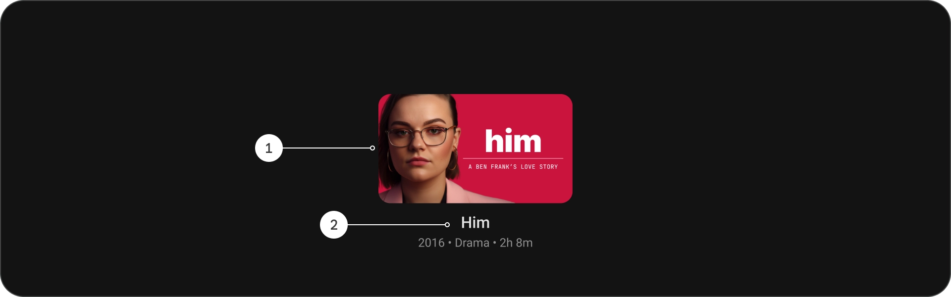
- कार्ड में इमेज से लेकर हेडलाइन तक, सब कुछ रखा जा सकता है. काम करने वाले टेक्स्ट, बटन, सूचियां, और दूसरे यूज़र इंटरफ़ेस (यूआई) एलिमेंट.
- एक कार्ड, दूसरे कार्ड के साथ मर्ज नहीं हो सकता और न ही उसे एक से ज़्यादा कार्ड में बांटा जा सकता है.
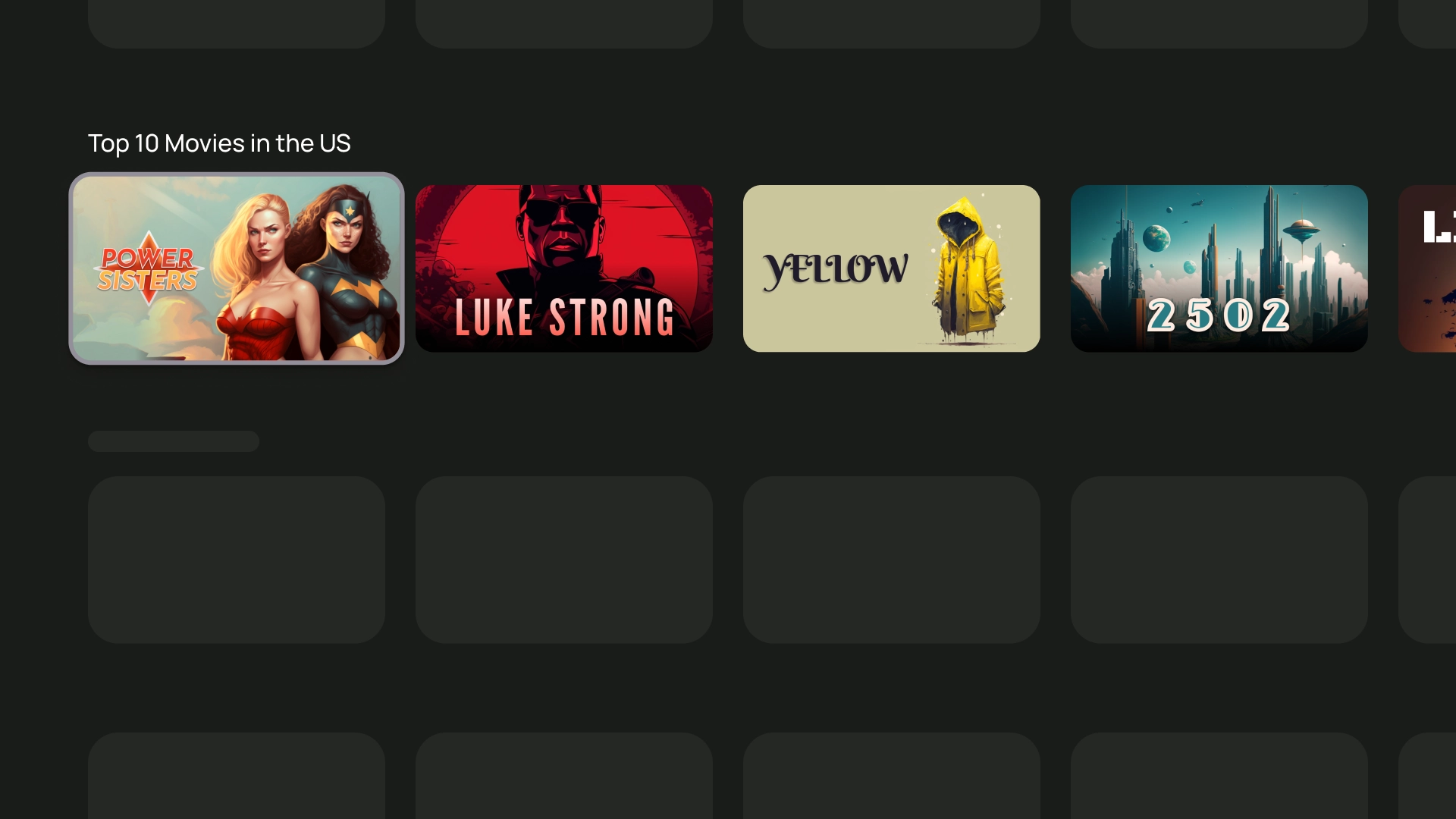
- कार्ड के छह वैरिएशन हैं: स्टैंडर्ड, क्लासिक, कॉम्पैक्ट, इनसेट, वाइड स्टैंडर्ड, और वाइड क्लासिक.
वैरिएंट
कार्ड पांच तरह के होते हैं और सभी के इस्तेमाल का उदाहरण अलग-अलग होता है:
- स्टैंडर्ड मोड
- क्लासिक
- संक्षिप्त
- वाइड स्टैंडर्ड
- वाइड क्लासिक
कॉन्टेंट ब्लॉक
कार्ड का कॉन्टेंट अलग-अलग ब्लॉक में व्यवस्थित किया जाता है. कार्ड का विज़ुअल डिज़ाइन 'प्राथमिकता' का मतलब है कि हैरारकी. कार्ड का लेआउट कार्ड में मौजूद कॉन्टेंट के टाइप को शामिल करता है.
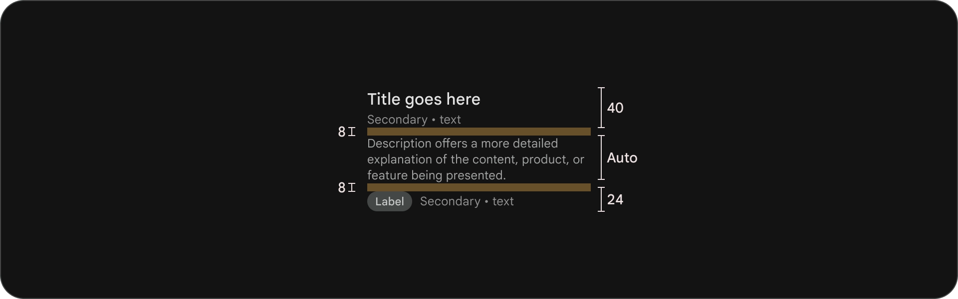
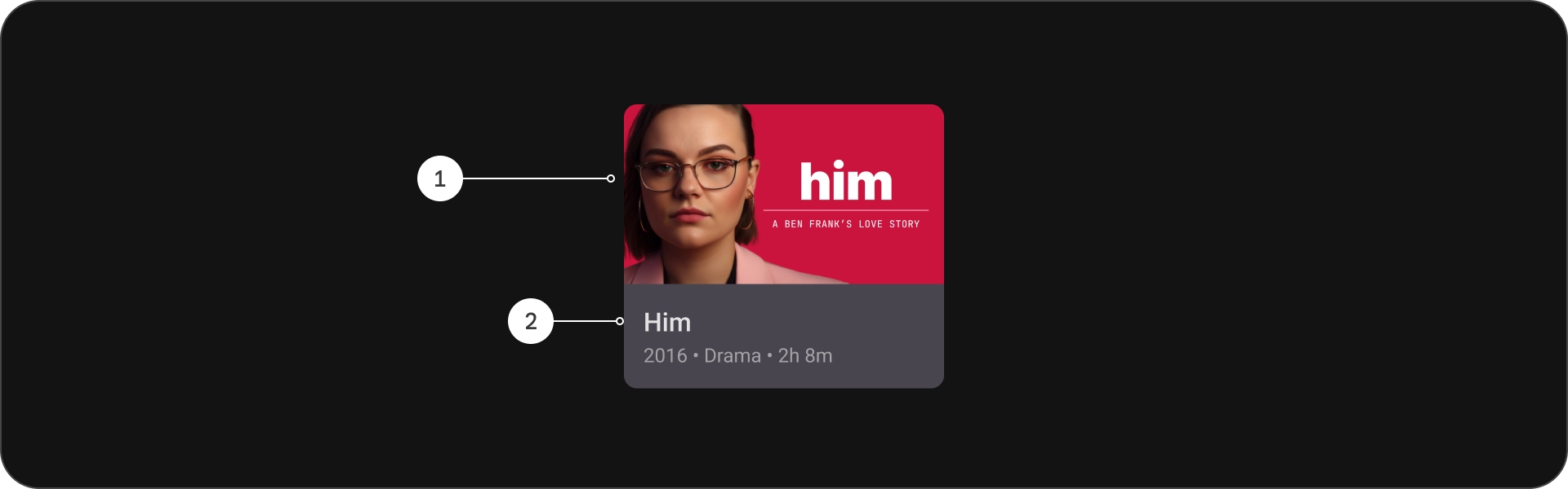
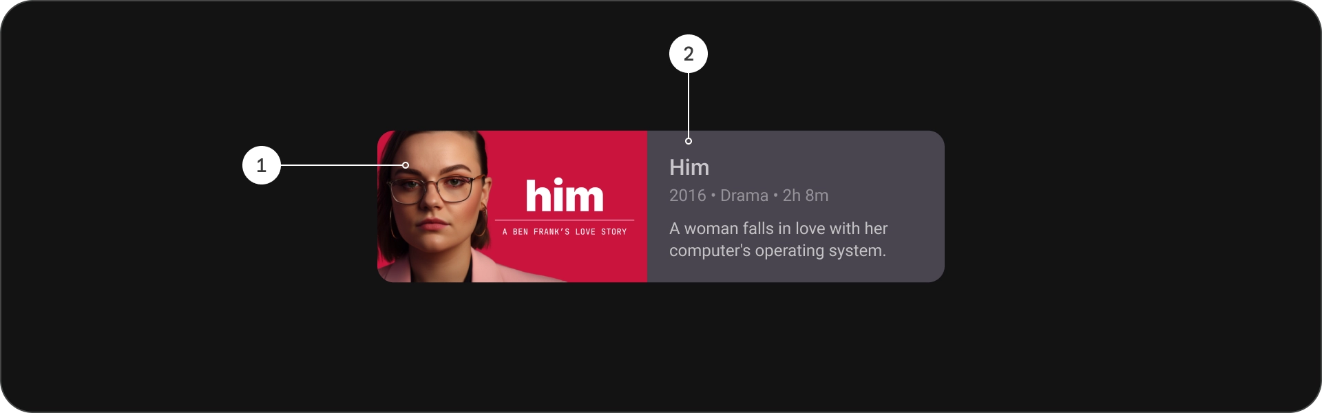
शरीर-रचना विज्ञान
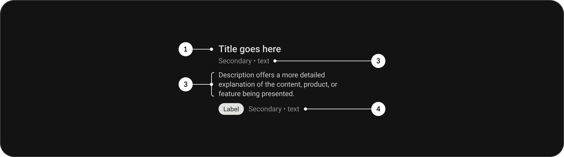
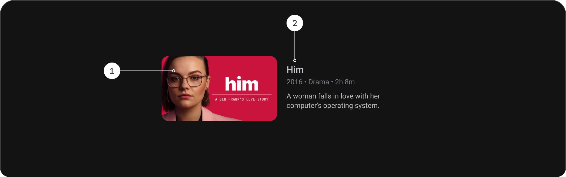
- शीर्षक
- सबटाइटल
- ब्यौरा
- अतिरिक्त टेक्स्ट
खास जानकारी
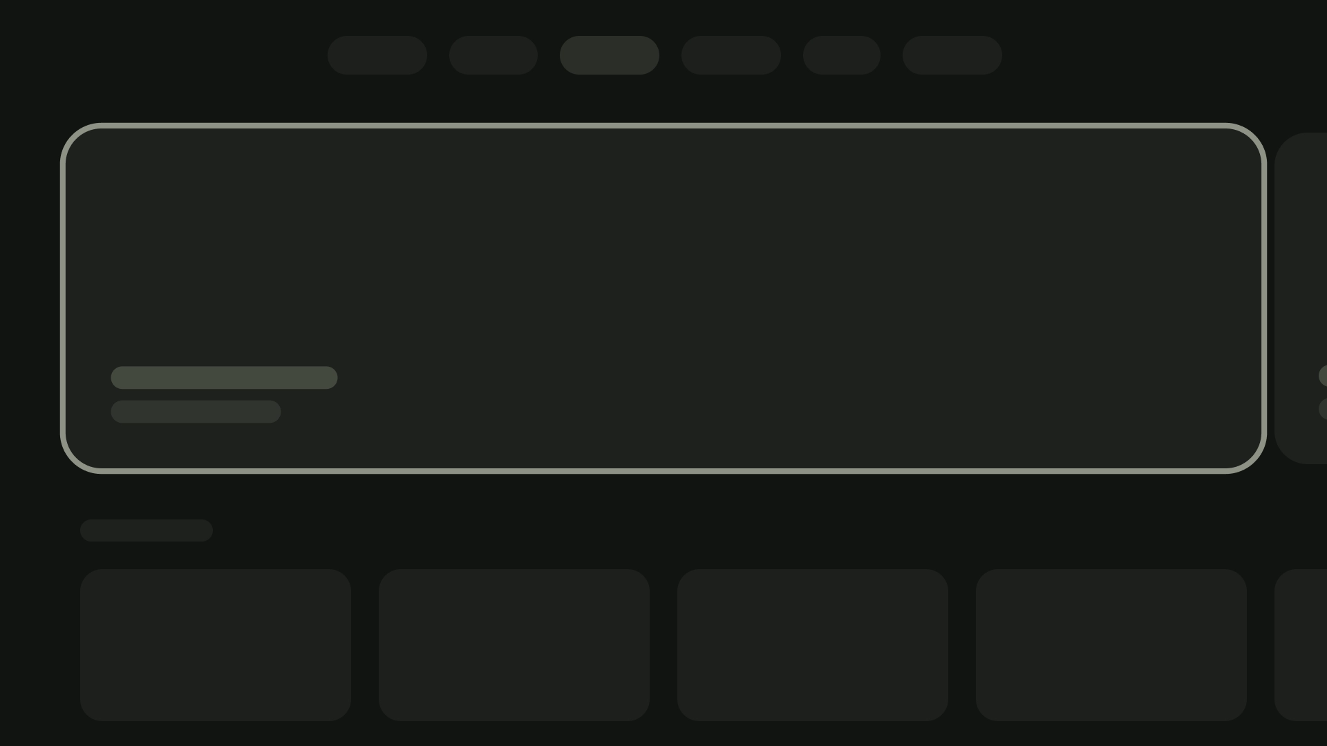
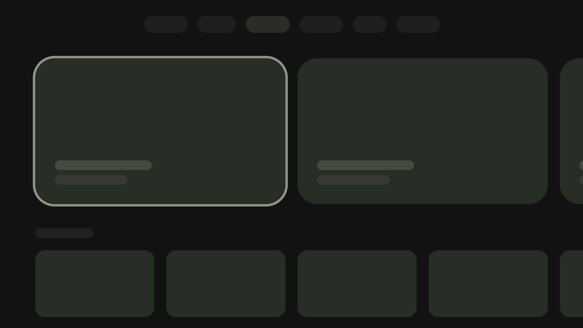
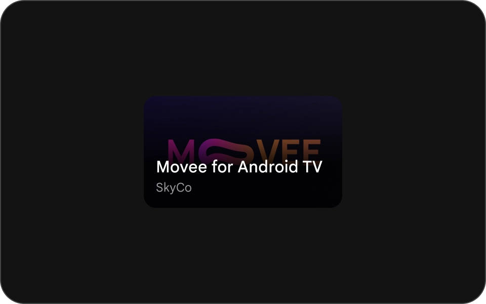
स्टैंडर्ड कार्ड
शरीर-रचना विज्ञान
- इमेज
- कॉन्टेंट ब्लॉक
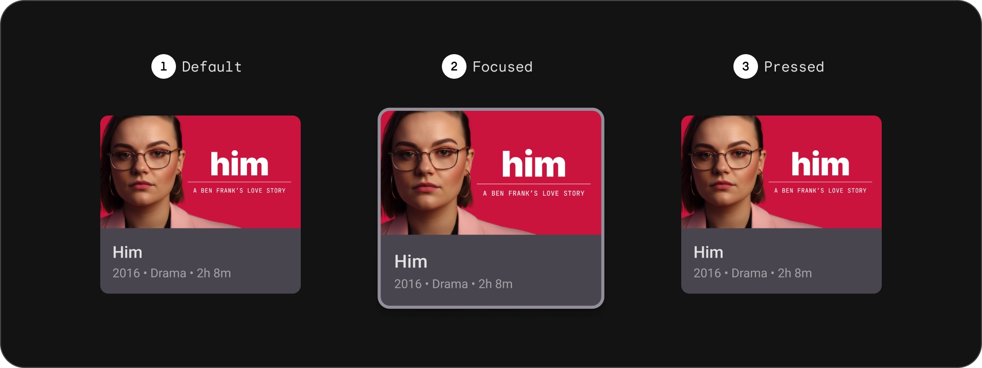
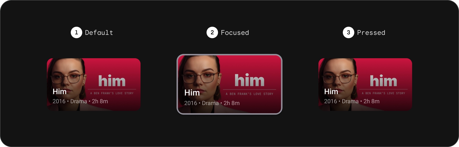
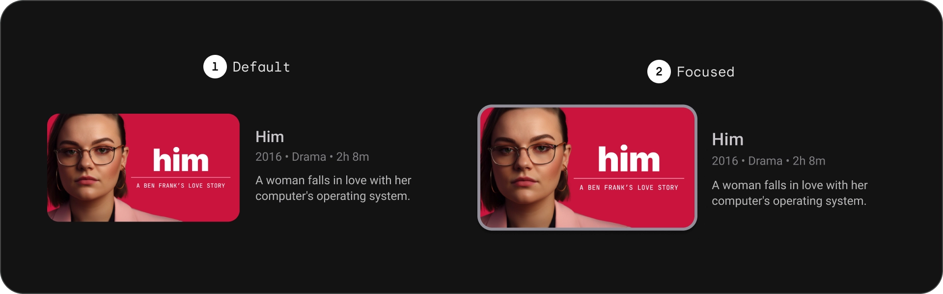
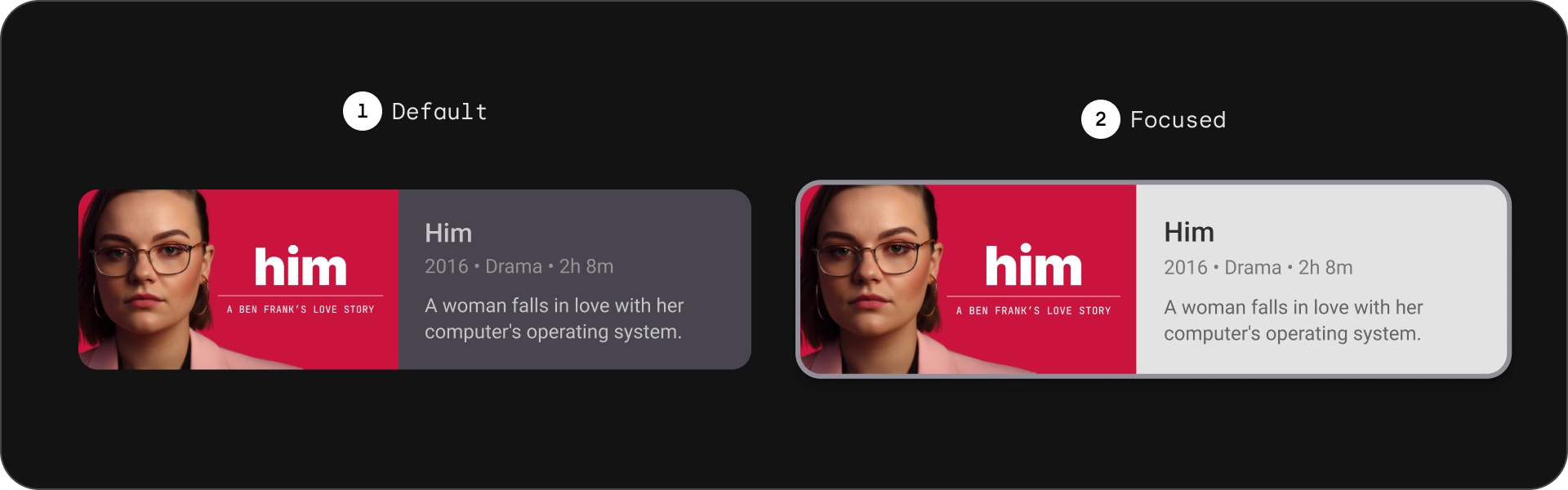
राज्य
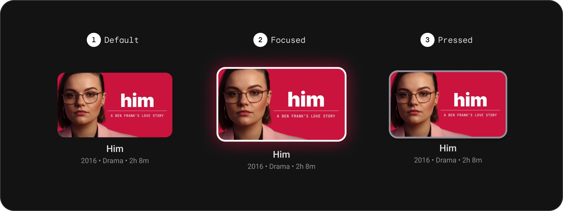
खास जानकारी
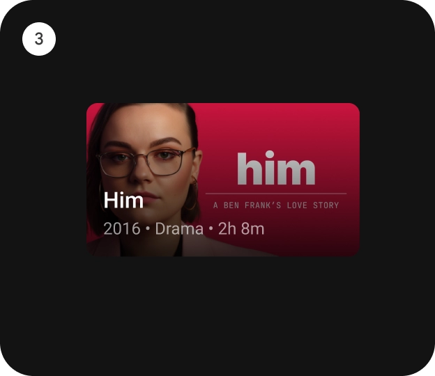
क्लासिक कार्ड
शरीर-रचना विज्ञान
- इमेज
- कॉन्टेंट ब्लॉक
राज्य
खास जानकारी
कॉम्पैक्ट कार्ड
शरीर-रचना विज्ञान
- इमेज
- कॉन्टेंट ब्लॉक
राज्य
खास जानकारी
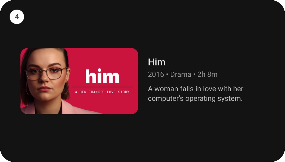
वाइड स्टैंडर्ड कार्ड
शरीर-रचना विज्ञान
- इमेज
- कॉन्टेंट ब्लॉक
राज्य
खास जानकारी
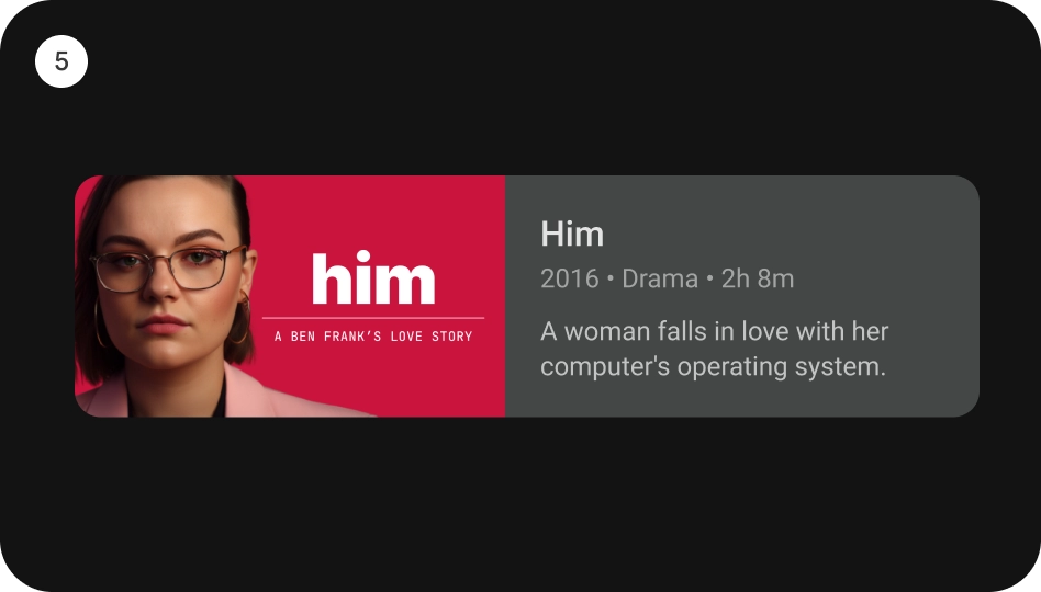
वाइड क्लासिक कार्ड
शरीर-रचना विज्ञान
- इमेज
- कॉन्टेंट ब्लॉक
राज्य
खास जानकारी
इस्तेमाल
कार्ड, कई तरह के डिज़ाइन वाले एलिमेंट होते हैं. इनका इस्तेमाल अलग-अलग तरह के डिज़ाइन दिखाने के लिए किया जा सकता है कॉन्टेंट को दिखाने में आकर्षक और आसान बनाओ. नीचे दिए गए सेक्शन में, कार्ड के डिज़ाइन के बारे में बताया जाता है.
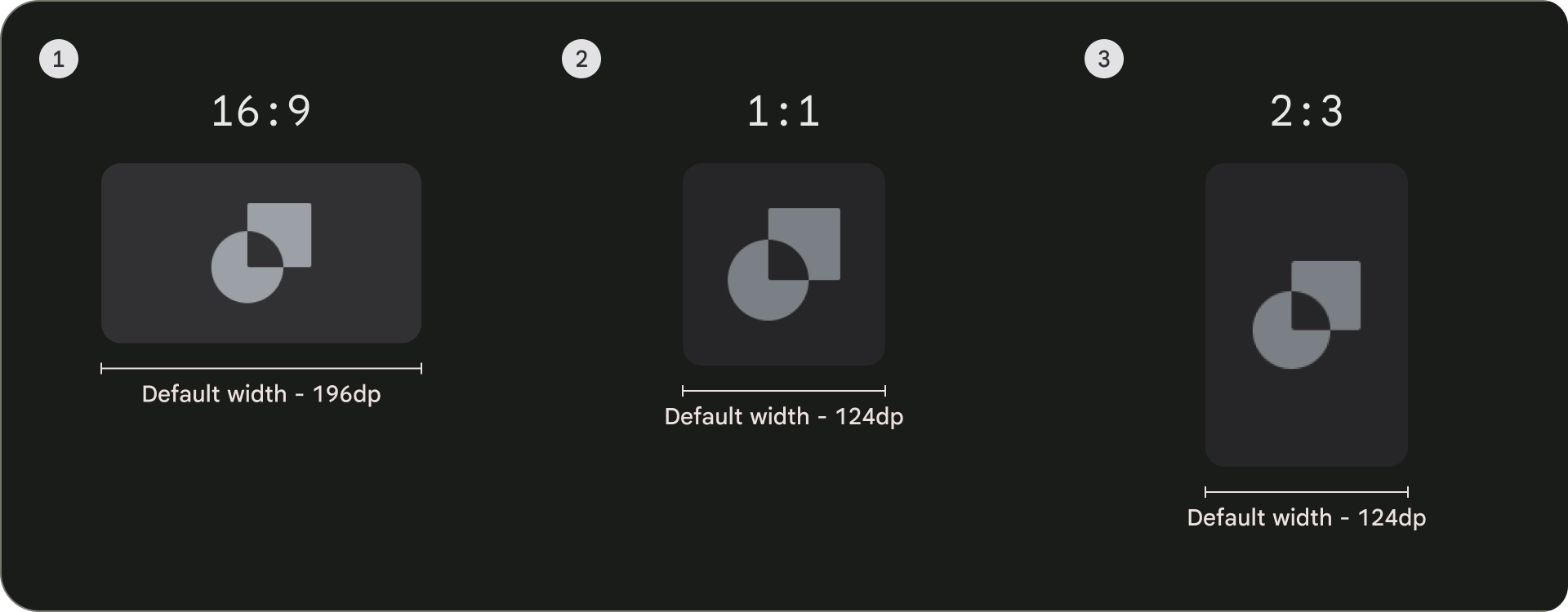
आसपेक्ट रेशियो
कार्ड के आसपेक्ट रेशियो (लंबाई-चौड़ाई का अनुपात) तीन तरह के होते हैं: 16:9, 1:1, और 2:3. हर आसपेक्ट रेशियो (लंबाई-चौड़ाई का अनुपात) की अपनी-अपनी खूबियां होती हैं. इसलिए, जो आपकी ख़ास ज़रूरतों पर निर्भर करती है.
- आम तौर पर, कार्ड का आसपेक्ट रेशियो (लंबाई-चौड़ाई का अनुपात) 16:9 होता है. यह एक चौड़ा पहलू है का अनुपात, जो इमेज और वीडियो दिखाने के लिए सबसे सही है.
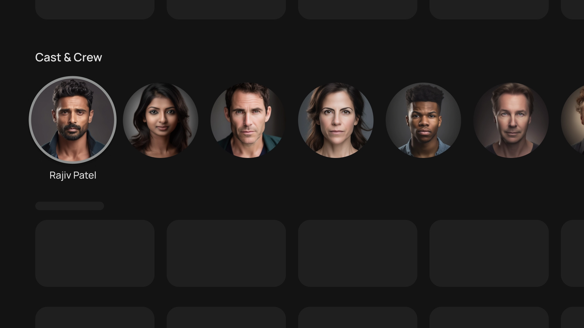
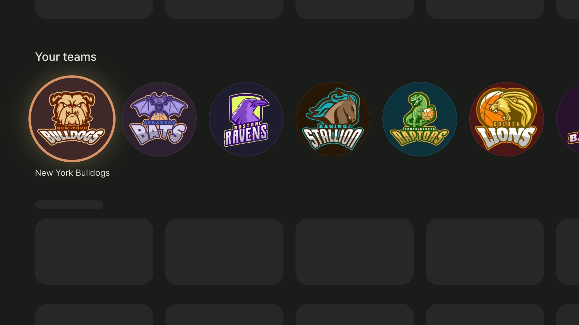
- 1:1 का आसपेक्ट रेशियो (लंबाई-चौड़ाई का अनुपात) एक स्क्वेयर होता है. यह ऐसे कार्ड के लिए एक अच्छा विकल्प है, जिन्हें दर्शकों को विज़ुअल तौर पर संतुलित न बनाया जाए. जैसे, कलाकार और क्रू, चैनल के लोगो या टीम के लोगो.
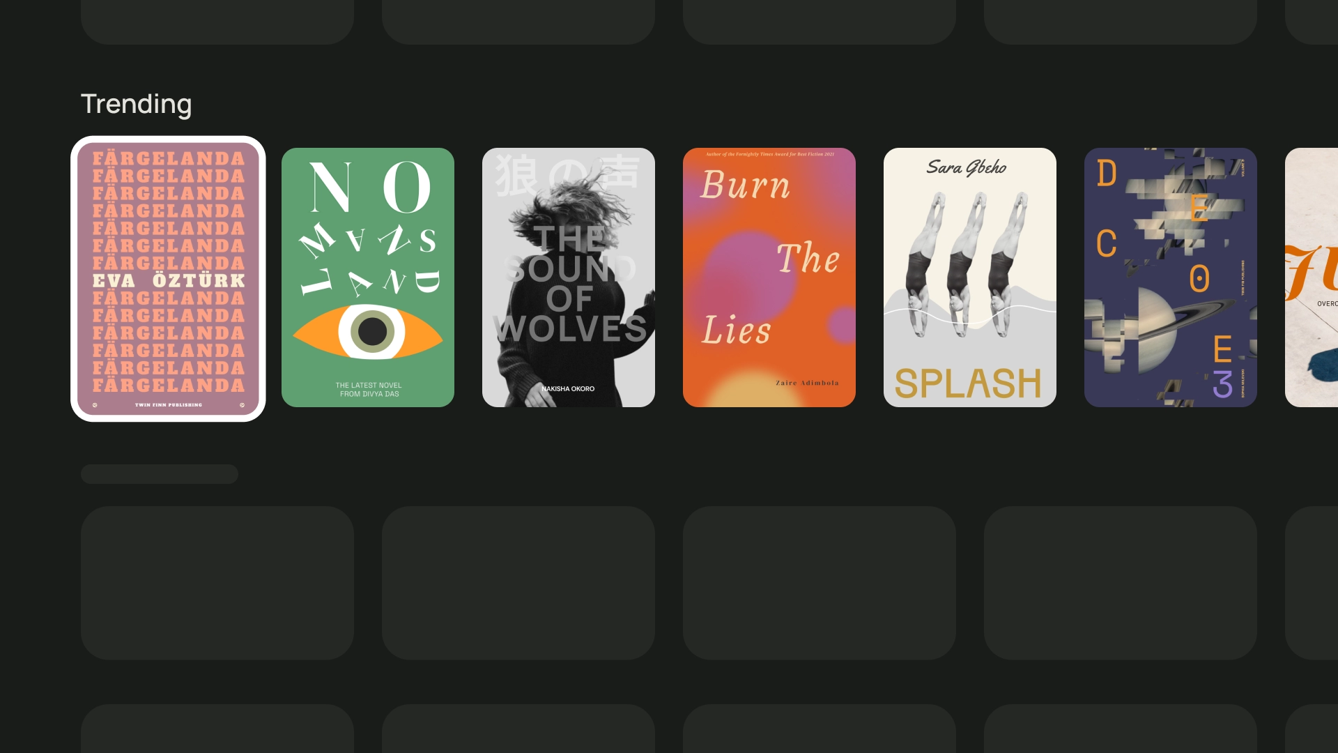
- 2:3 का आसपेक्ट रेशियो (लंबाई-चौड़ाई का अनुपात) ज़्यादा होता है. अगर आप ब्रेक अप करना चाहें, तो यह एक अच्छा विकल्प है इससे उन पर ज़ोर दिया जा सकता है.
अपने कार्ड का आसपेक्ट रेशियो (लंबाई-चौड़ाई का अनुपात) चुनने का सबसे अच्छा तरीका यह है कि अलग-अलग विकल्पों को आज़माकर देखें कि कौनसा विकल्प सबसे अच्छा लगता है.
यहां अलग-अलग आसपेक्ट रेशियो (लंबाई-चौड़ाई का अनुपात) के इस्तेमाल के कुछ उदाहरण दिए गए हैं
1:1
कलाकार और सहायक
खेल की टीमों के लोगो
2:3
चर्चित किताबें
16:9
फ़िल्म वाले कार्ड
लेआउट और स्पेसिंग
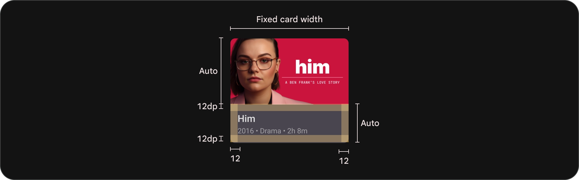
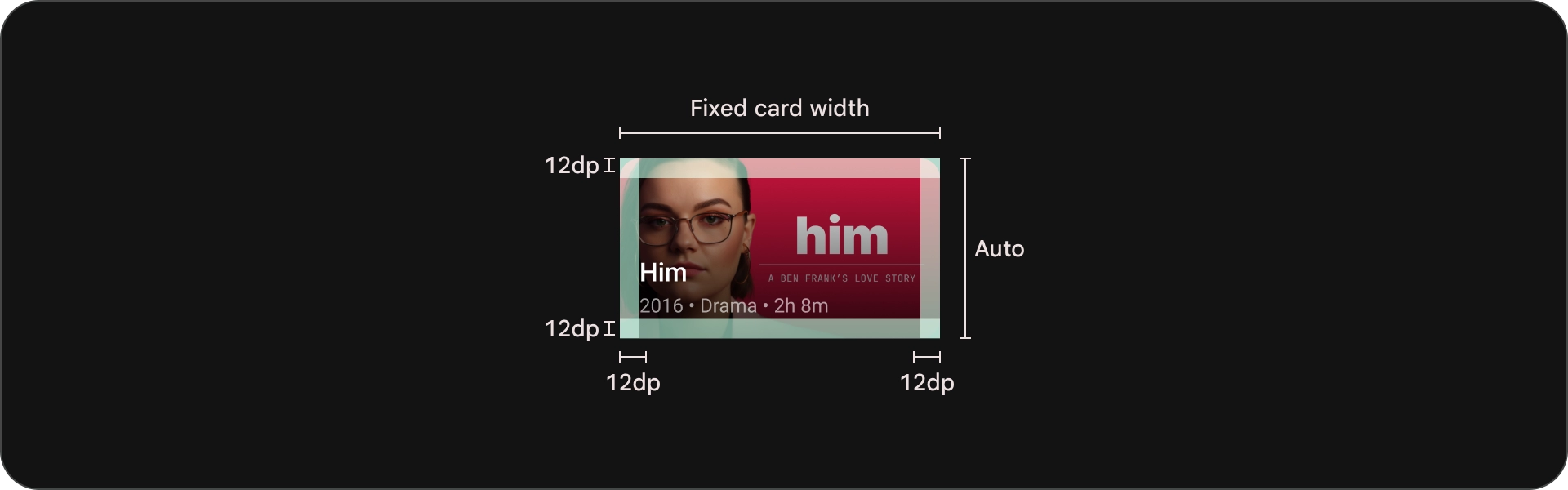
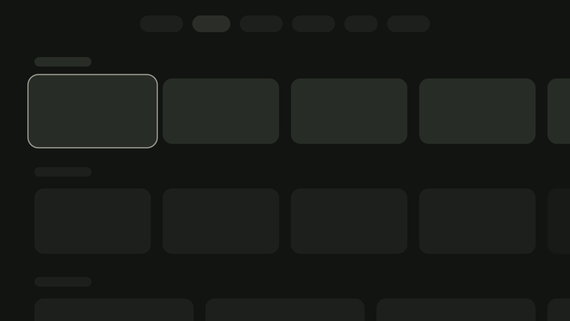
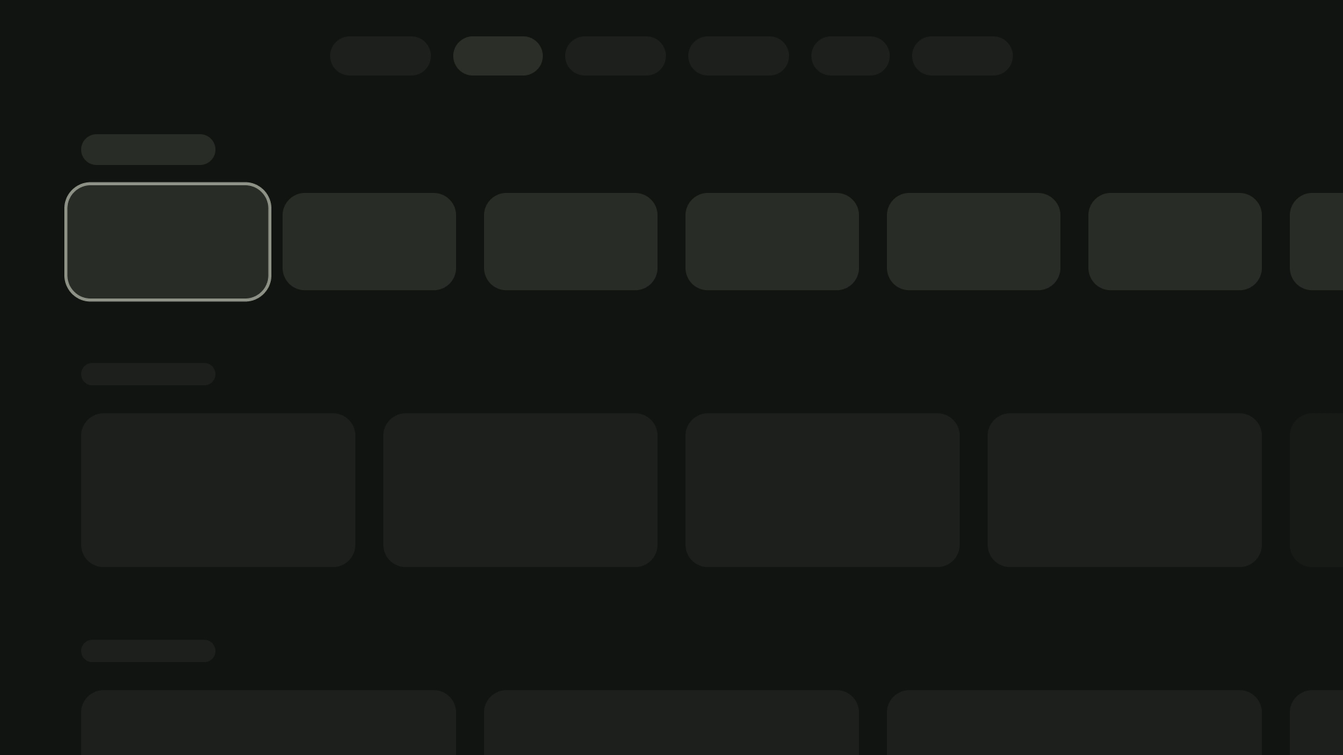
स्क्रीन पर दिखने वाले कार्ड की संख्या के हिसाब से, कार्ड की चौड़ाई अलग-अलग हो सकती है 20dp की स्पेसिंग के साथ उचित पीकिंग लागू करके हासिल किया जा सकता है.
1-कार्ड वाला लेआउट
कार्ड की चौड़ाई — 844dp
2-कार्ड वाला लेआउट
कार्ड की चौड़ाई — 412dp
3-कार्ड वाला लेआउट
कार्ड की चौड़ाई — 268dp
4-कार्ड वाला लेआउट
कार्ड की चौड़ाई — 196dp
5-कार्ड वाला लेआउट
कार्ड की चौड़ाई — 124dp
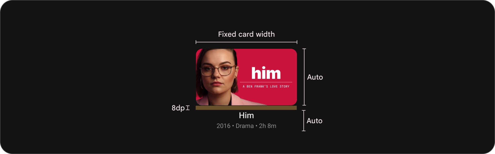
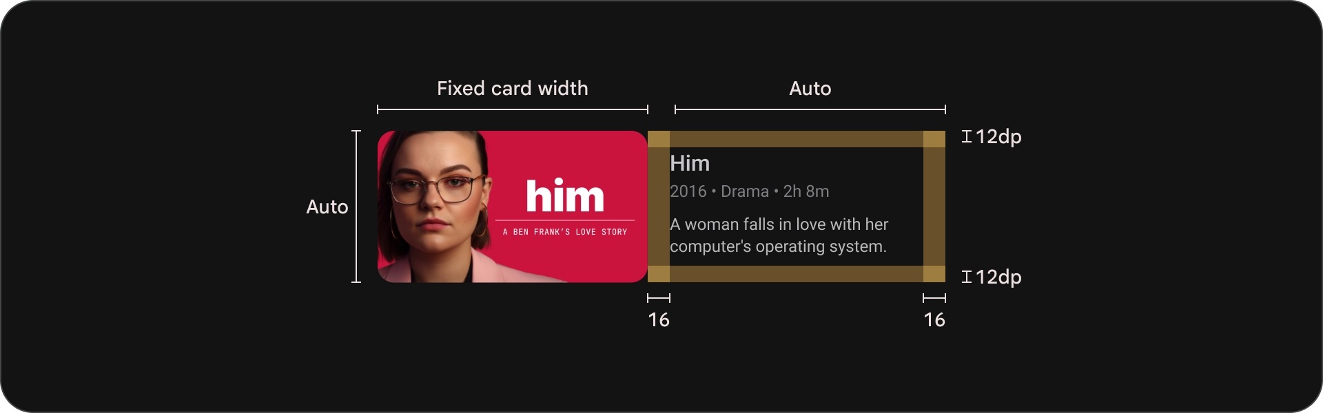
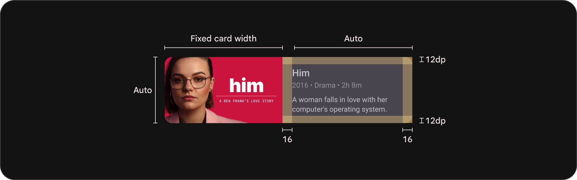
कॉन्टेंट ब्लॉक
कार्ड में कॉन्टेंट ब्लॉक की चौड़ाई, इमेज की चौड़ाई के बराबर होनी चाहिए थंबनेल. अगर आपको कॉन्टेंट ब्लॉक में ज़्यादा टेक्स्ट दिखाने की ज़रूरत है, तो कार्ड के अलग-अलग तरह के कार्ड का इस्तेमाल करें.
यह करें
यह न करें
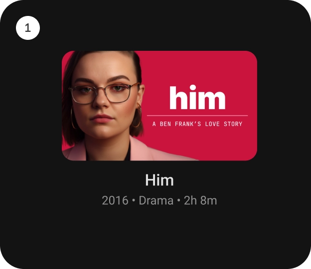
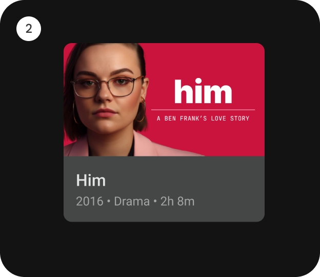
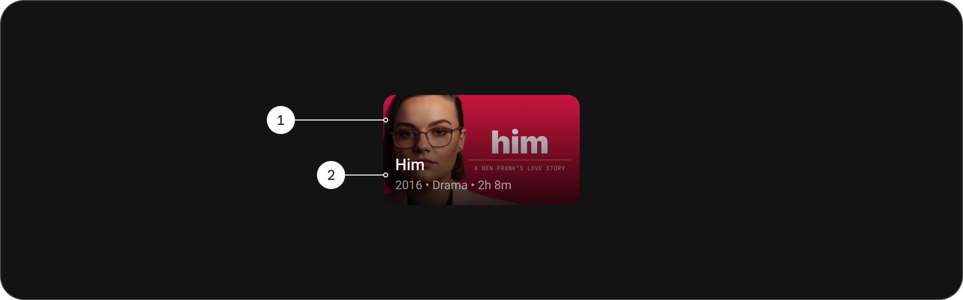
कॉम्पैक्ट कार्ड
कॉम्पैक्ट कार्ड छोटे और पढ़ने में आसान होने चाहिए. पिछले बैकग्राउंड की इमेज छोटी और सटीक होनी चाहिए. लंबे टाइटल बनाने से बचें, सबटाइटल या जानकारी. इससे आपके कार्ड पर ज़्यादा सुविधाएं मिलती हैं दिखने में आकर्षक और स्कैन करने में आसान.
किसी इमेज पर मौजूद टेक्स्ट को पढ़ने लायक बनाने के लिए, आधा-पारदर्शी काला रंग जोड़ें ग्रेडिएंट ओवरले. इससे बैकग्राउंड को धुंधला किए बिना, उसे गहरा कर दिया जाता है इमेज बहुत ज़्यादा है, जिससे टेक्स्ट को आसानी से देखा जा सकता है.
यह करें