इमर्सिव लिस्ट, कॉन्टेंट और इसका पूर्वावलोकन करें चुना गया आइटम. यह कॉन्टेंट को बड़े व्यूपोर्ट में दिखाता है.
संसाधन
| टाइप | लिंक | स्थिति |
|---|---|---|
| डिज़ाइन | डिज़ाइन सोर्स (Figma) | उपलब्ध है |
| लागू करना | सैंपल | लागू नहीं |
हाइलाइट
- डाइनैमिक कॉन्टेंट की झलक. जब कोई उपयोगकर्ता तो प्रदर्शन के लिए पूर्वावलोकन क्षेत्र अपने आप अपडेट हो जाता है. वर्तमान फ़ोकस किया गया आइटम.
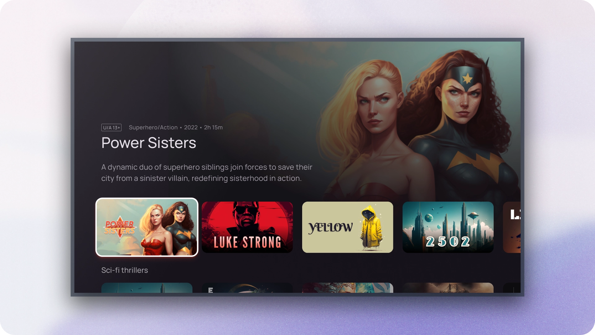
- इमर्सिव लिस्ट कॉम्पोनेंट, जिसमें इमेज के लिए एक बड़ा व्यूपोर्ट कॉन्टेंट दिखाना. इससे लोगों के लिए कॉन्टेंट को देखना और उसकी सराहना करना आसान हो जाता है फ़ोकस किए गए आइटम की विज़ुअल जानकारी.
- इमर्सिव सूचियों से काम की और काम की जानकारी मिलती है जिसमें उपयोगकर्ताओं को बिना किसी भेदभाव के सोच-समझकर फ़ैसले लेने में मदद मिलती है. अपने ब्राउज़िंग अनुभव को छोड़ दें.
- इमर्सिव लिस्ट कॉम्पोनेंट, उपयोगकर्ताओं के बारे में जानकारी देने के लिए, क्रमिक जानकारी का इस्तेमाल करता है नेविगेट करने के दौरान कॉन्टेंट में ज़्यादा जानकारी मिलती है, ताकि सीखने-समझने की क्षमता कम हो जाए उपयोगकर्ता के जुड़ाव को लोड करने और बनाए रखने के लिए.
- इमर्सिव लिस्ट कॉम्पोनेंट यह पक्का करता है कि पूरे ऐप्लिकेशन पर एक जैसा इंटरैक्शन हो, जो लोगों को जाने-पहचाने और अनुमान लगाने वाला अनुभव उपलब्ध कराता है.
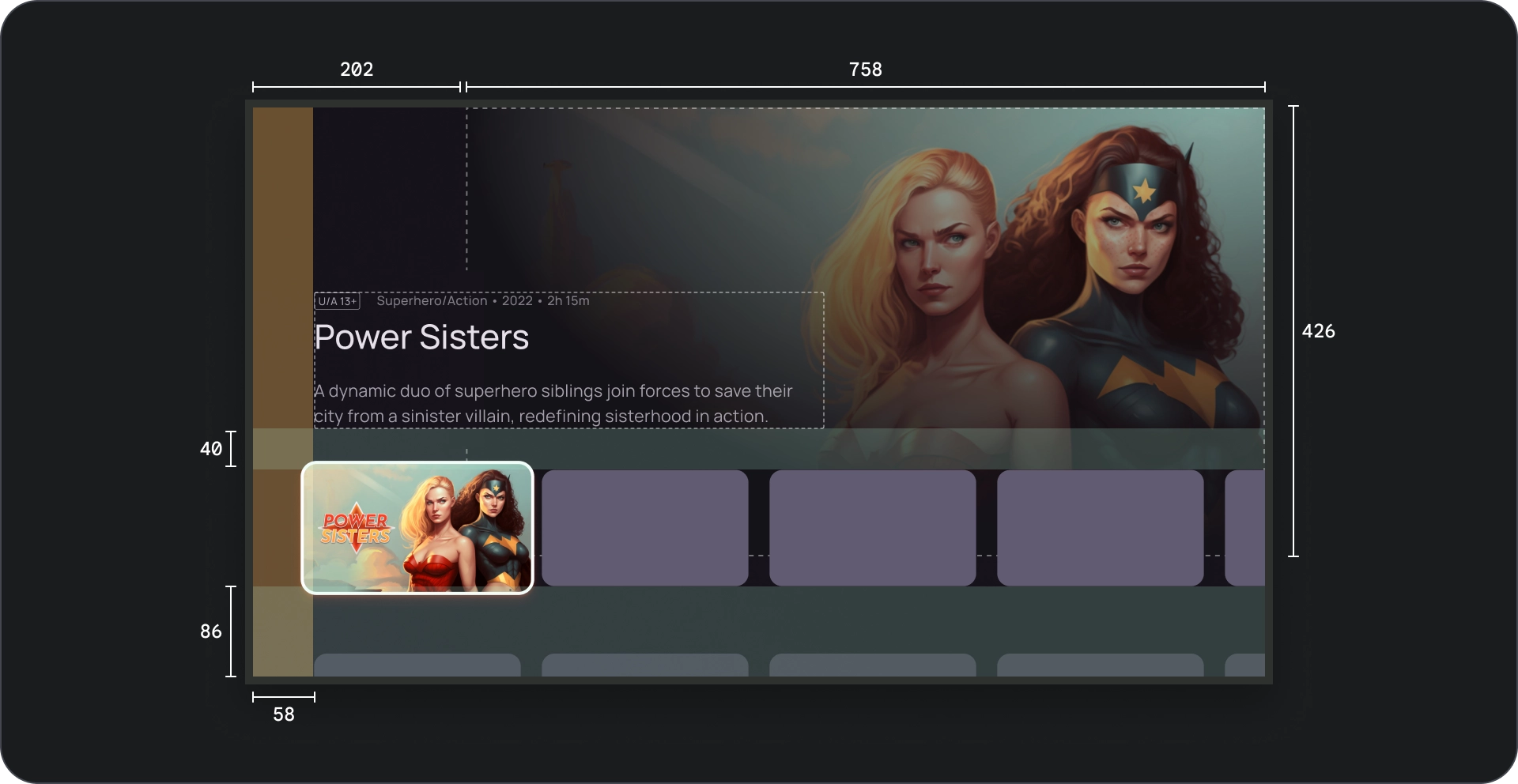
शरीर-रचना विज्ञान
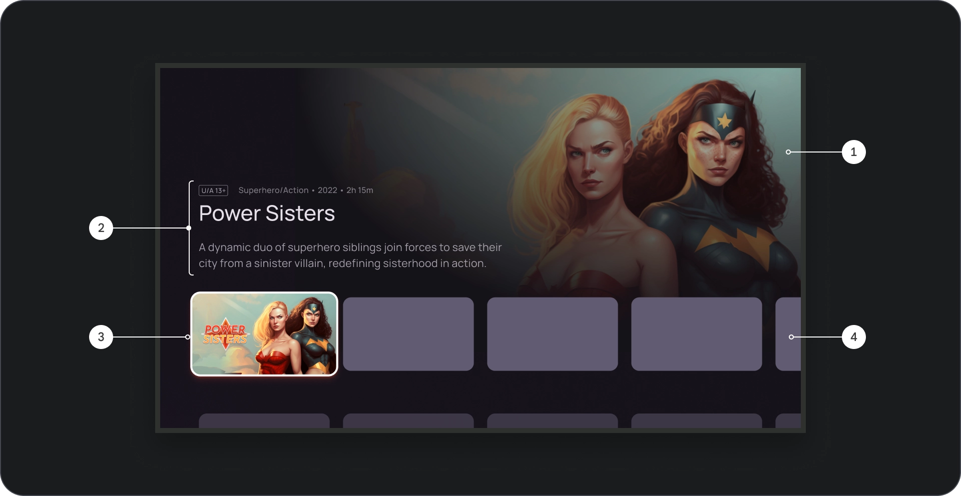
- इमेज का बैकग्राउंड
- कॉन्टेंट ब्लॉक
- कार्ड ऑन फ़ोकस
- कॉन्टेंट ग्रिड
- सिनमैटिक स्क्रिम
- पोस्टर
- बैकग्राउंड का रंग
खास जानकारी
व्यवहार
इमर्सिव सूची में कार्ड के बीच नेविगेट करते समय, चुने गए कार्ड बैकग्राउंड में धीरे-धीरे दिखाए जाते हैं.
जब इमर्सिव सूची फ़ोकस में होती है, तो स्क्रीन पर यह देखने के लिए इसकी ऊंचाई बढ़ जाती है अतिरिक्त जानकारी, जैसे कि बैकग्राउंड का टाइटल और ब्यौरा, जैसा कि नीचे दिए गए वीडियो में दिखाया गया है.
इस्तेमाल
आकर्षक कैरसेल का इस्तेमाल तब करें, जब आपको चुनिंदा या प्रमोट किया गया कॉन्टेंट, जैसे कि नई रिलीज़, लोकप्रिय शो या खास टाइटल शामिल करें. बड़े व्यूपोर्ट और डाइनैमिक झलक की वजह से करने का तरीका बताया है.
इमेज डिसप्ले
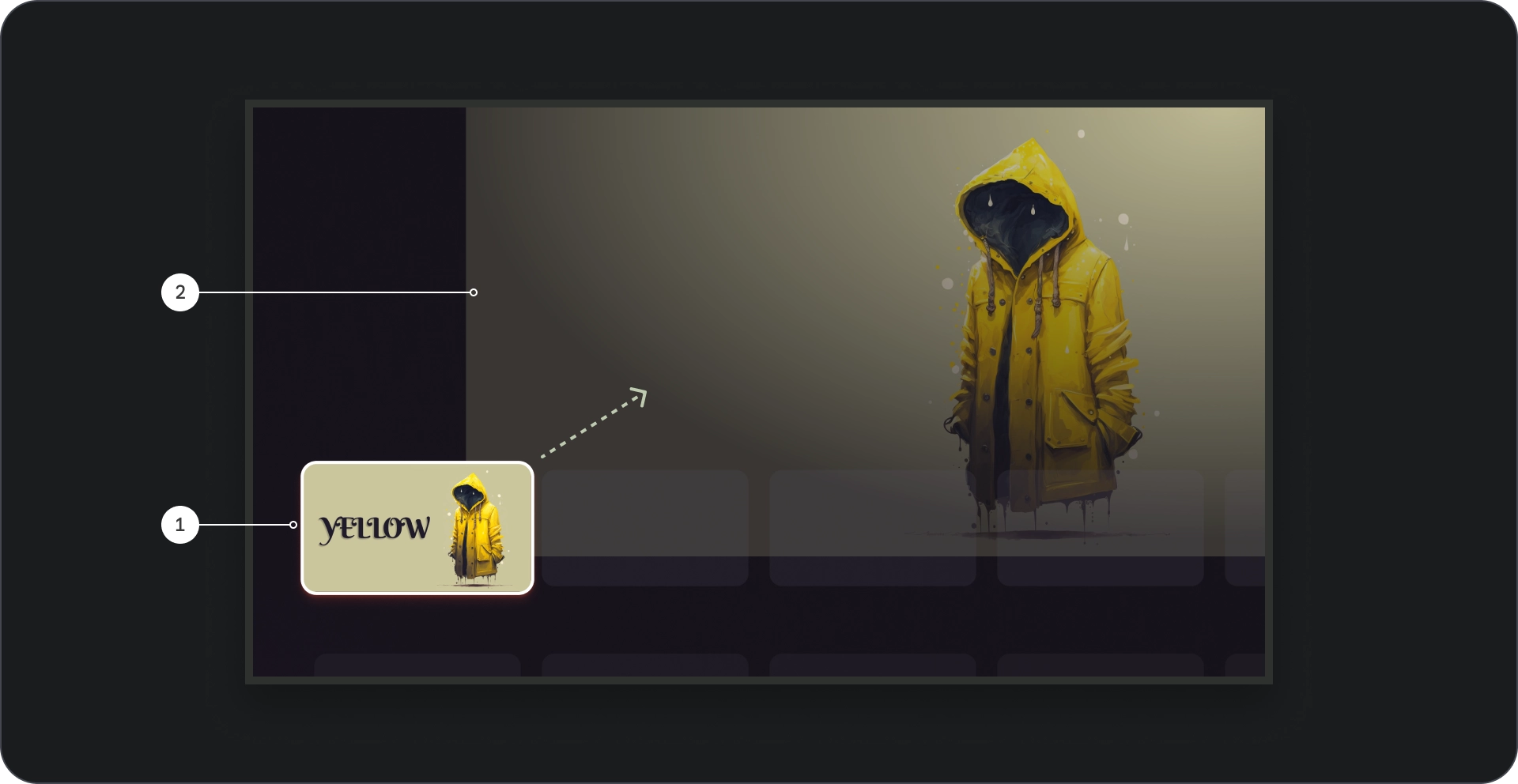
- कार्ड फ़ोकस: जब उपयोगकर्ता कैरसेल में नेविगेट करता है, तो फ़ोकस किए गए कार्ड पर विज़ुअल तौर पर ज़ोर दिया जाता है और बॉर्डर का इस्तेमाल करके, कार्ड को 1.1 से स्केल किया जाता है. और इसके चयन को दर्शाने के लिए ऊंचाई के रूप में अन्य विज़ुअल संकेत. पक्का करें कि कॉन्टेंट उपलब्ध हो फ़ोकस किए गए कार्ड के थंबनेल में टाइटल साफ़ तौर पर आसानी से पढ़ा जा सकता है.
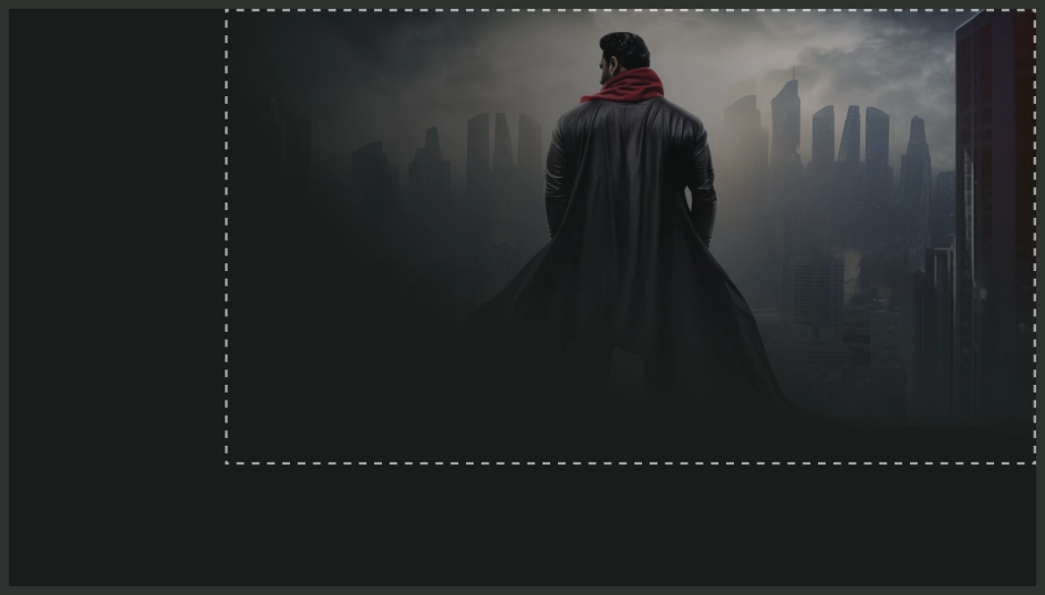
- बैकग्राउंड इमेज: जब कार्ड फ़ोकस में होता है, तो उससे जुड़ा बैकग्राउंड दिखता है इमेज को बड़े व्यूपोर्ट में दिखाया गया है. हमारा सुझाव है कि यह बैकग्राउंड इस्तेमाल करें इमेज अच्छी क्वालिटी वाली और दिखने में आकर्षक होती है. इससे, वह इमर्सिव और कॉन्टेंट के लिए दिलचस्प बैकग्राउंड.
कंपोज़िशन
यह करें
यह न करें
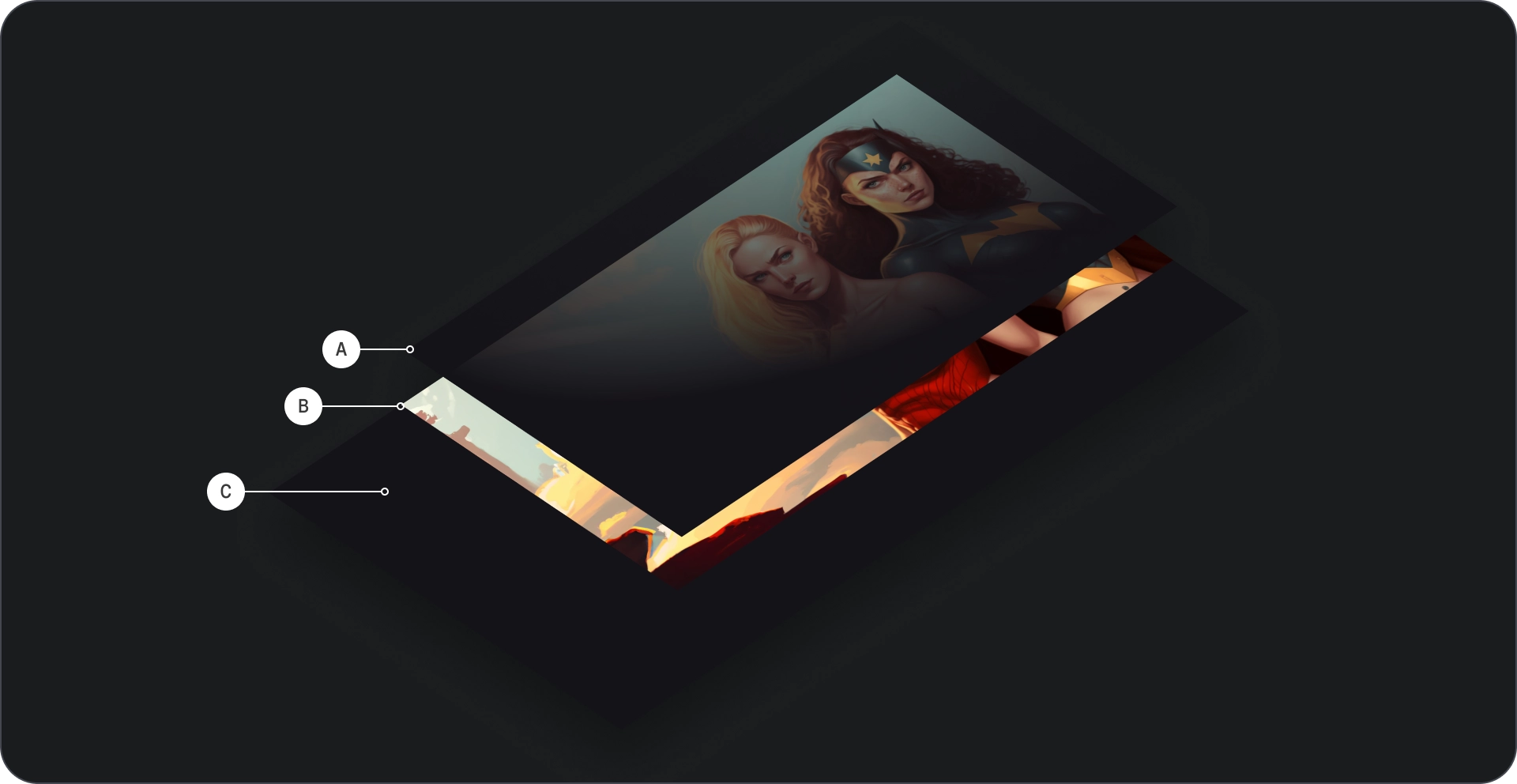
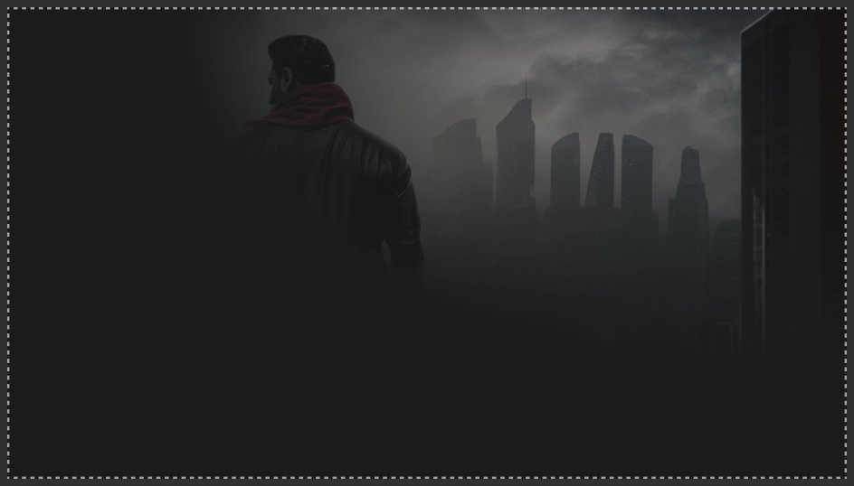
यह पक्का करने के लिए कि इमर्सिव लिस्ट कॉम्पोनेंट में इमेज का इस्तेमाल बैकग्राउंड के तौर पर किया जाए अच्छे दिखते हैं, उन्हें सही तरीके से स्केल करना न भूलें, ताकि वे धुंधली न हों या टेढ़े-मेढ़े.
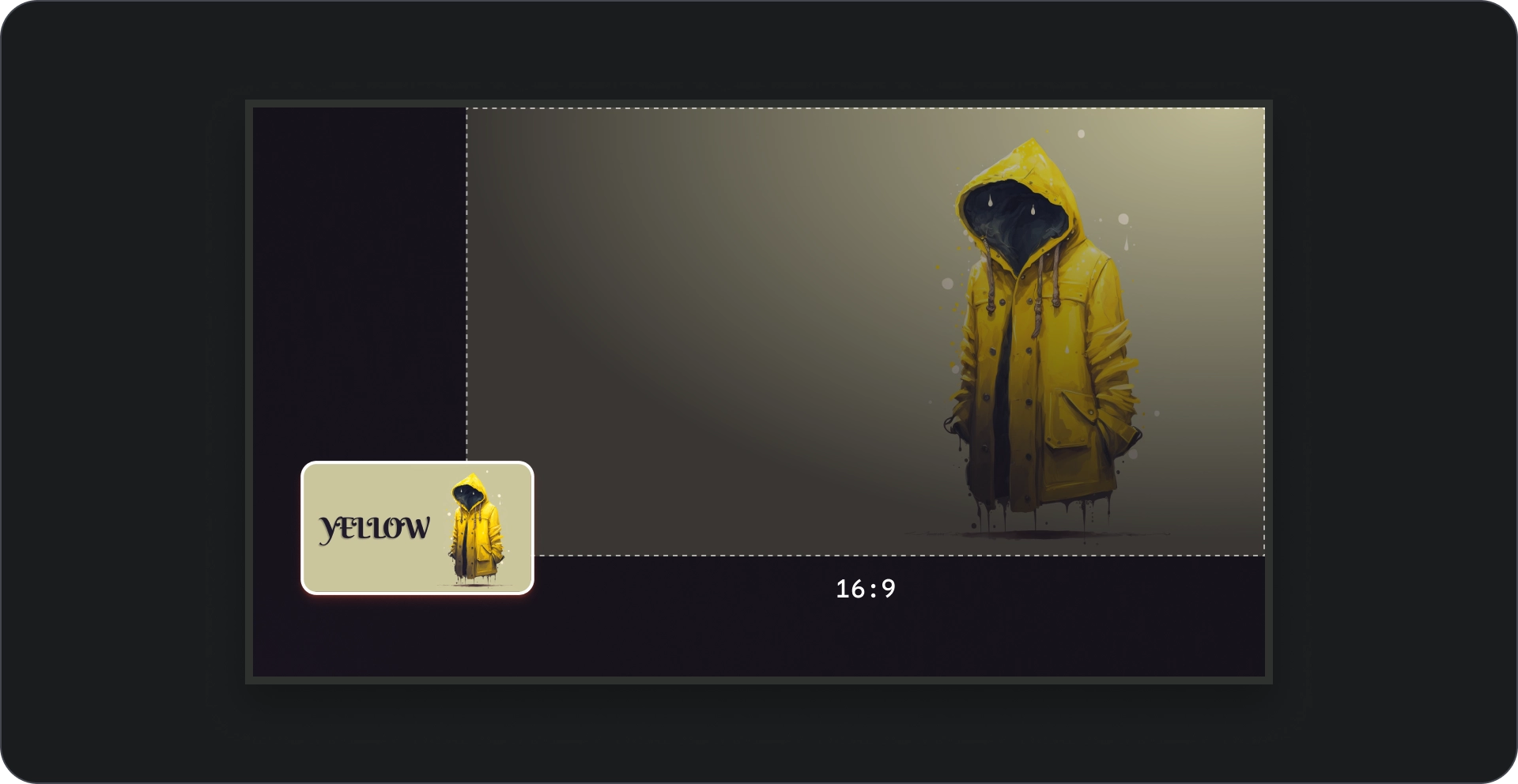
आसपेक्ट रेशियो
अगर हो सके, तो बैकग्राउंड की इमेज के लिए 16:9 के अनुपात का इस्तेमाल करें दिखने में आकर्षक और एक जैसा लेआउट.