
ווידג'טים הם רכיבים במסך הבית שאפשר להתאים אישית, והם מציגים תצוגה ברורה ושימושית של התוכן או הפעולות של אפליקציה. התוכן הזה יכול להתעדכן מעת לעת.
הווידג'טים עוזרים למשתמשים להשיג את המטרות שלהם, או באמצעות אינטראקציה עם התוכן של האפליקציה ישירות בווידג'ט, או באמצעות פתיחת האפליקציה המלאה.
שנתחיל?
כשיוצרים את הווידג'ט, מבצעים את השלבים הבאים:
- בוחרים תרחיש שימוש עיקרי אחד שיוצג בווידג'ט.
- אפשר לעיין בדוגמאות לתבניות של ווידג'טים ב-Figma.
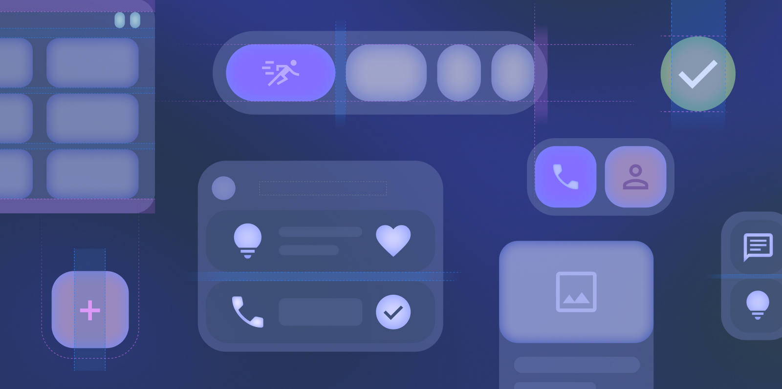
- עיצוב ממשק המשתמש בהתאם להנחיות בנושא גודל.
- כדאי לבדוק את המודעות בגדלים שונים של מסכים.
- כדאי לבדוק את הווידג'ט בכמה גורמי צורה, כמו Android Auto.
- מוודאים שהווידג'ט עומד בדרישות של הנחיות האיכות של הווידג'טים.
פריסות קנוניות של ווידג'טים
הפריסות קובעות איך המידע והאלמנטים האינטראקטיביים מאורגנים בווידג'ט. מידע נוסף על פריסות מוכנות מראש לווידג'טים של טקסט, רשימה ורשת
התאמת גודל
מידע נוסף על עיצוב ווידג'טים שניתן לשנות את הגודל שלהם בצורה חלקה. אפשר לראות את גדלי ברירת המחדל של הווידג'טים וללמוד איך להשתמש באופן מלא בשטח הרשת שמוקצה.
סגנון
כאן מוסבר איך לעצב את הווידג'ט כדי לשפר את ההשפעה החזותית שלו ולהתאים אותו לעיצוב שמוגדר במכשיר של המשתמש.
גילוי וקידום
כאן מוסבר איך לקדם את הווידג'ט שלכם בכלי לבחירת ווידג'טים באמצעות גודל מתאים ומידע שמוצג.