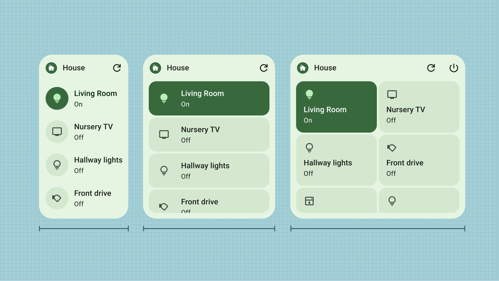
원활하게 확장되는 적응형 Android 위젯을 디자인하세요. 권장 기본 크기를 출발점으로 삼고 다양한 크기에서 레이아웃을 테스트하여 최적의 가독성과 사용자 환경을 보장하세요.
기본 크기
권장 크기 중 하나 이상에 맞게 레이아웃을 최적화하여 세련된 위젯 환경을 제공하세요. 휴대기기와 태블릿 기기 모두에 targetCellWidth 및 targetCellHeight 속성을 정의하여 위젯 선택 도구에서 올바른 배치와 가시성을 보장합니다.
이 값은 Pixel 기기를 기준으로 합니다. 이 크기를 위젯 디자인의 시작점으로 사용하세요. 다양한 크기와 기기에서 위젯을 철저히 테스트하여 우수한 사용자 환경을 보장하세요.
휴대기기
크기
최소 너비
최대 너비
최소 높이
최대 높이
2x1
109
306
56
130
2x2
109
306
115
276
2x3
109
306
185
422
4x1
245
624
56
130
4x2
245
624
115
276
4x3
245
624
185
422
태블릿
크기
최소 너비
최대 너비
최소 높이
최대 높이
2x1
180
304
64
120
2x2
180
304
184
304
2x3
180
304
304
488
3x1
328
488
64
120
3x2
298
488
184
304
3x3
298
488
304
488
3x4
298
488
424
672
중단점
중단점은 조정 가능하고 사용자 친화적이며 크기를 조절할 수 있는 위젯을 만드는 데 필수적입니다. 디자인을 테스트하여 레이아웃 조정이 필요한 크기 기준점을 정확하게 파악할 수 있습니다. 이러한 변경사항을 트리거하는 브레이크포인트를 구현하여 위젯이 어떤 크기에서든 시각적 매력과 기능을 유지하도록 합니다.
브레이크포인트를 사용하면 추가 콘텐츠를 조건부로 포함하거나 제외하여 위젯의 크기를 기반으로 공간 활용도를 최적화할 수 있습니다.
그림 1: 중단점을 사용하여 다양한 크기에서 레이아웃을 변경합니다.
경계 채우기
사용자가 위젯을 삭제하는 주된 이유 중 하나는 다른 홈 화면 요소와의 정렬 불량 때문입니다. 이를 방지하려면 위젯이 항상 할당된 그리드 공간을 완전히 채우도록 하세요.
check_circle
권장사항
컨테이너가 모든 크기에서 가장자리까지 늘어나는지 확인합니다.
cancel
금지사항
맞춤 패딩을 추가합니다. 위젯이 가장자리까지 원활하게 이어져야 합니다.
check_circle
권장사항
시각적 일관성을 위해 직사각형이 아닌 도형이 세로 또는 가로 축의 그리드에 닿도록 합니다.
cancel
금지사항
고정된 정사각형 모양을 사용합니다. 대신 다양한 그리드 크기에 맞게 조정되는 반응형 직사각형 컨테이너를 사용하세요.
이 페이지에 나와 있는 콘텐츠와 코드 샘플에는 콘텐츠 라이선스에서 설명하는 라이선스가 적용됩니다. 자바 및 OpenJDK는 Oracle 및 Oracle 계열사의 상표 또는 등록 상표입니다.
최종 업데이트: 2025-07-27(UTC)
[[["이해하기 쉬움","easyToUnderstand","thumb-up"],["문제가 해결됨","solvedMyProblem","thumb-up"],["기타","otherUp","thumb-up"]],[["필요한 정보가 없음","missingTheInformationINeed","thumb-down"],["너무 복잡함/단계 수가 너무 많음","tooComplicatedTooManySteps","thumb-down"],["오래됨","outOfDate","thumb-down"],["번역 문제","translationIssue","thumb-down"],["샘플/코드 문제","samplesCodeIssue","thumb-down"],["기타","otherDown","thumb-down"]],["최종 업데이트: 2025-07-27(UTC)"],[],[],null,["# Sizing\n\nDesign adaptable Android widgets that scale seamlessly. Use our recommended\ndefault sizes as a starting point, and test your layouts across different\ndimensions to ensure optimal readability and user experience.\n\nDefault sizes\n-------------\n\nDeliver a polished widget experience by optimizing your layout for at least one\nof our recommended sizes. Ensure correct placement and visibility in the widget\npicker by defining `targetCellWidth` and `targetCellHeight` attributes for both\nhandheld and tablet devices.\n\nThese values are based off Pixel devices. Use these sizes as a starting point\nfor your widget design. Thoroughly test your widget at different sizes and on\nvarious devices to ensure a quality user experience. \n\n### Handheld\n\n\n| Sizes | Min width | Max width | Min height | Max height |\n|-------|-----------|-----------|------------|------------|\n| 2x1 | 109 | 306 | 56 | 130 |\n| 2x2 | 109 | 306 | 115 | 276 |\n| 2x3 | 109 | 306 | 185 | 422 |\n| 4x1 | 245 | 624 | 56 | 130 |\n| 4x2 | 245 | 624 | 115 | 276 |\n| 4x3 | 245 | 624 | 185 | 422 |\n\n\u003cbr /\u003e\n\n### Tablet\n\n\n| Sizes | Min width | Max width | Min height | Max height |\n|-------|-----------|-----------|------------|------------|\n| 2x1 | 180 | 304 | 64 | 120 |\n| 2x2 | 180 | 304 | 184 | 304 |\n| 2x3 | 180 | 304 | 304 | 488 |\n| 3x1 | 328 | 488 | 64 | 120 |\n| 3x2 | 298 | 488 | 184 | 304 |\n| 3x3 | 298 | 488 | 304 | 488 |\n| 3x4 | 298 | 488 | 424 | 672 |\n\n\u003cbr /\u003e\n\n| **Note:** Widget dimensions in the table encompass all device orientations, including landscape mode on phones, to ensure optimal functionality in a variety of scenarios.\n\nBreakpoints\n-----------\n\nBreakpoints are essential for crafting adaptable, user-friendly resizable\nwidgets. By testing your design, you can pinpoint size thresholds where layout\nadjustments are necessary. Implement breakpoints to trigger these changes,\nensuring your widget maintains visual appeal and functionality at any size.\n\nBreakpoints also offer the flexibility to conditionally include or exclude\nsupplemental content, optimizing space utilization based on the widget's\ndimensions.\n**Figure 1:** Use breakpoints to make layout changes at different sizes.\n\nFill the bounds\n---------------\n\nOne of the primary reasons users remove widgets is due to misalignment with\nother home screen elements. To prevent this, ensure your widget always fills its\nallocated grid space completely. \ncheck_circle\n\n### Do\n\nMake sure the container stretches edge-to-edge at all sizes. \ncancel\n\n### Don't\n\nAdd custom padding. Your widget should go seamlessly edge-to-edge. \ncheck_circle\n\n### Do\n\nEnsure your non-rectangular shape touches the grid on either the vertical or horizontal axis for visual consistency. \ncancel\n\n### Don't\n\nUse fixed square shapes. Instead, use responsive rectangular containers that adapt to various grid dimensions."]]