
ออกแบบเลย์เอาต์วิดเจ็ตที่มีประสิทธิภาพโดยระบุเนื้อหาหลักก่อน เลย์เอาต์ กำหนดวิธีจัดระเบียบข้อมูลและองค์ประกอบแบบอินเทอร์แอกทีฟภายใน วิดเจ็ต Android มีเลย์เอาต์ที่สร้างไว้ล่วงหน้าหลายแบบสำหรับแถบเครื่องมือ ข้อความ รายการ และวิดเจ็ตประเภทตารางกริดเพื่อเพิ่มประสิทธิภาพกระบวนการนี้
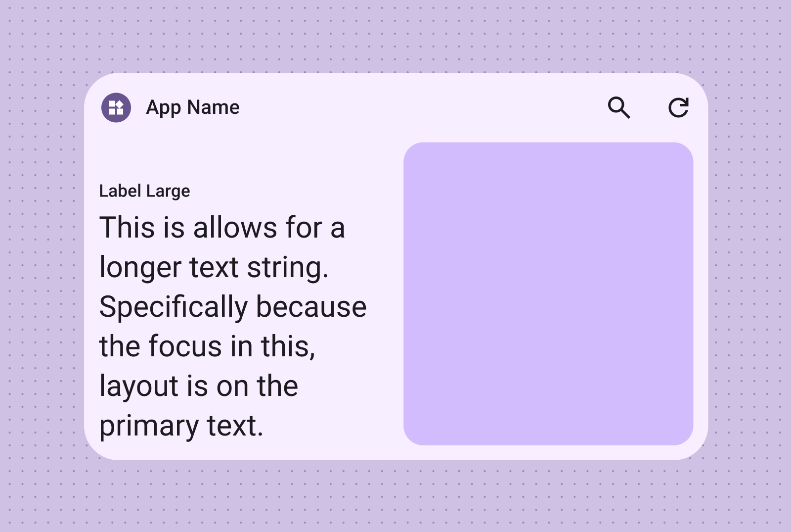
ข้อความ
เลย์เอาต์ข้อความเหมาะอย่างยิ่งสำหรับการแสดงข้อมูลแบบย่อ เพิ่มความน่าสนใจ ของวิดเจ็ตด้วยการใส่รูปภาพควบคู่ไปกับข้อความ (ไม่บังคับ)
เหมาะสำหรับชื่อ ข้อมูลอัปเดตสถานะ คำอธิบายสั้นๆ หรือสถานการณ์ใดๆ ที่ข้อความบรรทัดเดียวสื่อสารข้อความได้อย่างมีประสิทธิภาพ
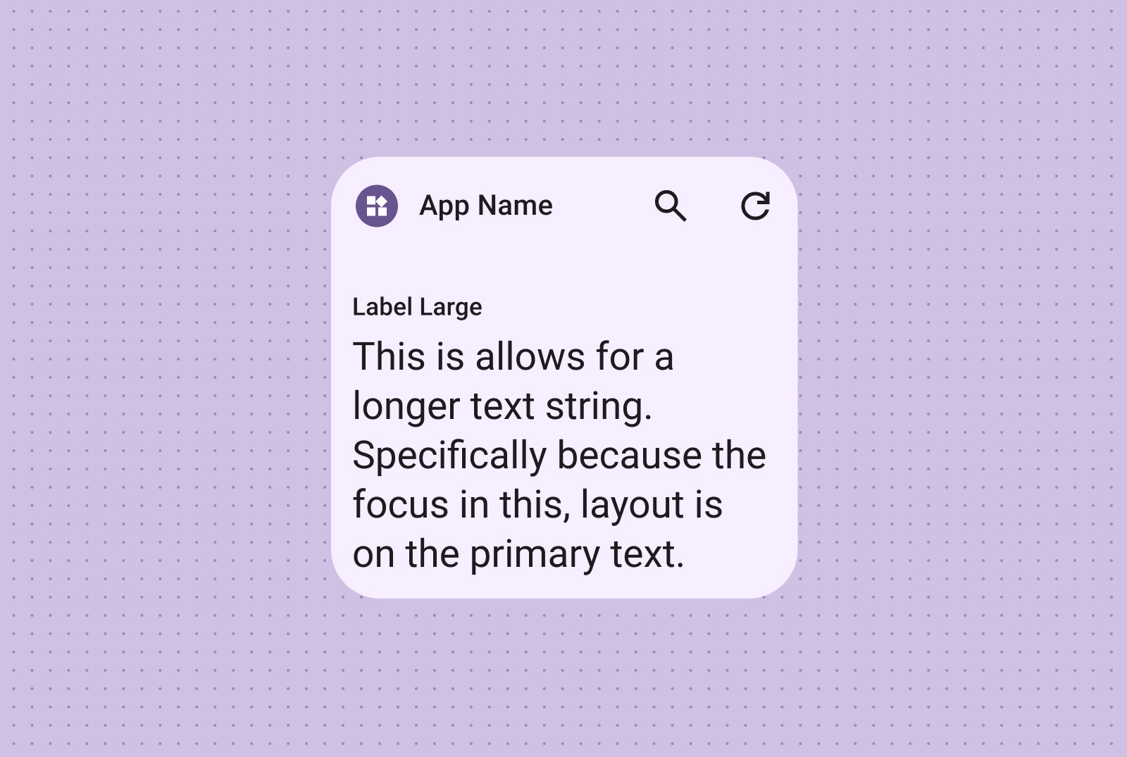
ใส่รูปภาพเพื่อเพิ่มผลลัพธ์ด้านภาพ ดูข้อมูลเพิ่มเติมได้ที่ เบรกพอยต์ เพื่อดูวิธีปรับเลย์เอาต์นี้ให้เหมาะกับขนาดหน้าจอต่างๆ
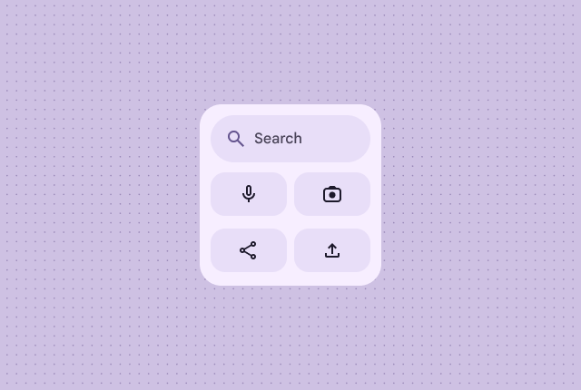
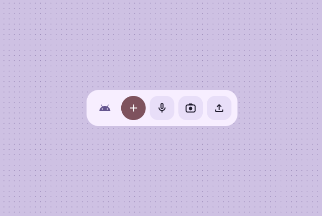
แถบเครื่องมือ
ใช้เลย์เอาต์แถบเครื่องมือเพื่อให้ผู้ใช้เข้าถึงงานที่ใช้บ่อยได้อย่างรวดเร็ว ในแอปของคุณในเลย์เอาต์ที่ยืดหยุ่นซึ่งปรับให้เข้ากับขนาดวิดเจ็ตต่างๆ
เลย์เอาต์แถบเครื่องมือค้นหาได้รับการออกแบบมาโดยเฉพาะเพื่อดึงดูดความสนใจไปที่การค้นหา ซึ่งเป็นการดำเนินการหลักในแถบเครื่องมือ ปุ่มเพิ่มเติมที่มีประโยชน์จะช่วยให้ เข้าถึงฟังก์ชันที่ใช้บ่อยได้อย่างรวดเร็ว
แถบเครื่องมือจะแสดงการสร้างแบรนด์ของแอป ตามด้วยปุ่มสำหรับงานที่ใช้บ่อยที่สุด ซึ่งเหมาะสำหรับการตั้งค่าที่สลับได้หรือลิงก์งาน เมื่อปรับขนาด ตัวเลือกที่ใช้ไม่บ่อยจะซ่อนไว้เพื่อแสดงการดำเนินการที่ใช้บ่อยกว่า ใช้ เบรกพอยต์ เพื่อเพิ่มปุ่มใหม่ที่แตะได้ขนาดขั้นต่ำ 48dp เมื่อมีพื้นที่
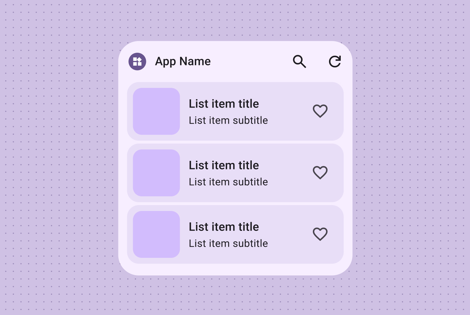
รายการ
ใช้เลย์เอาต์รายการเพื่อจัดระเบียบหลายรายการในรูปแบบที่ชัดเจนและสแกนได้ ซึ่งเหมาะสำหรับ พาดหัวข่าว รายการสิ่งที่ต้องทำ หรือข้อความ จัดระเบียบเนื้อหาเป็นรายการที่มีโครงสร้างและสแกนได้ เลือกระหว่างการนำเสนอแบบคอนเทนเนอร์หรือแบบไม่มีคอนเทนเนอร์ ตามความต้องการเนื้อหาของคุณ
ข้อความและรายการรูปภาพที่สแกนได้เหมาะอย่างยิ่งสำหรับการแสดงเนื้อหาหลายประเภท เช่น พาดหัวข่าว เพลย์ลิสต์ที่มีปกอัลบั้ม หรือข้อความ
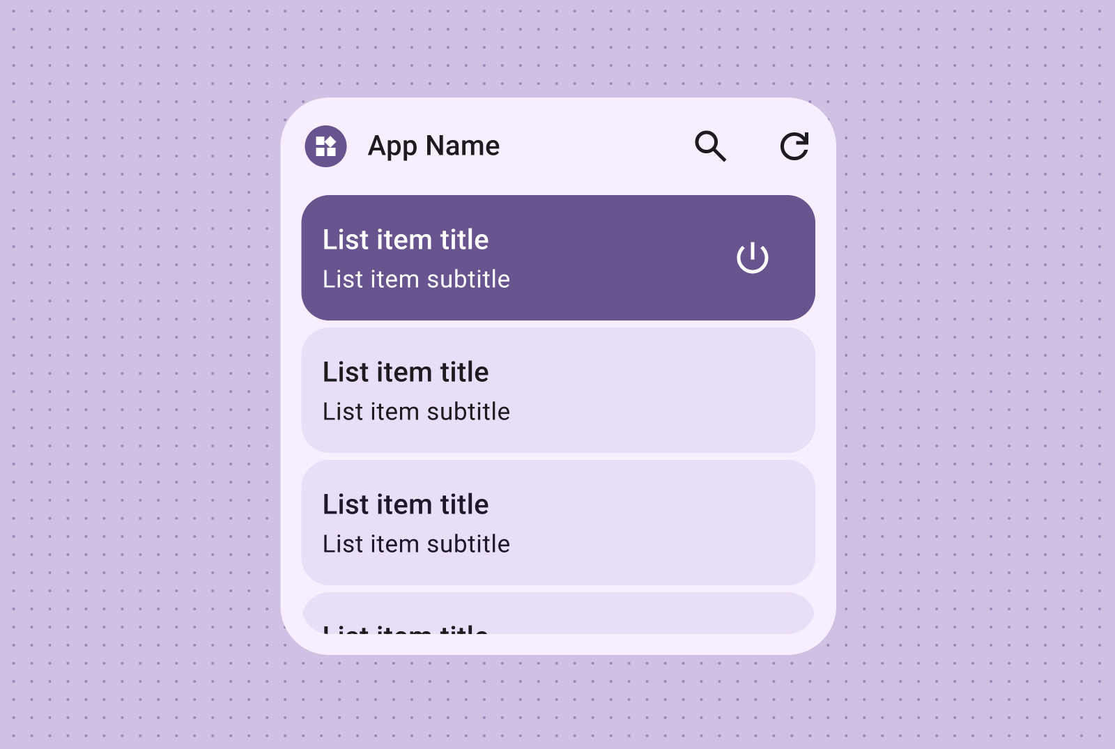
เลย์เอาต์ของเช็กลิสต์เหมาะอย่างยิ่งสำหรับการแสดงงาน โดยมีเป้าหมายการแตะที่ชัดเจน เพื่อให้ผู้ใช้ทำเครื่องหมายรายการว่าเสร็จแล้วได้อย่างรวดเร็ว
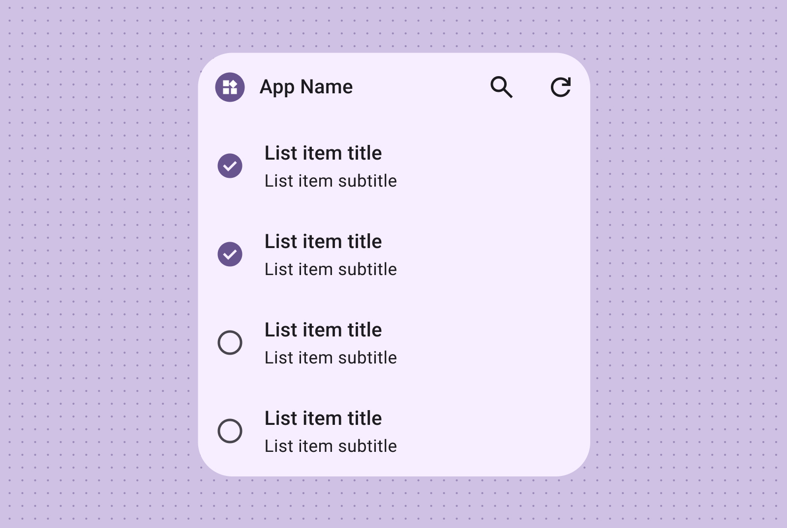
จัดกลุ่มการควบคุมที่ใช้งานง่ายด้วยรายการการทำงาน ซึ่งสถานะเปิด/ปิดภาพจะให้ความคิดเห็นเกี่ยวกับสถานะของรายการได้ทันที
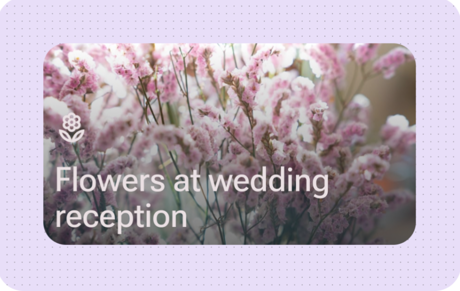
เลย์เอาต์นี้เหมาะอย่างยิ่งสำหรับการแสดงรูปภาพแบบเต็มขอบที่สมจริงบน Android 17 ขึ้นไป โดยใช้การเลื่อนแบบสแนปเพื่อให้แน่ใจว่าองค์ประกอบย่อยแต่ละรายการจะสอดคล้องกับความสูงของคอนเทนเนอร์วิดเจ็ตอย่างสมบูรณ์
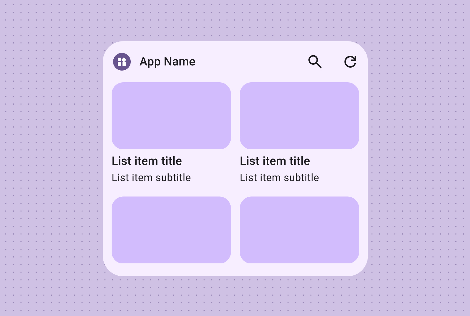
ตารางกริด
แสดงรูปภาพในตารางกริดที่กะทัดรัด ยืดหยุ่น สวยงาม พร้อมป้ายกำกับ (ไม่บังคับ) ใช้คอลัมน์และแถวที่ปรับให้เข้ากับขนาดหน้าจอต่างๆ
สร้างแกลเลอรีรูปภาพที่เลื่อนได้และดึงดูดสายตาโดยใช้ตารางที่มีเฉพาะรูปภาพ แถวและคอลัมน์จะปรับให้เข้ากับหน้าจอขนาดต่างๆ โดยอัตโนมัติเพื่อให้แสดงผลได้ดีที่สุด
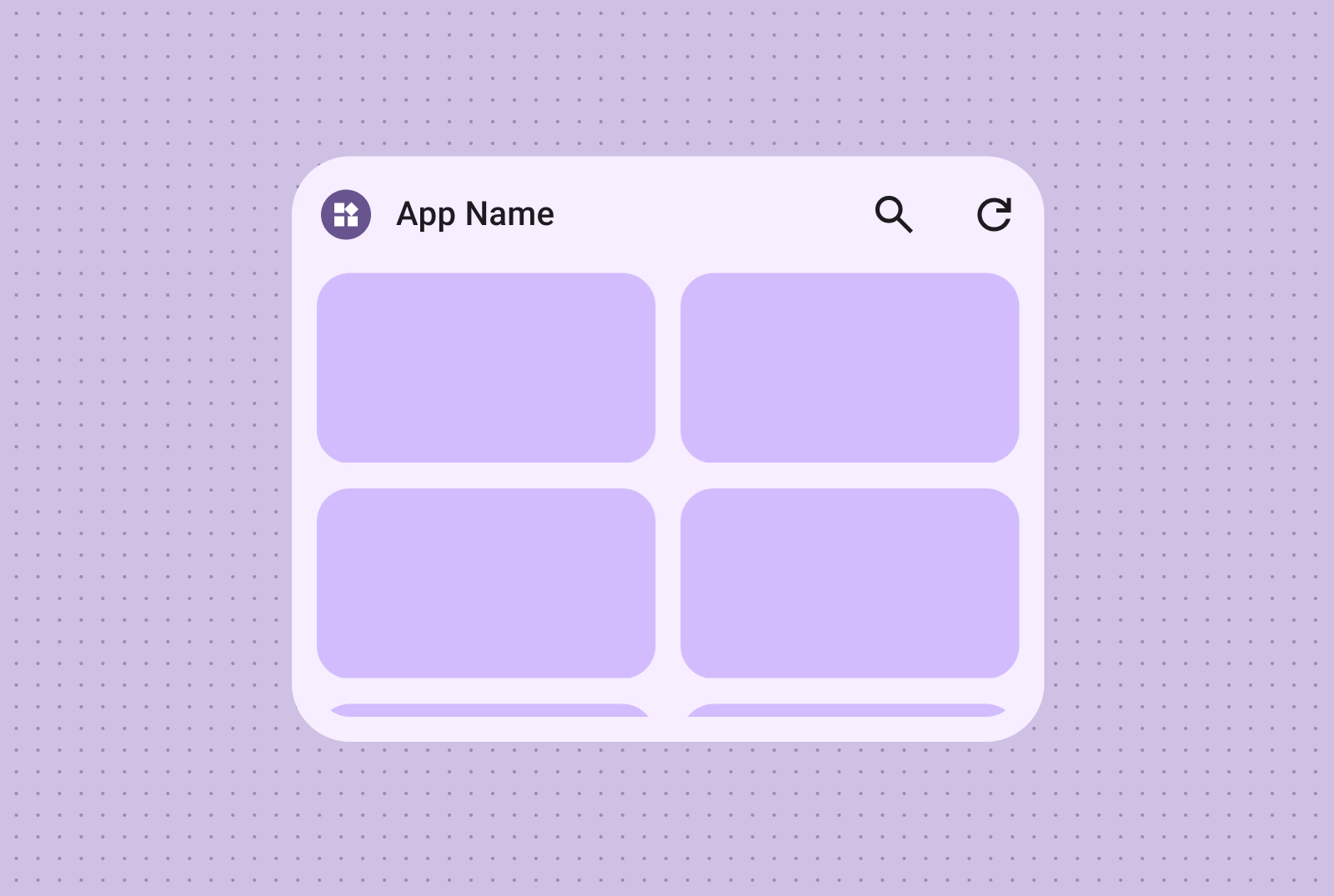
นอกจากนี้ คุณยังใส่ป้ายกำกับและคำอธิบายข้อความเพื่อเพิ่มบริบทและข้อมูลเพิ่มเติมให้กับเนื้อหาตารางกริดรูปภาพได้ด้วย
ตัวอย่างโค้ด
ตารางต่อไปนี้จะแมปเลย์เอาต์มาตรฐานแต่ละรายการกับการใช้งาน Jetpack Glance ที่เกี่ยวข้องในที่เก็บ GitHub ของตัวอย่างแพลตฟอร์ม Android
| เลย์เอาต์ Canonical | หมวดหมู่เลย์เอาต์ | ไฟล์ตัวอย่างการใช้งาน |
|---|---|---|
| ข้อความเท่านั้น | ข้อความ | LongTextAppWidget.kt |
| ข้อความและรูปภาพ | ข้อความ | TextWithImageAppWidget.kt |
| แถบเครื่องมือค้นหา | แถบเครื่องมือ | SearchToolBarAppWidget.kt |
| แถบเครื่องมือ (มาตรฐาน) | แถบเครื่องมือ | ToolBarAppWidget.kt |
| รายการข้อความและรูปภาพ | รายการ | ImageTextListAppWidget.kt |
| เช็กลิสต์ | รายการ | CheckListAppWidget.kt |
| รายการการดำเนินการ | รายการ | ActionListAppWidget.kt |
| การเลื่อนแบบสแนปภาพเต็มหน้า | รายการ | FullBleedImageAppWidget.kt |
| รูปภาพเท่านั้น | ตารางกริด | ImageGridAppWidget.kt |
| รูปภาพและข้อความ | ตารางกริด | ImageGridAppWidget.kt |