
無邊框應用程式會將 UI 繪製在系統資訊列下方,充分利用整個螢幕。
重點整理
- 在系統資訊列下方繪製背景和捲動內容,打造無邊框體驗。
- 請避免在系統插邊下方新增輕觸手勢或拖曳目標,因為這些手勢或目標會與無邊框設計和手勢操作模式衝突。
在系統資訊列後方繪製內容
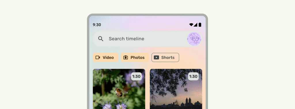
無邊框功能可讓您在系統資訊列下方繪製 UI,打造身歷其境的體驗。
應用程式可以對插邊做出反應,解決內容重疊問題。插邊會說明應用程式內容需要多少邊框間距,才能避免與系統資訊列或實體裝置功能 (例如螢幕凹口) 重疊。請參閱這篇文章,瞭解如何在 Compose 和 View 中支援無邊框設計及處理插邊。
設計無邊框應用程式時,請注意下列插邊類型:
- 系統資訊列插邊適用於可輕觸的 UI,且不應遭到系統資訊列遮蔽。
- 系統手勢插邊適用於 OS 使用的手勢操作區域,優先於應用程式。
- 螢幕凹口插邊適用於延伸至螢幕表面的裝置區域,例如相機凹口。
狀態列注意事項
如需基本的系統資訊列設計指南,請參閱「Android 系統資訊列」。下一節將討論狀態列的其他注意事項。
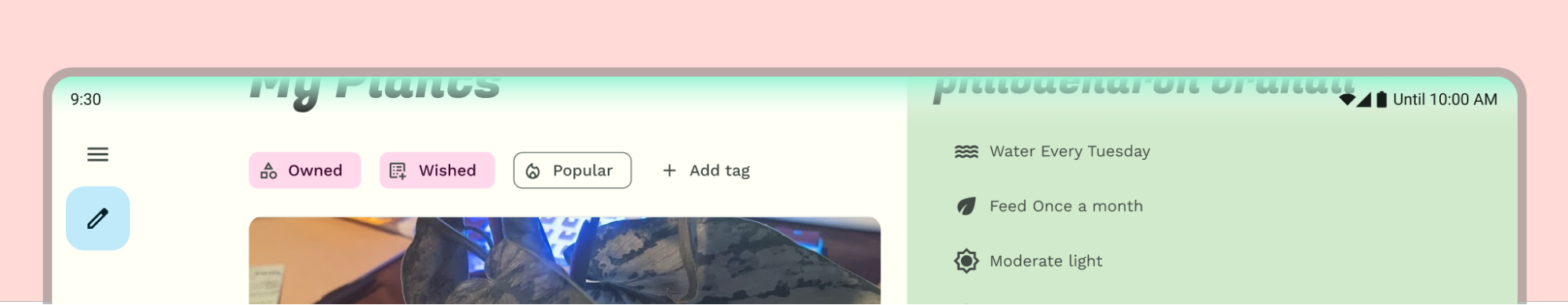
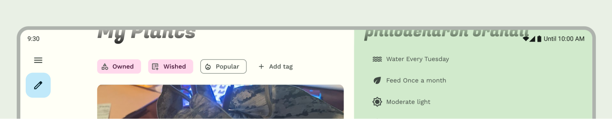
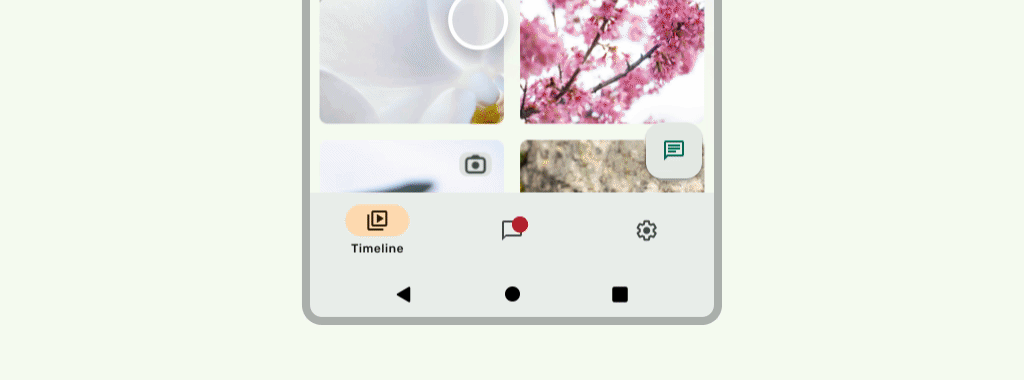
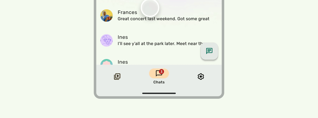
捲動內容
捲動時,頂端應用程式列應會收合。瞭解如何收合 Material 3 TopAppBar。在 Material 3 中,小型頂端應用程式列可收合至狀態列高度,或捲動至畫面外。中型和大型頂端應用程式列可以收合為較小的應用程式列。請參閱 Material 指南。
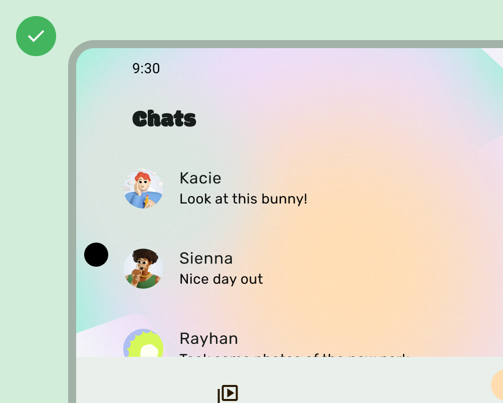
正確做法
正確做法
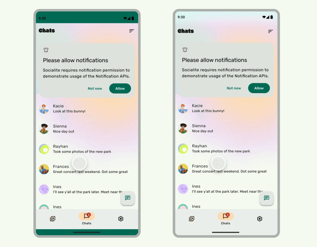
當 UI 在狀態列下方捲動時,狀態列應為半透明,以免狀態列圖示看起來雜亂。如要達成這個目標,請先實作 LazyColumn 或 RecyclerView 說明文件中的步驟,建立可捲動的無邊框 UI。接著,請執行下列其中一項操作,確保系統資訊列為半透明:
- 如果適用,請在捲動時,依賴 Material 3 TopAppBar 的自動保護機制。
- 建立自訂漸層可組合函式,或針對 Views 使用 GradientProtection。如要進一步瞭解如何在 Compose 中執行這項操作,請參閱「系統資訊列保護措施」。

如果是自動調整版面配置,請確保不同背景顏色的窗格有各自的保護措施。
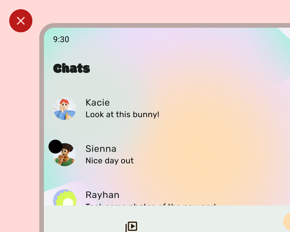
錯誤做法
正確做法
同樣地,導覽匣也應與應用程式的其餘部分分開保護。
請勿堆疊狀態列保護措施,例如同時使用 Material 3 TopAppBar 內建保護措施和自訂保護措施。
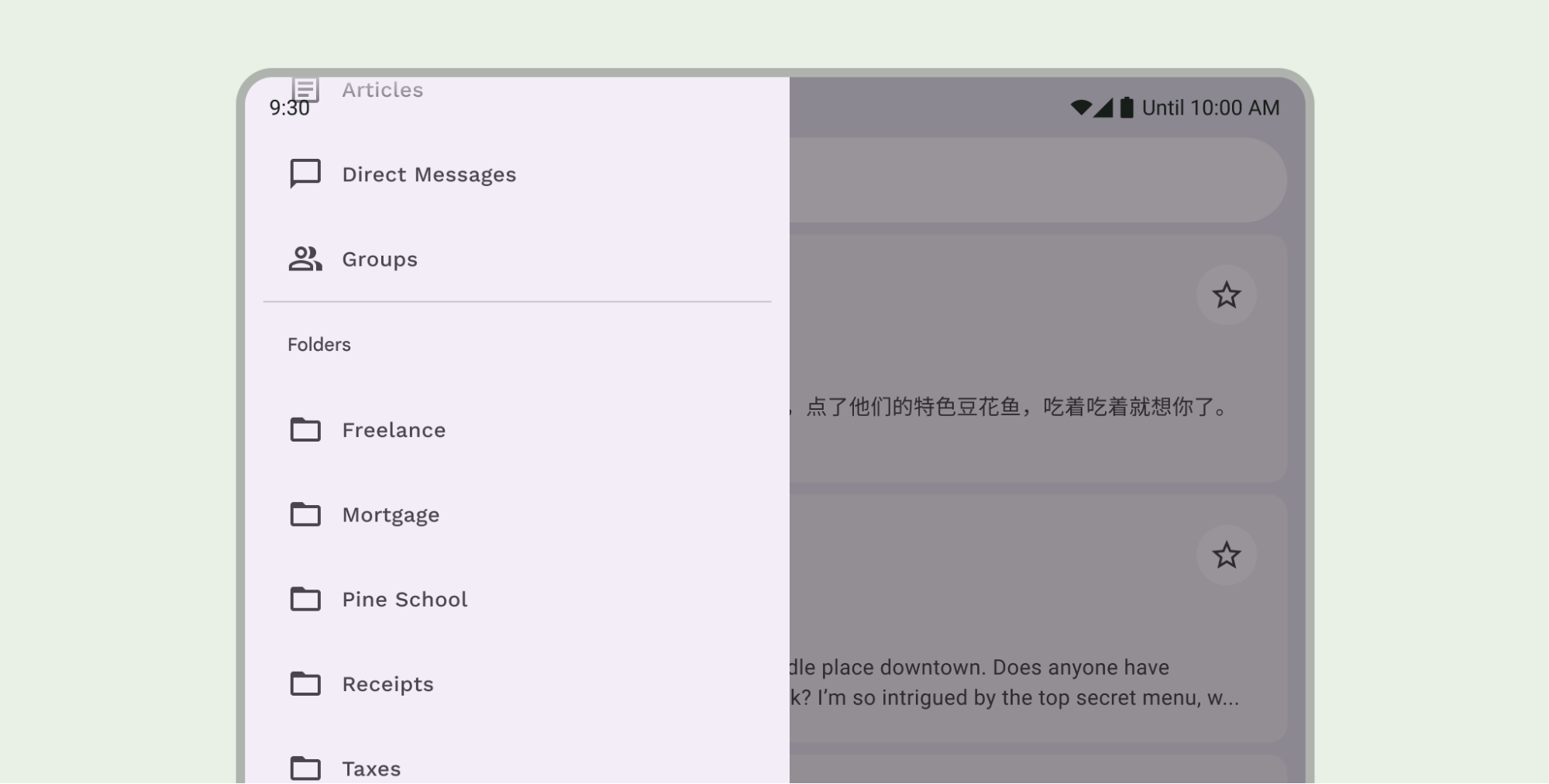
導覽列注意事項
如需基本導覽列設計指南,請參閱「Android 系統資訊列」。下一節將說明導覽列的其他注意事項。
捲動內容
捲動時,底部應用程式列應會收合。
正確做法
正確做法
螢幕凹口
螢幕凹口可能會影響 UI 外觀。應用程式必須處理螢幕凹口插邊,以免重要 UI 部分繪製在螢幕凹口下方。
正確做法
錯誤做法
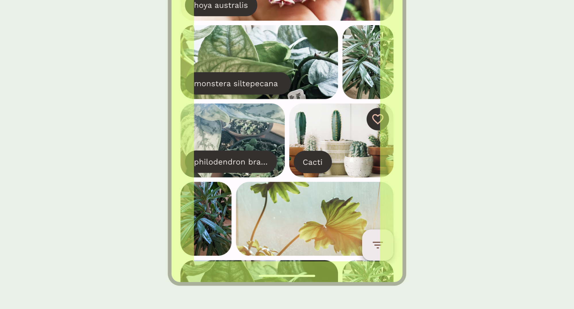
不過,實心應用程式列背景應繪製到螢幕凹口,如下圖所示。
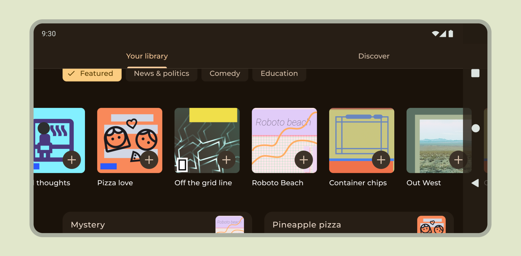
確認水平輪播內容會繪製到螢幕凹口位置。
請參閱這篇文章,瞭解如何在 Compose 和 View 中支援螢幕凹口。
其他指南
一般來說,背景和分隔線也應繪製至邊緣,而文字和按鈕等內容則應內嵌,避免與系統 UI 和硬體元素重疊。