

狀態列、說明文字列和導覽列都是系統資訊列。可顯示電量、時間和通知快訊等重要資訊,並提供隨時隨地直接與裝置互動的功能。
無論是設計版面配置、輸入法或其他裝置功能,請務必考量系統資訊列的顯示位置和顯眼程度。
重點整理
在不同螢幕大小和板型規格的版面配置中加入系統資訊列。考量 UI 安全區域、系統互動、輸入法、螢幕凹口、狀態列、說明文字列、導覽列和其他裝置功能。
將系統狀態列和導覽列設為透明或半透明,並在這些資訊列後方繪製內容,即可實現無邊框設計。
使用
WindowInsets正確處理系統資訊列入侵問題,確保內容不會在自適應版面配置中遭到遮蔽。使用標準版面配置,有效運用螢幕空間。
狀態列
狀態列會顯示通知圖示和系統圖示。使用者與狀態列互動,方法是將狀態列向下拉,開啟通知導覽匣。狀態列樣式可以是透明或半透明。
狀態列圖示
狀態列圖示的外觀可能會因背景資訊、時段、使用者設定的偏好設定或主題,以及其他參數而有所差異。詳情請參閱「系統列圖示」。
收到通知時,狀態列通常會顯示圖示。這會向使用者發出信號,表示通知導覽匣中有內容可查看。可以是應用程式圖示或代表頻道的符號。請參閱「通知設計」。
設定狀態列樣式
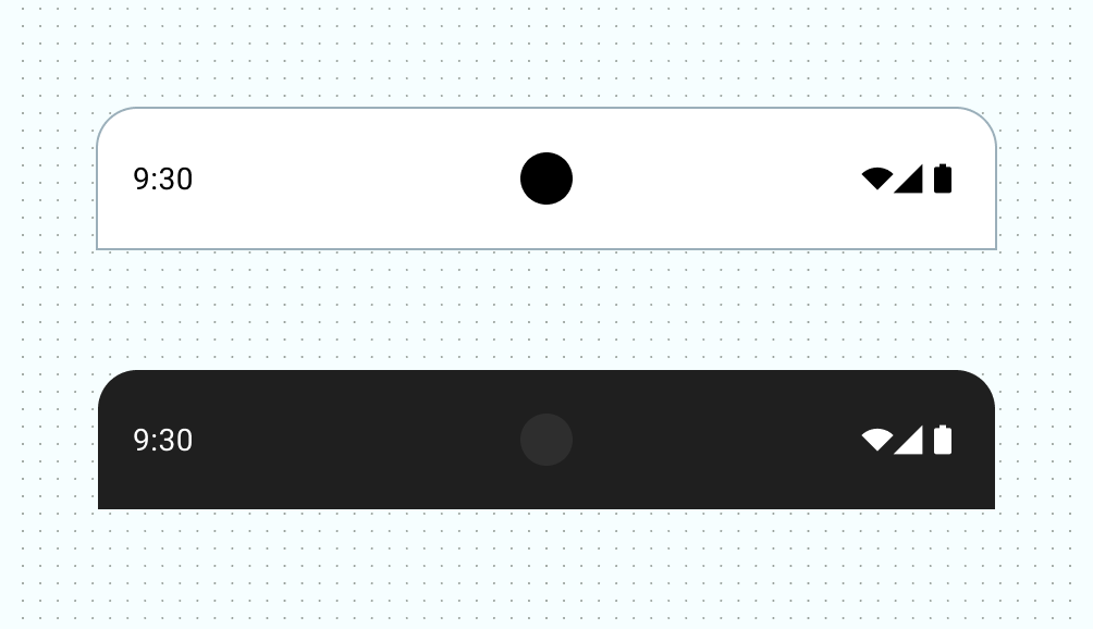
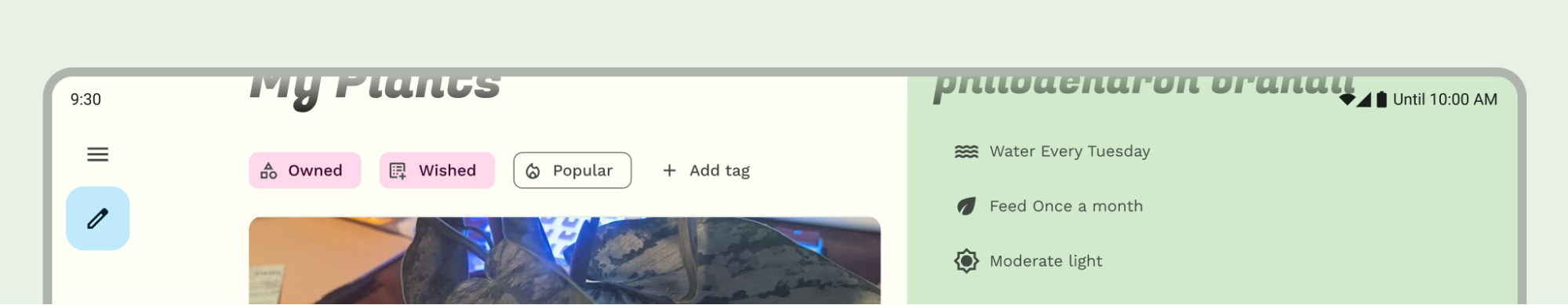
將狀態列設為透明或半透明,確保應用程式內容涵蓋整個畫面。接著設定系統資訊列圖示的樣式,確保圖示具有適當對比。
Android 15 會強制採用無邊框設計,預設將狀態列設為透明。如要回溯相容,請呼叫 enableEdgeToEdge()。
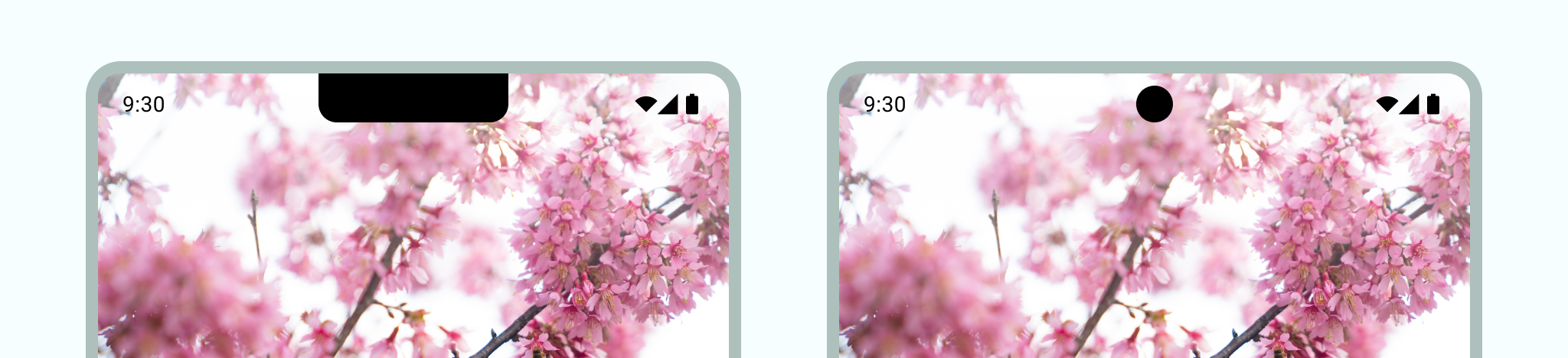
在下圖左側,狀態列呈現透明狀態,且 TopAppBar 的綠色背景會繪製在狀態列後方。
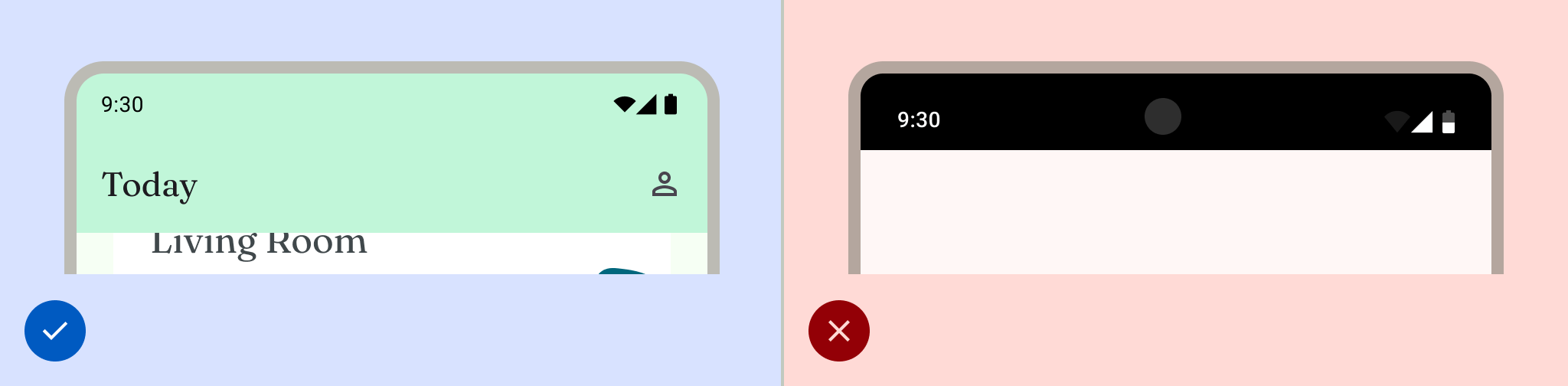
如果 UI 不會顯示在狀態列下方,或是圖片會繪製在狀態列下方,透明狀態列就是理想選擇。如果 UI 會在狀態列下方捲動,半透明狀態列就是理想選擇。如要進一步瞭解漸層保護措施,請參閱「無邊框設計」一文。
導覽
Android 允許使用者透過返回、主畫面和總覽控制項控制導覽:
- 「返回」會返回上一個檢視畫面。
- 系統會將 Home 移出應用程式,並轉移至裝置的主畫面。
- 「總覽」會顯示使用中的應用程式,以及最近未關閉的應用程式。
使用者可以選擇各種操作設定,包括手勢操作和自動調整操作。為提供最佳使用者體驗,請考量多種導覽類型。
手勢操作
手勢操作模式不會使用「返回」、「主畫面」和「總覽」按鈕,而是顯示單一的手勢控點。使用者可從螢幕左側或右側邊緣滑動來返回,從底部向上滑動則可返回主畫面。向上滑動並按住可開啟總覽。
手勢操作導覽是更具擴充性的導覽模式,適用於設計行動裝置和大螢幕。為提供最佳使用者體驗,請考量手勢操作模式,並採取下列做法:
- 支援無邊框內容。
- 請避免在手勢操作導覽插邊下方新增互動或觸控目標。
詳情請參閱「新增對手勢操作模式的支援」。
自動調整式導覽
Android 上另一個常見的導覽模式是根據螢幕的視窗大小類別,在導覽邊欄和導覽列之間切換。Jetpack Compose 中的自動調整導覽元件可處理多種板型規格,同時避免系統資訊列干擾導覽元件的版面配置。
在自動調整式版面配置中,請考量系統資訊列在各種情境下的行為或樣式可能有所不同,例如緊湊或展開的視窗大小,或是不同的折疊式裝置型態。
詳情請參閱「建構自動調整式導覽」。
導覽圖示
導覽圖示的外觀也可能因使用者設定的偏好選項或主題而異。詳情請參閱「系統列圖示」。
設定導覽樣式
Android 會在手勢操作模式和按鈕模式中,處理使用者介面的視覺保護措施。系統會套用動態色彩調整功能,根據系統資訊列後方的內容變更顏色。
手勢操作模式
指定 Android 15 或在 Activity 上呼叫 enableEdgeToEdge 後,系統會繪製透明的手勢操作導覽列,並套用動態色彩調整功能。在下列範例中,如果控點位於淺色內容上方,導覽列中的控點會變更為深色,反之亦然。
建議一律使用透明的手勢操作列。
正確做法
錯誤做法
按鈕模式
指定 Android 15 或在 Activity 上呼叫 enableEdgeToEdge 後,系統會在按鈕導覽列後方套用半透明的遮罩,您可以將 Window.setNavigationBarContrastEnforced() 設為 false 來移除遮罩。
如果畫面底部有應用程式列或應用程式導覽列,或是 UI 不會捲動到三按鈕操作列下方,請使用透明的三按鈕操作列。如要取得透明導覽列,請將 Window.setNavigationBarContrastEnforced() 設為 false,並填補底部應用程式列,在系統導覽列下方繪製,如圖 7、8 和 9 所示。詳情請參閱「系統資訊列保護措施」。
使用半透明的三按鈕導覽列捲動內容。如要進一步瞭解半透明導覽列的注意事項,請參閱「無邊框設計」。
鍵盤與導覽
每種導覽類型都會適當回應螢幕小鍵盤,讓使用者執行動作,例如關閉或變更鍵盤類型。如要確保順暢轉換,讓應用程式的轉換作業與鍵盤從螢幕底部向上和向下滑動的動作同步,請使用 WindowInsetsAnimationCompat。
版面配置
自動調整式版面配置可充分運用可用的顯示空間。這類窗格會將內容移至次要或第三層窗格,藉此整理應用程式 UI。
設計自適應版面配置時,請考量系統資訊列與內容的互動方式。使用 WindowInsets 確保 UI 不會遭到系統資訊列遮蔽,例如大螢幕、折疊式裝置,以及多視窗和電腦分割視窗模式下的應用程式視窗。
應用程式以無邊框模式顯示時,請確認內容和控制項不會遭到系統 UI 遮蔽。舉例來說,如果導覽列遮蓋了按鈕,使用者可能就無法點選該按鈕。
詳情請參閱「標準版面配置」。
螢幕凹口
螢幕凹口是某些裝置上延伸至螢幕表面的區域,可為前置感應器提供空間。螢幕凹口可能因製造商而異。請考量螢幕凹口與內容、方向和無邊框的互動方式。
沉浸模式
需要全螢幕體驗時,您可以隱藏系統資訊列,例如使用者觀看電影時。使用者仍應能輕觸螢幕來顯示系統資訊列,並瀏覽或操作系統控制項。詳情請參閱「沉浸式內容」和「在沉浸模式下隱藏系統資訊列」。