לפי דוח משנת 2011 של ארגון הבריאות העולמי (WHO) והבנק העולמי, כ-15% מהאוכלוסייה העולמית – כלומר, בערך אחד מכל שישה אנשים – חווים מוגבלות משמעותית או זמנית במהלך חייהם. לכן, נגישות בתהליך העיצוב היא חיונית ליצירת אפליקציה איכותית, שימושית ומכילה – היא מובילה לתוצאות הטובות ביותר עבור המשתמשים ויכולה למנוע עבודה חוזרת יקרה. מערכת Android כוללת מגוון תכונות שיעזרו לכם לבנות את האפליקציה כך שתתמוך באפשרויות נגישות כברירת מחדל.
עיצוב לאנשים עם לקויות ראייה
כדי לוודא שהתוכן באפליקציה קריא ככל האפשר, צריך לבדוק את הניגודיות בין הצבעים ואת גודל הטקסט, ולוודא שהרכיבים ברורים מבחינה ויזואלית וקל להבחין ביניהם.
כדי לעצב אתרים שנגישים לאנשים עם לקויות ראייה, חשוב לפעול לפי ההנחיות הבאות.
- כדי לאפשר למשתמשים לשנות את גודל הגופן, מציינים את גודל הגופן בפיקסלים שניתן לשנות (sp)
- לא מומלץ להקטין את גודל הגופן של הטקסט בגוף ההודעה מתחת ל-12sp. ההנחיה הזו תואמת לסקאלת הגופנים של Material כברירת מחדל.
- צריך לוודא שהניגודיות בין הרקע לטקסט היא לפחות 4.5:1. איך בודקים את ניגודיות הצבעים
- יחס של 3:1 בין משטחים לרכיבים שאינם טקסט. לדוגמה, היחס בין הרקע לסמל יהיה 3:1.
- כדאי להשתמש ביותר מאמצעי ויזואלי אחד כדי להמחיש פעולות כמו קישורים.
משתמשים במערכת הצבעים הנגישה של Material . מערכת הצבעים הזו מבוססת על לוחות צבעים טונאליים, והיא חיונית ליצירת ערכות צבעים נגישות כברירת מחדל.

עיצוב לסאונד
TalkBack הוא קורא המסך של Google שכלול במכשירי Android ומאפשר למשתמשים לשלוט במכשיר בלי להסתכל על המסך. אפשר לבדוק את זה באופן ידני על ידי בדיקת האפליקציה באמצעות TalkBack או באמצעות סורק הנגישות.
כדי לוודא שהאפליקציה מוכנה לקוראי מסך, צריך לפעול לפי ההנחיות הבאות:
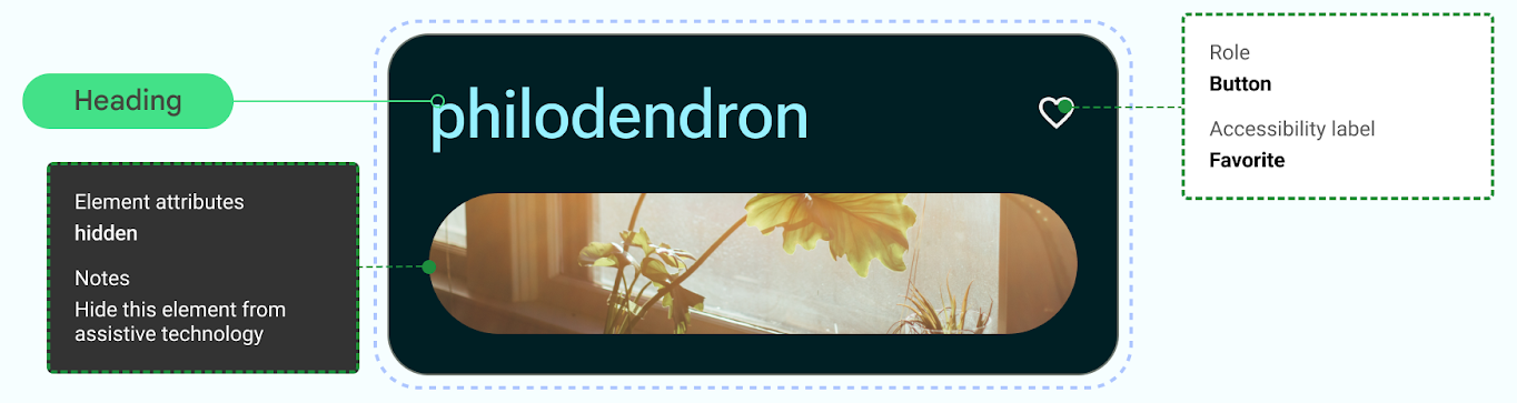
- מתארים רכיבים בממשק המשתמש בקוד. התכונה 'יצירה' משתמשת במאפייני סמנטיקה כדי לספק לשירותי נגישות מידע על מה שמוצג ברכיבי ממשק המשתמש.
- כדי לעמוד בדרישות של מסגרת Android, צריך לספק תיאור טקסטואלי נוסף של הסמלים והתמונות.
- הגדרת תיאורי פריטים דקורטיביים כ-null.
- כדי לאפשר דילוג בין בלוקים של פעולות ותוכן, כדאי לשקול את רמת הפירוט של ממשק המשתמש ולקבץ רכיבי ממשק משתמש.
מומלץ לעיין במאמר Design to Implementation Walk של Material, שכולל הסברים על שיקולי נגישות וסימון באמצעות Web Content Accessibility Guidelines (WCAG).
עיצוב לאודיו
ב-Android יש תכונות שמאפשרות למשתמשים לבצע פעולות במכשירים שלהם באמצעות מגוון של פקודות קוליות ושאילתות.
אפליקציית Voice Access ל-Android מאפשרת לשלוט במכשיר באמצעות פקודות קוליות. בעזרת הקול אפשר לפתוח אפליקציות, לנווט ולערוך טקסט ללא מגע.
עיצוב לשיפור מיומנויות מוטוריות
גישה באמצעות מתג מאפשרת למשתמשים לבצע פעולות במכשיר Android באמצעות מכשיר אחד או יותר. התכונה הזו יכולה לעזור למשתמשים עם מוגבלויות מוטוריות שמתקשים לבצע פעולות ישירות במסך מגע.
בודקים ידנית על ידי התנסות בגישה באמצעות מתג.
- אל תסתמכו על מחוות כדי להשלים את כל הפעולות. צריך ליצור פעולות נגישות כדי לתמוך בכל תהליכי המשתמש באפליקציה.
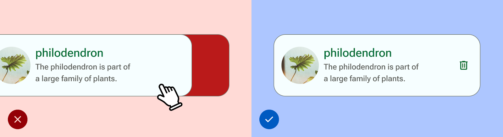
- מוודאים שכל משטחי המגע הם לפחות 48dp, גם אם זה חורג מהאלמנט החזותי של ממשק המשתמש.
- כדאי להשתמש במשוב הפטי כדי לספק למשתמש קלט חושי נוסף בזמן אמת.