
แอปใน Wear OS ใช้เทคนิคเลย์เอาต์เดียวกันกับอุปกรณ์ Android อื่นๆ แต่ต้องออกแบบโดยคำนึงถึงข้อจำกัดเฉพาะของนาฬิกา
หมายเหตุ: อย่านำฟังก์ชันการทำงานและ UI จากแอปบนอุปกรณ์เคลื่อนที่มายัง Wear OS โดยตรงและคาดหวัง ว่าจะได้รับประสบการณ์ของผู้ใช้ที่ดี
หากคุณออกแบบแอปสำหรับอุปกรณ์พกพารูปสี่เหลี่ยมผืนผ้า เนื้อหาที่อยู่ใกล้มุมของหน้าจอ อาจถูกครอบบนนาฬิกาทรงกลม หากคุณใช้รายการแนวตั้งที่เลื่อนได้ ปัญหานี้จะลดลง เนื่องจากผู้ใช้สามารถเลื่อนเพื่อจัดเนื้อหาให้อยู่ตรงกลางได้ แต่สำหรับหน้าจอเดียว การทำเช่นนี้อาจ ส่งผลให้ผู้ใช้ได้รับประสบการณ์การใช้งานที่ไม่ดี
หากใช้การตั้งค่าต่อไปนี้สำหรับการออกแบบ ข้อความจะแสดงไม่ถูกต้องในอุปกรณ์ที่มีหน้าจอกลม
<androidx.constraintlayout.widget.ConstraintLayout
    xmlns:android="http://schemas.android.com/apk/res/android"
    xmlns:app="http://schemas.android.com/apk/res-auto"
    xmlns:tools="http://schemas.android.com/tools"
    android:layout_width="match_parent"
    android:layout_height="match_parent">

    <TextView
        android:id="@+id/text"
        android:layout_width="0dp"
        android:layout_height="0dp"
        android:text="@string/very_long_hello_world"
        app:layout_constraintBottom_toBottomOf="parent"
        app:layout_constraintEnd_toEndOf="parent"
        app:layout_constraintStart_toStartOf="parent"
        app:layout_constraintTop_toTopOf="parent" />

</androidx.constraintlayout.widget.ConstraintLayout>
หากต้องการแก้ปัญหานี้ ให้ใช้เลย์เอาต์ใน ไลบรารี UI ของ Wear OS ที่รองรับอุปกรณ์ทรงกลม
- คุณใช้
BoxInsetLayoutเพื่อป้องกันไม่ให้มุมมองถูกครอบตัดใกล้ขอบของหน้าจอทรงกลมได้ - คุณสามารถใช้
WearableRecyclerViewเพื่อสร้างเลย์เอาต์โค้งเมื่อต้องการแสดงและจัดการ รายการแนวตั้งที่ปรับให้เหมาะกับหน้าจอทรงกลม
ดูข้อมูลเพิ่มเติมเกี่ยวกับการออกแบบแอปได้ที่ หลักเกณฑ์การออกแบบ Wear OS
ใช้ BoxInsetLayout
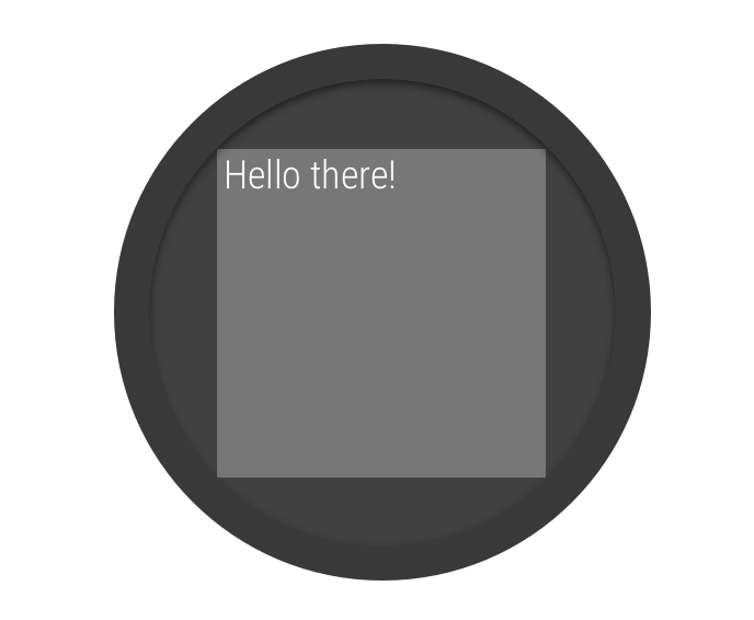
รูปที่ 2 ขอบหน้าต่างบนหน้าจอกลม
คลาส
BoxInsetLayout ในไลบรารี UI ของ Wear OS ช่วยให้
คุณกำหนดเลย์เอาต์ที่ใช้ได้กับหน้าจอทรงกลม คลาสนี้ช่วยให้คุณ
จัดแนววิวที่กึ่งกลางหรือใกล้ขอบหน้าจอได้อย่างง่ายดาย
สี่เหลี่ยมสีเทาในรูปที่ 2 แสดงพื้นที่ที่ BoxInsetLayout
สามารถวางมุมมองย่อยบนหน้าจอทรงกลมโดยอัตโนมัติหลังจากใช้
การแทรกในหน้าต่างที่จำเป็น หากต้องการให้แสดงภายในพื้นที่นี้ มุมมองย่อย
จะระบุแอตทริบิวต์ layout_boxedEdges ด้วยค่าต่อไปนี้
- รวมถึง
top,bottom,leftและrightเช่น ค่า"left|top"จะจัดตำแหน่งขอบด้านซ้ายและด้านบนขององค์ประกอบย่อย ไว้ภายในสี่เหลี่ยมสีเทาในรูปที่ 2 - ค่า
"all"จะจัดตำแหน่งเนื้อหาทั้งหมดของบุตรหลานภายใน สี่เหลี่ยมสีเทาในรูปที่ 2 นี่เป็นแนวทางที่พบบ่อยที่สุดเมื่อมีConstraintLayoutอยู่ภายใน
เลย์เอาต์ที่แสดงในรูปที่ 2 ใช้<BoxInsetLayout>
และทำงานบนหน้าจอทรงกลม
<androidx.wear.widget.BoxInsetLayout
    xmlns:android="http://schemas.android.com/apk/res/android"
    xmlns:app="http://schemas.android.com/apk/res-auto"
    android:layout_height="match_parent"
    android:layout_width="match_parent"
    android:padding="15dp">

    <androidx.constraintlayout.widget.ConstraintLayout
        android:layout_width="match_parent"
        android:layout_height="match_parent"
        android:padding="5dp"
        app:layout_boxedEdges="all">

        <TextView
            android:layout_height="wrap_content"
            android:layout_width="match_parent"
            android:text="@string/sometext"
            android:textAlignment="center"
            app:layout_constraintEnd_toEndOf="parent"
            app:layout_constraintStart_toStartOf="parent"
            app:layout_constraintTop_toTopOf="parent" />

        <ImageButton
            android:background="@android:color/transparent"
            android:layout_height="50dp"
            android:layout_width="50dp"
            app:layout_constraintBottom_toBottomOf="parent"
            app:layout_constraintStart_toStartOf="parent"
            android:src="@drawable/cancel" />

        <ImageButton
            android:background="@android:color/transparent"
            android:layout_height="50dp"
            android:layout_width="50dp"
            app:layout_constraintBottom_toBottomOf="parent"
            app:layout_constraintEnd_toEndOf="parent"
            android:src="@drawable/ok" />

    </androidx.constraintlayout.widget.ConstraintLayout>

</androidx.wear.widget.BoxInsetLayout>
สังเกตส่วนของเลย์เอาต์ที่ทำเครื่องหมายเป็นตัวหนาดังนี้
-
android:padding="15dp"บรรทัดนี้กำหนดระยะห่างภายในให้กับองค์ประกอบ
<BoxInsetLayout> -
android:padding="5dp"บรรทัดนี้กำหนดระยะห่างจากขอบให้กับองค์ประกอบ
ConstraintLayoutด้านใน -
app:layout_boxedEdges="all"บรรทัดนี้ช่วยให้มั่นใจได้ว่าองค์ประกอบ
ConstraintLayoutและองค์ประกอบย่อยจะอยู่ในกรอบภายในพื้นที่ที่กำหนดโดยระยะขอบหน้าต่าง บนหน้าจอทรงกลม
ใช้เลย์เอาต์โค้ง
WearableRecyclerView คลาสในไลบรารี UI ของ Wear OS
ช่วยให้คุณเลือกใช้เลย์เอาต์โค้งที่เพิ่มประสิทธิภาพสำหรับหน้าจอทรงกลมได้
หากต้องการเปิดใช้เลย์เอาต์โค้งสำหรับรายการที่เลื่อนได้ในแอป
โปรดดู
สร้างรายการใน Wear OS