Material 3 Expressive (M3) 的設計目的,是為了滿足使用者對現代化、相關性和獨特性的體驗需求。設計人員也可以透過 Expressive,在介面版面配置和呈現方式中反映特定情緒和感受。
色彩和字體排版
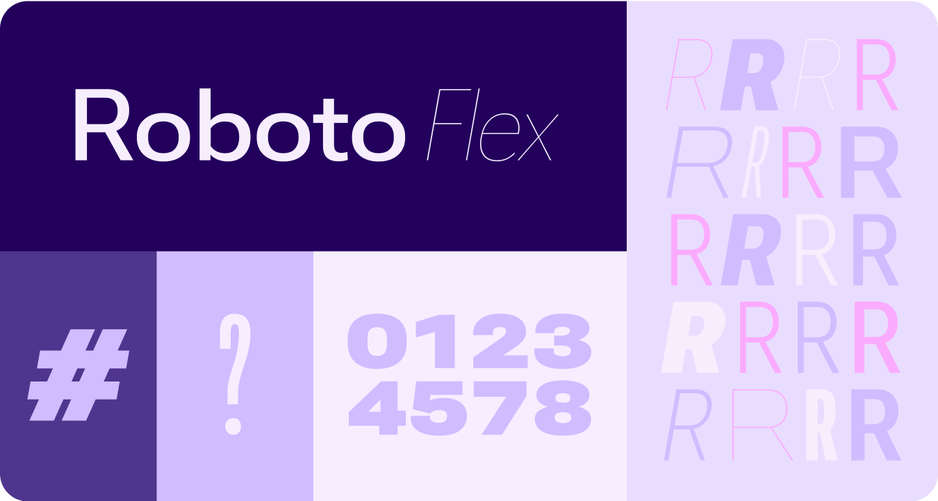
色彩系統正在擴充,採用 M3 更深層的色調調色盤和更廣泛的符記集,而更簡單的字體排版比例則是利用可變字型軸線,提供更多表情符號,讓互動更具表達力和樂趣。
色彩主題
新的符記可讓您在不同主題和整個設計系統的背景下,套用更多顏色。
變數字型
我們已更新變數字型及其可自訂軸的考量事項,除了用於第一方服務,也適用於第三方用途,例如 Roboto Flex,因為這類字型也具有類似的變數軸。
變數字型軸線動畫
使用可變字型軸線傳達生動的動作回饋,讓互動更生動有趣。
用途範例:
- 動態調整字型粗細
- 動態調整字型寬度
- 動態調整字型粗細和寬度
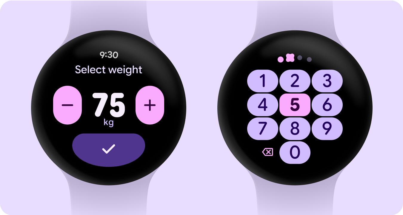
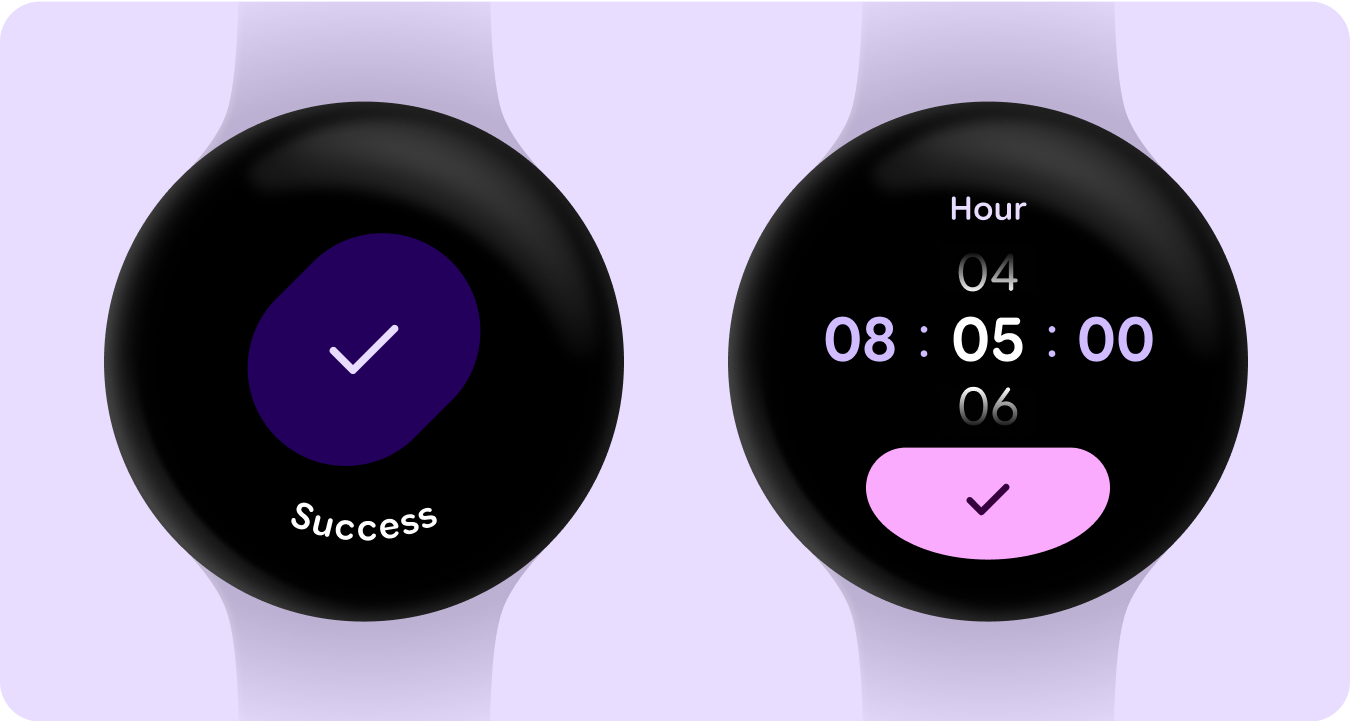
類型角色
除了更新並最佳化類型等級,我們也推出了新的類型角色,專門提供 Wear 的顯著模式。
這些新的類型角色可支援多種用途,包括用於介面標題的 Arc Text、含有即時空間的主動式內容,以及專門用於數字的類型角色,可讓文字串的文字大小更大且更具樣式,但不必經過本地化。
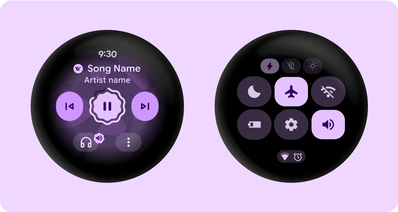
形狀和動作
我們也以更廣泛且有意義的方式,運用彈性容器形狀來套用圓角半徑的圓角和銳利度,以支援形狀變形清單和按鈕狀態。我們推出了邊緣貼合按鈕,這是 Wear 圓形裝置專屬的全新經典設計模式。
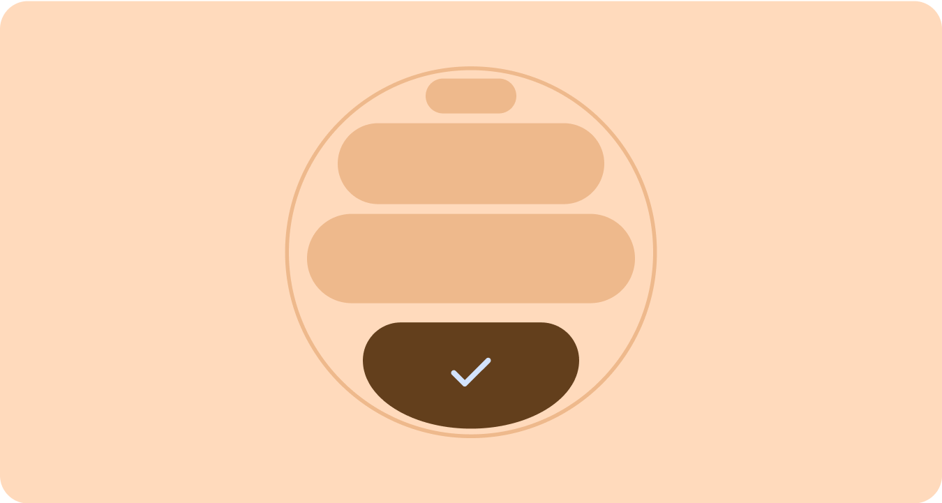
邊緣緊貼容器
推出形狀容器,可支援圓形,並盡量擴大圓形板型規格內的空間。
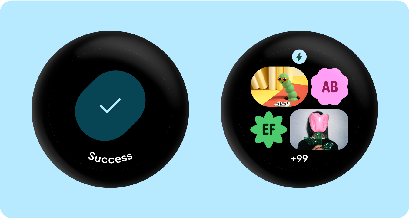
已套用形狀
使用圓角半徑和獨特形狀做為容器,採用生動設計,擴展至令人驚豔的載入動畫、有趣的版面配置、形狀變形按鈕和自適應按鈕群組。
圓角半徑
使用 Material 3 邊框形狀,讓容器形狀之間具有多樣性、區別性和關係。
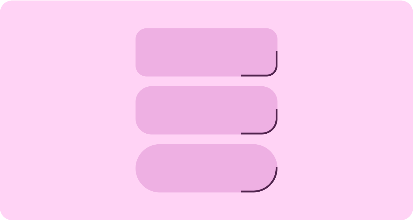
已分組的容器
元件容器會使用彈性版面配置技術,動態調整可用空間。他們可以將這個空間平均分配,以達到對稱效果,也可以策略性地安排元素,建立視覺階層、強調重要內容,並透過生動且以動態為主的視覺提示引導使用者互動。