تنظيم صفحاتك في مجموعات
يمكنك حفظ المحتوى وتصنيفه حسب إعداداتك المفضّلة.
نظرًا لأن شاشات التلفزيون يتم عرضها عادةً من مسافة بعيدة، فإن الواجهات التي تستخدم أسلوب الخط الأكبر تكون أكثر وضوحًا وراحة للمستخدمين. يتضمن مقياس النوع الافتراضي
لـ TV Design أنماط كتابة متباينة ومرنة
لدعم مجموعة واسعة من حالات الاستخدام.
أهمّ الميزات
أعط الأولوية لاستخدام أسلوب الخط الأكبر للحصول على تجربة مشاهدة
أكثر راحة على شاشات التلفزيون.
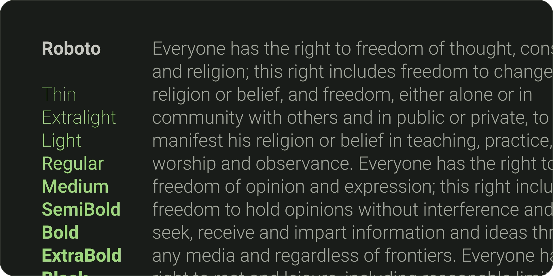
الخط التلقائي لـ Android TV هو Roboto.
اختر خطوطًا مميّزة وسهلة القراءة لتعكس نمط علامتك التجارية على أفضل وجه.
تأكد من أن الخطوط سهلة القراءة بنظرة سريعة، مع العرض المناسب والتحجيم البصري.
قم بإقران الخطوط المجانية؛ على سبيل المثال، استخدم sans-serif للنص الأساسي والتسميات.
زيادة الوضوح من خلال تجنُّب الخطوط الزخرفية
خطوط
الخطوط الطباعية التلقائية
يتميّز Android TV بالخط الطباعي الخاص به، وهو Roboto، الذي تم تحسينه
من أجل الوضوح والوضوح. يمكنك استخدام Roboto للحصول على عنصر واجهة مستخدم عملي لا يحمل علامة تجارية، ويتم عرضه على أفضل وجه من خلال تجربة النظام الأساسي الأصلية.
الخطوط الطباعية المختلفة
عند الاقتضاء، استخدم خطًا مميزًا يعكس نمط علامتك التجارية.
فيما يلي الأشياء الرئيسية التي يجب التفكير فيها عند اختيار خط:
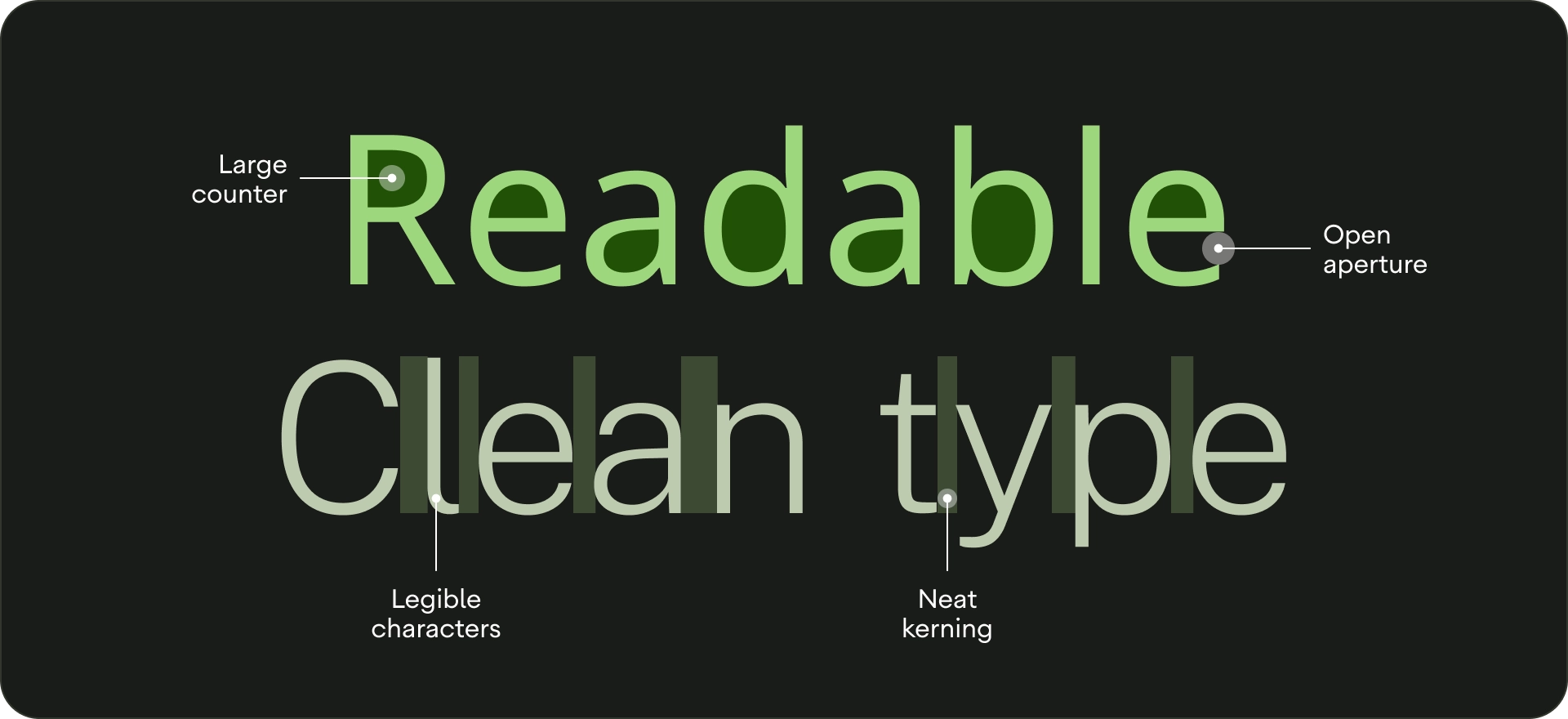
الوضوح - لتحسين مقروئية النص عن بُعد، استخدِم الخطوط الطباعية ذات العدّادات الكبيرة
والتحجيم البصري البسيط. التأكد من تمييز الحروف عن بعضها البعض.
سهولة القراءة بنظرة سريعة:
يجب أن يكون عرض الخط على أي نص على التلفزيون واضحًا، إذ لا يمكن التعرّف على الخطوط الأكثر سمكًا على الفور.
إقران خطوط تكميلية - إذا أردت استخدام خطوط متعددة، استخدِم الخط الطباعي San-serif للنص الأساسي والتصنيفات.
إذا أمكن، تجنَّب الخطوط الزخرفية. في حين أن أحجام الخطوط على التلفزيون أكبر من أحجام الشاشات
الأخرى، فإن سهولة قراءة نص واجهة المستخدم هي الأولوية.
تجنَّب الخطوط التي لا يمكن أن تعمل كنص أساسي.
كتابة المقياس
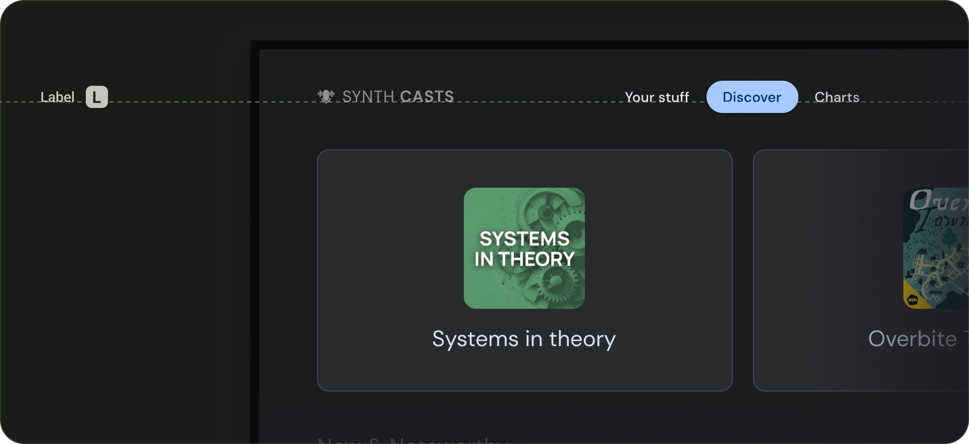
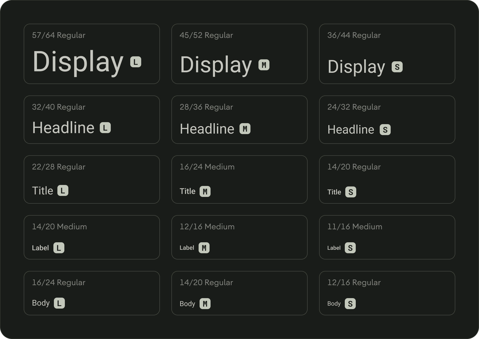
مقياس الكتابة هو مجموعة من أنماط الخطوط التي يمكن استخدامها في أي تطبيق.
يضمن ذلك نمطًا مرنًا ومتسقًا في الوقت نفسه يلبّي مجموعة من الأغراض. مقياس نوع تصميم التلفزيون عبارة عن مزيج من 15 نمطًا،
لكل منها تطبيق ومعنى مقصود. يتم تعيينها بناءً على الاستخدام، مثل "الشبكة الإعلانية" أو "العنوان"، ويتم تجميعها في فئات على أساس الحجم (كبير أو صغير). يستخدم مقياس الكتابة الافتراضي في TV Design Roboto لجميع
العناوين والتسميات والنص الأساسي لإنشاء تجربة طباعة موحدة.
للتعرف على الرموز المميزة لأسلوب الخط وتخصيص الخطوط،
انتقل إلى Material Design 3.
أدوار النوع
الشاشة
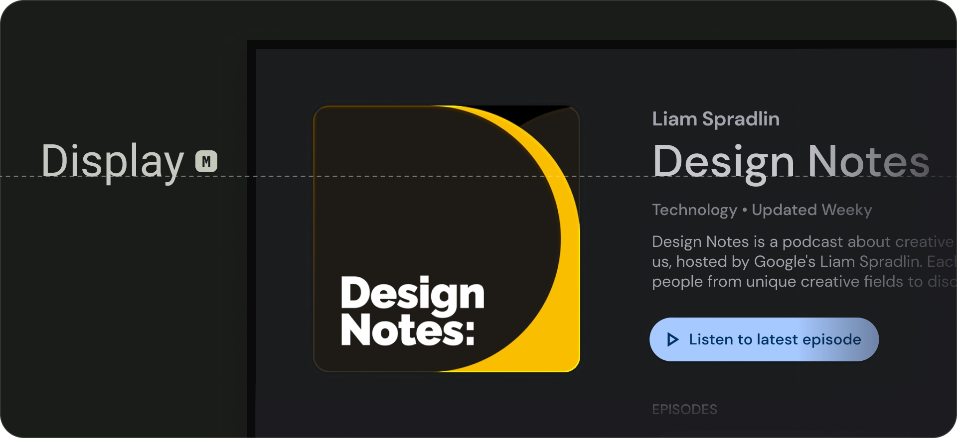
تتوفر ثلاثة أنماط للعرض في مقياس النوع الافتراضي: كبير ومتوسط وصغير. بصفتها أكبر نص على الشاشة، يتم حجز أنماط
العرض الكبيرة للمقاطع النصية القصيرة والمهمة أو الأرقام. يمكن استخدامها
للعنوان الرئيسي للشاشة. لا تستخدم أنماط عرض كبيرة
لعناوين الأقسام أو المجموعات.
Headline
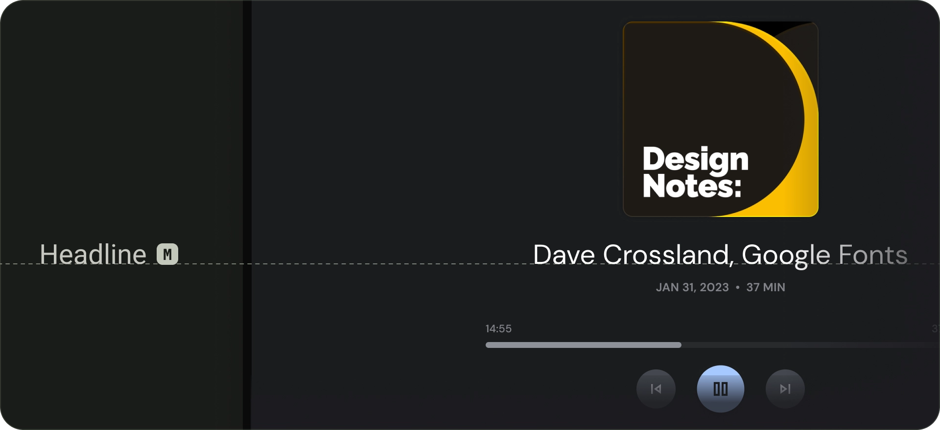
العناوين هي الأنسب للنصوص القصيرة عالية التوكيد.
يمكن أن تكون هذه الأنماط جيدة لتمييز الفقرات الأساسية من النص أو
مناطق المحتوى المهمة. تُستخدم للعناوين في العروض الدوارة
المميزة والمجموعات الشاملة. يمكن للعناوين الرئيسية أيضًا الاستفادة من
الخطوط الطباعية المعبّرة، وتوفير ارتفاع السطر المناسب وتباعد الأحرف
في الحفاظ على سهولة القراءة.
العنوان
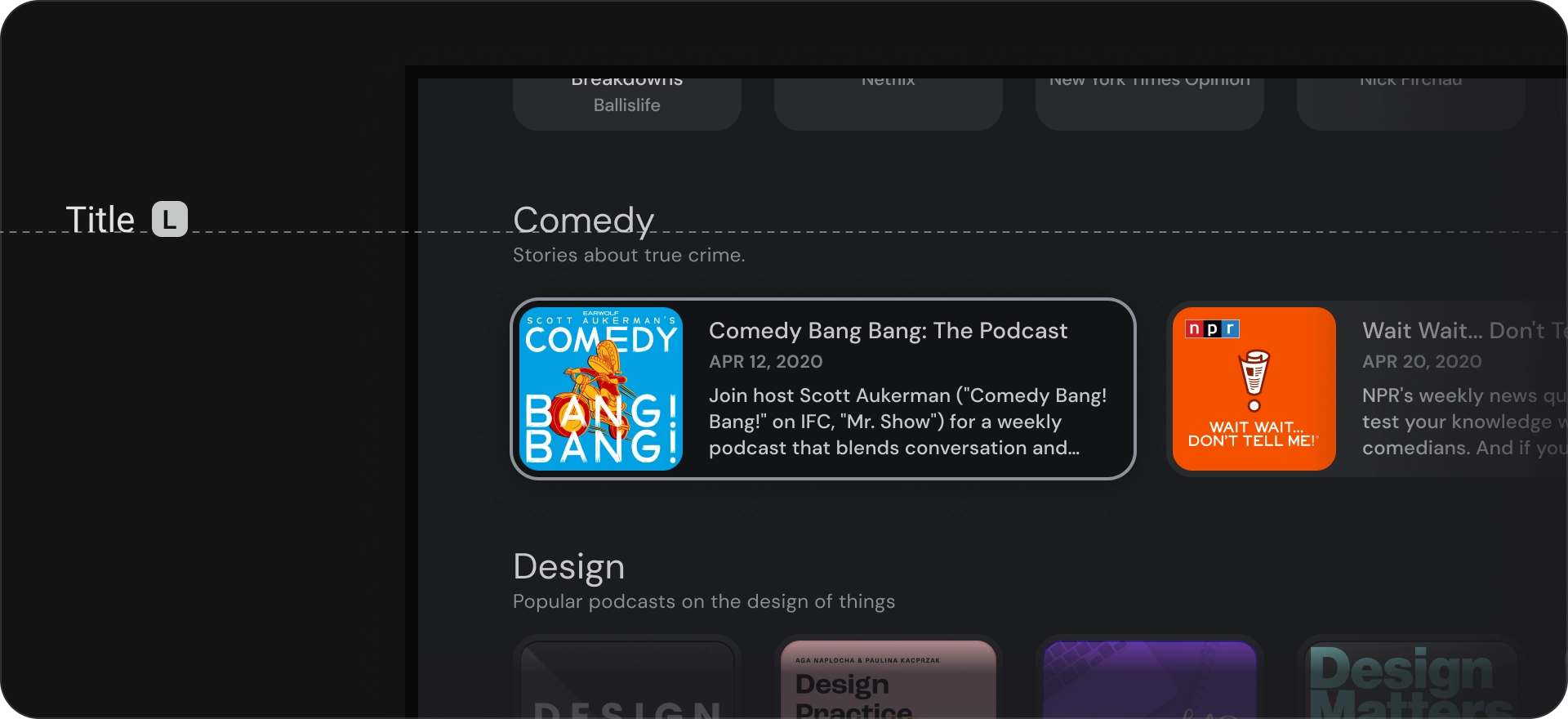
أنماط العناوين أصغر من أنماط العناوين. استخدم العناوين لنص موجز
متوسط التوكيد. على سبيل المثال، ضع في اعتبارك استخدام العناوين لتقسيم فقرات
ثانوية من النص أو مناطق ثانوية من المحتوى.
استخدِم العناوين لعناصر واجهة المستخدم مثل البطاقات أو القوائم. تكون أحجام العناوين مضغوطة مع توفير مستوى مفيد من البروز والوضوح.
الهيكل
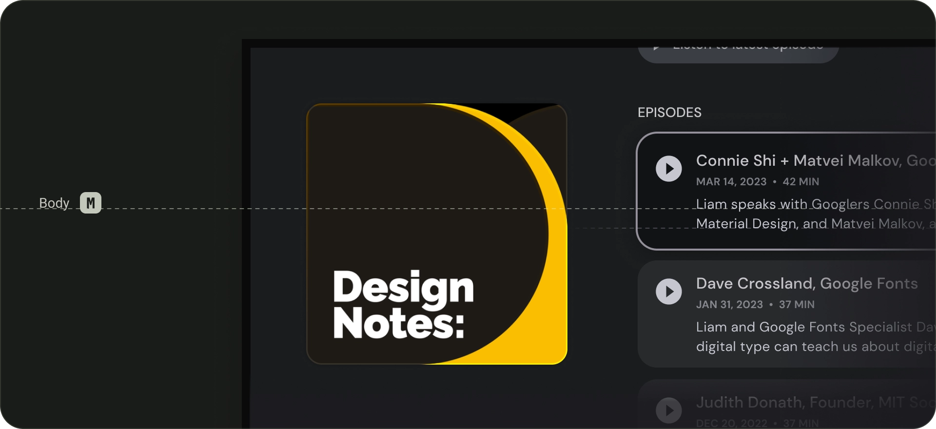
تُستخدم أنماط النص الأساسي للمقاطع النصية الأطول في تطبيقك. استخدم الخطوط الطباعية
التي يمكن قراءتها بأحجام أصغر والتي يمكن قراءتها بوضوح في الفقرات الطويلة. تجنب الخطوط الزخرفية للنص الأساسي نظرًا لأنه قد يكون من الصعب
قراءتها من مسافة بعيدة.
التصنيف
أنماط التصنيفات أصغر حجمًا وعملية، حيث تُستخدم لأشياء مثل النص
داخل المكونات أو للنص الصغير جدًا في نص المحتوى، مثل التسميات التوضيحية.
الأزرار، على سبيل المثال، تستخدم تصنيف "نمط كبير".
يخضع كل من المحتوى وعيّنات التعليمات البرمجية في هذه الصفحة للتراخيص الموضحّة في ترخيص استخدام المحتوى. إنّ Java وOpenJDK هما علامتان تجاريتان مسجَّلتان لشركة Oracle و/أو الشركات التابعة لها.
تاريخ التعديل الأخير: 2025-07-27 (حسب التوقيت العالمي المتفَّق عليه)
[[["يسهُل فهم المحتوى.","easyToUnderstand","thumb-up"],["ساعَدني المحتوى في حلّ مشكلتي.","solvedMyProblem","thumb-up"],["غير ذلك","otherUp","thumb-up"]],[["لا يحتوي على المعلومات التي أحتاج إليها.","missingTheInformationINeed","thumb-down"],["الخطوات معقدة للغاية / كثيرة جدًا.","tooComplicatedTooManySteps","thumb-down"],["المحتوى قديم.","outOfDate","thumb-down"],["ثمة مشكلة في الترجمة.","translationIssue","thumb-down"],["مشكلة في العيّنات / التعليمات البرمجية","samplesCodeIssue","thumb-down"],["غير ذلك","otherDown","thumb-down"]],["تاريخ التعديل الأخير: 2025-07-27 (حسب التوقيت العالمي المتفَّق عليه)"],[],[],null,["# Typography\n\nAs television screens are typically viewed from a distance, interfaces that use\nlarger typography are more legible and comfortable for users. TV Design's\ndefault type scale includes contrasting and flexible type styles to\nsupport a wide range of use cases.\n\nHighlights\n----------\n\n- Prioritize using larger typography for a more comfortable viewing experience on TV screens.\n- The default Android TV typeface is Roboto.\n- Choose distinct, legible fonts which best reflect your brand style.\n- Ensure fonts are readable at a glance, with appropriate width and optical sizing.\n- Pair complimentary fonts; for instance, use sans-serif for body text and labels.\n- Maximize legibility by avoiding decorative fonts.\n\nFonts\n-----\n\n### Default typefaces\n\nAndroid TV has its own system typeface, Roboto, which is optimized for\nlegibility and clarity. Use Roboto for a utilitarian, non-branded UI\nelement that's best served using the native platform experience.\n\n### Distinct typefaces\n\nWhere relevant, use a distinctive font that reflects your brand style.\nHere are the main things to think about when choosing a font:\n\n- [Legibility](https://fonts.google.com/knowledge/glossary/legibility) - For better readability from a distance, use typefaces with large counters and apt optical sizing. Ensure letters are distinguishable from one other.\n- [Readable at a glance](https://www.nngroup.com/articles/glanceable-fonts/)- Any text on TV needs to have a legible font width, as thinner lines are not instantly recognisable.\n- [Pair complimentary fonts](https://fonts.google.com/knowledge/choosing_type/pairing_typefaces) - If you want to use multiple fonts, use a sans-serif typeface for body text and labels.\n\n| **Note:** More personable fonts are best suited to bigger size text.\n\n- If you can, avoid [decorative fonts](https://fonts.google.com/?category=Handwriting). While the font sizes on TV are bigger than other display sizes, UI text legibility is the priority. Steer clear of fonts that can't function as body text.\n\n### Type scale\n\nA type scale is a selection of font styles that can be used across an app.\nIt ensures a flexible, yet consistent style that accommodates a range\nof purposes. The TV Design type scale is a combination of 15 styles,\neach with an intended application and meaning. They're assigned based\non use, such as \"display,\" or \"headline,\" and are grouped into\ncategories based on scale (large or small). TV Design's default\ntype scale uses Roboto for all titles, labels, and body text to\ncreate a unified typography experience.\n\nTo learn about typography tokens and typeface customization,\nvisit [Material Design 3](https://m3.material.io/styles/color/the-color-system/key-colors-tones).\n\nType roles\n----------\n\n### Display\n\nThere are three display styles in the default type scale: large, medium,\nand small. As the largest text on the screen, large display styles are\nreserved for short, important text passages, or numerals. They can be\nused for the main heading of the screen. Don't use large display\nstyles for section or cluster headings.\n| **Tip:** For display type, consider choosing a more expressive font. If available, set the appropriate optical size to your usage.\n\n### Headline\n\nHeadlines are best-suited for short, high-emphasis text.\nThese styles can be good for marking primary passages of text or\nimportant regions of content. They are used for headings in featured\ncarousels and immersive clusters. Headlines can also make use of\nexpressive typefaces, provided appropriate line height and letter spacing\nhelps maintain readability.\n\n### Title\n\nTitle styles are smaller than headline styles. Use titles for brief,\nmedium-emphasis text. For example, consider using titles to divide secondary\npassages of text or secondary regions of content.\n\nUse titles for UI elements like cards or lists. Title sizes are compact\nwhile providing a useful level of prominence and legibility.\n\n### Body\n\nBody styles are used for longer text passages in your app. Use typefaces\nthat are readable at smaller sizes and can be comfortably read in longer\npassages. Avoid decorative fonts for body text since these can be hard\nto read from far away.\n\n### Label\n\nLabel styles are smaller, utilitarian styles, used for things like the text\ninside components or for very small text in the content body, such as captions.\nButtons, for example, use the label large style."]]