由於電視螢幕通常從遠處觀看,因此使用較大的字體排版介面,能讓使用者更容易閱讀和使用。TV Design 的預設輸入比例包括對比度和彈性的輸入樣式,以支援各種用途。
重點特色
- 建議您優先使用較大的字體排版,在電視螢幕上提供更舒適的觀看體驗。
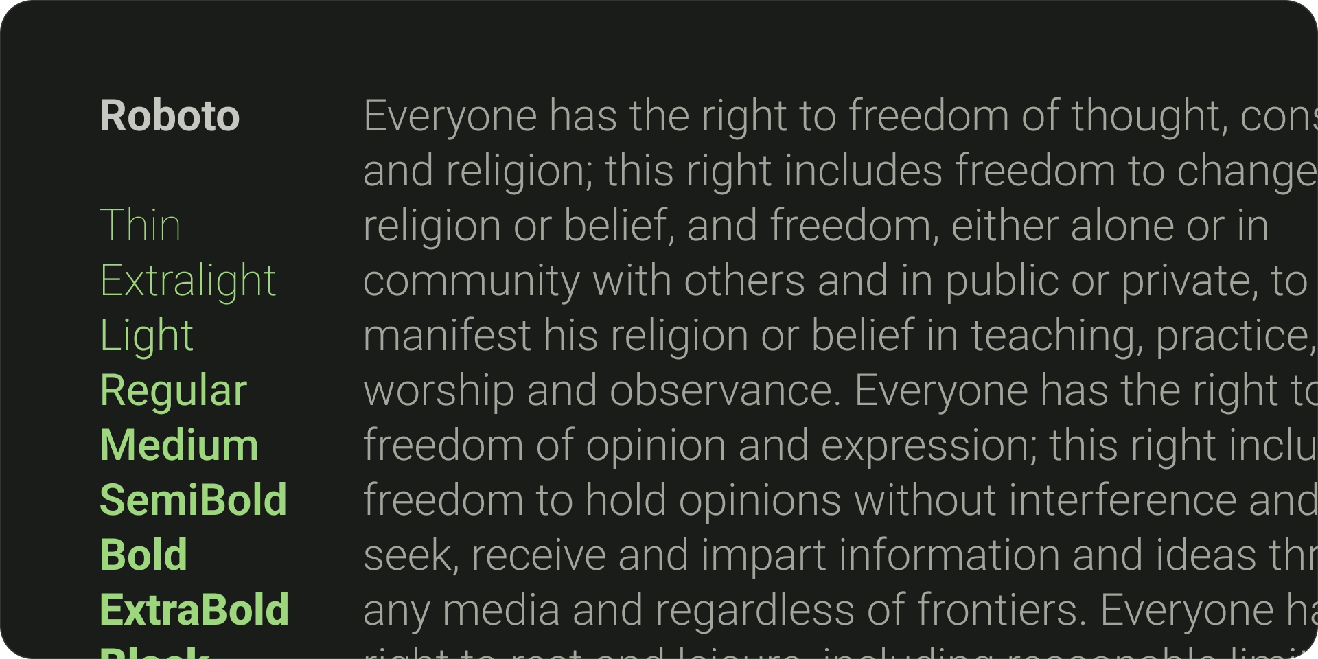
- 預設的 Android TV 字體為 Roboto。
- 選擇最能代表品牌風格且清楚易懂的字型。
- 確保字型一目瞭然,使用合適的寬度和光學大小調整字型。
- 配對免費字型;例如,使用 Sant Serif 做為內文和標籤。
- 避免使用裝飾字型,盡可能提高清晰易讀性。
字型
預設字體
Android TV 提供專屬的系統字體 Roboto,經過最佳化調整,相當清晰易讀。使用 Roboto 使用最適合使用原生平台體驗的實用非品牌 UI 元素。
不同的字體
在適用情況下,使用能反映品牌風格的獨特字型。選擇字型時,請考量以下重點:
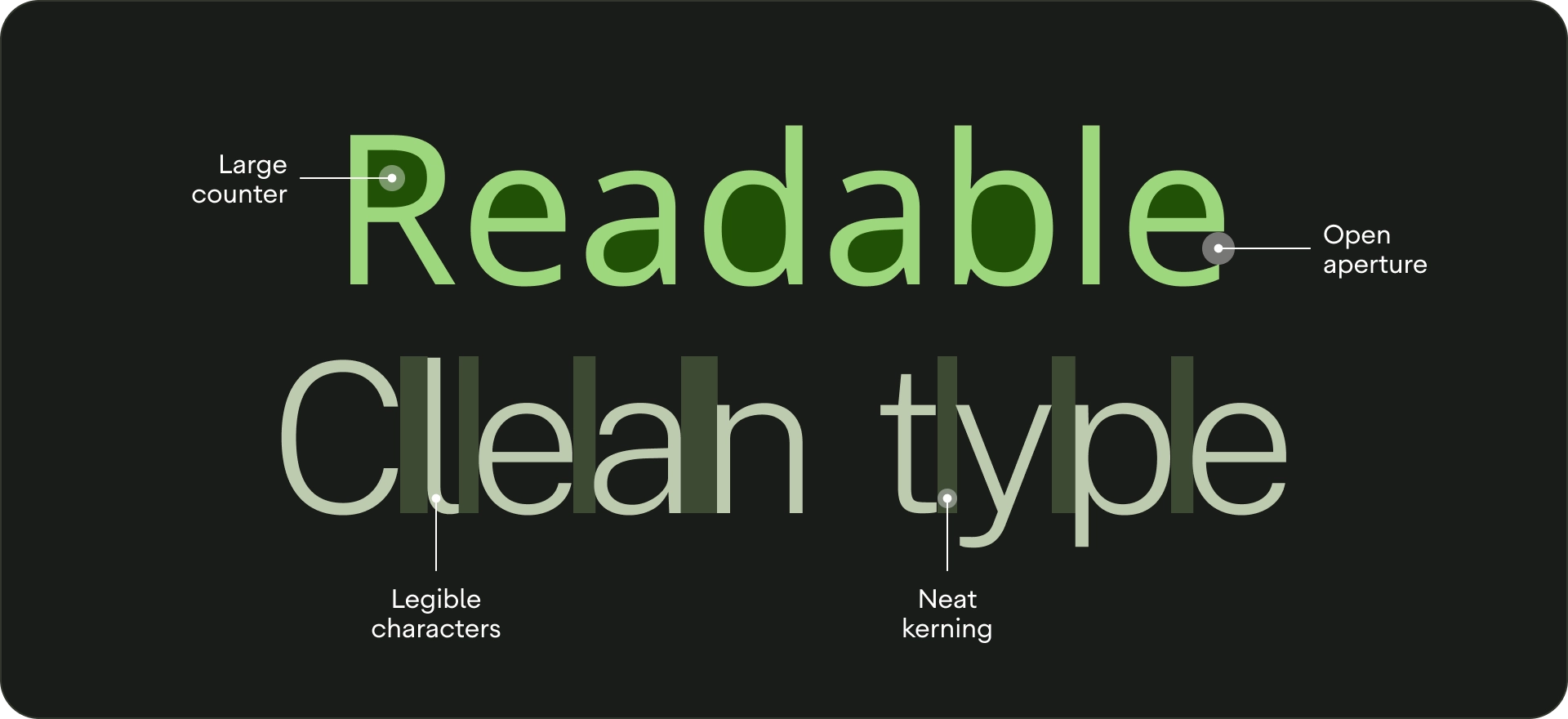
- 易讀性 - 為了從遠處更容易讀取,請使用設有大型計數器的字體,並調整光學大小。請確保字母可以彼此區別。
- 一目瞭然 - 電視上的任何文字都必須使用清晰易讀的字型寬度,因為較細的行無法立即辨識。
- 「Pair 免費字型」:如要使用多種字型,請在內文和標籤中使用 sans-Serif 字體。
- 如果可以,請避免使用裝飾字型。雖然電視上的字型大小大於其他顯示大小,但使用者介面文字的易讀性更是優先。遠離無法用在內文的字型。
輸入比例
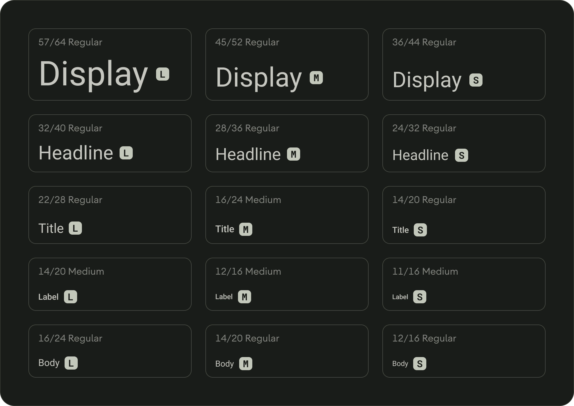
輸入比例是可以在應用程式中使用的多種字型樣式,可確保風格靈活一致,並能滿足各種用途。電視設計輸入比例由 15 種樣式組合而成,每種樣式各有專屬的應用程式和意義。系統會根據使用情況 (例如「多媒體」或「廣告標題」) 指派,並根據比例 (大或小) 分門別類。TV Design 的預設輸入比例會使用 Roboto 來處理所有標題、標籤和內文,藉此打造一致的字體排版體驗。
如要瞭解字體排版權杖和自訂字體,請參閱 Material Design 3。
類型角色
螢幕
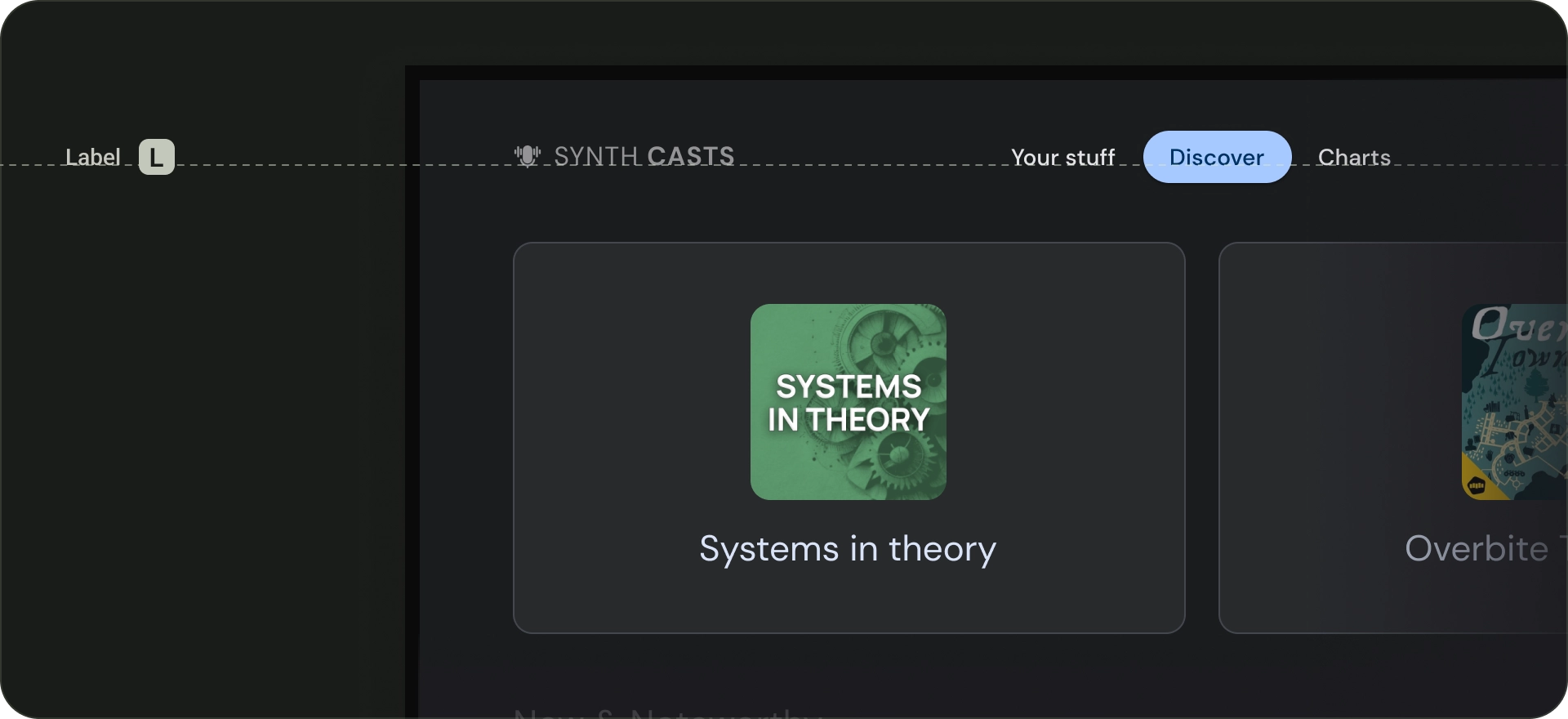
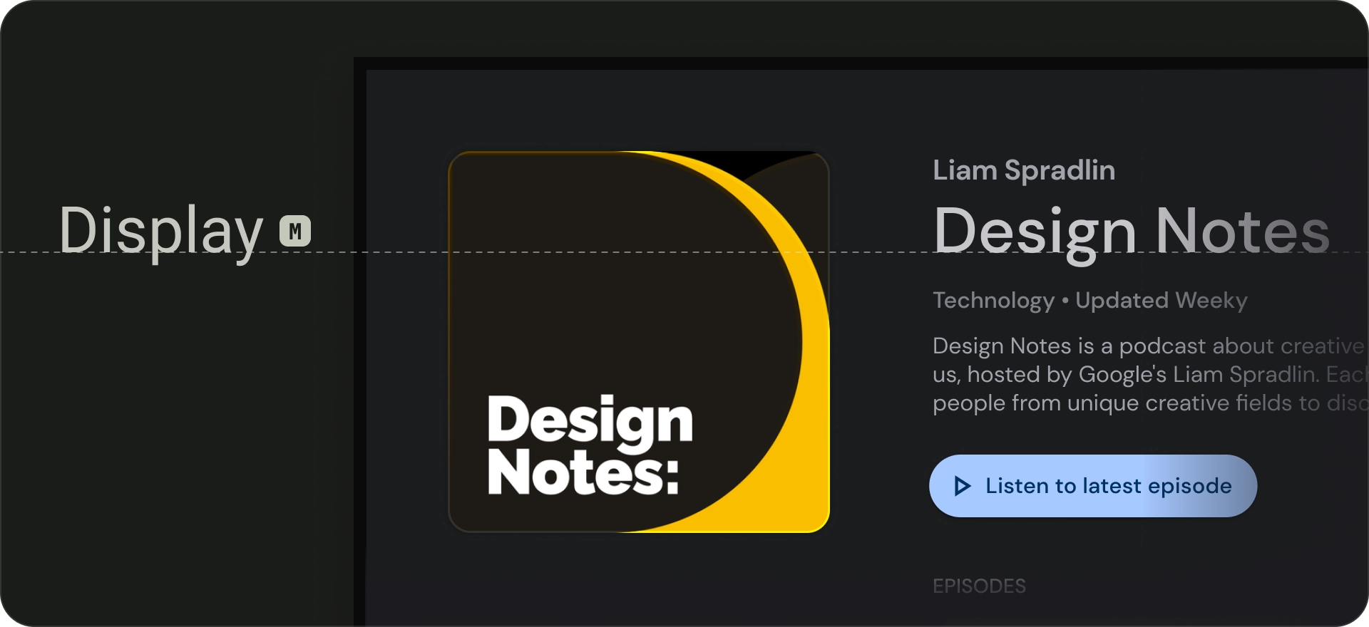
預設輸入比例中有三種顯示樣式:大、中、小。大螢幕文字會佔畫面最大的文字,保留了大型的顯示樣式,適合簡短且重要的文字段落或數字。可用於畫面的主要標題。請勿使用大型顯示樣式做為區塊或叢集標題。
標題
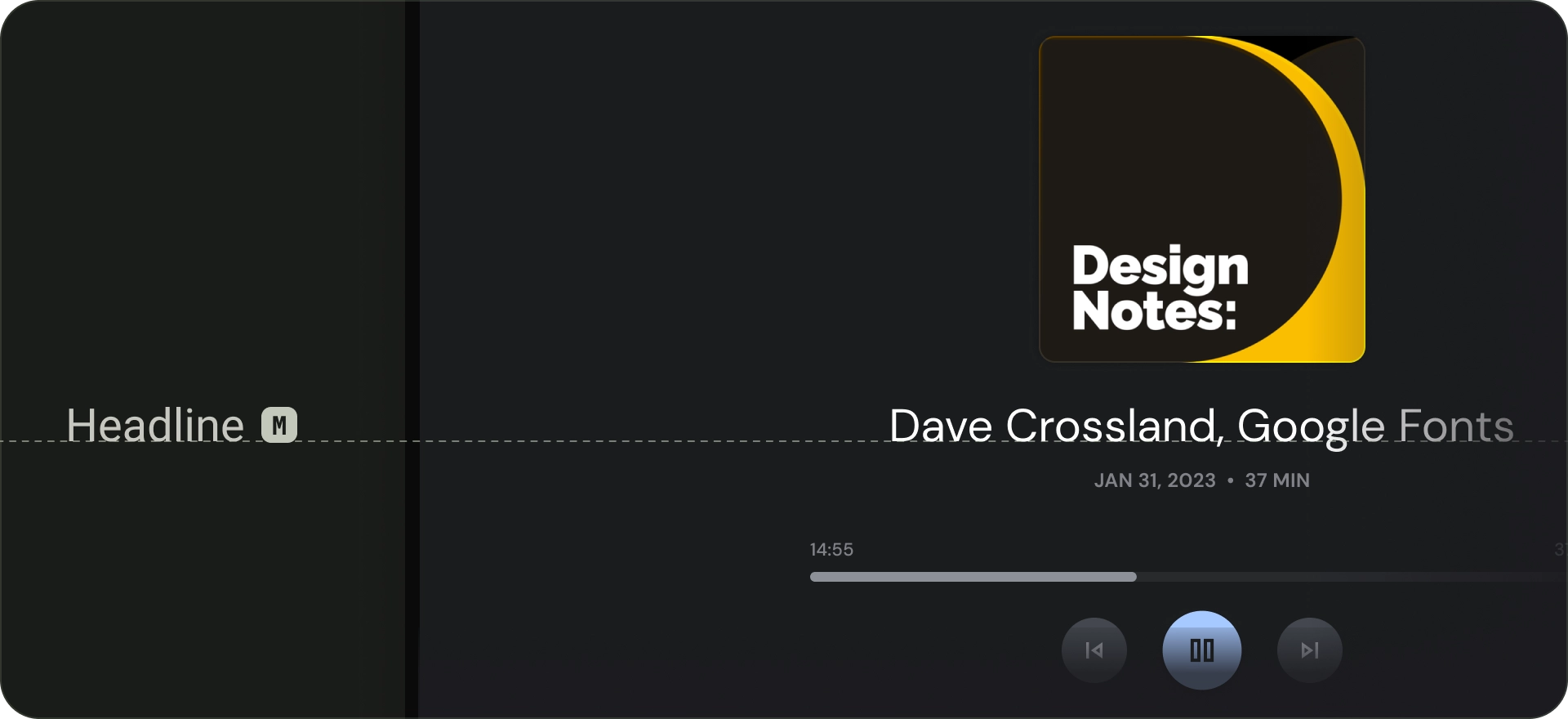
廣告標題最適合用於簡短、高度強調的文字。如要標記文字的主要段落,或內容的重要區域,這些樣式就能派上用場。它們用於精選輪轉介面和沈浸式叢集中的標題。此外,標題也能使用表達出意容的字體,只要提供適當的行高和字母間距,標題就能維持可讀性。
標題
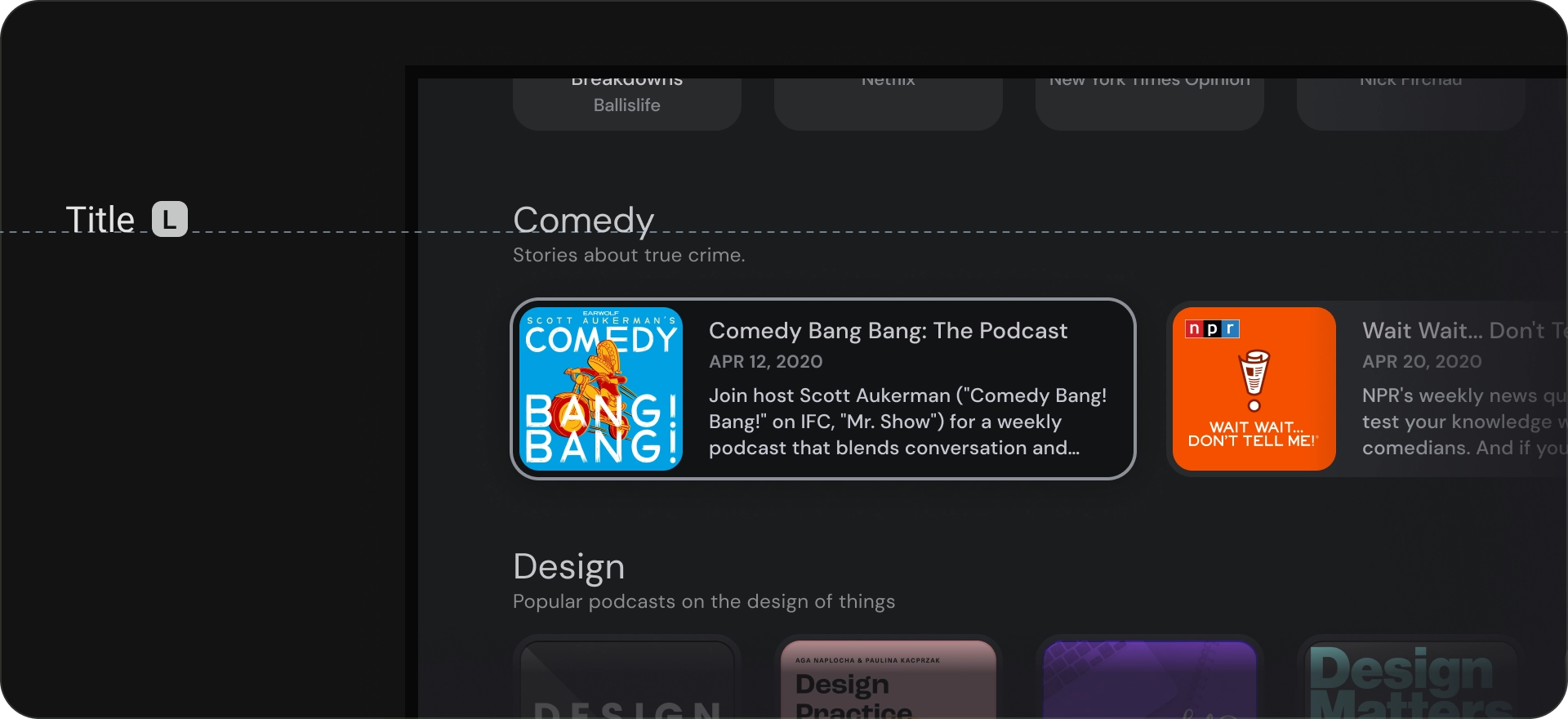
標題樣式比廣告標題樣式小。使用簡短、中強調的文字。例如,考慮使用標題劃分次要段落或次要內容區域。
請為資訊卡或清單等 UI 元素使用標題。標題大小精簡,且具備實用的顯眼程度與易讀性。
Body
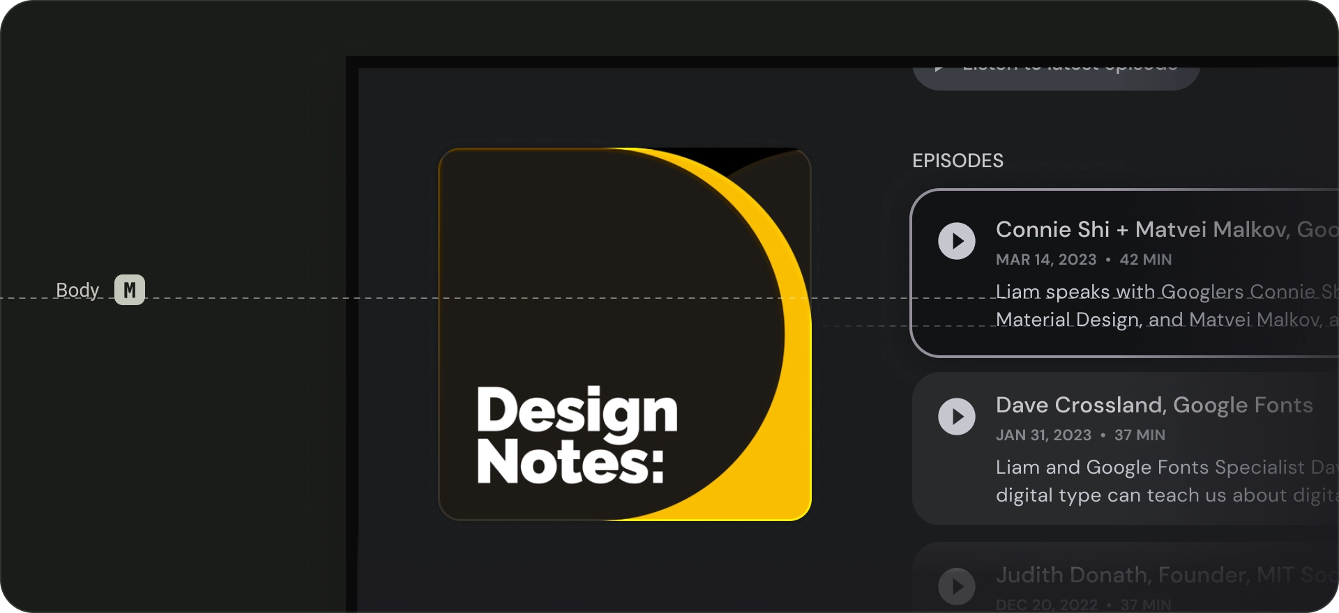
「內文」樣式適用於應用程式中較長篇幅的文字段落。使用較小尺寸可以閱讀,且在較長的段落中也能輕鬆閱讀的字體。請避免在內文中使用裝飾字型,因為從遠處讀取這些字型可能難以閱讀。
標籤
標籤樣式是較小且實用的樣式,適用於文字內元件,或內容主體中極小的文字 (例如說明文字)。舉例來說,按鈕可以使用「大型」標籤。