Google uses AI technology to translate content into your preferred language. AI translations can contain errors.
分頁
透過集合功能整理內容
你可以依據偏好儲存及分類內容。
這些分頁會整理不同畫面、資料集和互動的內容。分頁可用來切換查看不同和相關資訊群組檢視畫面。
資源
重點特色
- 分頁可以水平捲動。使用者介面可以設有任意數量的分頁。
- 分頁會將內容分門別類,協助使用者快速找到不同類型的資訊。
- 這些分頁會彼此並排顯示為對等點,依重要性相同。
變化版本
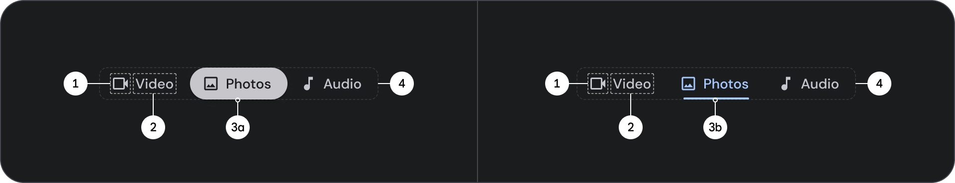
分頁指標有兩種類型:
- 藥丸指標
- 長條指標
請依強調內容選擇正確的類型。建議您使用圓滑指標分頁來整理完整頁面。並顯示主要內容目的地。內容區域中會使用長條指標分頁,進一步區隔相關內容並建立階層。
圖解
- 圖示 (選用)
- 唱片公司
- 使用中的指標
- 藥丸
- 吧台
- 容器
狀態
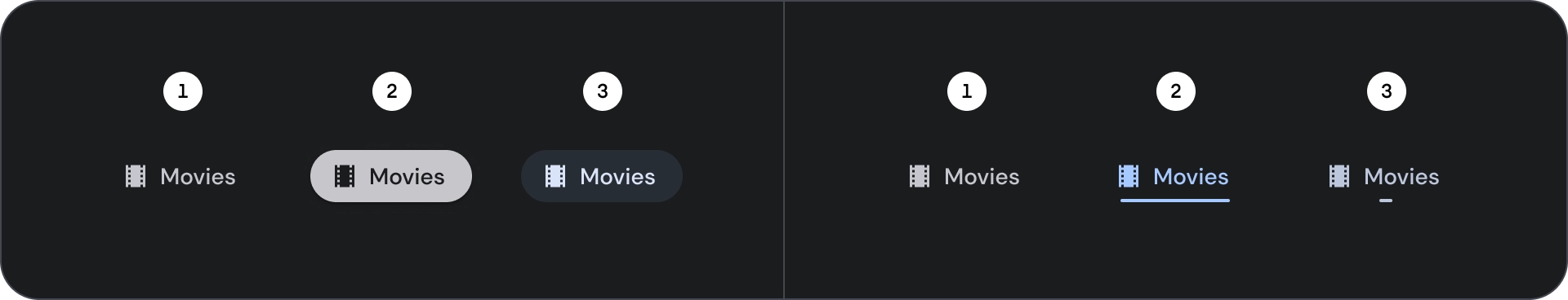
- 預設
- 專注
- 已選取
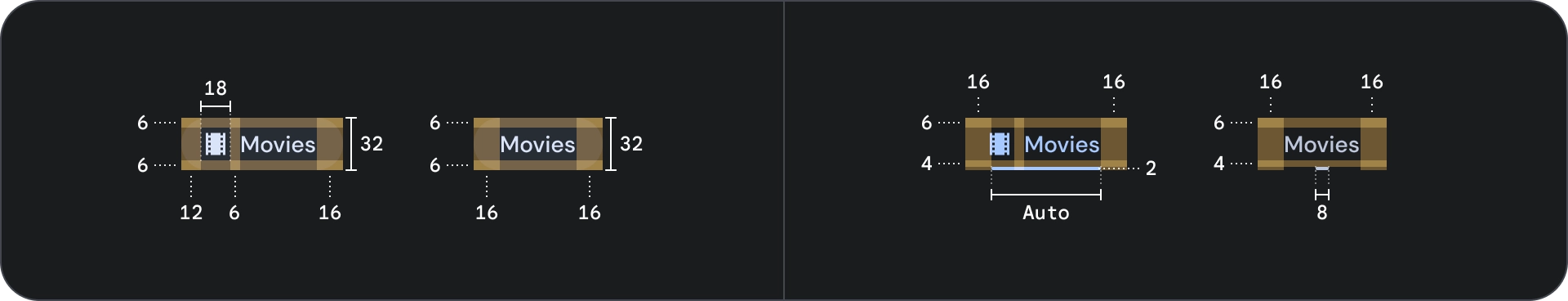
規格
行為
從某個分頁移至下一個分頁時,也會根據分頁移動情形左右滑動。
這個頁面中的內容和程式碼範例均受《內容授權》中的授權所規範。Java 與 OpenJDK 是 Oracle 和/或其關係企業的商標或註冊商標。
上次更新時間:2025-07-27 (世界標準時間)。
[[["容易理解","easyToUnderstand","thumb-up"],["確實解決了我的問題","solvedMyProblem","thumb-up"],["其他","otherUp","thumb-up"]],[["缺少我需要的資訊","missingTheInformationINeed","thumb-down"],["過於複雜/步驟過多","tooComplicatedTooManySteps","thumb-down"],["過時","outOfDate","thumb-down"],["翻譯問題","translationIssue","thumb-down"],["示例/程式碼問題","samplesCodeIssue","thumb-down"],["其他","otherDown","thumb-down"]],["上次更新時間:2025-07-27 (世界標準時間)。"],[],[]]