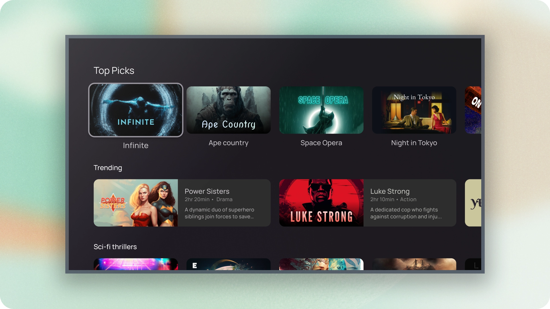
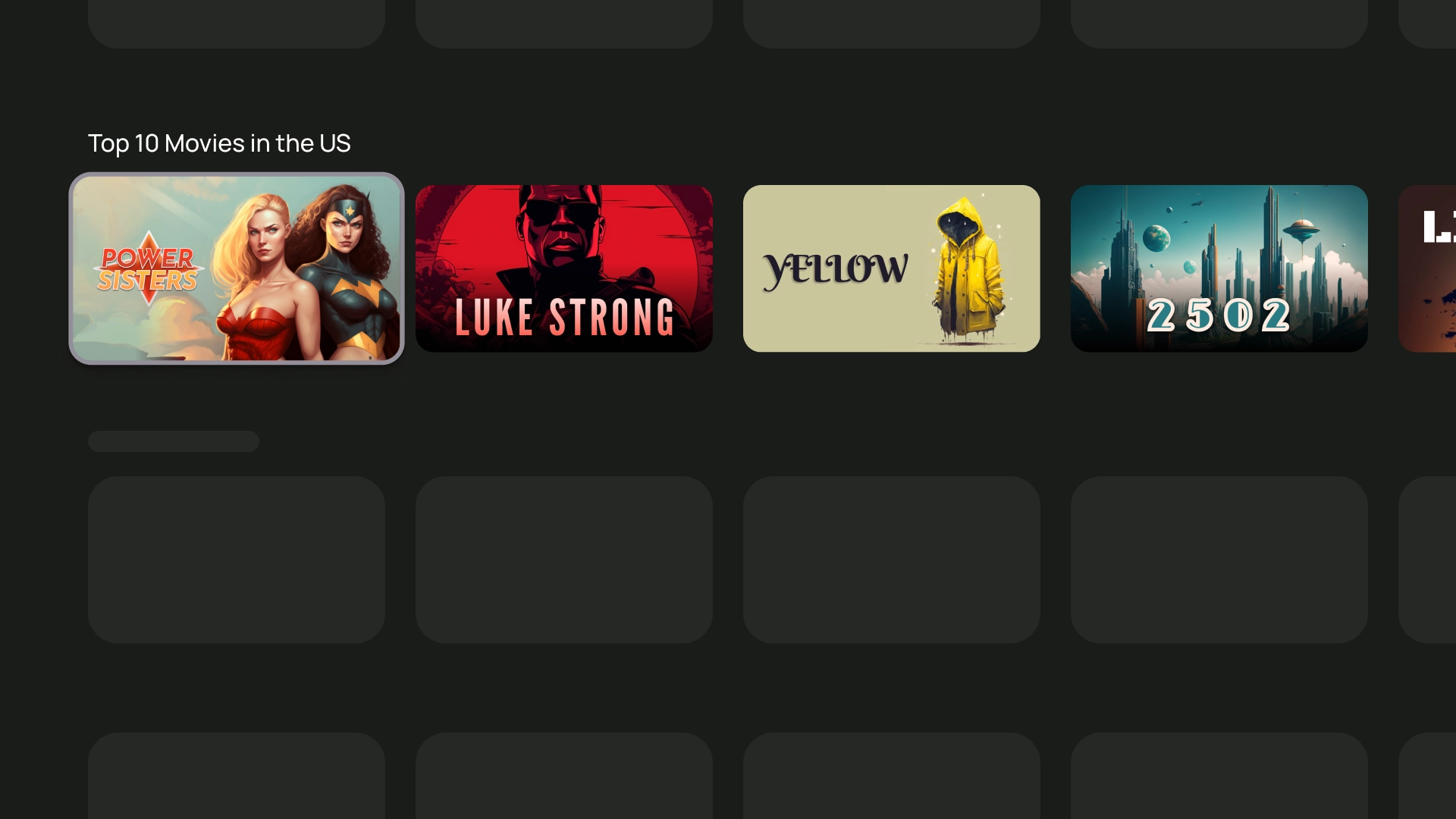
কার্ডগুলি হল আপনার টিভি অ্যাপের মৌলিক বিল্ডিং ব্লক।
সম্পদ
| টাইপ | লিঙ্ক | স্ট্যাটাস |
|---|---|---|
| ডিজাইন | ডিজাইন সোর্স (ফিগমা) | পাওয়া যায় |
| বাস্তবায়ন | জেটপ্যাক রচনা | পাওয়া যায় |
হাইলাইট
- একটি একক বিষয়ে সামগ্রী প্রদর্শন করতে একটি কার্ড ব্যবহার করুন৷
- একটি কার্ড ছবি থেকে শুরু করে শিরোনাম, সমর্থনকারী পাঠ্য, বোতাম, তালিকা এবং অন্যান্য UI উপাদানগুলি ধারণ করতে পারে।
- একটি কার্ড অন্য কার্ডের সাথে একত্রিত হতে পারে না বা একাধিক কার্ডে বিভক্ত হতে পারে না।
- কার্ডের ছয়টি বৈচিত্র রয়েছে: স্ট্যান্ডার্ড, ক্লাসিক, কমপ্যাক্ট, ইনসেট, ওয়াইড স্ট্যান্ডার্ড এবং ওয়াইড ক্লাসিক।
বৈকল্পিক
পাঁচ ধরনের কার্ড আছে, প্রতিটিরই আলাদা ব্যবহার আছে:
- স্ট্যান্ডার্ড
- ক্লাসিক
- কমপ্যাক্ট
- প্রশস্ত মান
- ওয়াইড ক্লাসিক
বিষয়বস্তু ব্লক
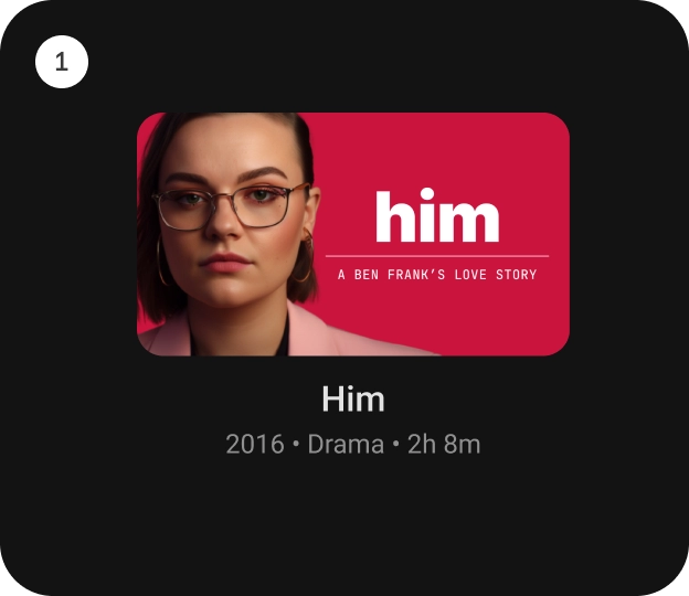
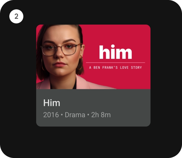
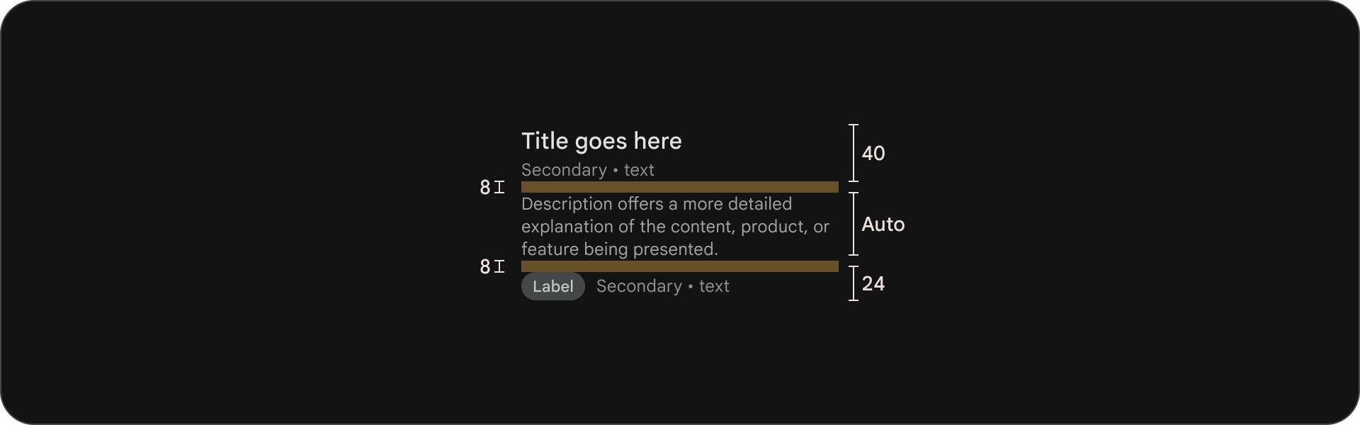
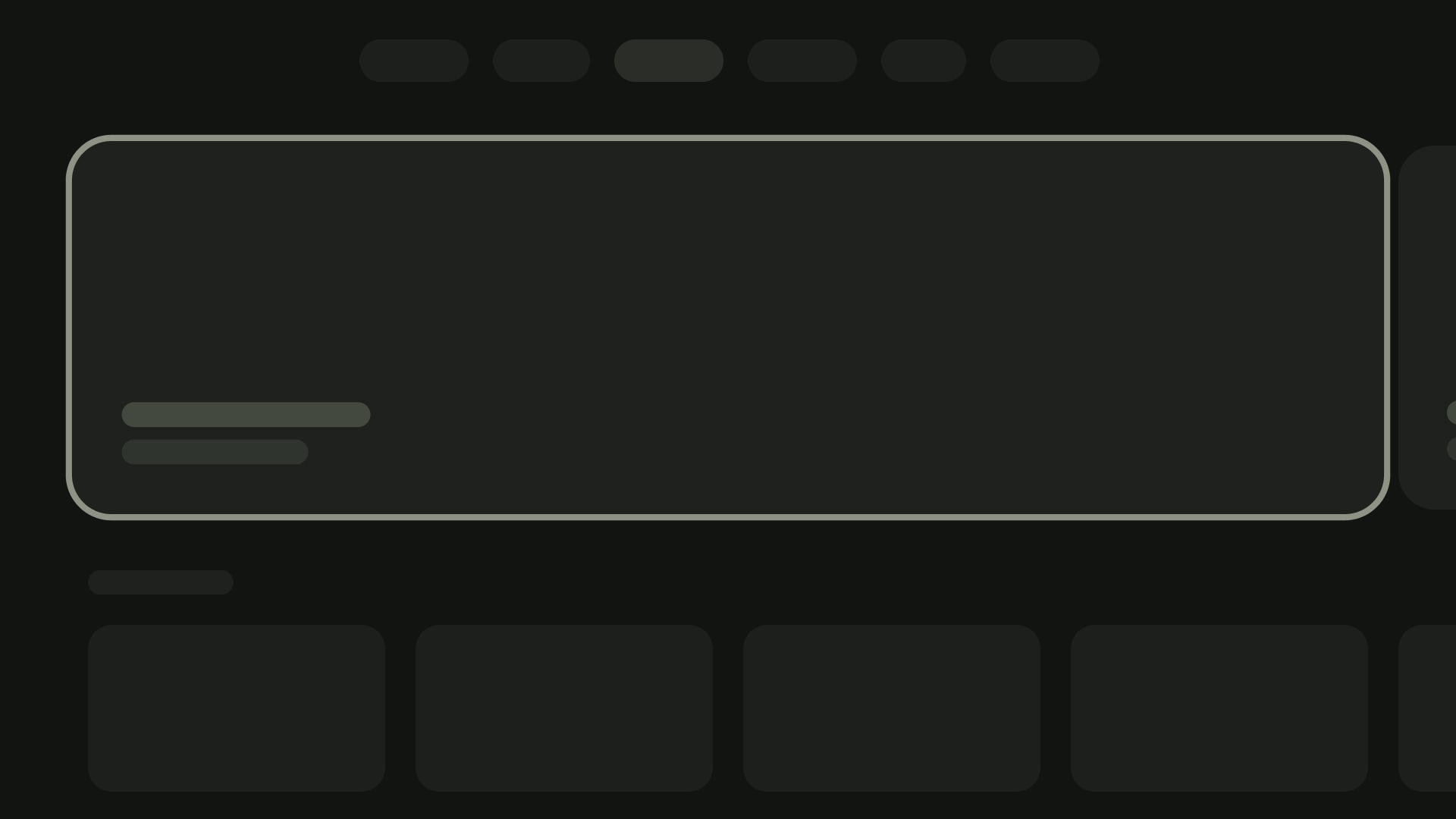
একটি কার্ডের বিষয়বস্তু পৃথক ব্লকে সাজানো হয়। জোর দেওয়া সহ কার্ডের ভিজ্যুয়াল ডিজাইন অনুক্রম নির্দেশ করে। কার্ডগুলির বিন্যাস নিজেই কার্ডগুলিতে থাকা বিষয়বস্তুর ধরণকে মিটমাট করে।
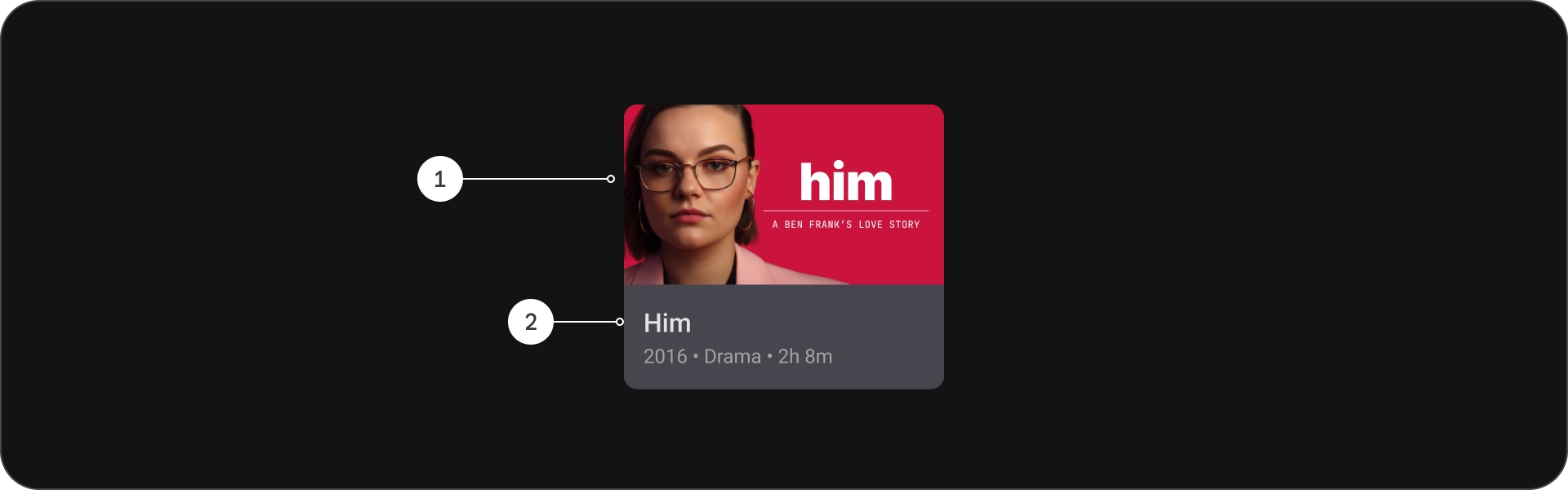
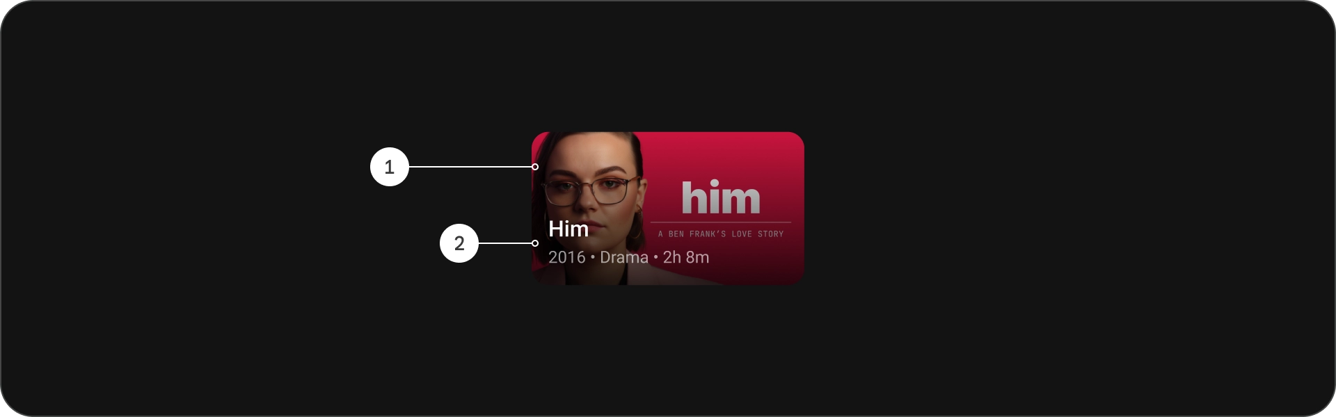
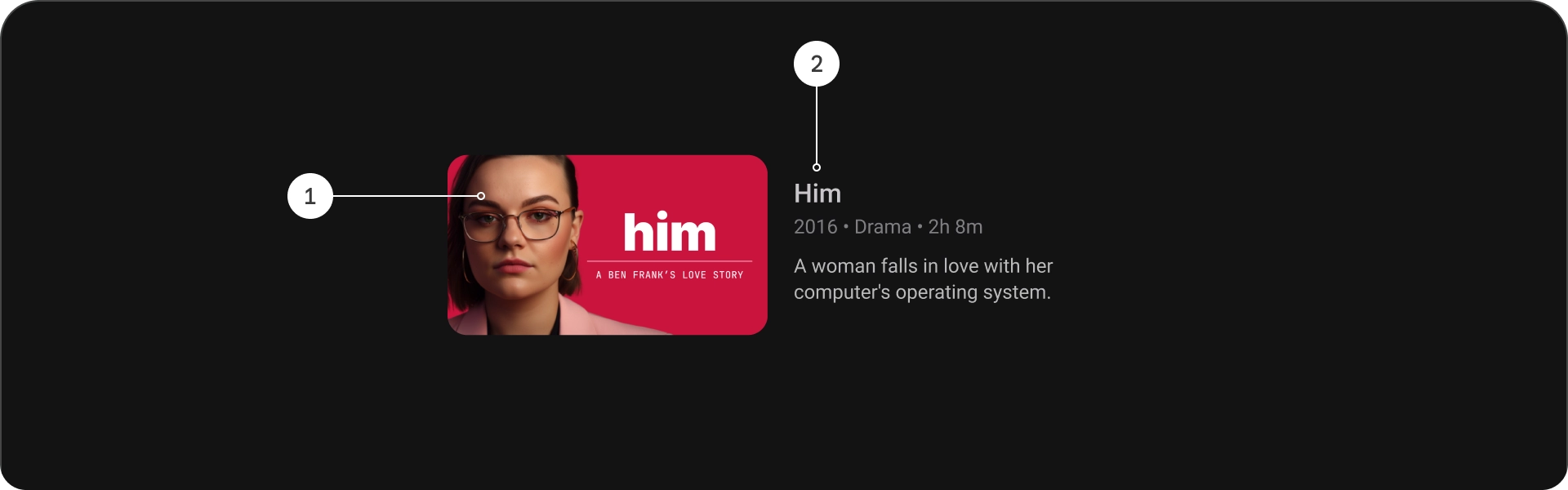
অ্যানাটমি
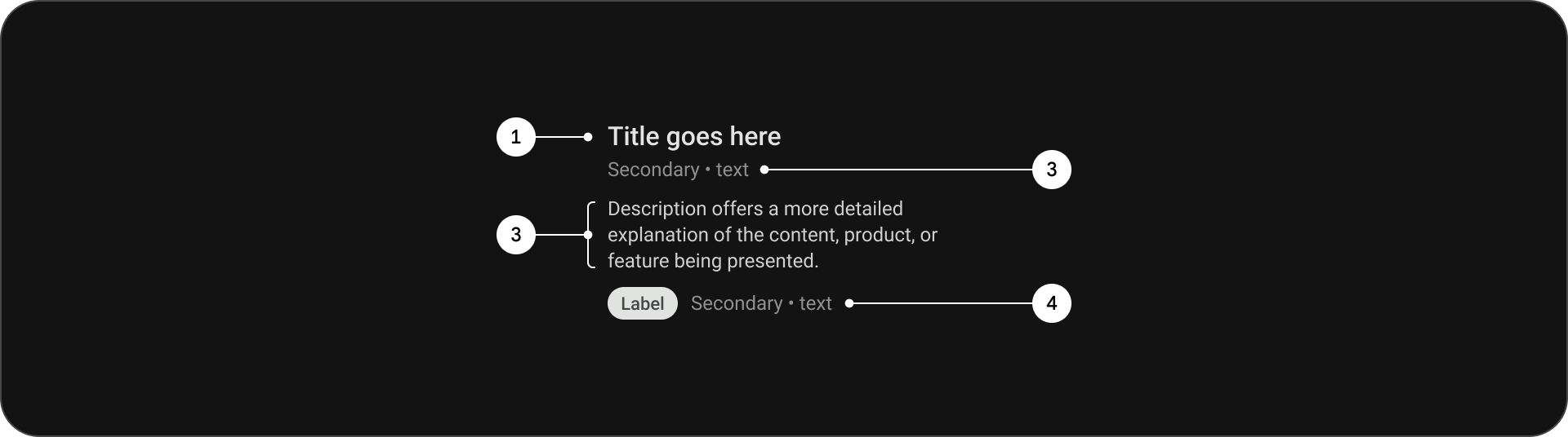
- শিরোনাম
- সাবটাইটেল
- বর্ণনা
- অতিরিক্ত পাঠ্য
চশমা
স্ট্যান্ডার্ড কার্ড
অ্যানাটমি
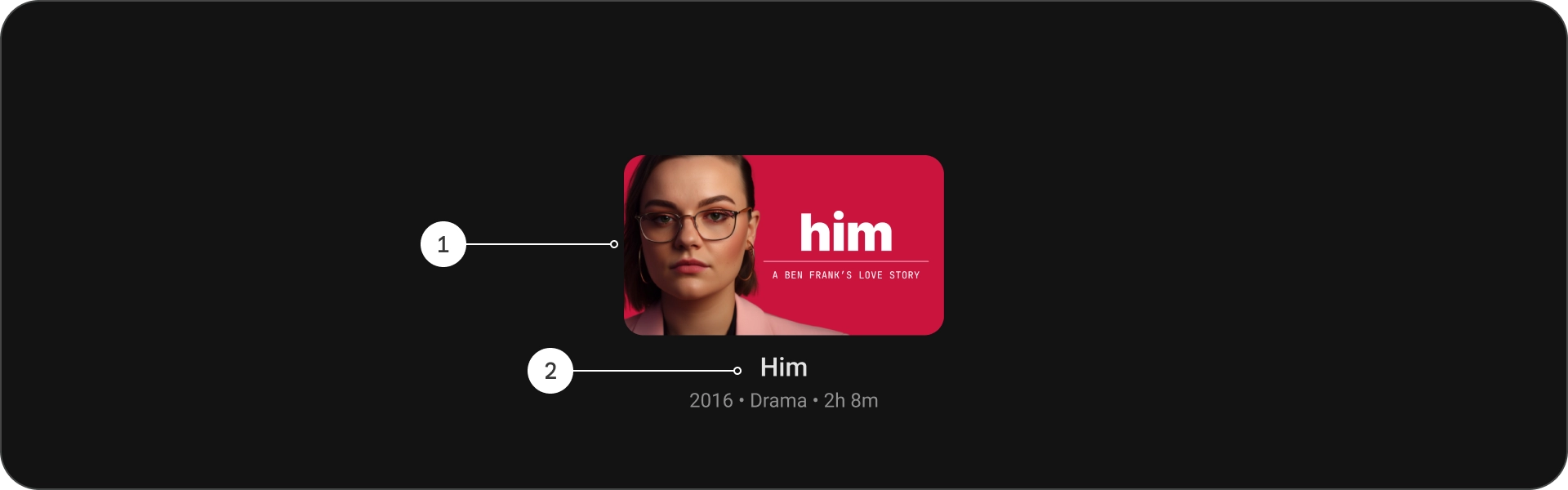
- ছবি
- বিষয়বস্তু ব্লক
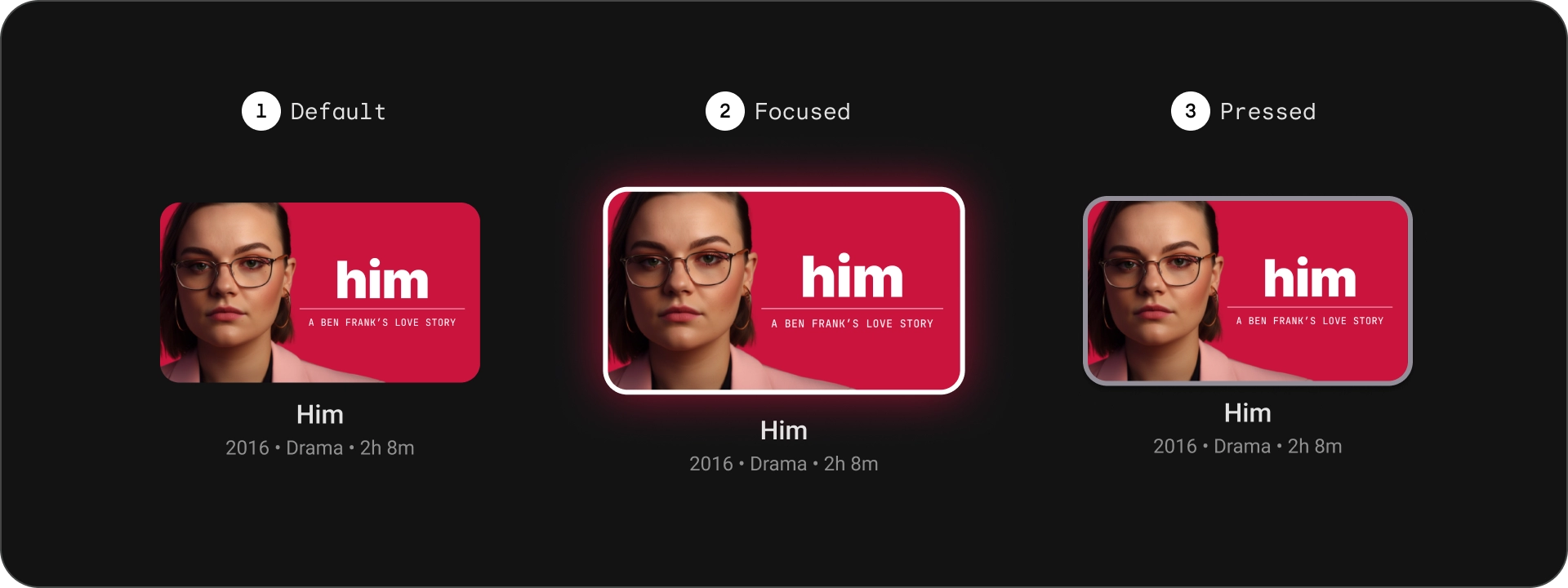
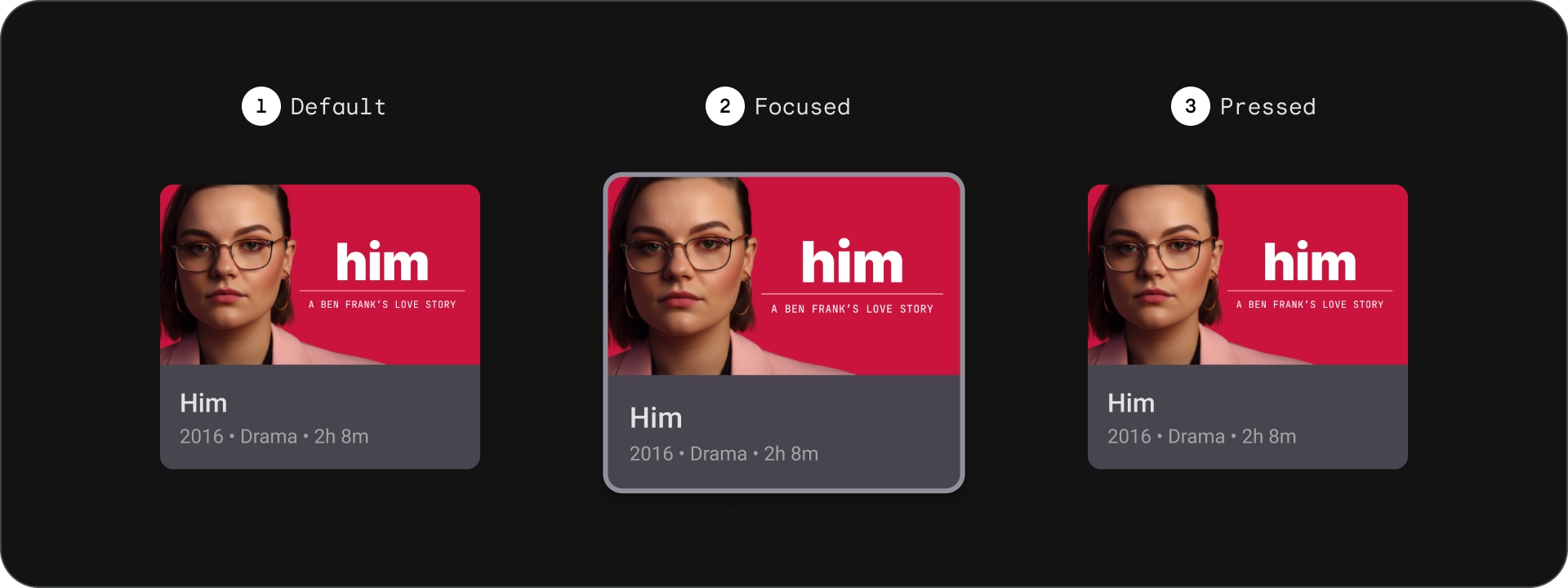
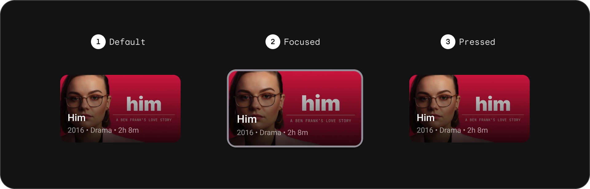
রাজ্যগুলি
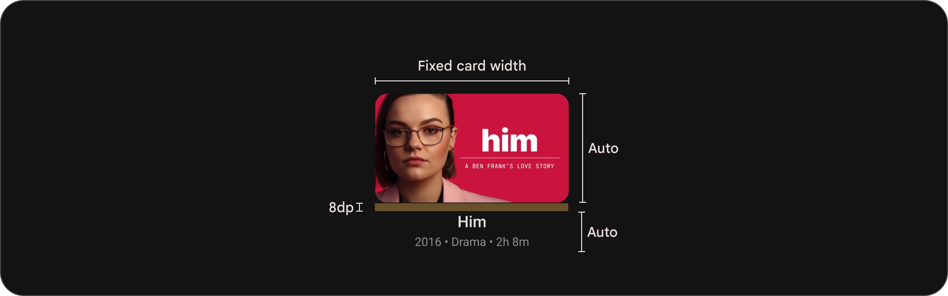
চশমা
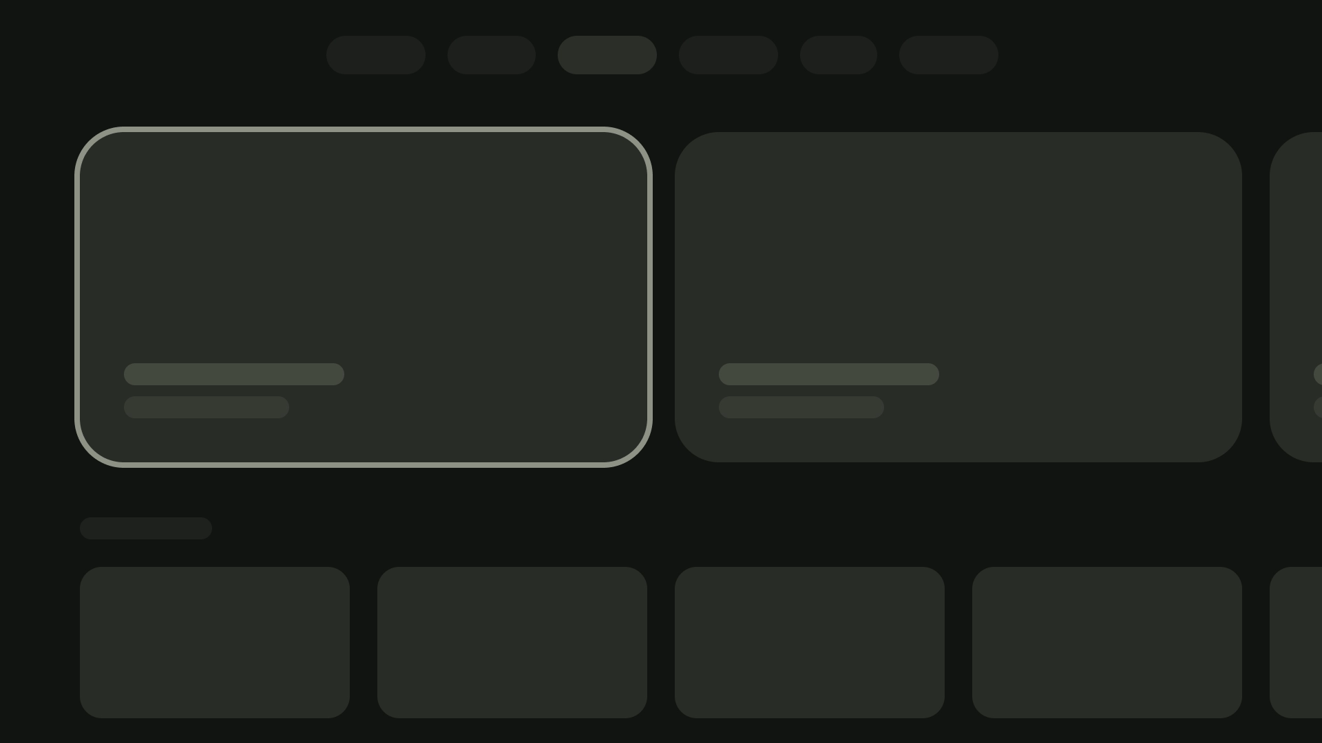
ক্লাসিক কার্ড
অ্যানাটমি
- ছবি
- বিষয়বস্তু ব্লক
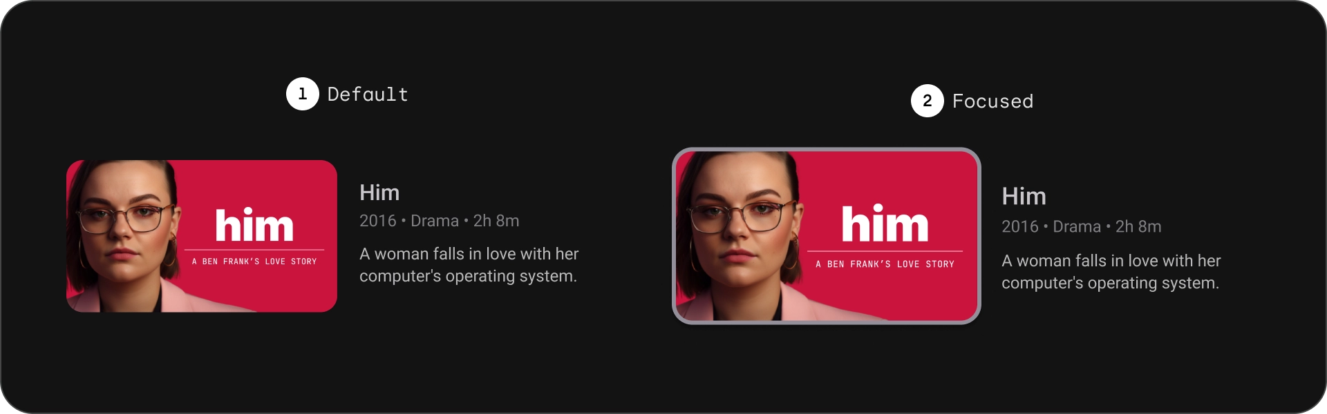
রাজ্যগুলি
চশমা
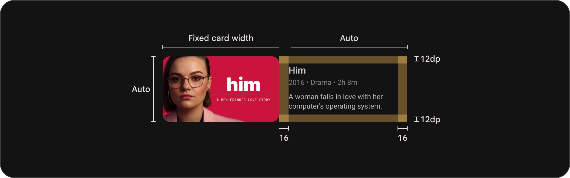
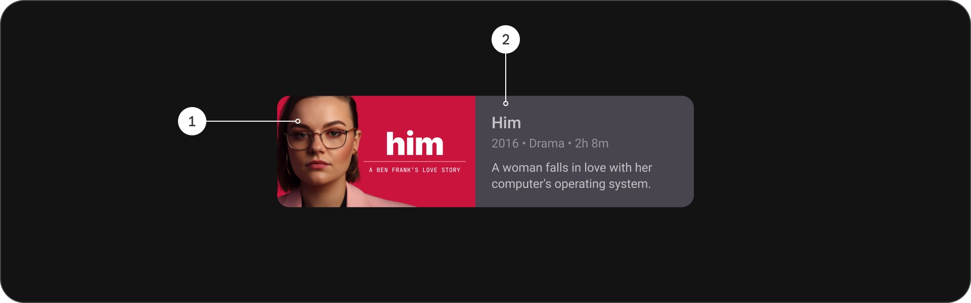
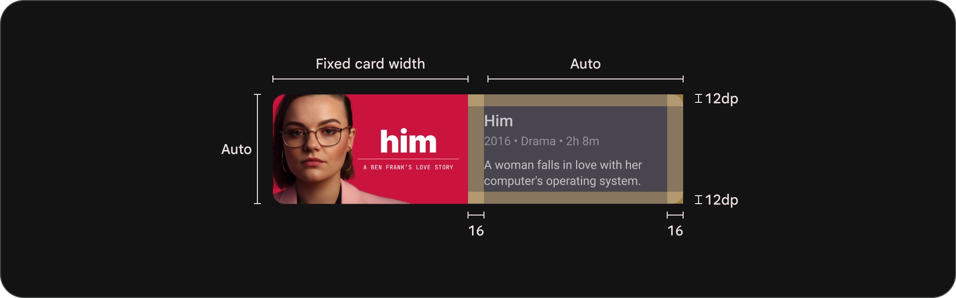
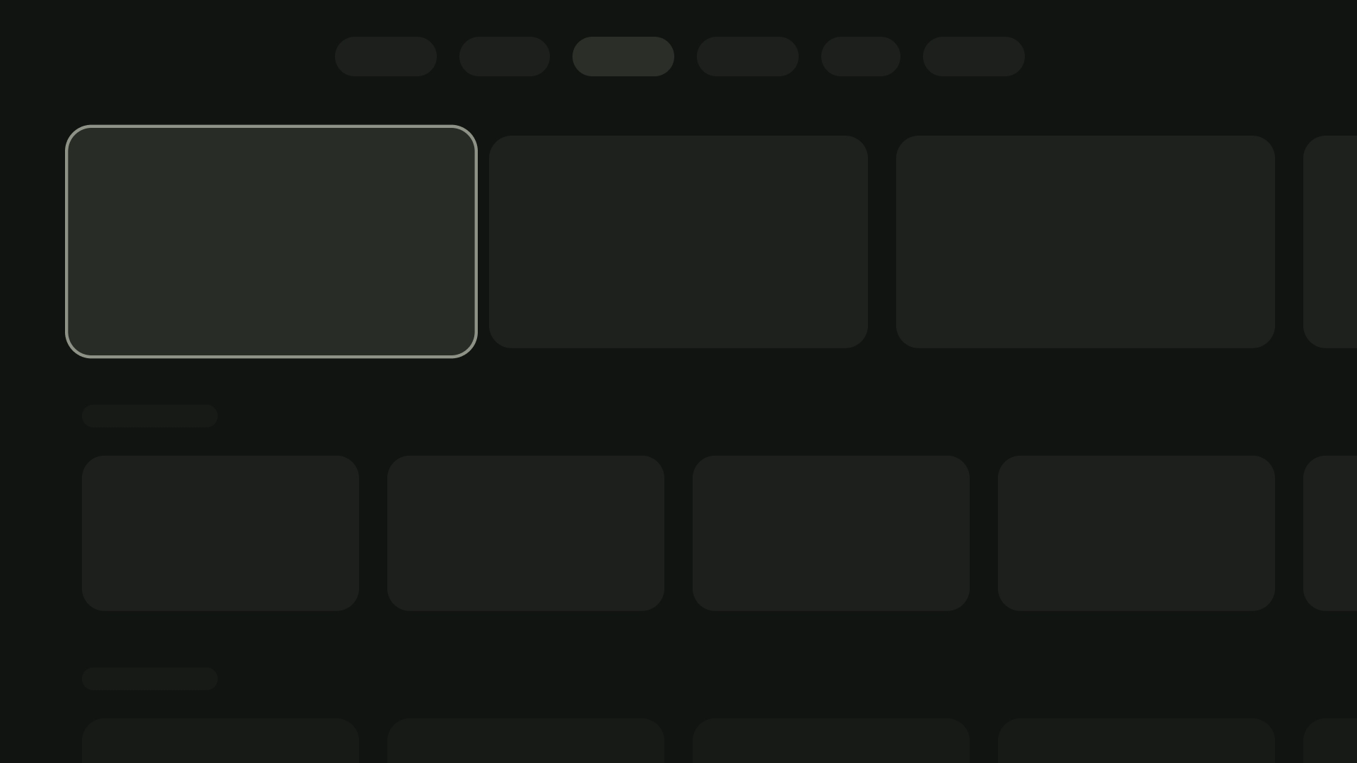
কমপ্যাক্ট কার্ড
অ্যানাটমি
- ছবি
- বিষয়বস্তু ব্লক
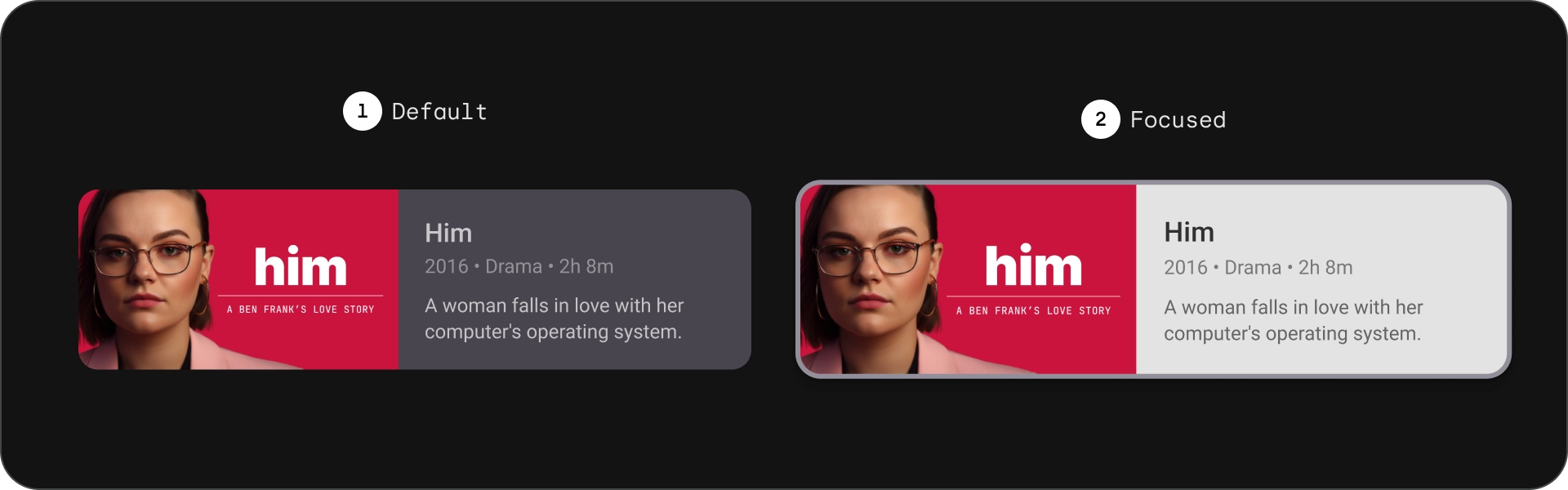
রাজ্যগুলি
চশমা
ওয়াইড স্ট্যান্ডার্ড কার্ড
অ্যানাটমি
- ছবি
- বিষয়বস্তু ব্লক
রাজ্যগুলি
চশমা
ওয়াইড ক্লাসিক কার্ড
অ্যানাটমি
- ছবি
- বিষয়বস্তু ব্লক
রাজ্যগুলি
চশমা
ব্যবহার
কার্ডগুলি হল বহুমুখী ডিজাইনের উপাদান যা দৃশ্যত আকর্ষণীয় এবং ব্যবহারকারী-বান্ধব উপায়ে বিভিন্ন বিষয়বস্তু প্রদর্শন করতে ব্যবহার করা যেতে পারে। নিম্নলিখিত বিভাগগুলি কার্ডগুলির জন্য ডিজাইনের বিবেচনাগুলি অন্বেষণ করে৷
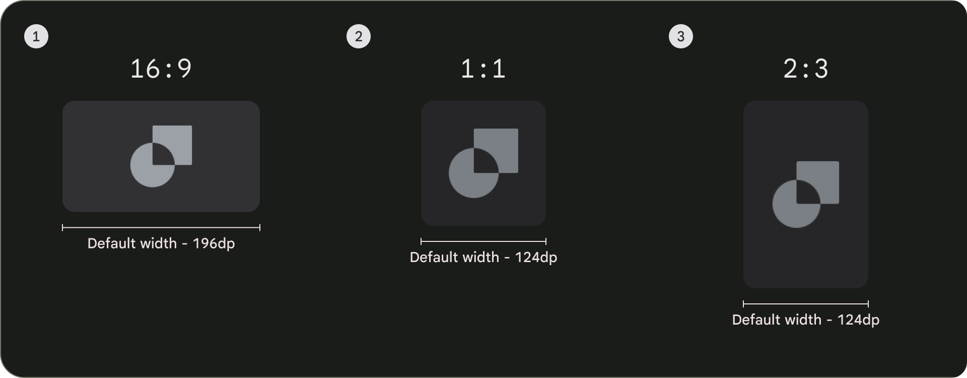
আকৃতির অনুপাত
কার্ডের জন্য তিনটি সাধারণ আকৃতির অনুপাত রয়েছে: 16:9, 1:1 এবং 2:3৷ প্রতিটি আকৃতির অনুপাতের শক্তি রয়েছে, তাই আপনার জন্য সেরা পছন্দটি আপনার নির্দিষ্ট চাহিদার উপর নির্ভর করে।
- 16:9 কার্ডের জন্য সবচেয়ে সাধারণ অনুপাত। এটি একটি বিস্তৃত আকৃতির অনুপাত যা ছবি এবং ভিডিও প্রদর্শনের জন্য উপযুক্ত।
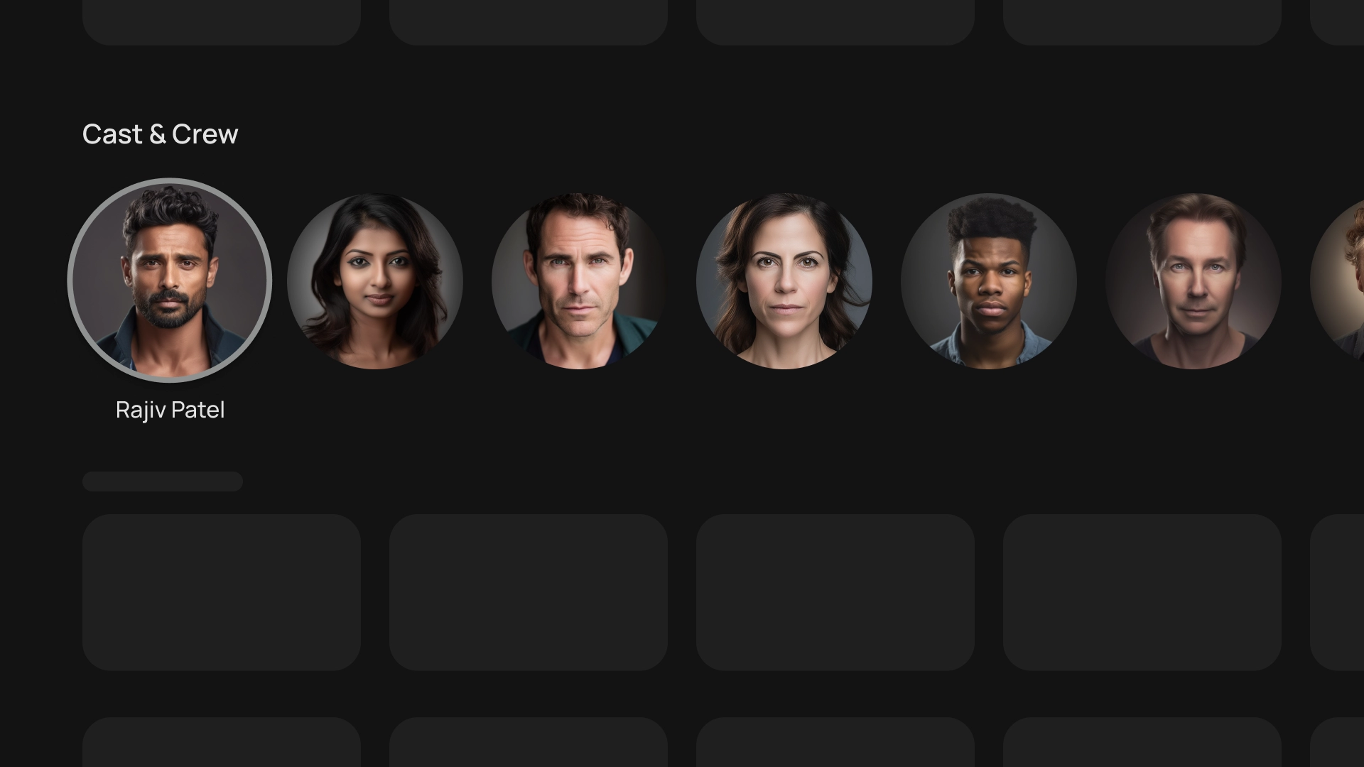
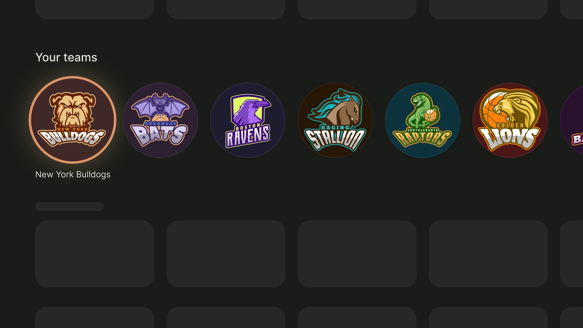
- 1:1 একটি বর্গক্ষেত্র অনুপাত। কাস্ট এবং ক্রু, চ্যানেল লোগো বা টিম লোগোর মতো দৃশ্যত ভারসাম্যপূর্ণ কার্ডগুলির জন্য এটি একটি ভাল পছন্দ।
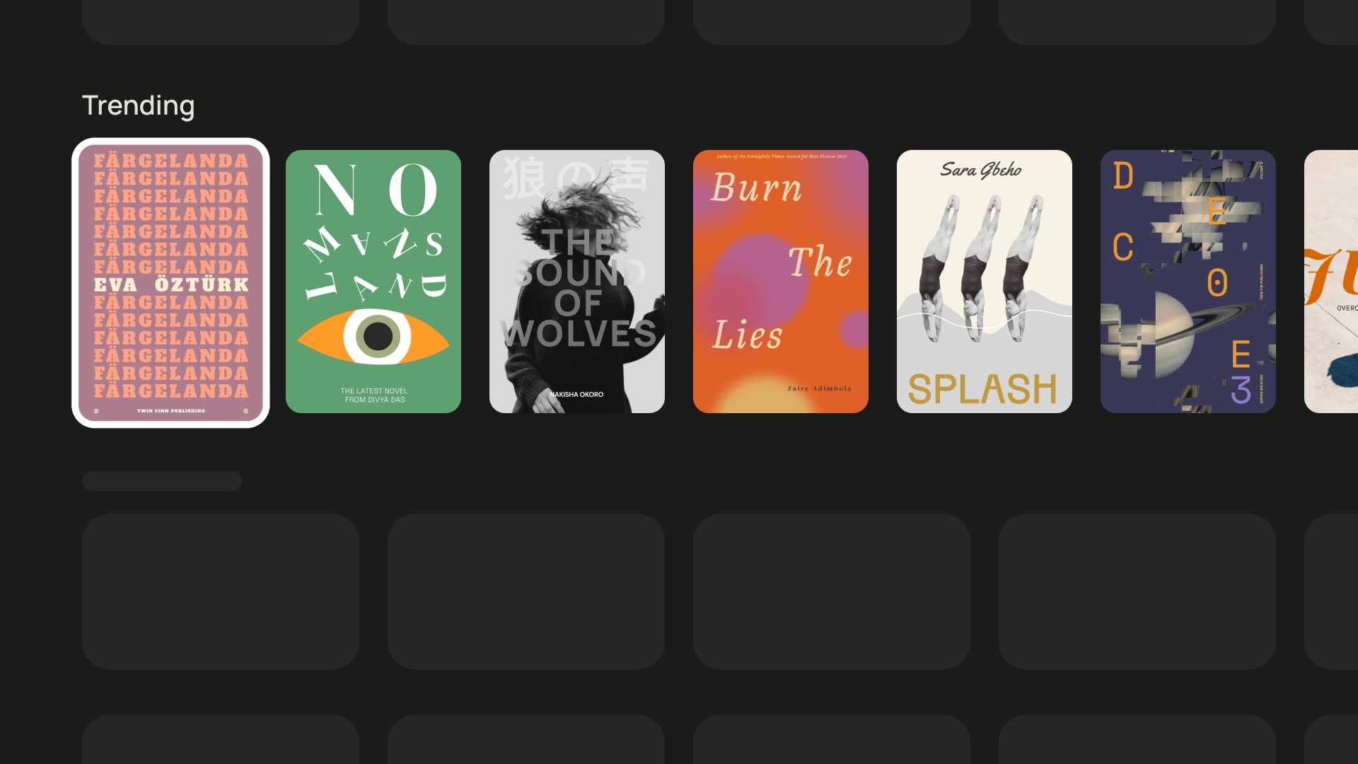
- 2:3 হল একটি লম্বা আকৃতির অনুপাত। আপনি যদি গ্রিড ভাঙতে চান এবং আরও জোর দিতে চান তবে এটি একটি ভাল পছন্দ।
শেষ পর্যন্ত, আপনার কার্ডের জন্য একটি আকৃতির অনুপাত বেছে নেওয়ার সর্বোত্তম উপায় হল বিভিন্ন বিকল্পের সাথে পরীক্ষা করা এবং কোনটি সেরা দেখায় তা দেখুন।
এখানে বিভিন্ন আকৃতির অনুপাতের কিছু উদাহরণ রয়েছে
1:1
কাস্ট এবং ক্রু
ক্রীড়া দলের লোগো
2:3
ট্রেন্ডিং বই
16:9
সিনেমা কার্ড
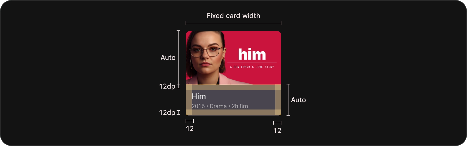
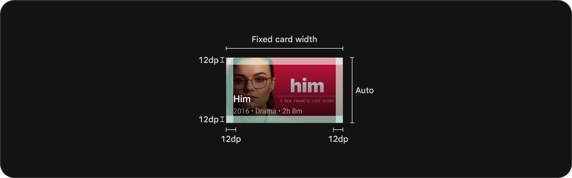
বিন্যাস এবং ব্যবধান
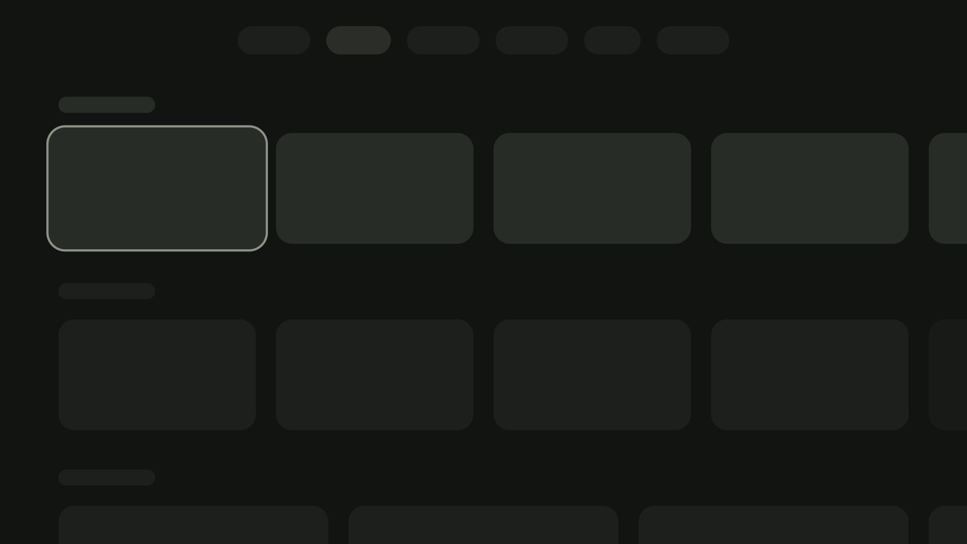
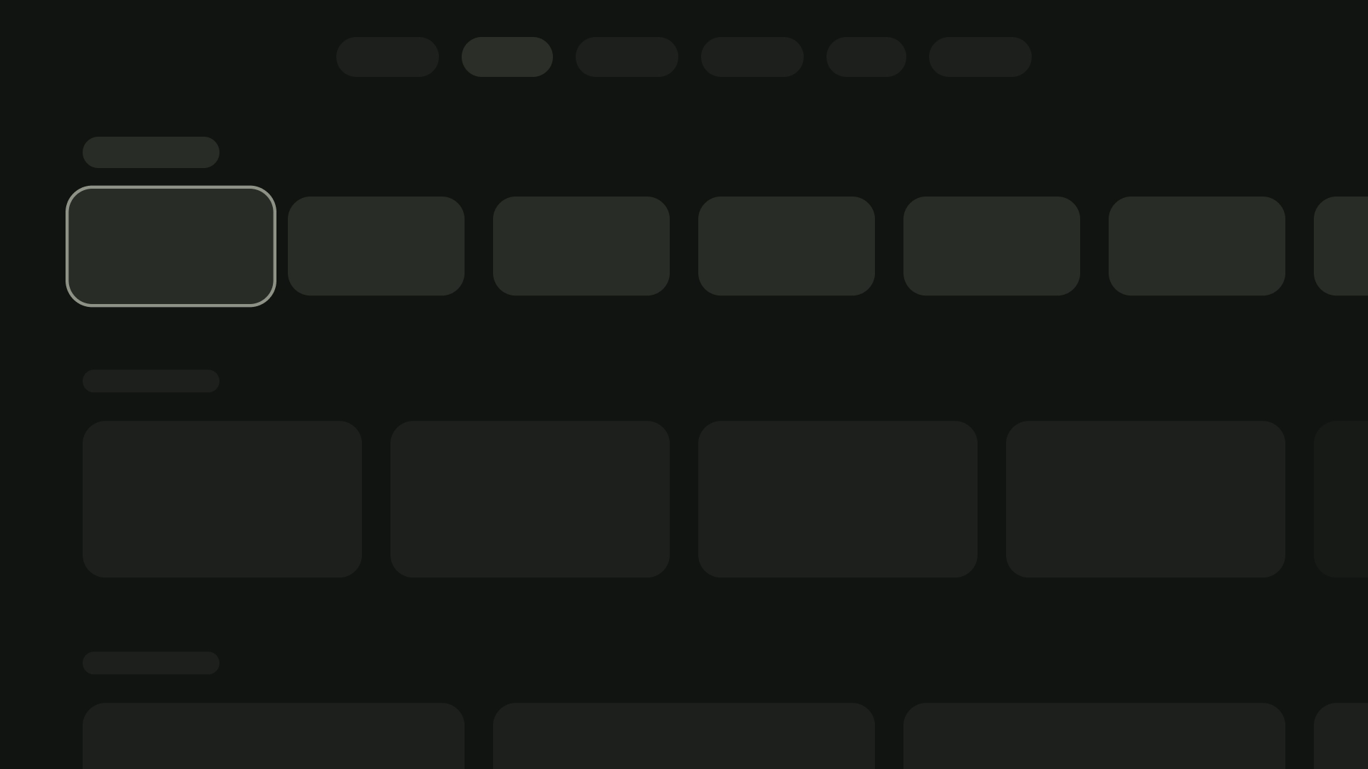
স্ক্রীনে দৃশ্যমান কার্ডের সংখ্যার উপর ভিত্তি করে বিভিন্ন কার্ডের প্রস্থ 20dp এর ব্যবধানে সঠিক পিকিং প্রয়োগ করে অর্জন করা যেতে পারে।
1-কার্ড লেআউট
কার্ডের প্রস্থ — 844dp
2-কার্ড লেআউট
কার্ডের প্রস্থ — 412dp
3-কার্ড লেআউট
কার্ডের প্রস্থ — 268dp
4-কার্ড লেআউট
কার্ডের প্রস্থ — 196dp
5-কার্ড লেআউট
কার্ডের প্রস্থ — 124dp
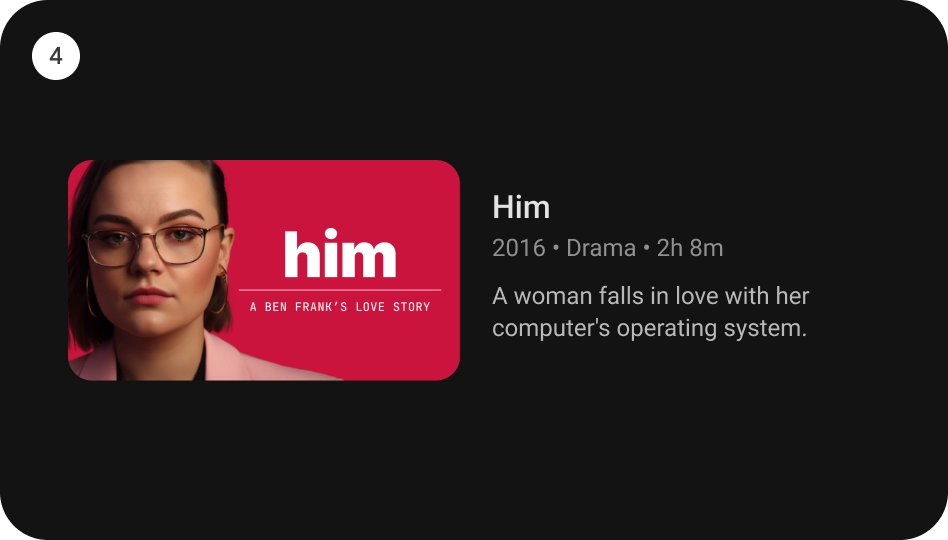
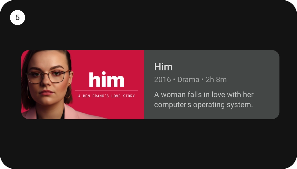
বিষয়বস্তু ব্লক
একটি কার্ডের বিষয়বস্তু ব্লকের প্রস্থ ছবির থাম্বনেইলের মতো প্রস্থ হওয়া উচিত। আপনি যদি বিষয়বস্তু ব্লকে আরও পাঠ্য প্রদর্শন করতে চান তবে একটি বিস্তৃত কার্ড বৈচিত্র ব্যবহার করুন।
করবেন
করবেন না
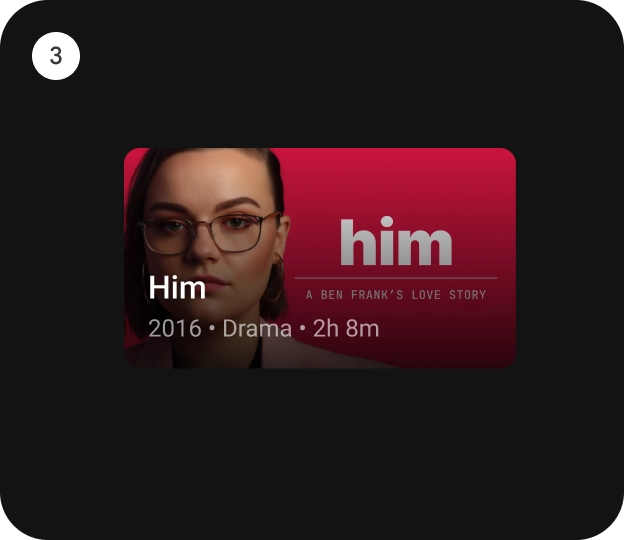
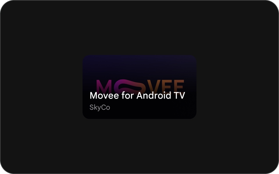
কমপ্যাক্ট কার্ড
কমপ্যাক্ট কার্ডগুলি সংক্ষিপ্ত এবং পড়তে সহজ হওয়া উচিত। ব্যাকগ্রাউন্ড ইমেজের আগে থাকা বিষয়বস্তু সংক্ষিপ্ত এবং বিন্দু পর্যন্ত হওয়া উচিত। লম্বা শিরোনাম, সাবটাইটেল বা বর্ণনা এড়িয়ে চলুন। এটি আপনার কার্ডগুলিকে আরও দৃষ্টিনন্দন এবং স্ক্যান করা সহজ করে তোলে৷
একটি ছবিতে পাঠ্যকে আরও পাঠযোগ্য করতে, একটি আধা-স্বচ্ছ কালো গ্রেডিয়েন্ট ওভারলে যোগ করুন। এটি চিত্রটিকে খুব বেশি অস্পষ্ট না করে পটভূমিকে অন্ধকার করে, যাতে পাঠ্যটি সহজে দেখা যায়।
করবেন