Use color to express style and communicate meaning. Setting your app's colors can be crucial for personalization, defining semantic purpose, and of course defining brand identity.
Takeaways
- To ensure accessibility:
- Check color contrast and avoid pairing colors with similar tones.
- Consider that red and green are common patterns, but also that they're not accessible to users with certain kinds of color blindness.
- Practice using colors meaningfully: Apps can be vibrant and expressive, but stick to a palette of colors. Extending your scheme with too many semantic colors can be confusing, while having too many decorative colors can be overwhelming.
- Colors can have patterns, so repeat established color patterns. If using semantic colors in your app, use consistent colors.
- To allow your app to work well in different contexts, build a light and dark color scheme (and ideally contrast themes).
- Assign colors with tokens to indicate the element's color role, instead of using a hardcoded value.
- Colors can come from various dynamic and static sources, but avoid mixing too many within the same view.
- When using dynamic content color, try to avoid pulling colors from multiple content pieces.
Color space on Android
To properly understand how Android applies color to your UI, it's important to first recognize how it's displayed on a device.
How color is displayed on a device
Your app is displayed on a backlit screen, which uses digital color and adheres to certain models and rules that help our eyes perceive that color. Digital color is additive color, created by "adding" or mixing of different lights to create a full spectrum of color. The way humans perceive colors from one screen to another can vary greatly depending on a device's color calibration, screen type, settings, and the color space.
When designing an app, consider the colors used may not be identical due to these factors, not to mention the unique color perceptions of individual users.
About color spaces
A color space is an organization of colors that uses a color model. RGB is an additive color model that creates the spectrum of colors through red, green, and blue, while CMYK, which is used for printing, is subtractive. For this reason, interactive designers typically use RGB or similar models to choose colors.
Material 3 (M3) introduced HCT, a new color space that uses hue, chroma, and tone to define colors that are perceptually accurate compared to other models like HSL
To learn more about the color science and development of HCT, read The Science of Color & Design.
Hue, chroma, and tone
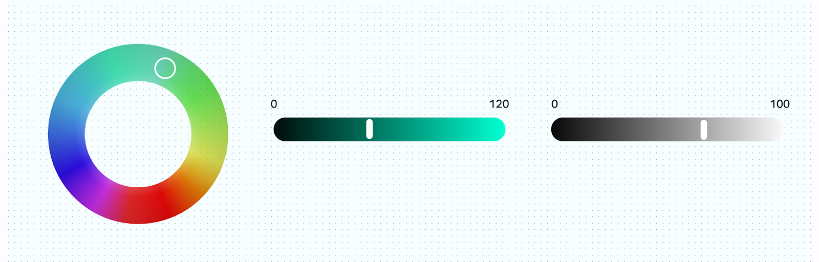
HCT allows for more personalized and flexible uses of color that stay within the system parameters. HCT models colors using hue, chroma, and tone:
- Hue: Hue is analogous to the adjective an individual user might use to describe the color, for example, "red" or "electric violet." The HCT value of hue ranges from 0–360.
- Chroma: Chroma represents the colorfulness of color, ranging from neutral gray to full vibrancy. In the HCT color space, chroma has a maximum value of around 120.
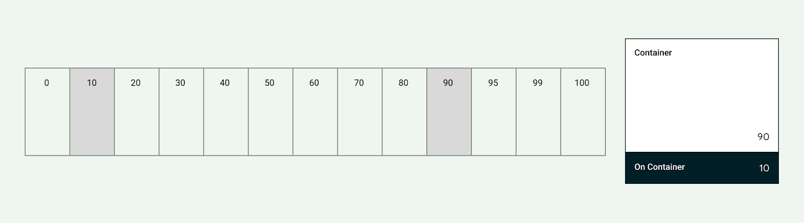
- Tone: Tone is the luminance, or brightness, of a color. HCT uses tone to create contrast. Colors set to the same tone value aren't accessible for certain accessibility contexts. Lower value tones are darker, and higher value tones are brighter.
Color system process
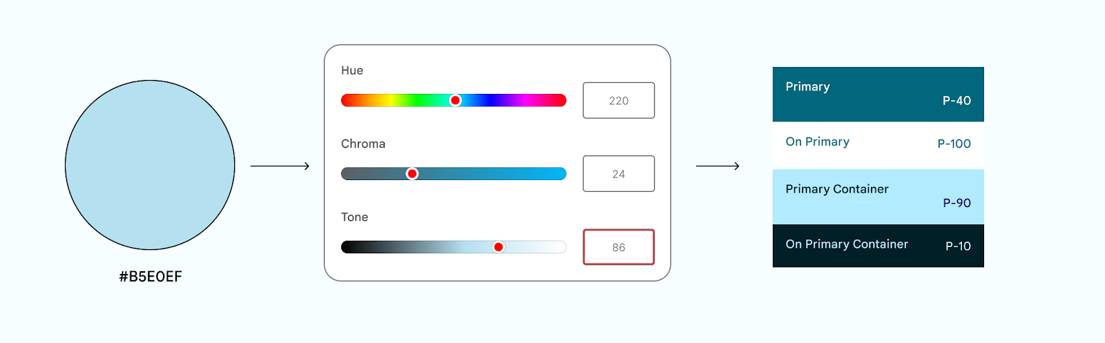
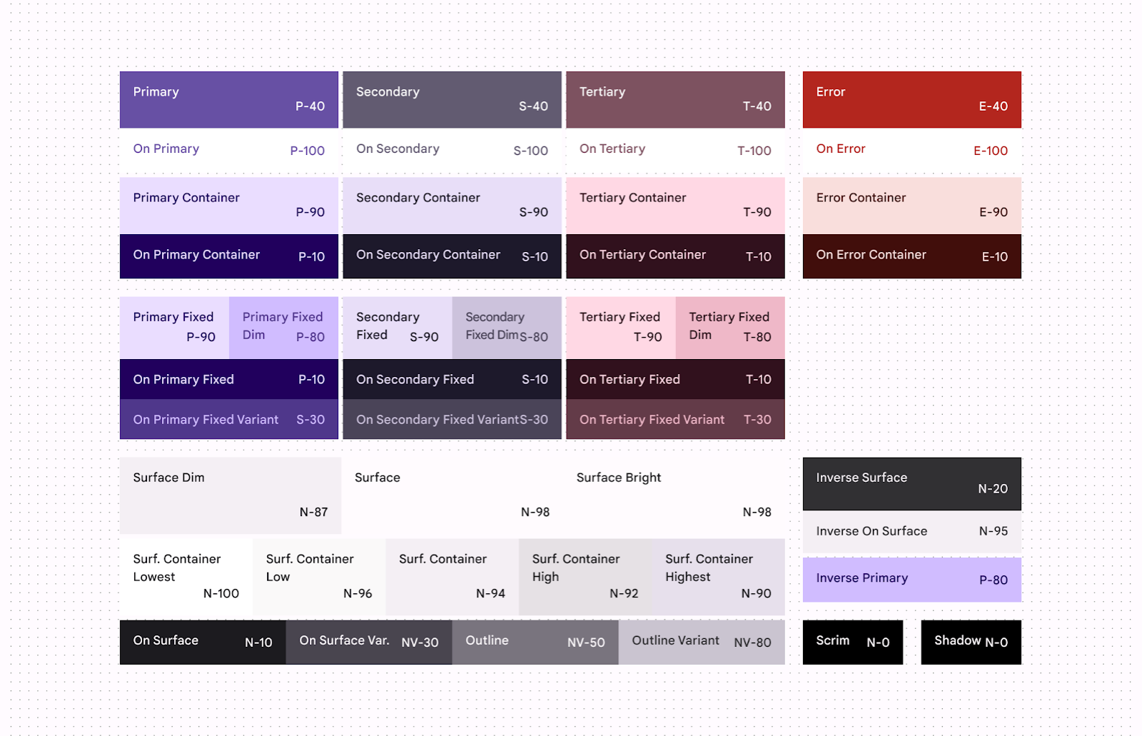
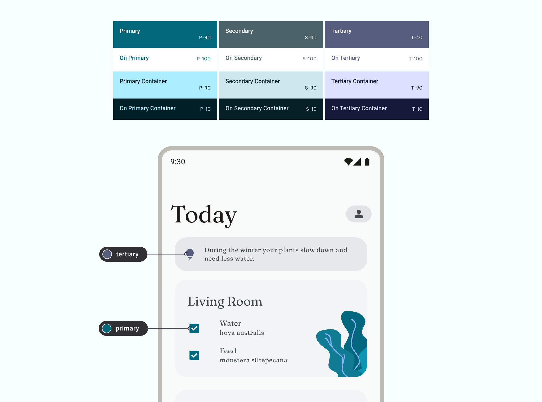
M3 color is built around the HCT model to derive harmonious accessible color schemes and helps dynamic color features. The M3 color system begins from a source color. This source color is translated into five key colors: primary, secondary, tertiary, neutral, and neutral variant. These five key colors create tonal palettes composed of tonal increments for each key color.
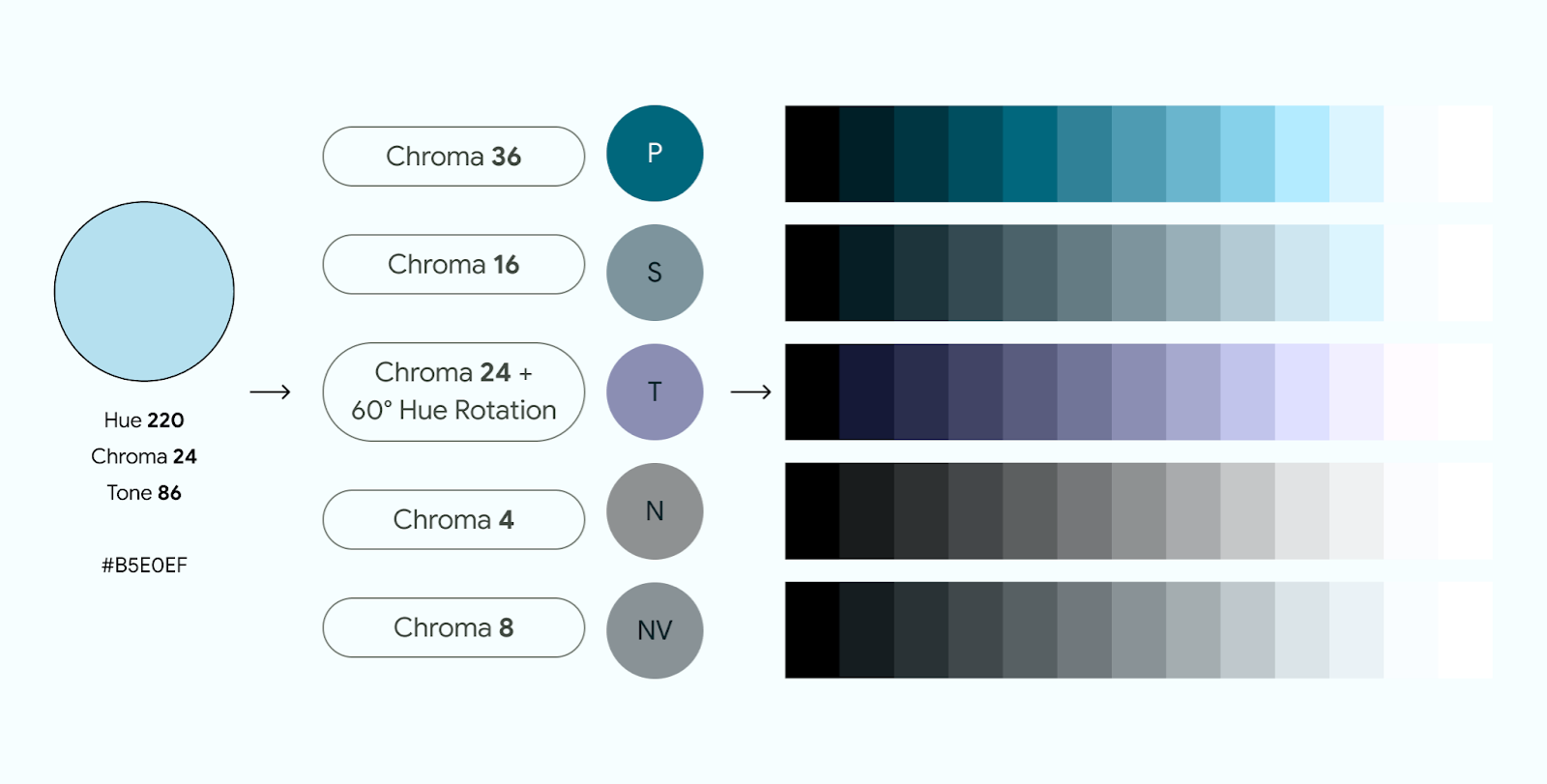
If you manually assign a key color, note the input's chroma and tone, as the color's tone may not be the color role's tonal value.
The M3 color system is powered by the Material Color Utilities (MCU), a set of color libraries containing algorithms and utilities that make it easier for you to develop color themes and schemes in your app.
The following video describes how color schemes are derived.
Color limitations
Color limitations are the physical limits of color—whether it's the actual physics, our own biological visual limitations, or the limitations of on-screen color rendering. For example, some hues cannot exist with certain chroma or tones. Color limitations are the reason colors such as light blue or bright light red are not quite possible. Tone color mapping must be consistent across all hue values.
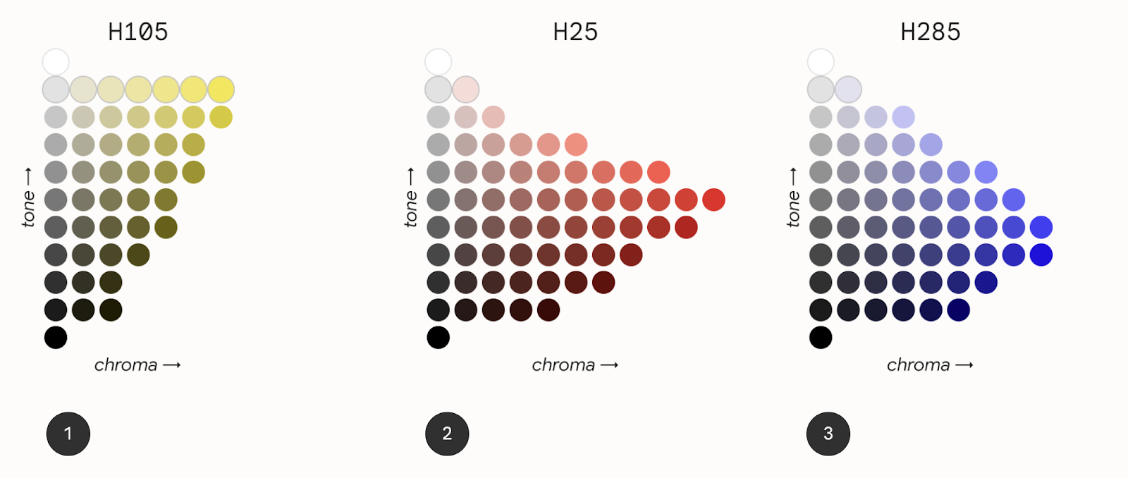
The preceding figure shows three different tone mapping charts for the H105, H25, and H285 hue values.
Chart 1–hue 105 (yellow). Indicates the availability of color. Chroma and Tone work like a graph. The yellow hue has limited chroma with certain tones along the graph, yellow does not have a wide range of vibrancy at lower tones.
Chart 2–hue 25 (red). Shows more chromatic options than hue 105 (yellow). In this tone map, the point of highest colorfulness is at a lower tone level.
Chart 3–hue 285 (blue). Shows that the highest colorfulness is found at an even darker tone. On the flipside, chroma capacity is lost at a lighter tone.
Color scheme
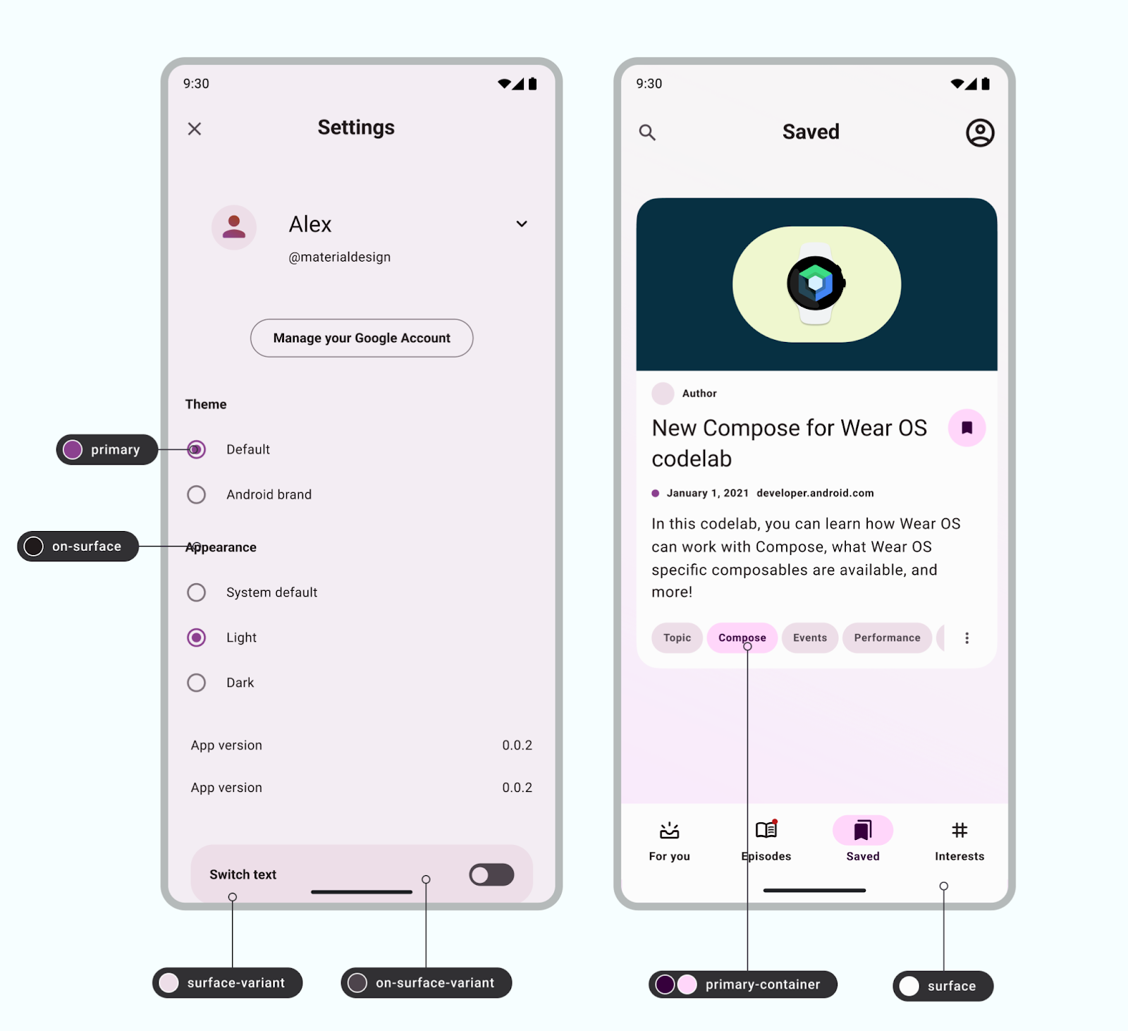
A color scheme is the set of accents and surfaces derived from specific tones and assigned to color roles, which are then mapped to UI elements and components. Color roles refer to the color's use, rather than the color's hue. For example, on-primary rather than on-blue.
Color schemes are designed to be harmonious, ensure accessible text, and distinguish UI elements and surfaces from one another. Color role pairs (composed of container and on-container roles) have tonal values that provide accessible contrast.
Light and dark schemes are created and have their own specific tone assignments.
The Material color system and custom schemes provide default values for color as a starting point for customization.
Learn more about the M3 color system.
For a customizable color scheme, explore the Android UI Kit.
Apply color to your UI
UI color consists of accent, semantic, and surface colors.
- Accent colors refer to core colors that are typically part of the Android brand color palette.
- Semantic colors (or custom colors within Material 3), are colors with specific meaning.
- Surface colors refer to any neutral derived colors used for background colors.
Accent color
Accent colors usually exhibit the most expressiveness within a UI, whether it's for branding, highlighting actions, personal expression, or user expression.
Each accent color (primary, secondary, and tertiary) is provided in a group of four to eight compatible colors of different tones for pairing, defining emphasis, and visual expression.
Dynamic color
Accent colors can be defined from dynamic sources.
Starting in Android 12 (API level 31), dynamic color lets the system extract a source color from a user's wallpaper or in-app content, like a keyart asset. Dynamic color uses MCU algorithms and processes to create schemes and implement them with little effort. To apply dynamic color to your app, read Enable users to personalize their color experience in your app.
Try out the code lab for Visualizing Dynamic color for a hands-on look at dynamic color.
Static
A static scheme is a scheme that has unchanging (or relatively) values. A common way of creating a static scheme is with brand colors, aligning primary, secondary, and tertiary colors to the brand's main color palette.
Even if you're using dynamic color, we strongly recommend creating a static scheme as a fallback if dynamic color isn't available to the user's device. Otherwise, the system uses the baseline purple color scheme.
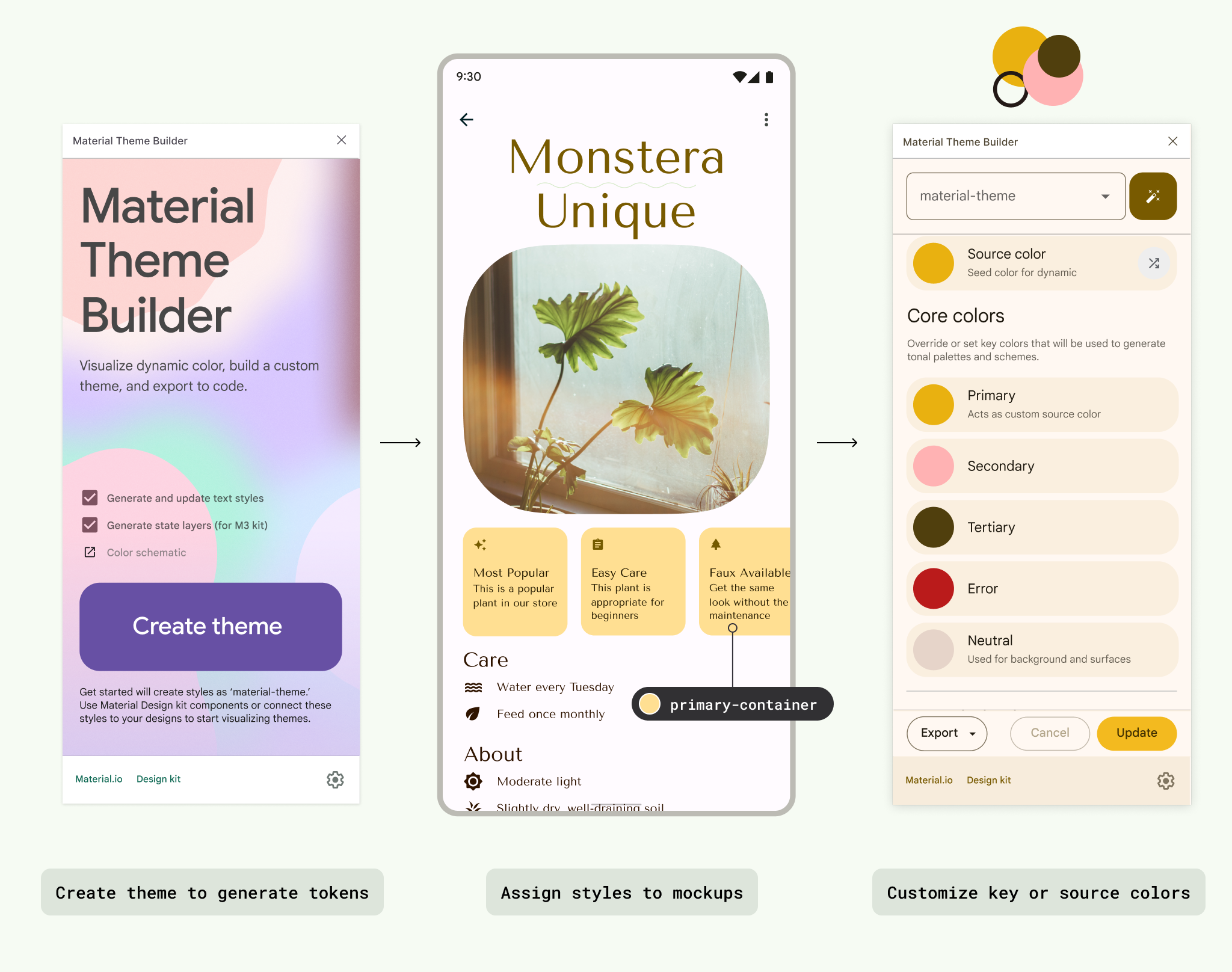
Using the Material Theme Builder, you can apply the MCU color algorithm to generate a static, custom theme. This results in colors that you've chosen, but which are aligned to the M3 color system tokens and harmonious accessibility principles.
It's still possible to create a fully customized static scheme. To do this,
assign different values within the color styles (color.kt or color.xml), or
export the theme file from Material Theme Builder for Figma after updating the
Figma style properties.
Usage
Material components have preassigned color roles, but you can utilize color tokens throughout your UI and custom elements. Use all accent colors mindfully, taking into account that the human eye is particularly drawn to vibrant colors.
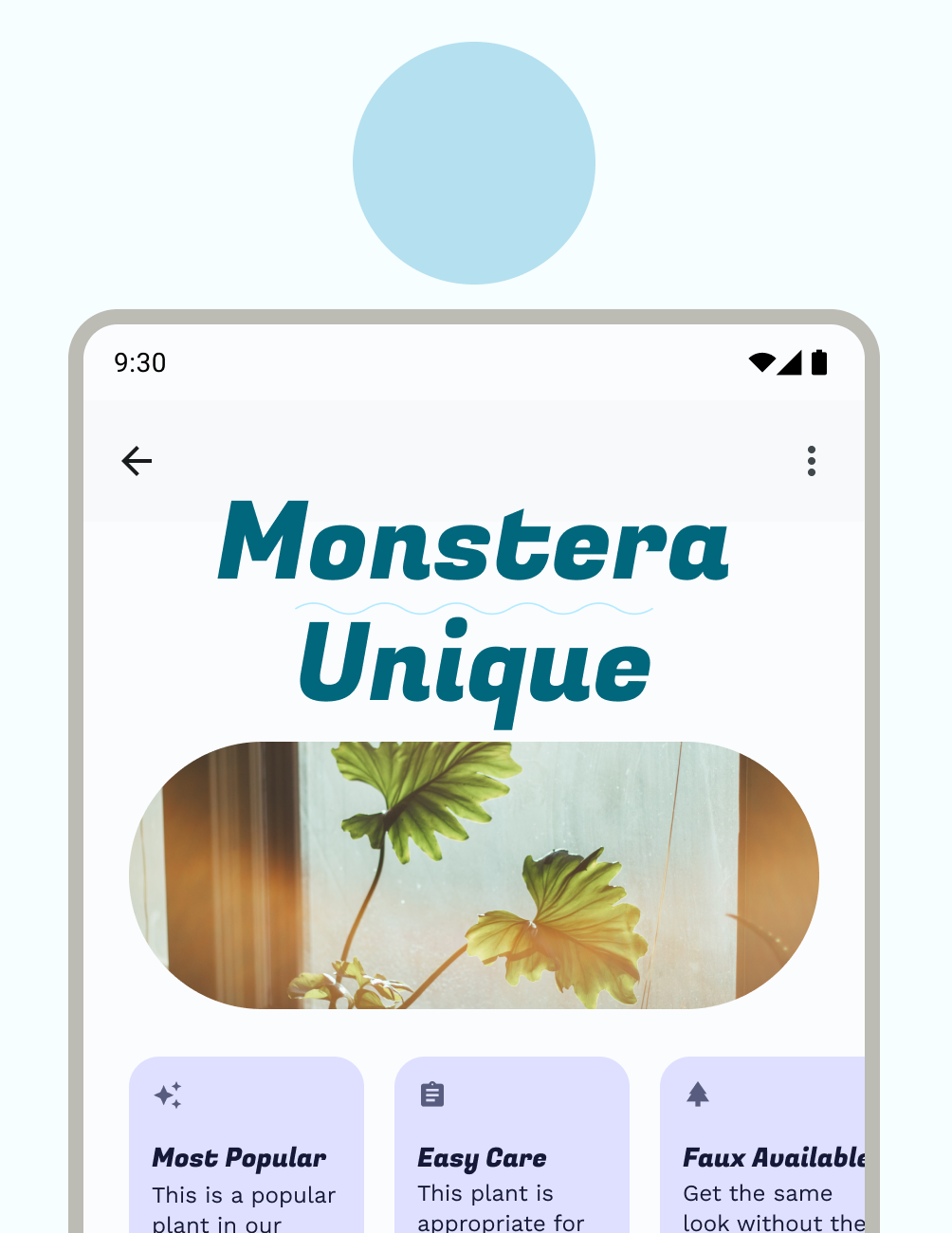
As with type, the system applies color in a hierarchy, with primary color and its respective roles assigned to crucial calls to action (CTAs). We recommend components such as floating action buttons (FABs) to take on primary roles.
When you're choosing a primary color, it's a good idea to assign your brand's primary color. Alternatively, you can select a color to represent interactive components, allowing your brand colors to be used more sparingly. Secondary and tertiary colors continue down the hierarchy of highlighting importance.
An oversaturated look can result in using only the base color roles of primary, secondary, or tertiary. To help with your color hierarchy, apply color schemes to include less vibrant container colors and outline roles.
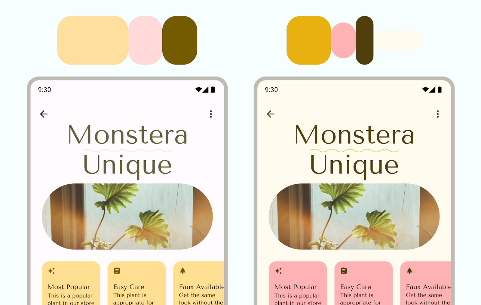
To ensure a better user experience, use more vibrant primary colors to signify actions of greater prominence in your app's visual hierarchy. In the following figure, the FAB in the first image has a muted color with the same tone and chroma as navigation, making it blend in. The second image shows a FAB that calls more attention to itself with a vibrant primary color.
For a hands-on look at dynamic color, try out the code lab for Customizing Material color.
Semantic color
Semantic color are colors that have assigned specific meanings. For example, Error is a semantic color.

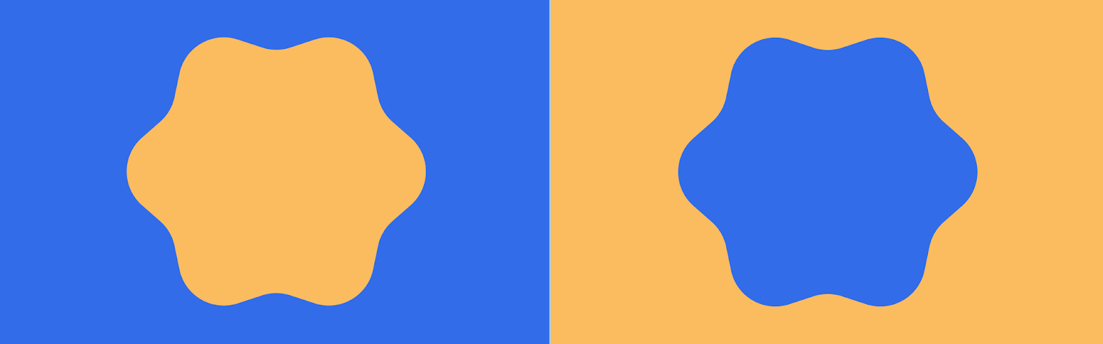
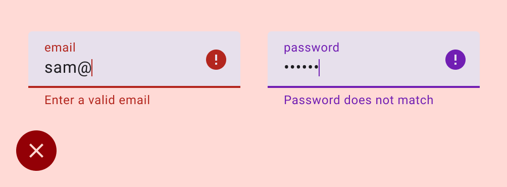
Be consistent with the meaning of color–if you establish a pattern, repeat it throughout the app. For example, if you have established purple to indicate a membership feature, use purple for all instances of this membership feature.
In the following example, an app uses red to indicate an error in one text field, but purple for the other–this would cause confusion when skimming a form.
Although the Material color scheme provides the semantic error color, additional semantic colors are created through custom colors to extend your color scheme. Read more about custom colors.
Harmonization provides a way to align dynamic user-generated color with custom colors within your app to create more harmonious color palettes.
Surface colors
Surface colors are designed for background elements such as component containers, sheets, and panes, and represent the majority of your app's colors. Don't be shy to use lots of surface space; the human eye needs space to relax. Surfaces also help contain content and direct the reader.
M3 introduced the concept of tonal surfaces, meaning all colors are derived from the tonal palettes. Tones create both depth and more contrast to aid accessibility. For more on surface roles, see the surface roles M3 guidance.
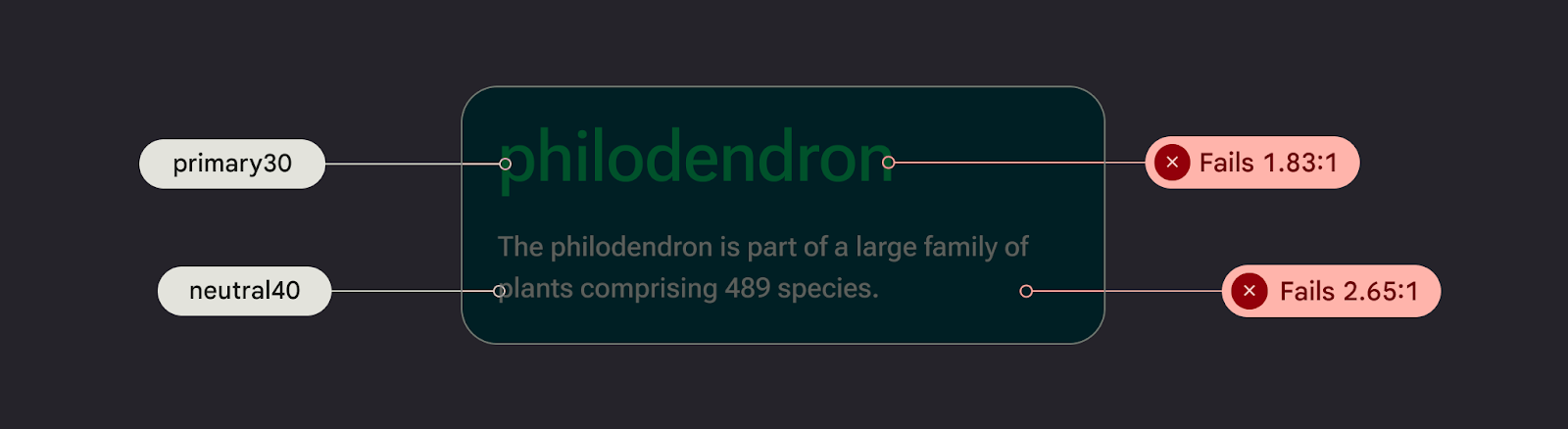
Accessibility and color
People view color in various ways depending on their visual acuity. Because some readers are color blind, you need to check color combinations to ensure UI elements don't blend together. Although opacity and weight might not be the literal hue of a color, they have a powerful visual effect on how users perceive color.
Color contrast is the difference between the luminance of the foreground and background elements, presented in a ratio format. This ratio criteria is given grades. For example, measuring the contrast between text on a button and its container helps determine the legibility of the text. Color contrast guidelines are divided into text and non-text, each with their own set of grades. Read Design with accessible colors for more details.
Never make color the only affordance or indicator for an available action. Utilize a component button, change of font weight, or even an icon to help inform your user that they can interact with the element.
Implement color
Tokens are small variable semantic representations of design data. They are repeatable and replace static values, such as hex codes for color, with self-explanatory names. To assign the color role of an element, use tokens instead of hard-coded color values.
Check out the Now in Android Figma sample for examples of color role mapping.
Color values are set within a color file color.kt using Compose (or
color.xml using Views). These colors set as styles are part of a
theme. See more about this in Design for Android mobile themes.
To set color values on Android, use hex code, which represents RGB in a 6-digit format. To capture opacity, append the value to the front to make an 8-digit code.
Using Material Theme Builder:
You can create customized light and dark color schemes using the Material Theme Builder (MTB).
MTB lets you visualize dynamic color, generate Material design tokens, and customize your color schemes.
The color scheme can be fully customized by updating style properties within the Figma inspector panel. These modified values are exported.