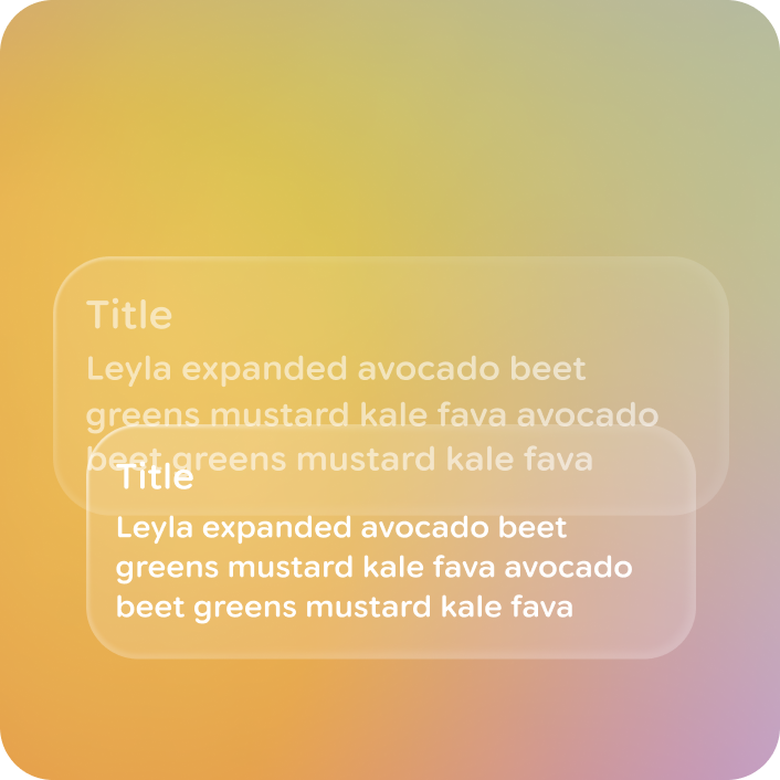
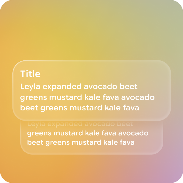
A stack is a collapsed list that only displays one piece of content at a time, in a stacked visual, such as a notification or card.
Principles
Stack are a container component, so they share design principles with cards and lists:
Containment: Stacks group related information and actions into a single, digestible unit.
Focused & Clarity: They present content in a clear, focused manner.
Versatility: Stacks can display cards and notifications.
Consistent Presentation: Stacks follow a consistent visual structure.
Usage & Placement
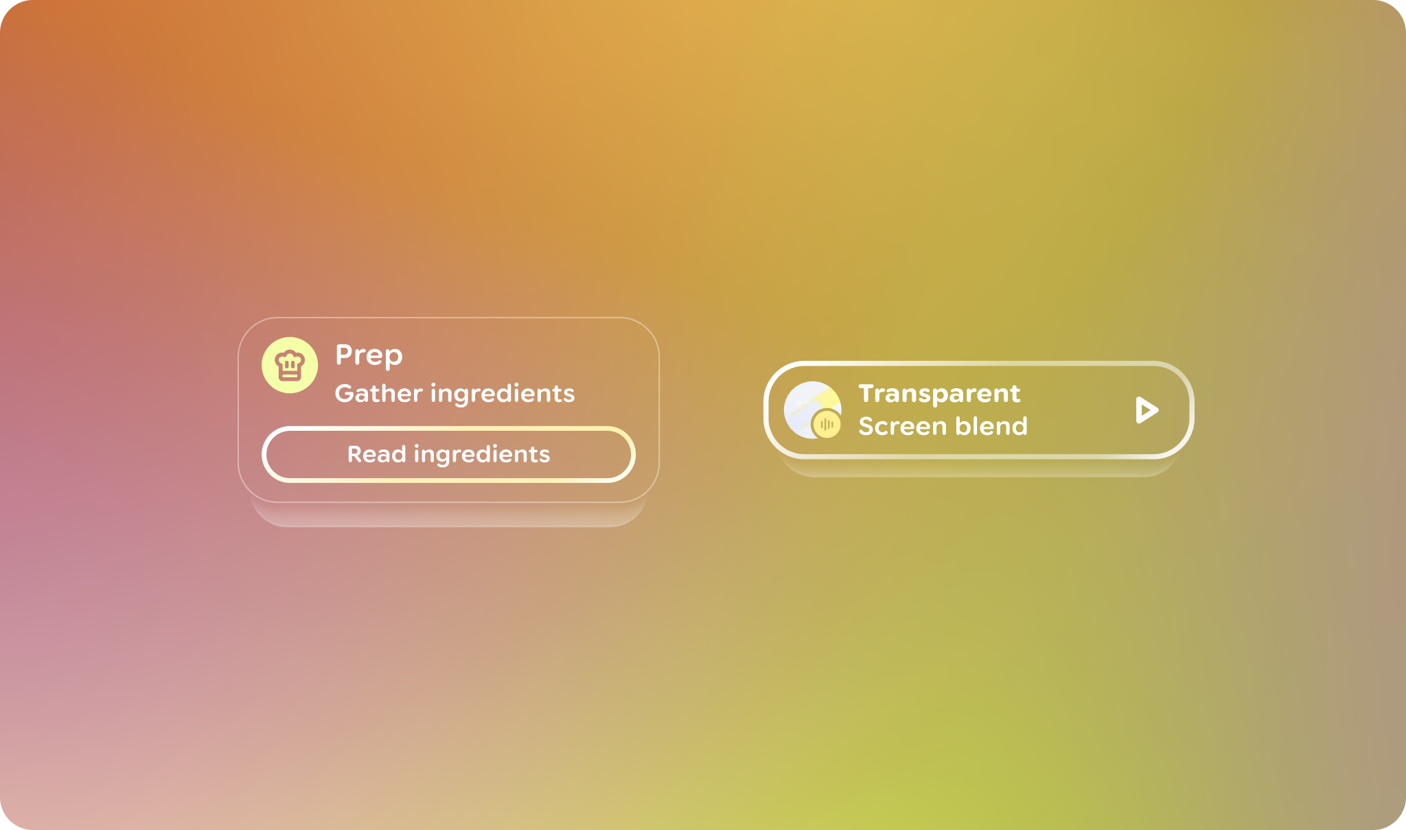
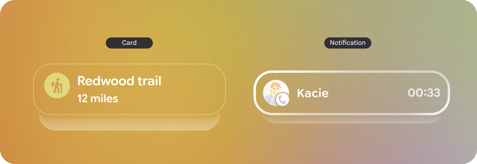
Stacks are a way to showcase to users that there are multiple elements collapsed in a list while minimizing the visual elements within view. There are two different variants of stacks:
Card stacks
Notification stacks
Stacks are a container component, both versions don't act or look differently.
Both should look and act nearly identical. The stack is a container for these controls with built-in logic for pagination.
Stack navigation
Users navigate by swiping or dragging along the touchpad forward and backward. Scrolling the stack will move through only one item at a time.
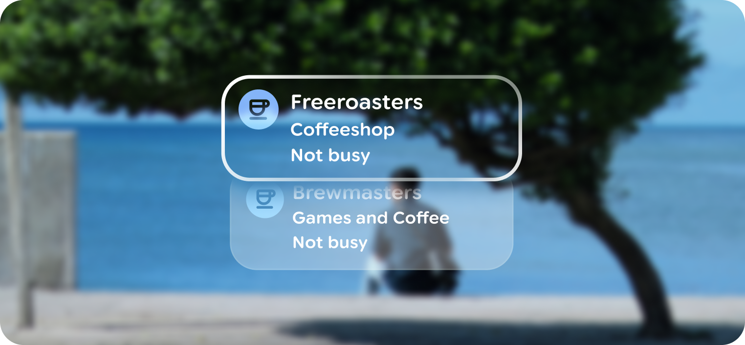
Stacks can traversed one item at a time.
Upon touch input, stacks are able to present one item at a time by moving vertically, and become lists to show more than one element at a time. The list should use default containers and focus states.
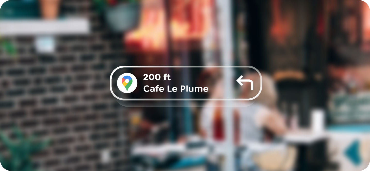
Use depth to indicate focus
Lower stack items use a depth of 0 while the top most item uses a depth of +2.
Anatomy
A stack is always collapsed as a pagination component. The top item is always the primary focus, showing the stronger border depth, unless there is a nested enabled button.
Swiping past the start or end of a stack shows the standard stretch animation, reinforcing the beginning or end of a stack.
Customization
Stacks have built-in scrim, paging, and animations that can't be customized. Rather the content within the stacks is customized.
Do