
Cards can contain a wide-variety of information like text, icons, images, Gemini responses, or actions.
Principles
Cohesive: Cards group related information and actions into a single, digestible unit.
Clear: They present content in a clear, organized manner, enhancing scannability.
Versitile: Cards can adapt to display a wide range of content, from small text blurbs to more complex summaries with multiple elements.
Modular: Designed to be modular and reusable across different parts of the Jetpack Compose Glimmer for Glasses interface.
Usage & Placement
Cards can contain a wide-variety of information like text, icons, images, actions or Gemini responses.
Use Jetpack Compose Glimmer card templates for content as they are come in many variations and optimized to follow glasses design principles out of the box.
Do
Don't
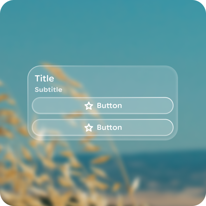
Use a button group with a card to display more than one action.
Do
Don't
Anatomy
Cards are built with pre-set slot templates.
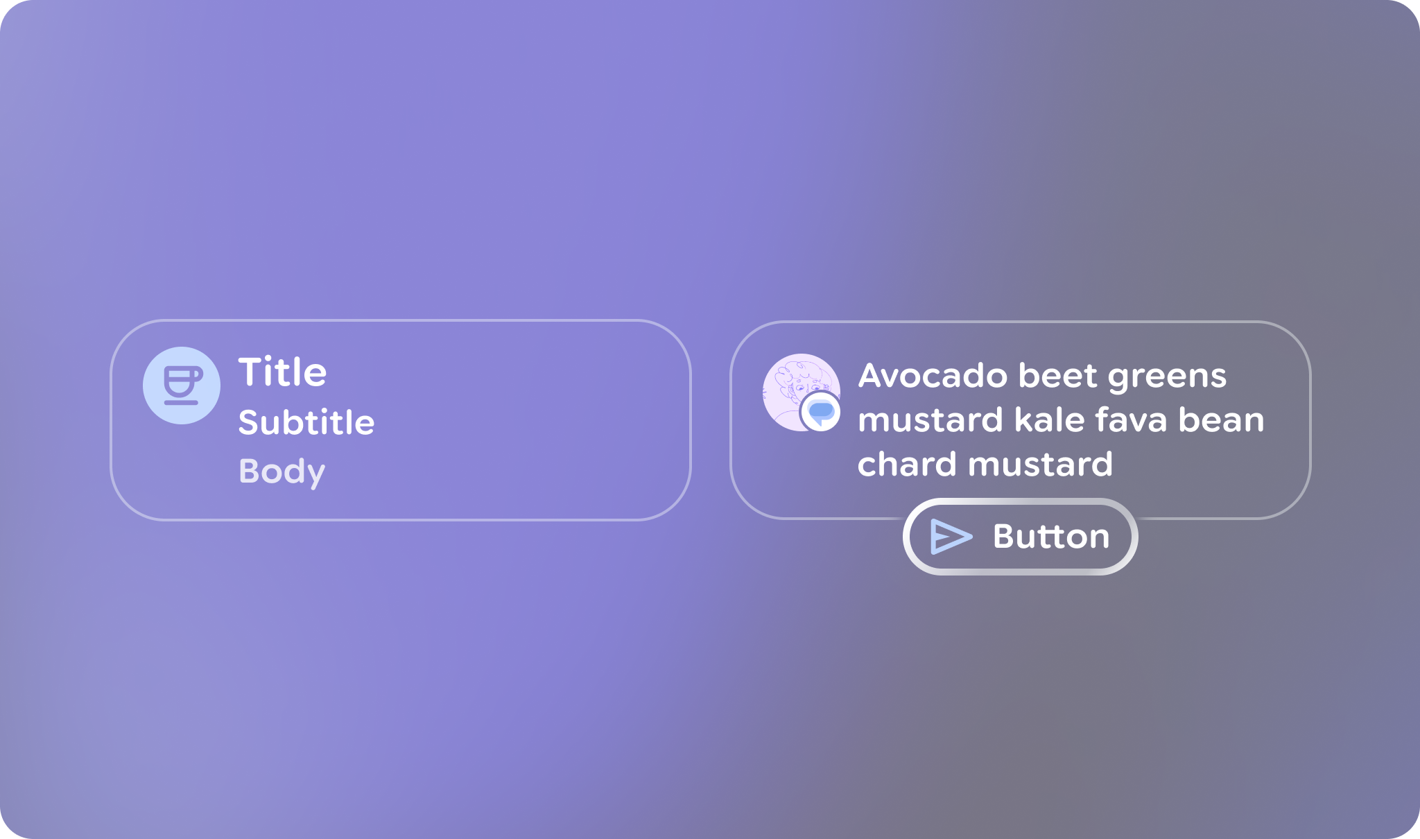
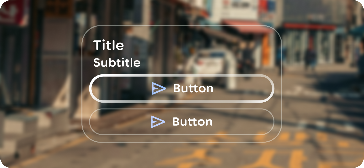
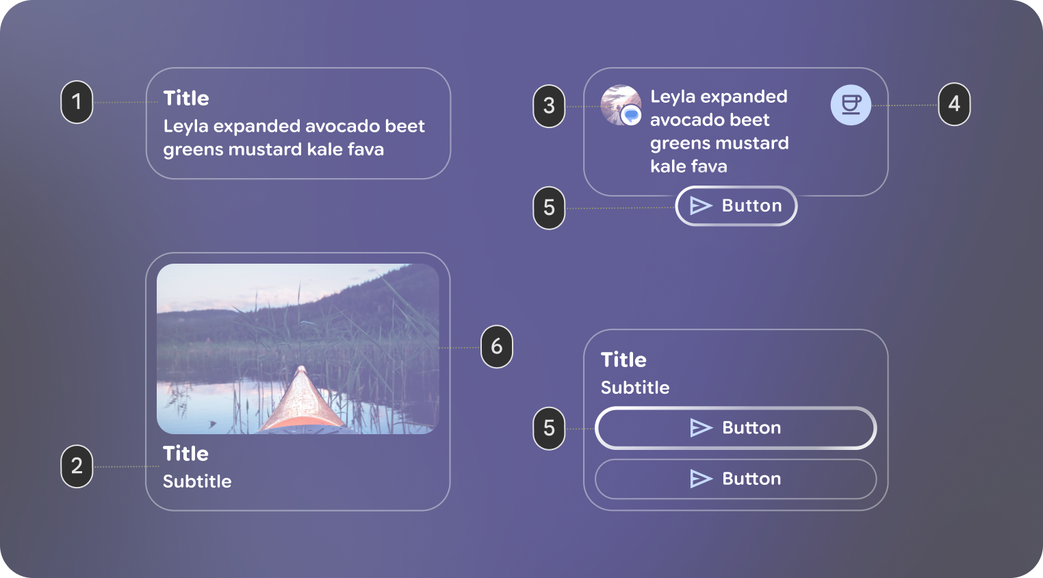 1. Header: The top section of the card, designed to hold an image.
2. Title and Subtitle: These text fields provide the main and secondary labels for the card.
3. Leading Icon: An optional icon that appears at the beginning of the card's content area.
4. Trailing Icon: An optional icon that appears at the end of the card's content area.
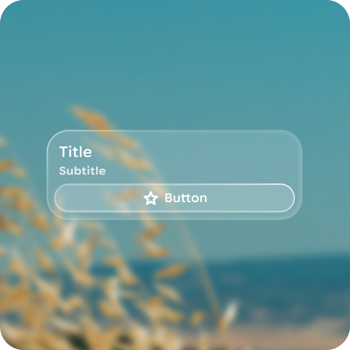
5. Action: A slot for a primary interactive element, such as a Button. This allows users to perform an action directly from the card. If a card has an action, it should only contain a single action.
6. Main Content: The core body of the card, where you place the primary Text or other content.
Focus
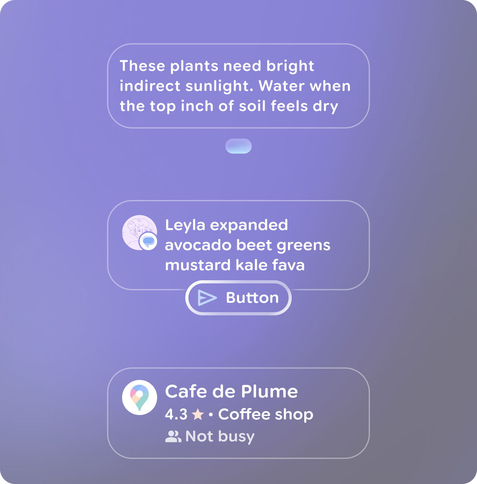
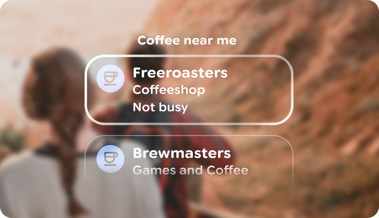
For cards whose primary purpose is to house a specific interactive element (like the Button in the Action), focus should go directly to that element, not the card container. A card becomes focusable when it represents a single, navigable item, such as an entry in a list. This provides a more direct and accessible user experience.
 A
card that has focus as a list item.
A
card that has focus as a list item.
 A
button within a card is given focus as the actionable element.
A
button within a card is given focus as the actionable element.
Customization
| Properties | Customization | Defaults |
|---|---|---|
| Shape | Yes | Medium |
| Padding | Yes | 24 dp, 24 dp |
| Border | Yes | 2 dp, #606460 |
| Text | Yes | Body Small |
| Leading icon | Yes | 56 dp |
| Trailing icon | Yes | 56 dp |