
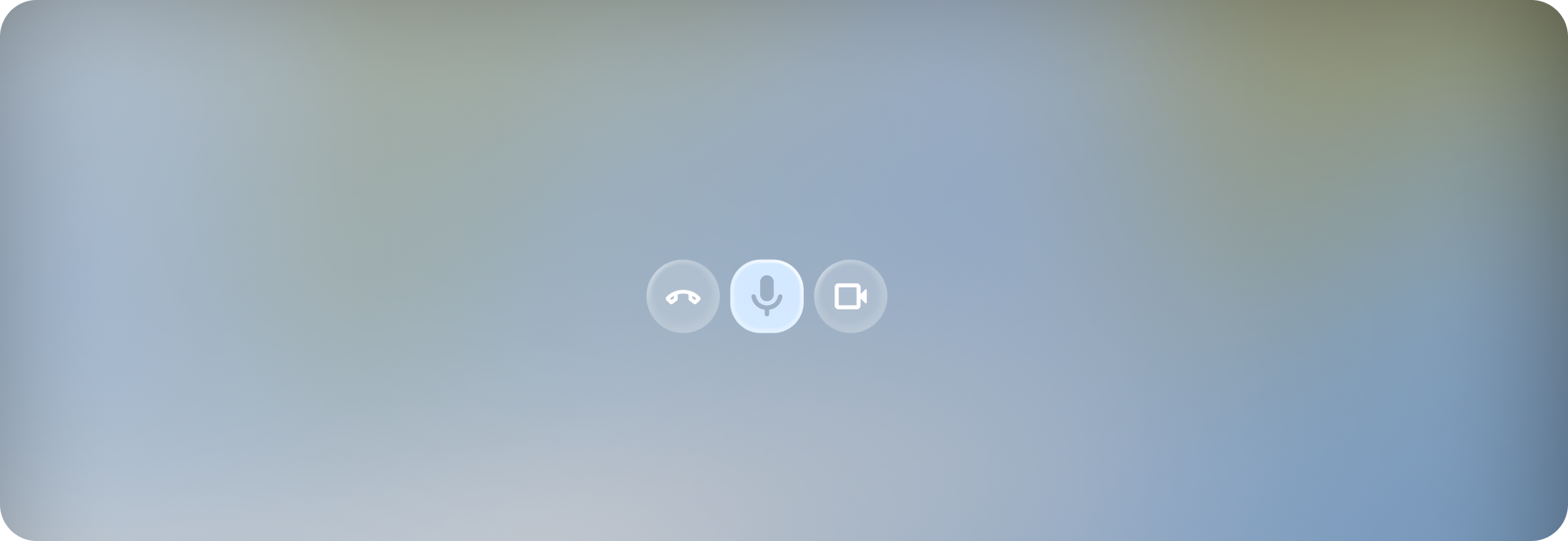
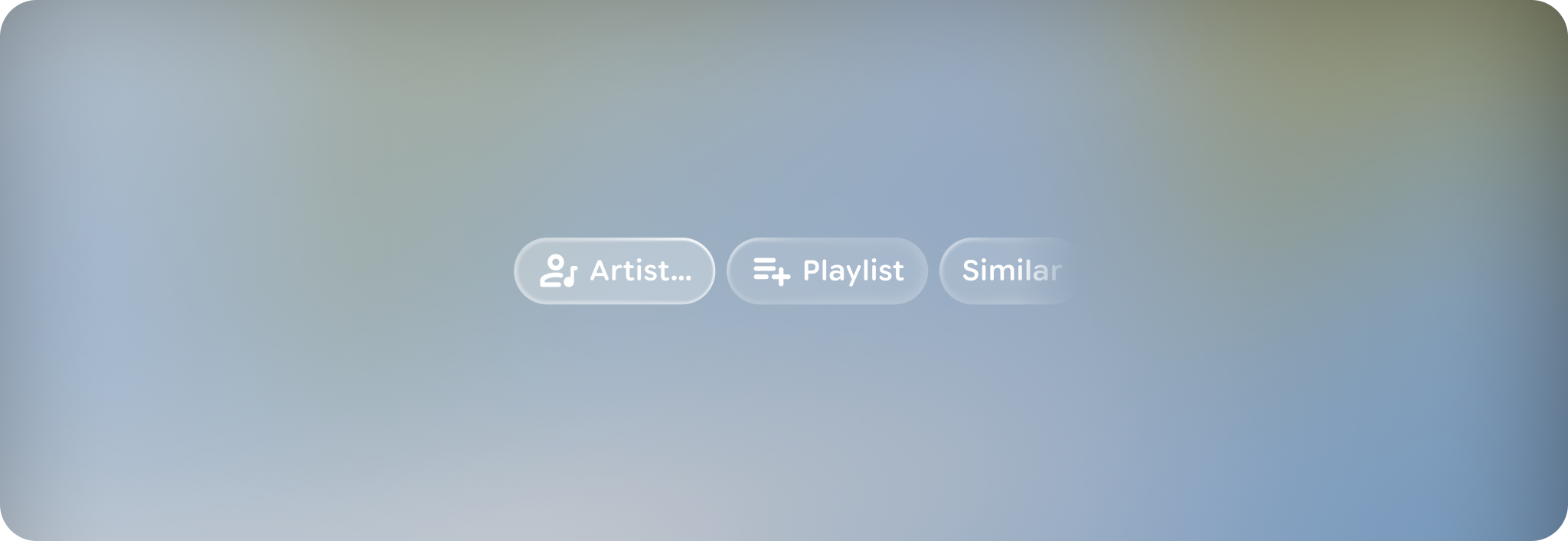
A button group provides a navigable container of buttons.
Principles
Action-Oriented: Contains actionable buttons, rather than groups of labels.
Containment: Groups actions together with motion and focus.
Flexible: Can consist of multiple button types.
Usage & Placement
Use a button group to display more than one button. When presenting multiple buttons, use a button group component rather than laying each out independently.
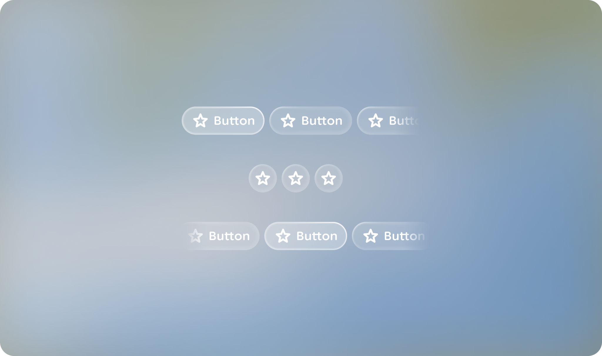
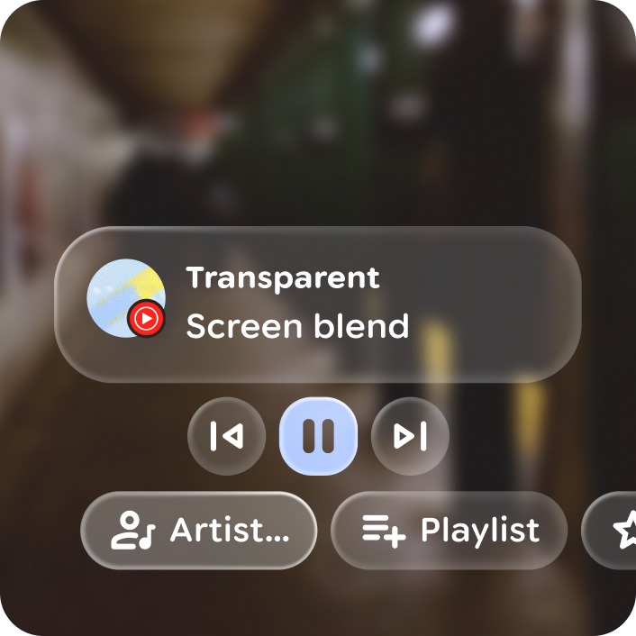
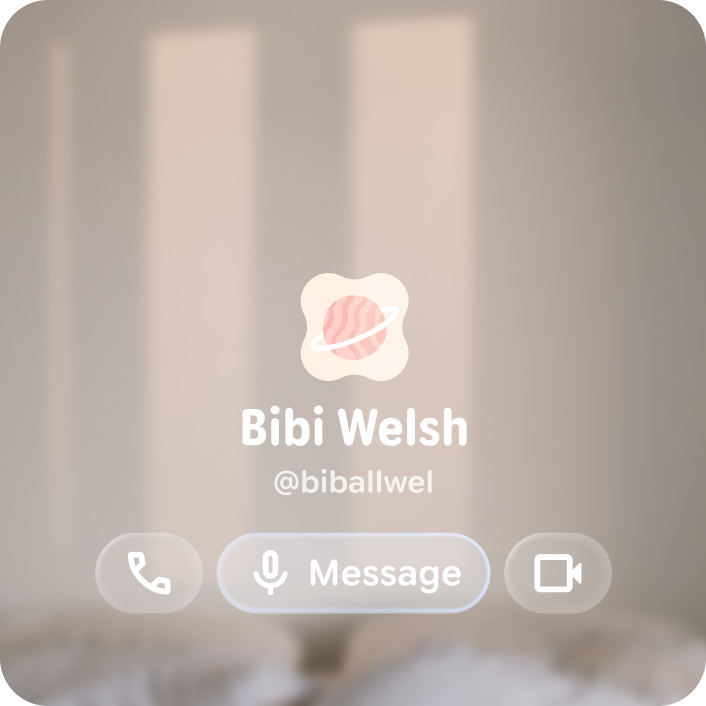
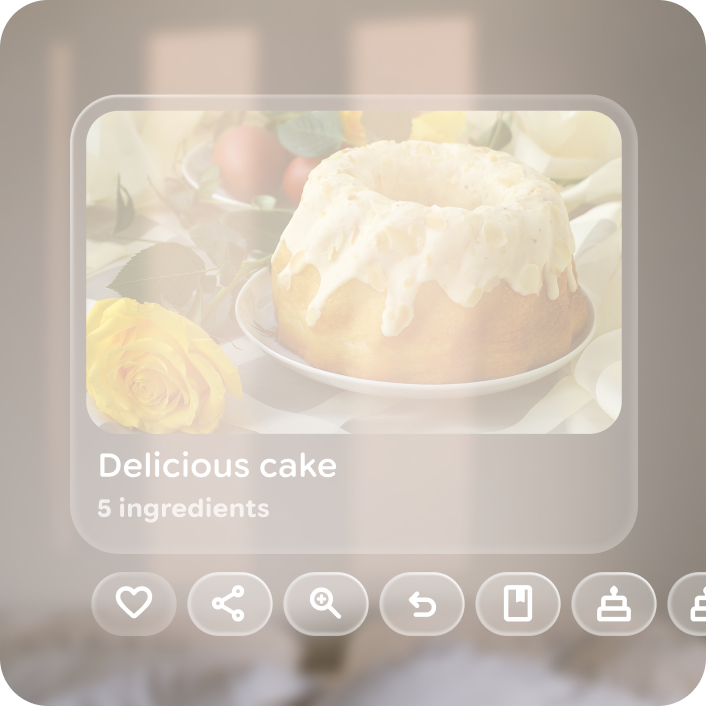
A button group can consist of any combination of button types of the same button height.

Do
Don't
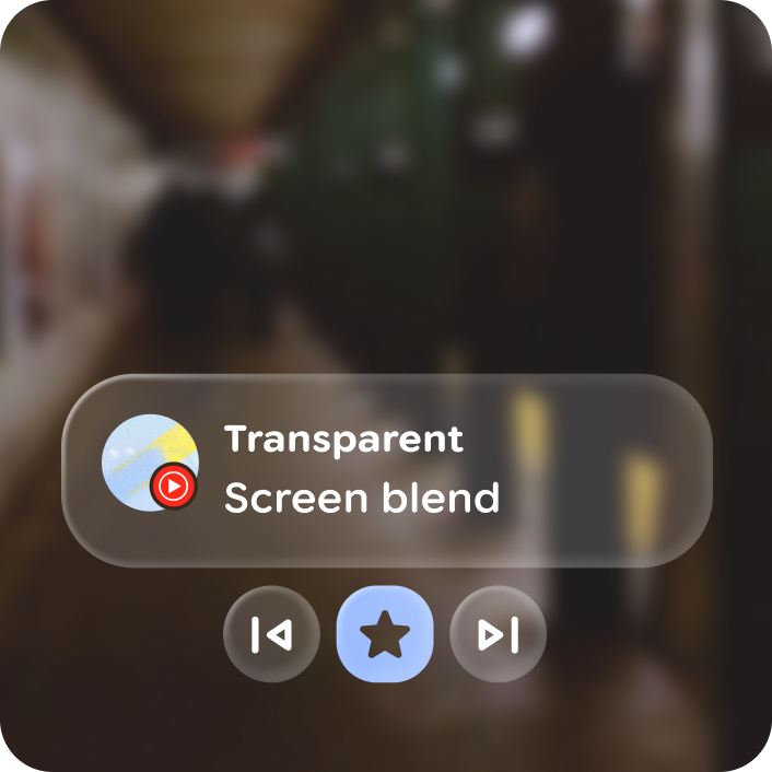
Button groups can be paired with other elements, like cards or stacks, to act as related actions.
Do
Don't
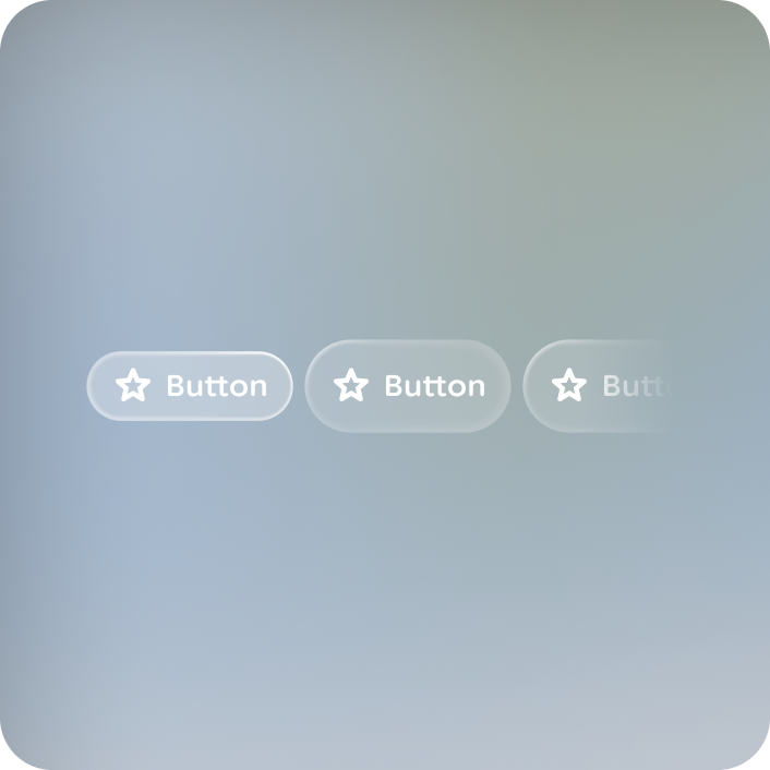
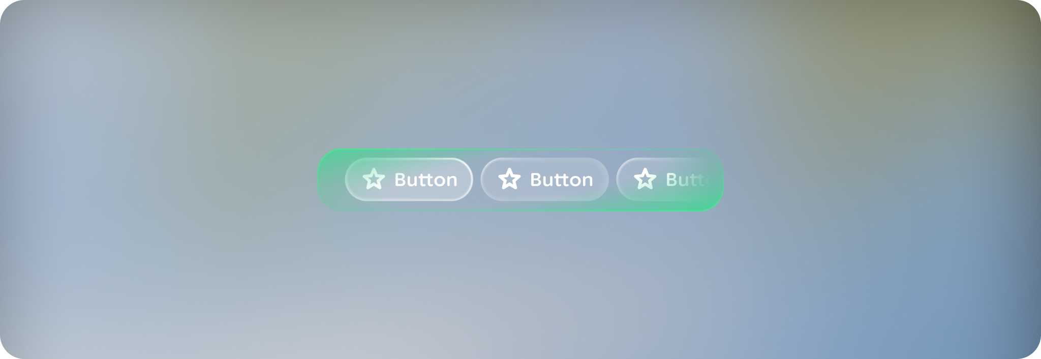
A button group layout can be contained or overflow, with 1 to 10 buttons.
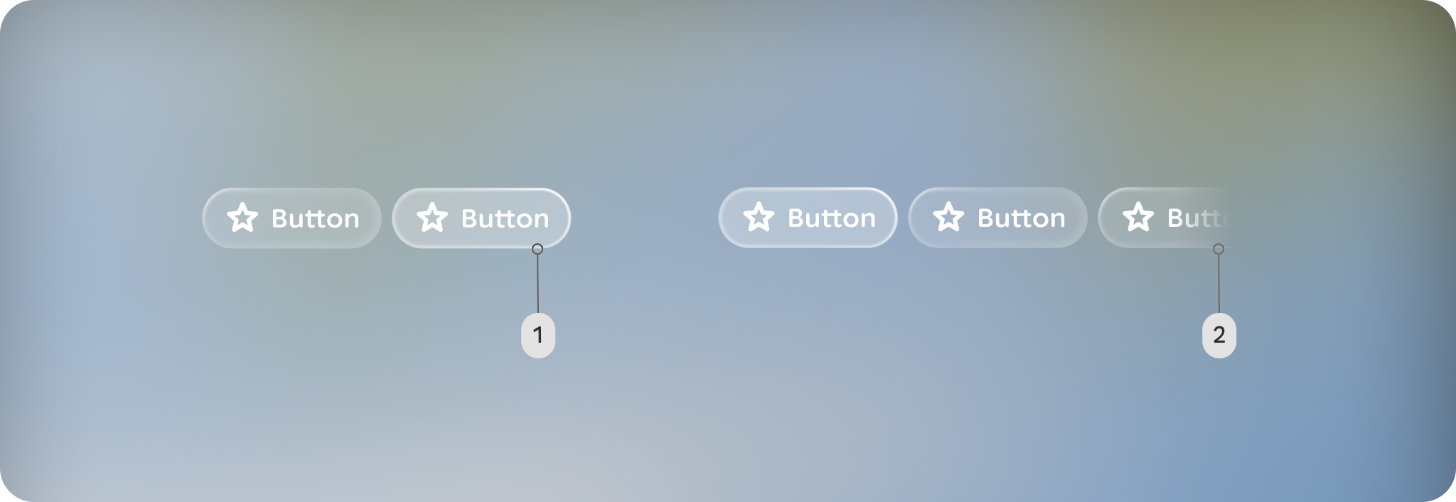
A. Contained: The button group fits within the container's width without any elements cut off.
B. Overflow: The button group's width is wider than the space available in the container.
Do
Don't
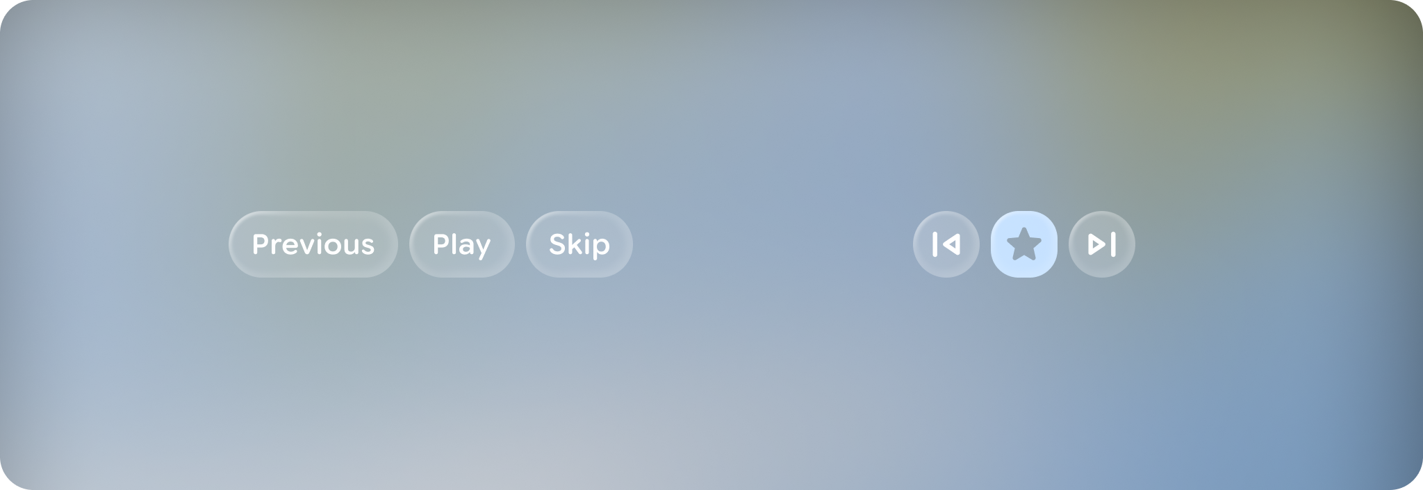
Focus
Initial focus defaults to the left most button, but can be configured to be centered for symmetrical button groups.
Do
Don't
A center aligned button group based on the initial focus element, that slides focus over per swipe. Avoid using an overflow layout, as all buttons should be visable and contained in a centered layout.
Left aligned button group layout include start and end margins of 44dp from edges. Buttons smoothly scroll over to the center over 3 steps on swipe and ramp up as they slide.
Anatomy
The button group is a container component, grouping 1 to 10 buttons of any type and consistent height. For more on buttons, read the button guidance.
Customization
A button group set can consist of any combination of button types of the same button height.
| Properties | Customization | Defaults |
|---|---|---|
| Initial focus | Yes | 0 |