
Up to Wear OS 7 (API 37), the platform did not render a system status bar over
application windows—apps owned the entire screen and could draw any content at
the top (12 o'clock) position (such as an in-app TimeText clock, custom
curved headers, or top controls).
Starting with Wear OS 8—and available now for early
preview testing in the Wear OS 7.1 Beta Preview Emulator (API 37.2-beta1)—the
system
renders a status bar over application windows at the 12 o'clock position to
display the time and status indicators. To prevent overlapping with the system
status bar, apps should stop rendering their own clock (TimeText) and respect
top status bar window insets (handled automatically by AppScaffold and
ScreenScaffold from Wear Compose 1.8 onwards), or hide the system status bar
when a full-screen immersive experience is needed.
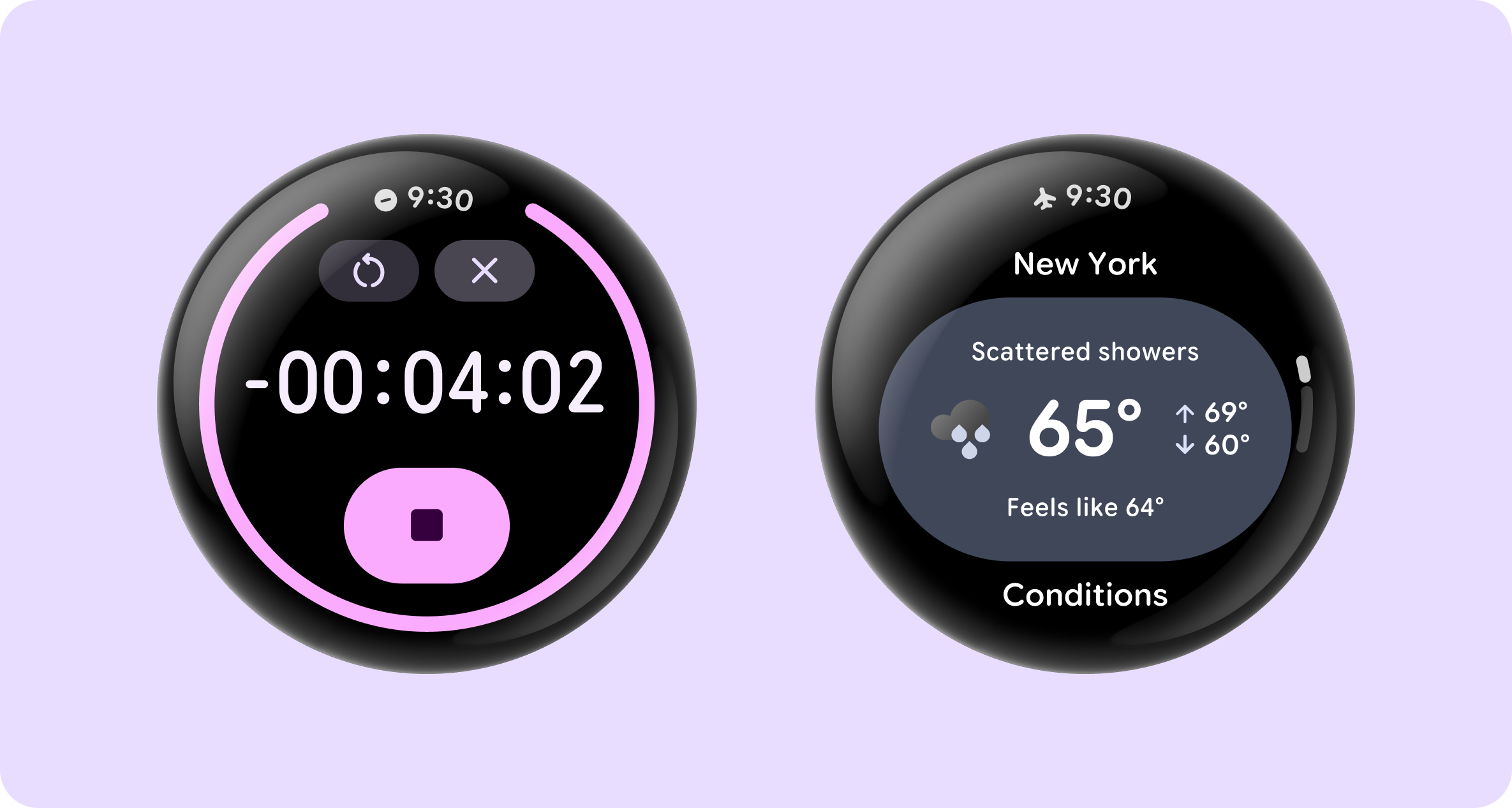
Key benefits include the following:
- Visual consistency: a uniform clock typography, placement, and backplate across the system and all apps.
- System status indicators: allows the platform to display status icons (such as active microphone and location indicators, connectivity status, or battery information) and time across surfaces. Only one icon is shown at a time, based on priority.
- Automatic scroll & transition coordination: when paired with Jetpack Compose for Wear OS 1.8, the system status bar automatically hides when users scroll through content and reappears after a short (2s) idle delay.
Set up your app
To get started, complete the following prerequisite steps:
- Install Android Studio Preview (Canary).
- In the SDK Manager, download the Wear OS 7.1 Preview Emulator System Image (API 37.2-beta1). This version provides early access to the Wear OS 8 system status bar ahead of the Wear OS 8 SDK.
- In the Device Manager, create and launch a Wear OS virtual device using the API 37.2-beta1 image.
To support the system status bar in your app, update your app's targetSdk
version to 35 or higher. The platform only activates the system status bar
for apps targeting API 35+ to preserve backward compatibility for legacy apps.
In addition, update your Wear Compose dependencies to the latest alpha
version—currently 1.8.0-alpha02—as shown in the following
code snippet. If your app is using an older version of Wear Compose, you can use
the Wear Compose Material 3 migration skill to facilitate the
migration.
android {
    defaultConfig {
        targetSdk = 35
    }
}

dependencies {
    implementation("androidx.wear.compose:compose-foundation:1.8.0-alpha02")
    implementation("androidx.wear.compose:compose-material3:1.8.0-alpha02")
}
Use the system status bar
In the latest alpha version of Wear Compose Material 3 1.8.0—currently
1.8.0-alpha02—the library automatically opts your app in by
merging the com.google.wear.ENABLE_GLOBAL_STATUS_BAR <meta-data> property
into your AndroidManifest.xml. At runtime, AppScaffold and ScreenScaffold
check whether the system status bar is enabled on the device and whether this
manifest opt-in property is set to true:
- On the preview emulator / Wear OS 8+ (when opted in):
AppScaffoldsuppresses its internalTimeTextso the system status bar renders cleanly at the 12 o'clock position without duplication.ScreenScaffoldre-calculatescontentPaddingto take Status Bar inset boundaries into account and coordinates hiding and showing the status bar as the list scrolls. - On Wear OS 7 and older devices (or when not opted in):
AppScaffoldautomatically falls back to rendering the standard in-appTimeText, maintaining full backward compatibility from a single codebase.
@Composable
fun GsbSampleApp() {
    // AppScaffold coordinates the system status bar across the app
    // and falls back to rendering TimeText on Wear OS 7 and earlier.
    AppScaffold {
        val columnState = rememberTransformingLazyColumnState()

        // ScreenScaffold includes status bar top inset clearance in
        // contentPadding and hides/shows the status bar during list scrolling.
        ScreenScaffold(scrollState = columnState) { contentPadding ->
            TransformingLazyColumn(
                state = columnState,
                contentPadding = contentPadding,
            ) {
                item {
                    ListHeader { Text("Hello Status Bar") }
                }
                items(count = 15) { index ->
                    Button(onClick = { /* Handle click */ }) {
                        Text("Item #${index + 1}")
                    }
                }
            }
        }
    }
}
Here's what to expect when running the sample:
- At rest (top of list): the system status bar is displayed at the 12 o'clock position. The "Hello Status Bar" header sits below the status bar inset area without clipping or overlapping.
- Scrolling down: as you scroll through the list items, the status bar hides, and list items scroll edge-to-edge behind the top bezel.
- Idle: when you stop scrolling and release the screen, the status bar automatically reappears after ~2 seconds.
Handle common scenarios and customizations
The following sections describe how to handle common scenarios that you might encounter when working with the system status bar.
Handle non-scrolling (static) screens
On screens that use a static layout (such as Column or Box) rather than a
scrolling list, apply the contentPadding provided by ScreenScaffold to your
root layout so top UI elements don't overlap the system status bar:
AppScaffold {
    ScreenScaffold { contentPadding ->
        Column(modifier = Modifier.padding(contentPadding)) {
            Text("Static Screen Content")
        }
    }
}
Work with full-screen interactive components
Full-screen interactive components in Wear Compose Material 3—including
AlertDialog, Dialog, Stepper, TimePicker, and
DatePicker—automatically hide the system status bar while on screen so their
controls have full access to the top of the circular display. When dismissed,
the system status bar is automatically restored using the window insets
controller API.
Switch to immersive mode
To switch to immersive mode—where both the system status bar and local
TimeText are hidden—add the StatusBarSuppression composable to your app or
screen. Reserve immersive mode for screens the user sees briefly (confirmation
overlays, dialogs) or that use the whole display (full-screen progress
indicators).
Consider when to use screen-level immersive mode
If only a specific screen in your app should be full-screen / immersive, call
StatusBarSuppression() within the ScreenScaffold's content.
ScreenScaffold automatically suppresses the system status bar (and omits top
status bar inset padding) while that screen is active, then restores the system
status bar when navigating back to other screens:
AppScaffold {
    ScreenScaffold() {
        StatusBarSuppression()
        // Full-screen immersive content
    }
}
Consider when to use app-level immersive mode
If your entire application (or Activity) is an immersive full-screen
experience across all screens, use StatusBarSuppression at AppScaffold
level and wrap your content to suppress system status bar in all screens:
// Use StatusBarSuppression at AppScaffold level and wrap your content
// to suppress status bar in the entire scaffold.
AppScaffold {
    StatusBarSuppression {
        SwipeDismissableNavHost(...) {
            // Nested screens inherit suppression and 0.dp padding
        }
    }
}
Display custom time text overrides
If you need to display a custom curved header or temporarily opt out of the
system status bar on a specific screen or across your app during migration for
Wear OS 8, passing a custom timeText composable suppresses the system status
bar:
// Screen-level custom TimeText override:
ScreenScaffold(
    timeText = { TimeText { timeTextCurvedText("Custom Status") } },
) {
    // Content
}

// App-level opt-out using in-app TimeText:
AppScaffold(
    timeText = { TimeText() },
) {
    // Screens
}
Implement using Views (not recommended)
If your app uses Android Views rather than Jetpack Compose for Wear OS, opt in
using AndroidManifest.xml. Unlike the
latest alpha release of Wear Compose Material 3, which enables the system
status bar automatically, View-based apps must explicitly opt in by adding the
ENABLE_GLOBAL_STATUS_BAR <meta-data> tag inside <application>:
<application ...>
    <meta-data
        android:name="com.google.wear.ENABLE_GLOBAL_STATUS_BAR"
        android:value="true" />
</application>
Monitor top window insets
Use ViewCompat.setOnApplyWindowInsetsListener and check the value of
windowInsets.getInsets(WindowInsetsCompat.Type.statusBars()). When
statusBarInsets.top > 0, remove your legacy 12 o'clock UI and adjust top
padding; otherwise, fall back to your legacy UI:
ViewCompat.setOnApplyWindowInsetsListener(rootView) { view, windowInsets ->
    val statusBarInsets = windowInsets.getInsets(
        WindowInsetsCompat.Type.statusBars()
    )

    if (statusBarInsets.top > 0) {
        // status bar is visible: remove legacy 12 o'clock UI and apply top inset padding
        view.updatePadding(top = statusBarInsets.top)
    } else {
        // status bar is not visible: fall back to legacy UI and padding
    }

    WindowInsetsCompat.CONSUMED
}
Programmatically hide and show the status bar
Unlike ScreenScaffold in Compose, View-based apps must explicitly
hide or show the system status bar (for example, when entering a full-screen
immersive view or coordinating scroll-away behavior) using
WindowInsetsControllerCompat:
val insetsController = WindowCompat.getInsetsController(window, window.decorView)

// Hide the status bar
insetsController.hide(WindowInsetsCompat.Type.statusBars())

// Show the status bar
insetsController.show(WindowInsetsCompat.Type.statusBars())
Test your app
When testing your app on the Wear OS 7.1 Beta Preview Emulator (API 37.2-beta1), check the following:
- Clock appears only once: Verify that only the system status bar time
appears at the 12 o'clock position and no legacy in-app
TimeTextand app content overlaps it. - Top padding: Verify that screen titles, headers, and top buttons appear beneath the status bar.
- Full-screen overlays & dialogs: Verify that dialogs, pickers, steppers, and custom full-screen activities hide the status bar when opened, and that they restore it when closed.