
이 가이드에서는 Android TV용 배너 및 런처 아이콘을 만드는 방법을 설명합니다.
핵심 요점
다음은 이 페이지의 주요 내용입니다.
- AndroidManifest.xml의 Android TV OS 앱에는 두 가지 아이콘 유형이 있습니다.
android:icon(표준, 필수)android:banner(배너, 필수)
- 적응형 아이콘을 사용하는 것이 좋습니다.
- 아이콘과 배너는 모두 이 가이드에 설명된 디자인 가이드라인을 준수해야 합니다.
- 공식 figma 템플릿을 사용하여 배너 및 아이콘을 생성합니다.
- Android TV OS는 테마 아이콘을 지원하지 않습니다.
개요
Google TV 및 Android OS에서는 AndroidManifest.xml를 통해 제공되는 아이콘을 세 가지 방식으로 사용합니다.
- 런처 아이콘 (가로세로 비율 1x1)
- 원형 런처 아이콘 (가로세로 비율 1x1, 원형)
- 배너 로고 (가로세로 비율 16x9)
이는 내 앱 행, 설정 또는 설치 진행률과 같은 다양한 사용 사례의 여러 위치에서 사용됩니다.
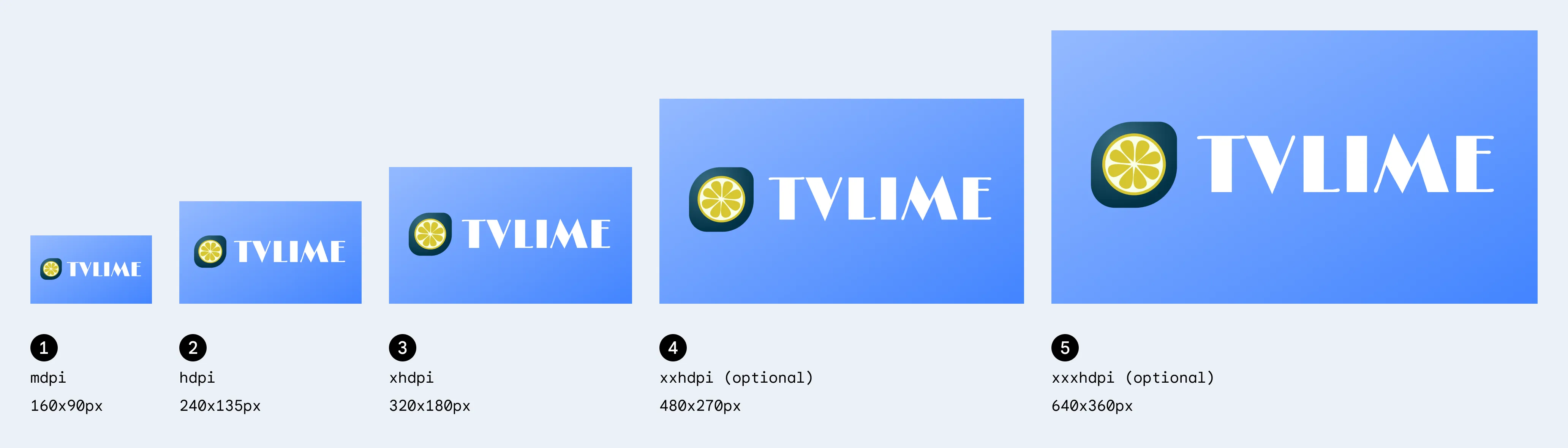
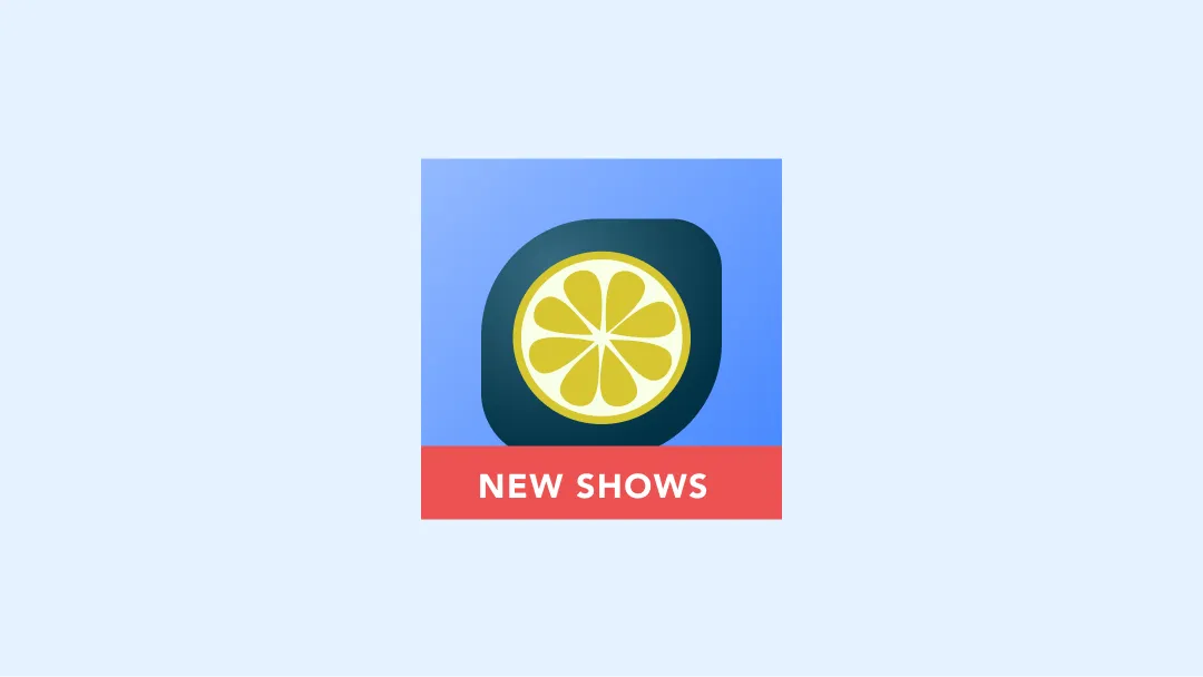
배너
배너 로고는 Android TV OS에서 앱 런처를 표시하는 데 사용되는
가로세로 비율 16x9의 로고입니다. TV 앱은 다음 사양으로 적응형 16:9 배너를 제공하는 것이 좋습니다. API 수준 25 이하를 사용할 때는
xhdpi 리소스를 320 x 180px 크기로 제공할 수도 있습니다.
| 밀도 | 최소 크기 | 폴더 위치 (해상도 아래) | 픽셀 비율 |
|---|---|---|---|
| mdpi | 160x90 px | 밉맵-mdpi | 1 |
| hdpi | 240x135 px | mipmap-hdpi | 1.5 |
| xhdpi | 320x180 px | mipmap-xhdpi | 2 |
| xxhdpi | 480x270 px | mipmap-xxhdpi | 3 |
| xxxhdpi | 640x360 px | mipmap-xxxhdpi | 4 |
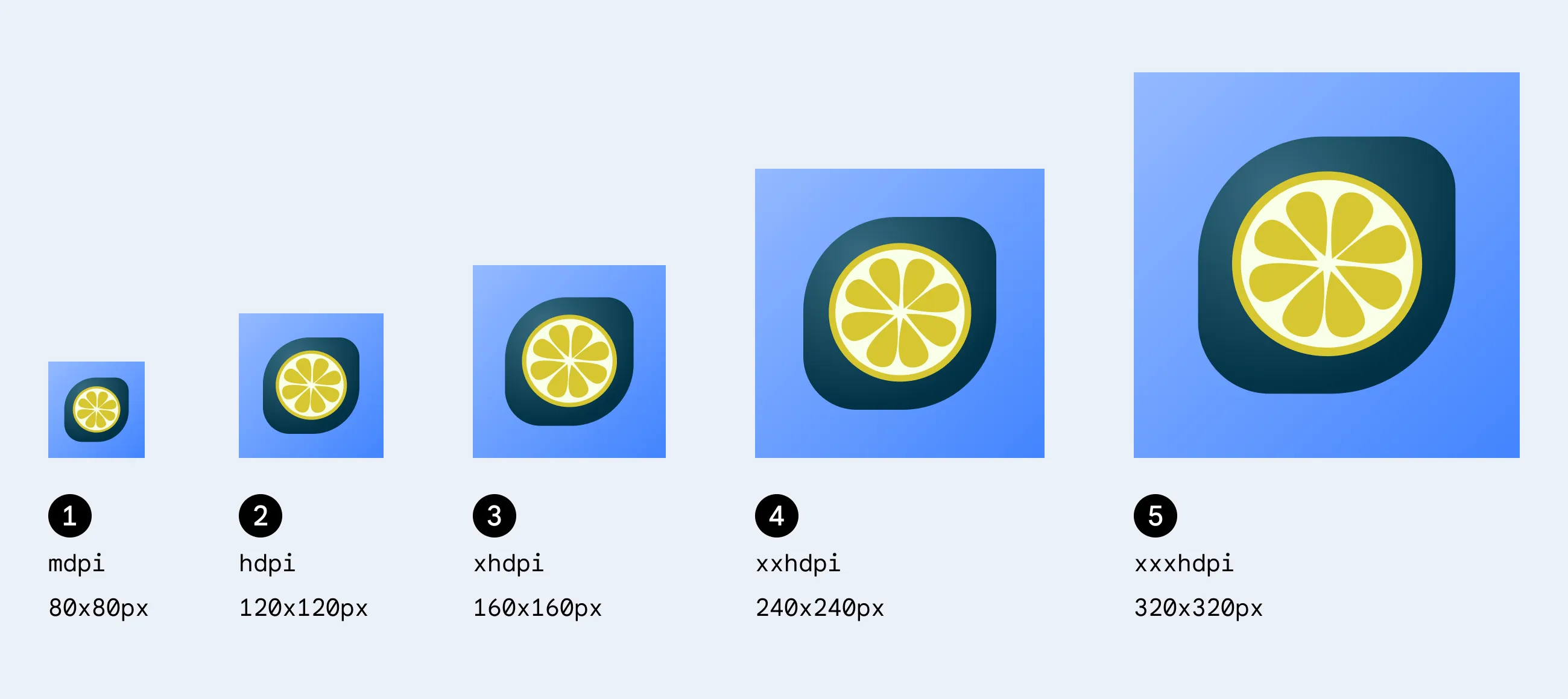
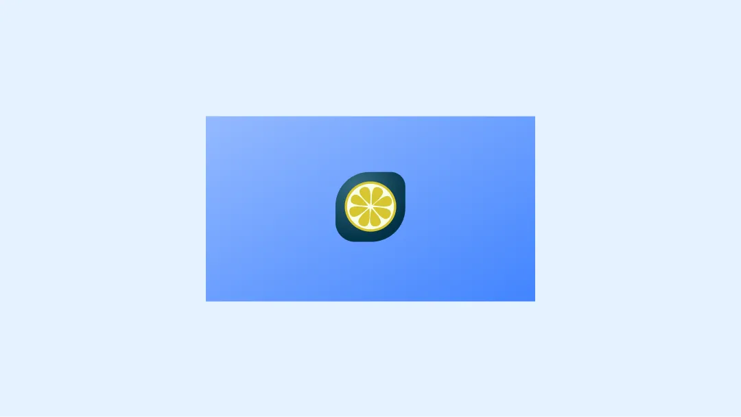
런처 아이콘
런처 아이콘은 Android TV의 설정 및 미디어 세션 통합 (Now Playing 카드)과 같은 여러 위치에서 사용되는 1x1 가로세로 비율 리소스입니다. 런처 아이콘은 Google TV의 내 앱 행에서도 사용할 수 있습니다.
| 밀도 | 최소 크기 | 폴더 위치 (해상도 아래) | 픽셀 비율 |
|---|---|---|---|
| mdpi | 80x80 px | 밉맵-mdpi | 1 |
| hdpi | 120x120 px | mipmap-hdpi | 1.5 |
| xhdpi | 160x160 px | mipmap-xhdpi | 2 |
| xxhdpi | 240x240 px | mipmap-xxhdpi | 3 |
| xxxhdpi | 320x320 px | mipmap-xxxhdpi | 4 |
적응형 아이콘
Android 8.0 버전 (API 수준 26)부터 적응형 런처 아이콘이 지원되므로 앱 아이콘과 관련하여 더 유연하고 흥미로운 시각 효과가 가능합니다. 즉, 개발자의 경우 앱 아이콘이 포그라운드 레이어와 백그라운드 레이어라는 두 가지 레이어로 구성되어 있습니다.
적응형 배너
레이어가 두 개 있는 런처 아이콘 배너와 유사하게 기존 배너와 함께 적응형 배너를 제공할 수도 있습니다.
적응형 런처 아이콘
적응형 아이콘이 다양한 모양과 시각적 효과를 지원하도록 하려면 디자인이 다음 요구사항을 충족해야 합니다.
아이콘의 컬러 버전에 대해 각각 포그라운드와 백그라운드를 위한 두 개의 레이어를 제공합니다.
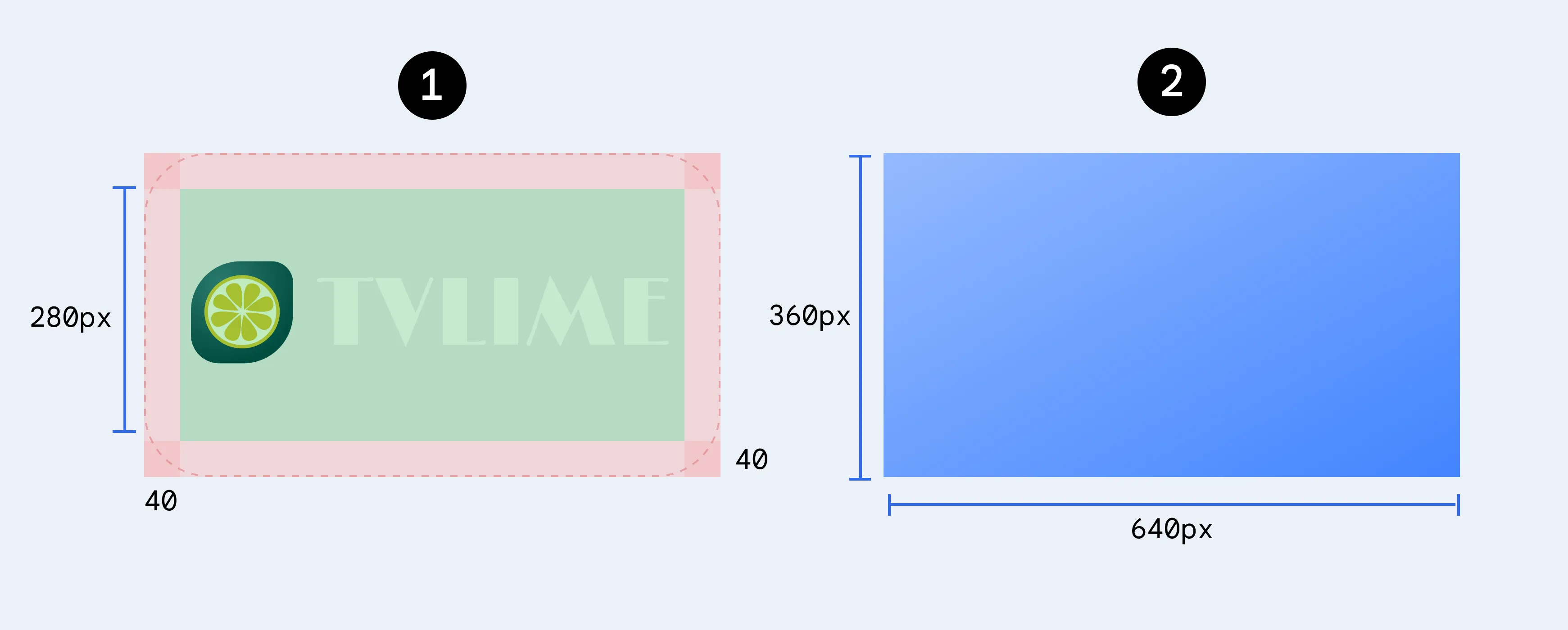
적응형 아이콘은 포그라운드 및 백그라운드 레이어를 사용하여 정의됩니다. 첫 번째 이미지의 72x72 안전 영역은 모양 마스크에 의해 아이콘과 포그라운드 레이어가 잘리지 않는 위치를 보여줍니다.
Android TV는 테마 아이콘을 지원하지 않으므로 흑백 버전의 아이콘은 필요하지 않습니다.
예
다음은 TV 앱 아이콘을 디자인할 때 고려해야 할 권장사항과 금지사항입니다.
배너 예시
의견을 제시하지
부적절한 예
부적절한 예
부적절한 예
부적절한 예
부적절한 예
주의
런처 예
의견을 제시하지
부적절한 예
부적절한 예
부적절한 예
부적절한 예
부적절한 예
리소스
- 배너 및 아이콘용 공식 figma 템플릿