Android spans a wide array of devices, forms, and screen sizes, so designing for specific pixel-perfect lockups is not only ineffective, it can also negatively impact user experience. Instead, design, build, and think adaptively. We recently introduced new APIs that bring some familiar design concepts to help build adaptive layouts.
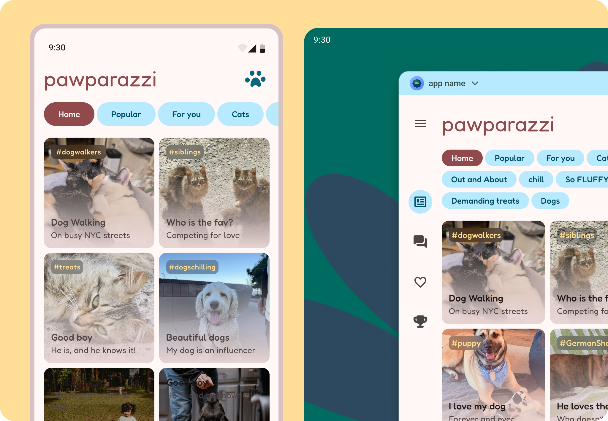
Pawparazzi is a sample app that showcases these concepts. It is designed and built to highlight adaptive design using adaptive APIs, such as Grid and Flexbox.
Thinking adaptively is not only a matter of designing with breakpoints, but thinking of content in flexible containers.
Everything's a grid!
Having a foundation to structure content helps with good design practice, and can help you decide how content should adapt. Android has an underlying 8 dp baseline grid which we can align all content to at a micro level.
Pawparazzi uses a hierarchical layout grid, rather than an even modular grid or a one-directional column grid, which means the columns and rows that compose it are decided based on the content hierarchy.
Deciding on grid type should depend on the content. Start with your app content and think about how the content is grouped together. This helps dictate the overall layout structure. Check out Grids and Units, Content structure , and getting started on desktop for m re on thinking in panes.
For Pawparazzi the primary goal was to see the team's pets in a variety of ways, beginning with a pet Overview, pet Details, and then ranked pets. This meant the gallery of pets would take the main content pane and more of the grid, followed by navigation and filter elements. When more space is available this allows the gallery to expand across more rows, more pets, and show pet details at the same time. This adaptive principle is reveal, or showing more content on larger layouts.
Looking at the app's primary goal and the content helped determine how and when the layout grid would need to adapt: which window class sizes, hinge placement, and device orientations.
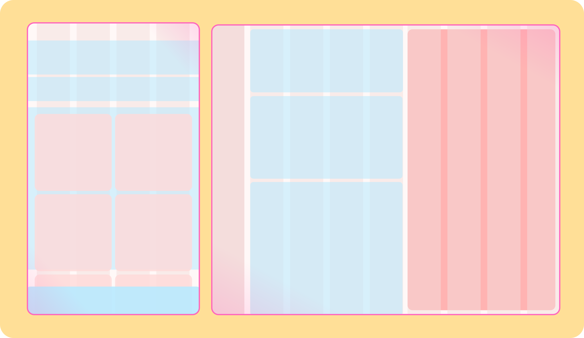
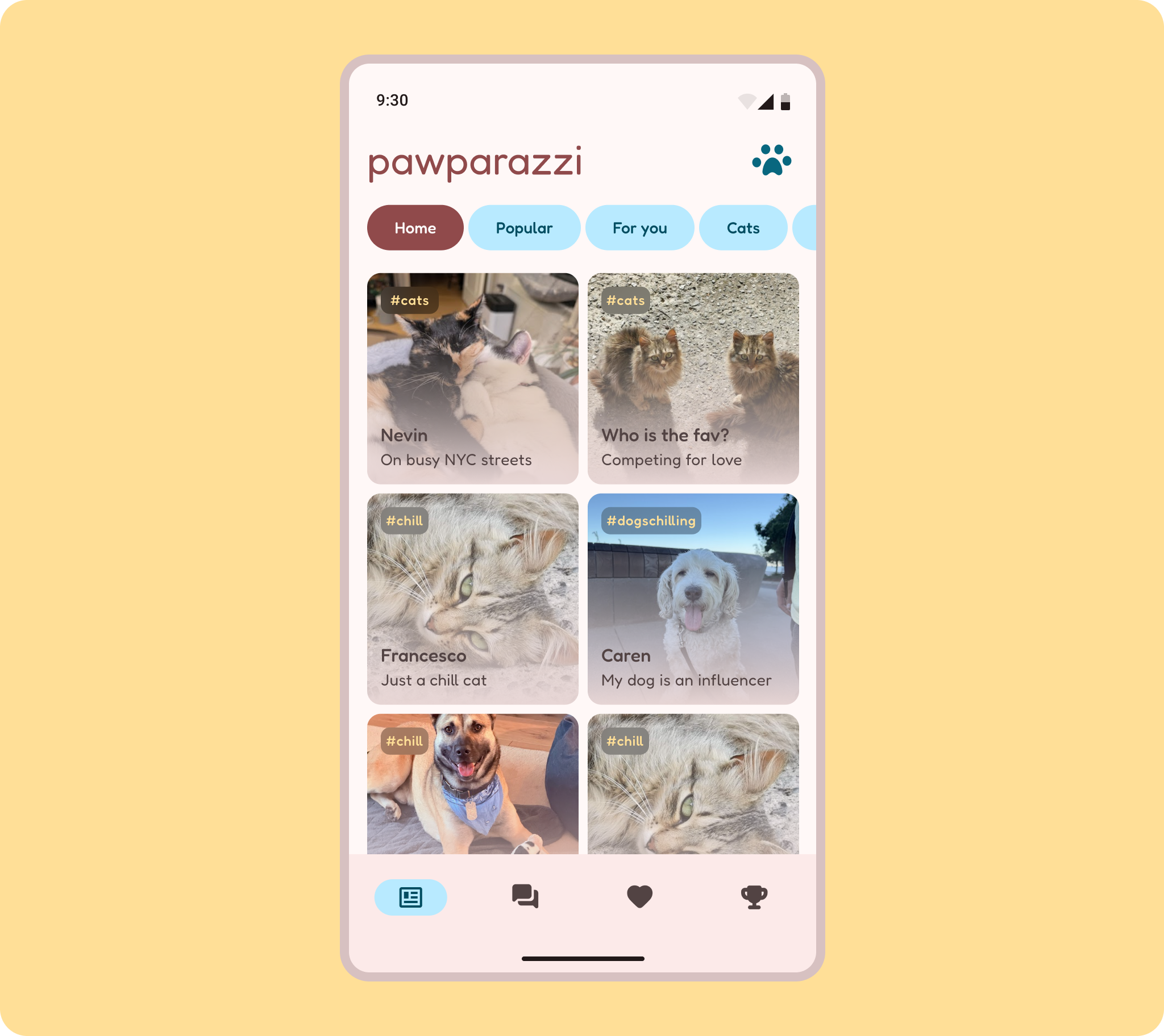
From the layout grid, subgrids help build more flexible content structures. The galleries are themselves a grid. For compact sizes, a 2-across grid is used.
Grids are a two directional layout concept, so content can flow in both a horizontal and vertical direction.
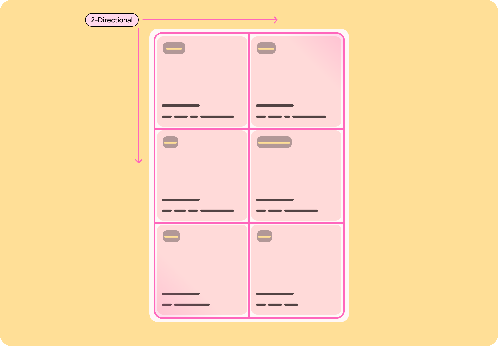
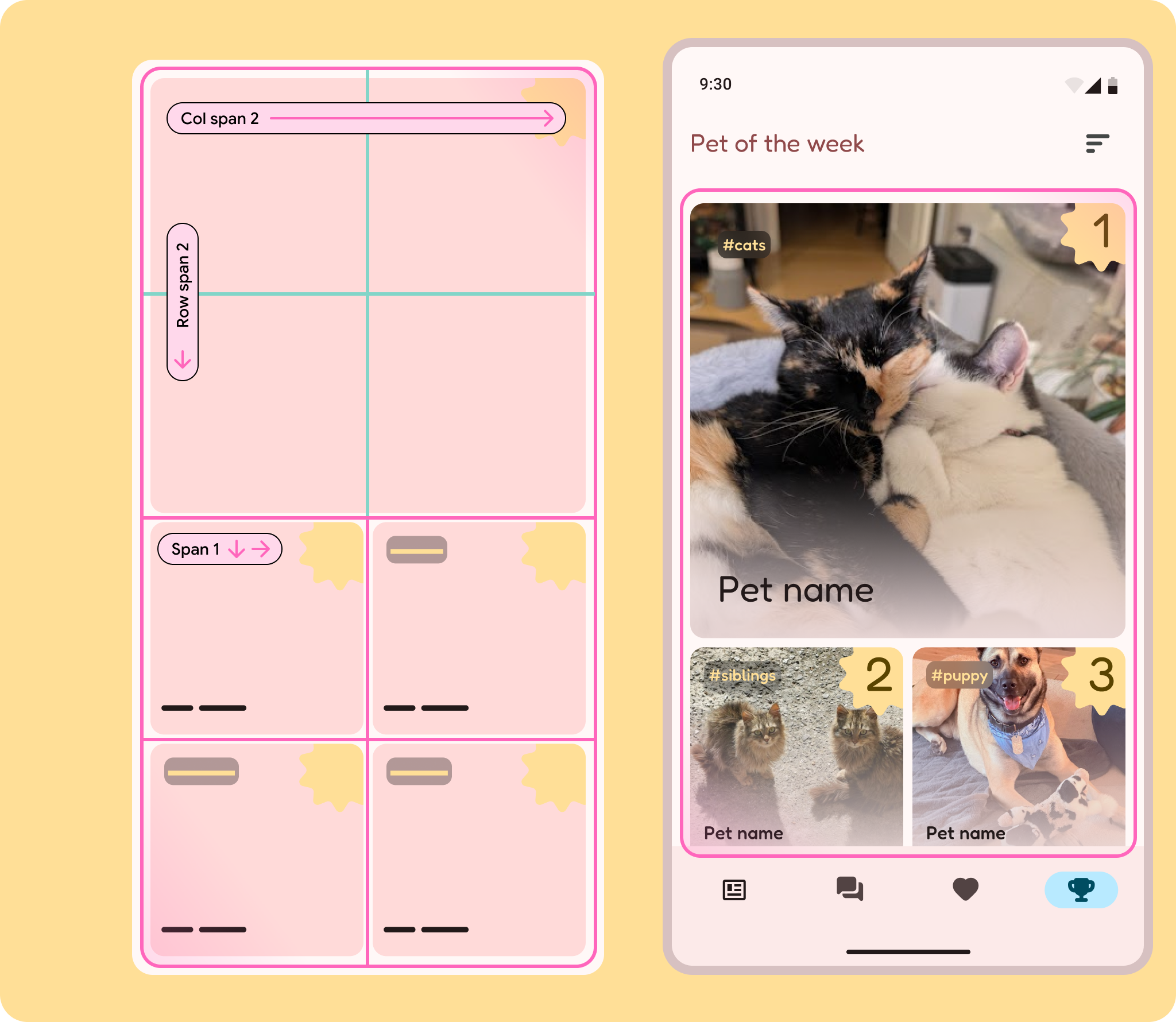
This can be used to create more interesting layouts or make for a clearer visual hierarchy, such as Pet of the week, where the grid is used to convey the top ranking pets. The grid may be 2x4, but the top spot spans 2 columns and rows.
All of this is accomplished with the Grid API.
Flex those components
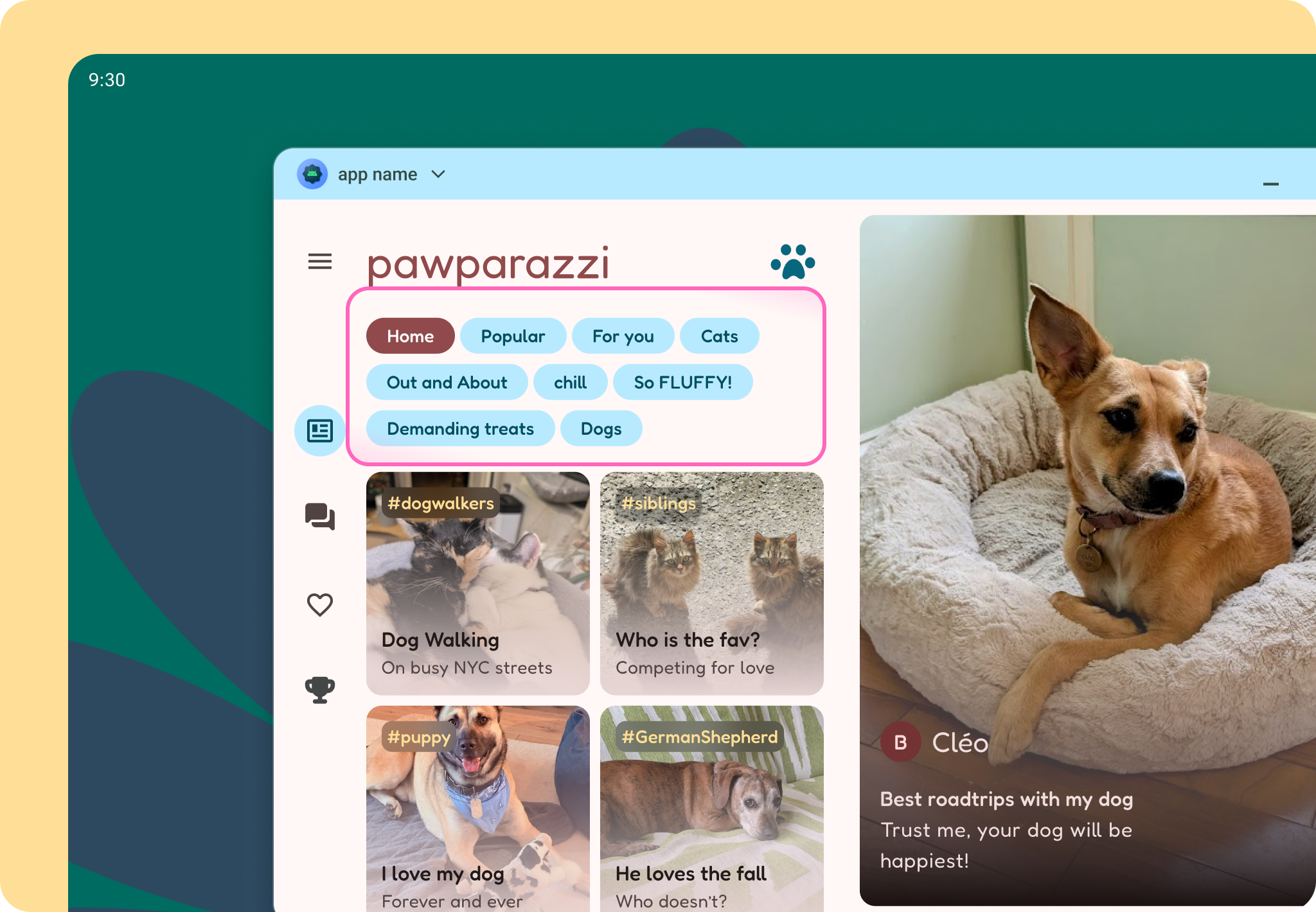
While grid covers the macro and micro content structure, Flexbox helps with components that need to respond to their content. This is used for one-directional content, where only horizontal or vertical is dictated. For example, filter chips can respond to their labels and the filter area can expand depending on the amount of filters. Use Reveal on larger screens to show more filters at once.

Nuanced queries
By designing a layout grid and using grid and flexbox, we allow for an adaptive layout across multiple screens and even accommodate unique forms like foldables. But what about different user contexts? Android users can connect to a display or plug in a mouse! MediaQuery allows us to make nuanced design decisions to accommodate users in all contexts.
In Pawparazzi, this meant taking advantage of precise pointer inputs, with smaller target areas and denser content.
Android AdaptiveUI Samples
Explore inspiring, optimized designs for large screen devices. Browse UI/UX templates for popular app categories, including media, creativity, games, and more.