Display AI glasses system UI weaves together with the app and hardware surfaces. The following are various system UI components to be aware of when designing for glasses.
Home
Acts as a familiar base for your user. Can contain a clock, weather, notifications, and Gemini visual feedback. Home is the lowest layer of the system. It provides minimal, contextual information and actions, and is inspired by the phone's lock screen.
- A familiar screen you wake and come back to
- Contextual, glanceable information without requiring any input
- Shortcuts to what you likely want to do next
- Multitasking abilities when multiple activities are running simultaneously
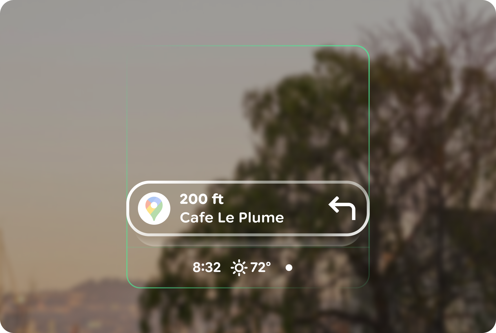
System bar
The system bar houses Gemini visual feedback and secondary, glanceable information like notifications, alerts, chips, and the clock. Apps cannot use this space outside of notifications chips. When not in use, it's invisible (except for home). Content displayed in the system bar depends on its location in the system:
- Home
- App view
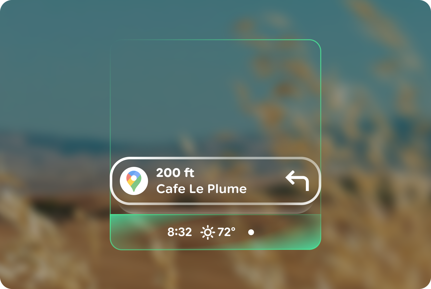
Additionally, there are ephemeral items that can appear "at any time" across locations. For example: Heads-up Notifications (HUNs), or other locations.
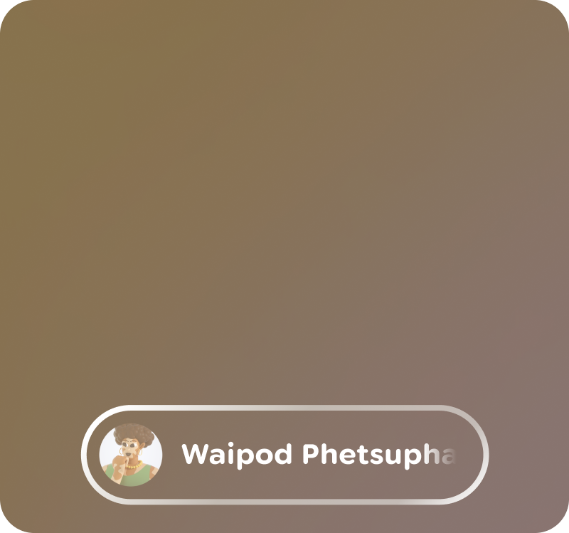
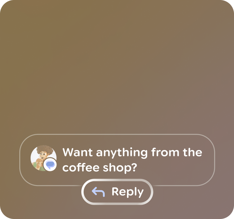
Notifications
Glasses notifications behave like mobile notifications that need to be brief, timely, and relevant. These are templated surfaces that can appear in different states depending on focus and display availability.
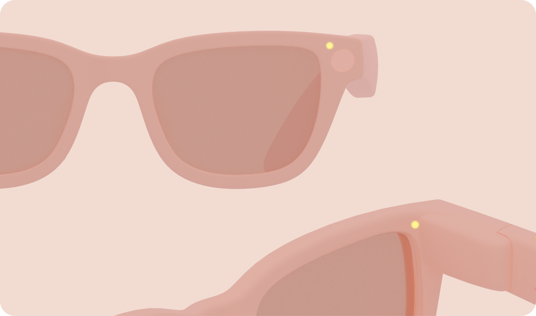
LEDs
There are two LEDs on all glasses, one for the wearer and one for bystanders. The LED provides visual feedback regarding feature and device states and should be considered when thinking about the holistic user experience. These are system UI indicators and can't be changed.