

In Jetpack Compose Glimmer, the GlimmerLazyColumn works similarly to a
Compose LazyColumn by only composing and laying out visible items to
maintain high performance. However, Glimmer lazy columns are built for
display glasses controls, where the user interacts using a touchpad rather
than a touchscreen. While a mobile user can tap any coordinate on a screen
at any time, a user with display glasses can interact only with the item
that holds focus.
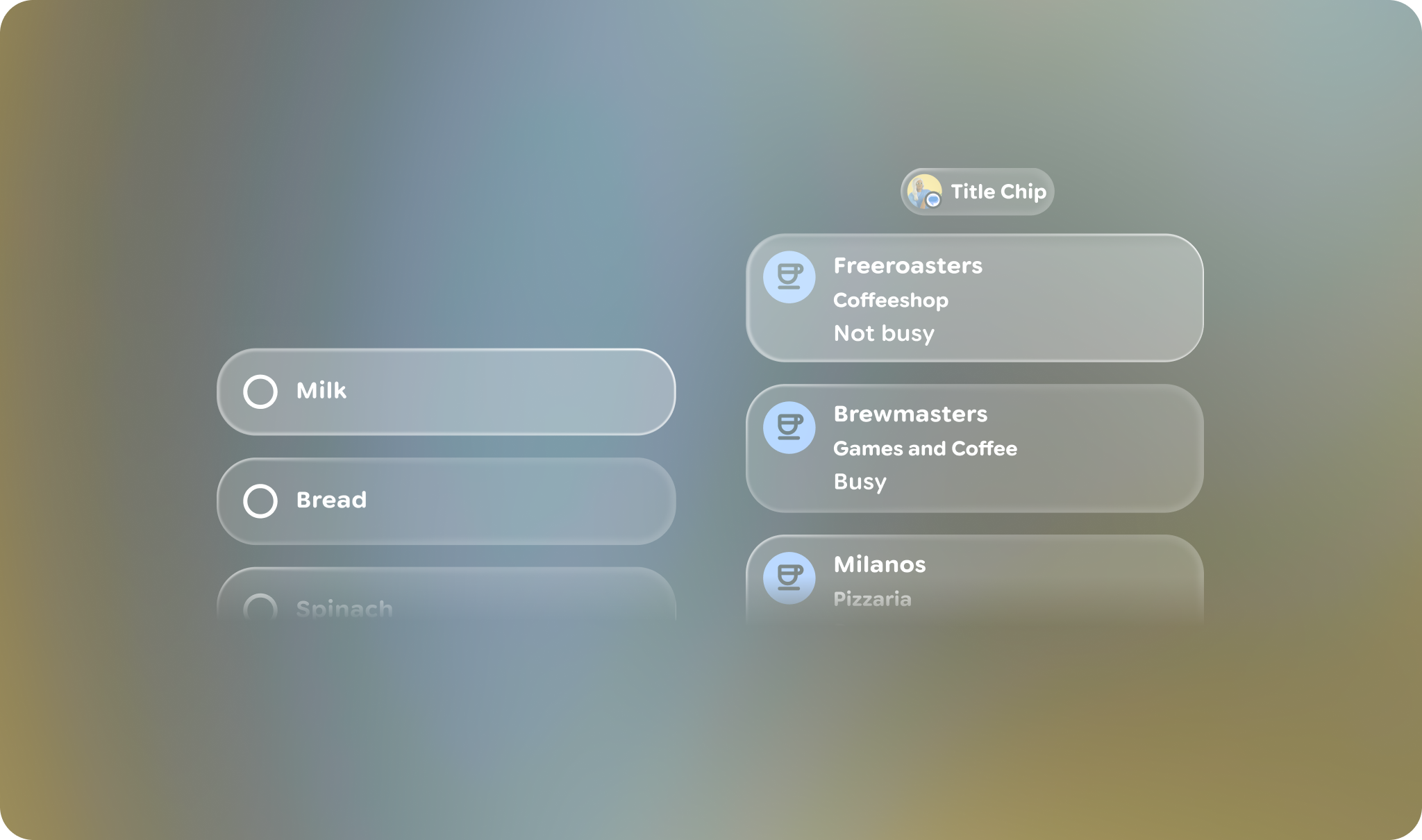
Focus behavior and child items
Glimmer lazy columns automatically handle focus-based navigation. Unlike lists for mobile devices where focus and scroll are often separate, a Glimmer lazy column coordinates the two by moving focus through its child items as the user scrolls with the touchpad. The list itself isn't focusable, so it manages and requests focus for its children so that the user has a clear point of interaction while scrolling.
Because there's no direct touch input, make all child items inside a Glimmer
lazy column focusable. When items have focus, also provide a visual
response, such as an active border or highlight. While users can still scroll
past non-focusable items, they can't interact with them. Use built-in components
like ListItem or Card whenever possible, as
these components are already focusable and provide visual feedback for focus
states.
Example: Glimmer lazy columns with multiple items
The following code shows how to use a Glimmer lazy column with item and items DSL methods to create a list of items:
@Composable fun GlimmerLazyColumnSample() { GlimmerLazyColumn { item { ListItem { Text("Header") } } items(count = 10) { index -> ListItem { Text("Item-$index") } } item { ListItem { Text("Footer") } } } }
Example: Glimmer lazy columns with a title slot
Jetpack Compose Glimmer also provides an overload of GlimmerLazyColumn that
contains a title slot. The non-focusable title, typically a TitleChip,
remains static at the top center while the list content scrolls underneath it.
The following code creates a Glimmer lazy column with a title slot:
@Composable fun GlimmerLazyColumnWithTitleChipSample() { val ingredientItems = listOf("Milk", "Flour", "Egg", "Salt", "Apples", "Butter", "Vanilla", "Sugar", "Cinnamon") GlimmerLazyColumn(title = { TitleChip { Text("Ingredients") } }) { items(ingredientItems) { text -> ListItem { Text(text) } } } }
Use Glimmer lazy list state for programmatic list operations
To control and observe different aspects of the list's state, such as its
scroll position using the firstVisibleItemIndex and
firstVisibleItemScrollOffset properties, use
GlimmerLazyListState.
You can hoist this state using rememberGlimmerLazyListState to
programmatically scroll using scrollToItem and
animateScrollToItem.