
The Slider composable lets users make selections from a range of
values. You might use a slider to let the user do the following:
- Adjust settings that use a range of values, such as volume, and brightness.
- Filter data in a graph, as when setting a price range.
- User input, like setting a rating in a review.
The slider contains a track, thumb, value label, and tick marks:
- Track: The track is the horizontal bar that represents the range of values the slider can take.
- Thumb: The thumb is a draggable control element on the slider that allows the user to select a specific value within the range defined by the track.
- Tick marks: Tick marks are optional visual markers or indicators that appear along the track of the slider.
This topic shows the following slider implementations:
Version compatibility
This implementation requires that your project minSDK be set to API level 21 or higher.
Dependencies
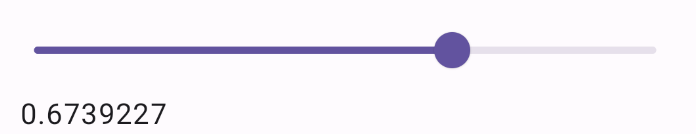
Create a basic slider
The following example is a straightforward slider. That allows the user to
select a value from 0.0 to 1.0. Because the user can select any value in
that range, the slider is continuous.
Results
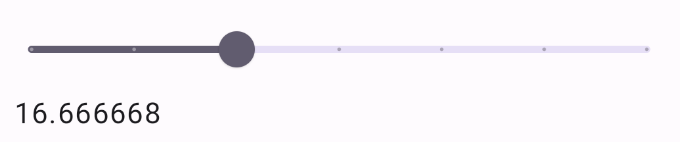
Create an advanced slider
The following snippet implements a slider that has three steps, with a range
from 0.0 to 50.0. Because the thumb snaps to each step, this slider is
discrete.
Results
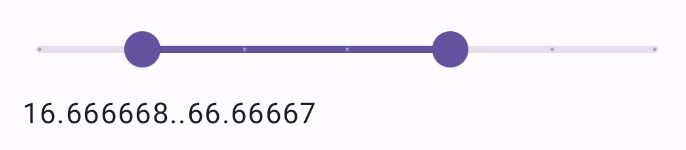
Range slider
You can also use the dedicated RangeSlider composable. This allows the user to
select two values. This can be useful in cases such as when the user wishes to
select a minimum and maximum price.
The following example is a relatively straightforward example of a continuous range slider:
Results
Key points
See the Slider reference for a full API definition. Some of the key
parameters for the Slider composable are the following:
value: The current value of the slider.onValueChange: A lambda that gets called every time the value is changed.enabled: A boolean value that indicates if the user can interact with the slider.
When implementing a more complex slider, you can additionally make use of the following parameters.
colors: An instance ofSliderColorsthat lets you control the colors of the slider.valueRange: The range of values that the slider can take.steps: The number of notches on the slider to which the thumb snaps.
You can also pass Slider a thumb and track composable to more
thoroughly customize the appearance of the component.
Collections that contain this guide
This guide is part of these curated Quick Guide collections that cover broader Android development goals:

Display interactive components