Material 3 富有表现力的设计语言
使用集合让一切井井有条
根据您的偏好保存内容并对其进行分类。
Material 3 Expressive (M3) 旨在满足用户对现代、相关且独特体验的需求。此外,借助富有表现力的设计,设计师还可以在界面的布局和呈现中反映特定的情感和感受。
颜色和排版
颜色系统正在扩展,以采用 M3 更深层次的色调调色板和更广泛的令牌集,而更简单的排版比例则利用可变字体轴实现更多表达,让互动更具表现力和愉悦感。
颜色主题
新令牌让您可以在不同的主题中以及整个设计系统的上下文中应用更多颜色。
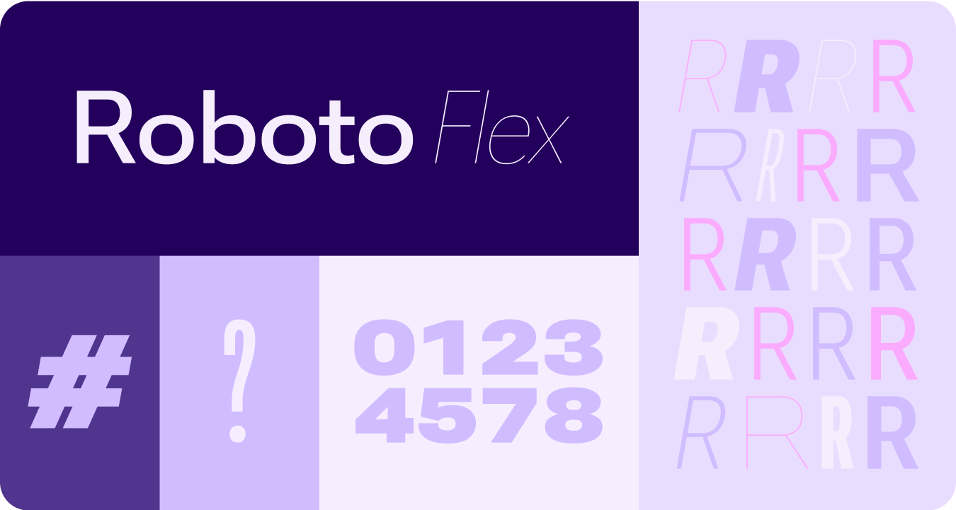
可变字体
更新后的可变字体及其可自定义轴的注意事项不仅适用于第一方,还适用于第三方用例,例如具有一组类似可变轴的 Roboto Flex。
可变字体轴在运动
利用可变字体轴来传达富有表现力的动作反馈,让互动更具表现力且使用起来更愉悦。
应用场景示例:
类型角色
除了经过更新和优化的类型比例之外,我们还推出了专门在 Wear 上提供醒目图案的新类型角色。
这些新的类型角色支持多种用例,包括用于显示标题的 Arc Text、包含直播空间的主动内容,以及专门用于数字的类型角色,可让不需要本地化的字符串采用更大且更具样式的文本大小。
形状和动作
我们还将以更广泛且更有意义的方式运用形状语言,利用灵活的容器形状应用圆角半径的圆润和锐化,以支持形状变形列表和按钮状态。我们将边缘贴合按钮引入为 Wear 上圆形设备的一种新的专有标志性设计模式。
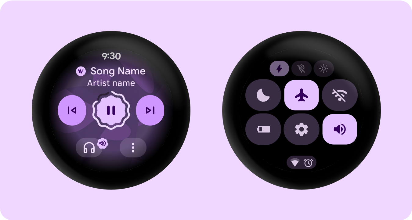
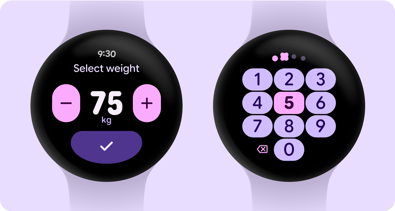
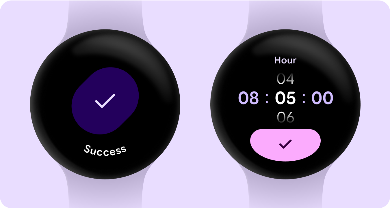
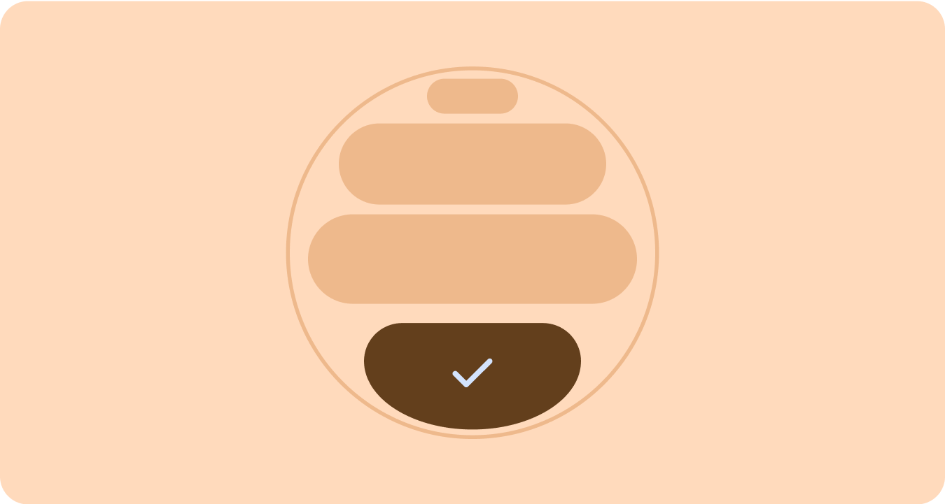
边缘容器
推出了形状容器,可采用圆形并最大限度地利用圆形外形规格中的空间。
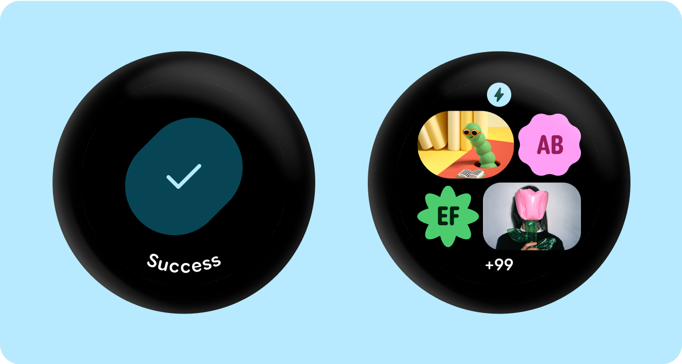
应用的形状
使用角半径和独特形状作为容器,采用富有表现力的设计,延伸到令人愉悦的加载动画、有趣的布局、形状可变的按钮和自适应按钮组。
角半径
利用 Material 3 角形,实现容器形状的多样性、区分性和关系。
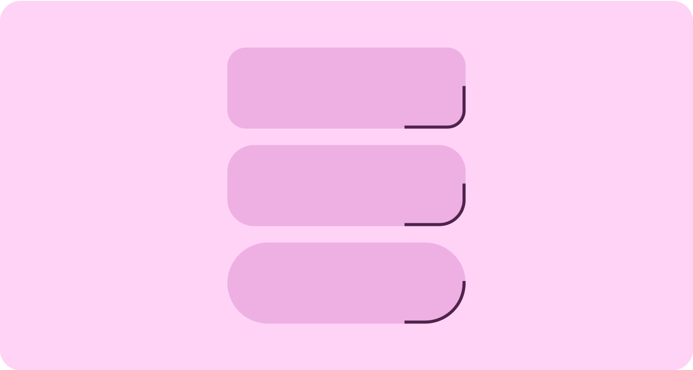
分组的容器
组件容器使用灵活的布局技术来动态适应可用空间。他们可以均匀分配此空间以实现对称,也可以有策略地排列元素以建立视觉层次结构、突出显示重要内容,并通过富有表现力的动画引导视觉提示来引导用户互动。
本页面上的内容和代码示例受内容许可部分所述许可的限制。Java 和 OpenJDK 是 Oracle 和/或其关联公司的注册商标。
最后更新时间 (UTC):2025-07-27。
[[["易于理解","easyToUnderstand","thumb-up"],["解决了我的问题","solvedMyProblem","thumb-up"],["其他","otherUp","thumb-up"]],[["没有我需要的信息","missingTheInformationINeed","thumb-down"],["太复杂/步骤太多","tooComplicatedTooManySteps","thumb-down"],["内容需要更新","outOfDate","thumb-down"],["翻译问题","translationIssue","thumb-down"],["示例/代码问题","samplesCodeIssue","thumb-down"],["其他","otherDown","thumb-down"]],["最后更新时间 (UTC):2025-07-27。"],[],[],null,["# Material 3 Expressive design language\n\nMaterial 3 Expressive (M3) was built to meet user demand for experiences that\nare modern, relevant, and distinct. Expressive also allows designers to mirror\nspecific emotions and feelings in the layout and presentation of the interface.\n\nColor and typography\n--------------------\n\nThe [color system](/design/ui/wear/guides/styles/color/system) is expanding to adopt M3's deeper tonal palettes and a\nwider token set and the simpler typography scale is utilizing variable font axes\nfor more expression, making interactions more expressive and delightful.\n\n### Color theming\n\n\nThe [new tokens](/design/ui/wear/guides/styles/color/roles-tokens) allow for more color to be applied across different themes\nand in context of the design system as a whole. \n\n\u003cbr /\u003e\n\n### Variable fonts\n\n\nThe updated considerations for variable fonts and their customizable axis,\nextend beyond 1P to also serve 3P use cases such as Roboto Flex, which has a\nsimilar set of variable axis. \n\n\u003cbr /\u003e\n\n### Variable font axis in motion\n\n\nUtilizing variable font axis to signal expressive motion feedback and making\ninteractions more expressive and delightful to use.\n\nExample use-cases:\n\n- Dynamic font weight\n- Dynamic font width\n- Dynamic font weight and width \n\n\u003cbr /\u003e\n\n### Type roles\n\n\nAlong with an updated and optimized type scale, we are also introducing new type\nroles that specifically serve notable patterns on Wear.\n\nThese new type roles support several use cases---including Arc Text for surface\ntitles, proactive content with live space, and a type role specifically for\nNumerals---that allow for bigger and more styled text sizes for strings that don't\nneed to be localized. \n\n\u003cbr /\u003e\n\nShape and motion\n----------------\n\nWe are also leaning into shape language in a much more expansive and meaningful\nway by utilizing flexible container shapes to apply rounding and sharpening of\ncorner radius to support shape morphing lists and button states. We're\nintroducing edge-hugging buttons as a new ownable and iconic design pattern for\nround devices on Wear.\n\n### Edge-hugging containers\n\n\nIntroducing shape containers that embrace round and maximize the space within\nthe circular form factor. \n\n\u003cbr /\u003e\n\n### Shape applied\n\n\nUsing corner radius and unique shapes as containers to embrace expressive design\n---extending to delightful loading animations, interesting layouts, shape-morphing\nbuttons and adaptive button groups. \n\n\u003cbr /\u003e\n\n### Corner radius\n\n\nUtilizing Material 3 corner shapes to enable variety, distinction, and\nrelationship between container shapes. \n\n\u003cbr /\u003e\n\n### Grouped containers\n\n\nComponent containers use flexible layout techniques to dynamically adapt to\navailable space. They can distribute this space evenly for symmetry, or\nstrategically arrange elements to establish visual hierarchy, emphasize\nimportant content, and guide user interaction through expressive and motion-lead\nvisual cues. \n\n\u003cbr /\u003e"]]