
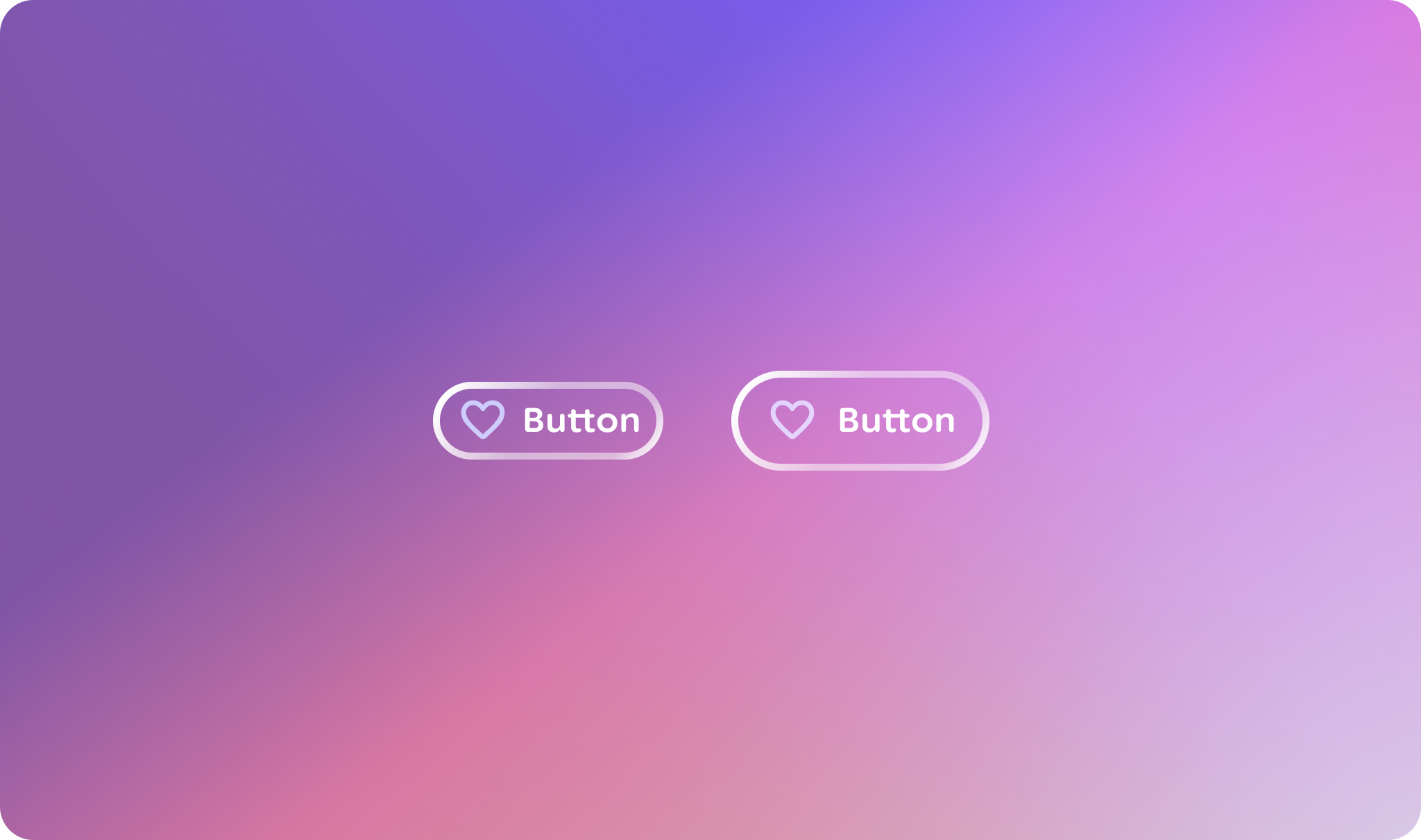
Buttons are the primary visual indicator for a user's actions.
Principles
Action-Oriented: Buttons should clearly communicate that they trigger an action.
Clear Feedback: The button's appearance must change distinctly across different interaction states (hover, press, focus) to provide immediate feedback.
Consistent: All buttons should share a core visual language to be instantly recognizable.
Flexible: The button component should accommodate common variations, such as including icons and different sizes, without sacrificing consistency.
Usage & Placement
A button should be placed closely to its relevant content. They can be placed alone or with other components, like cards and lists.
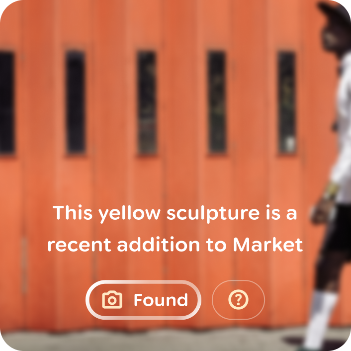
Do
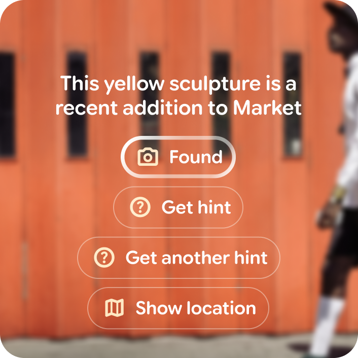
Don't
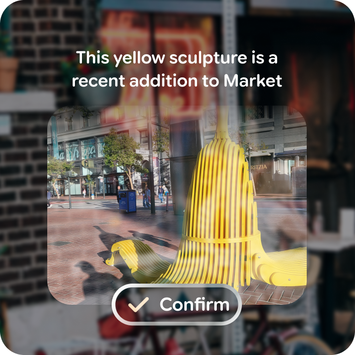
Do
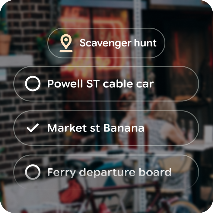
Don't
Icon buttons
Icon buttons are available to reduce content density. Use icon buttons when the icon clearly illustrates an action, otherwise include a button label.
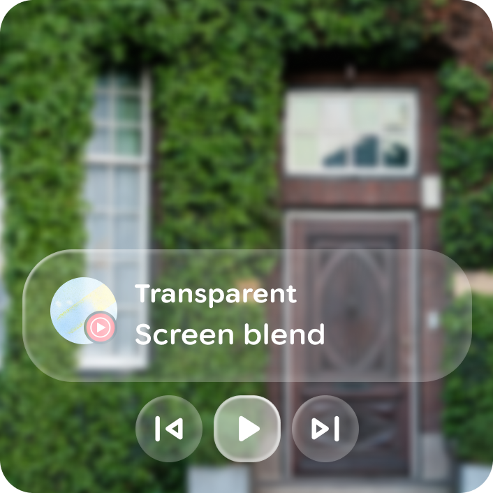
Do
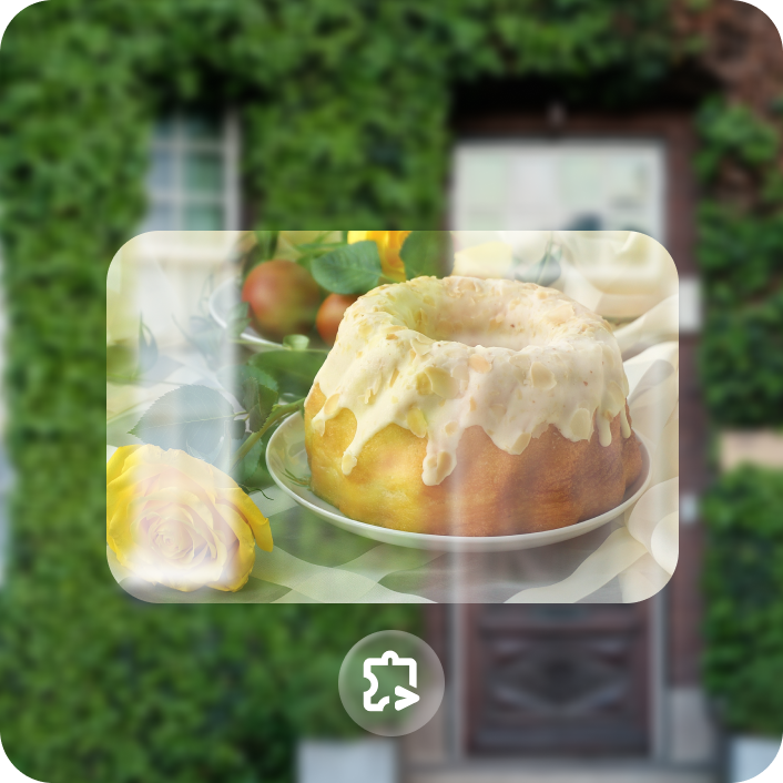
Don't
Toggable
For actions with boolean states, like favorite, a toggle variant is available for each button type. Swapping icons in between toggle states makes the interaction glanceable and responsive.
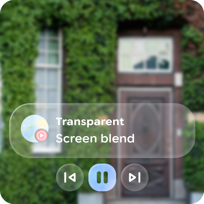
Do
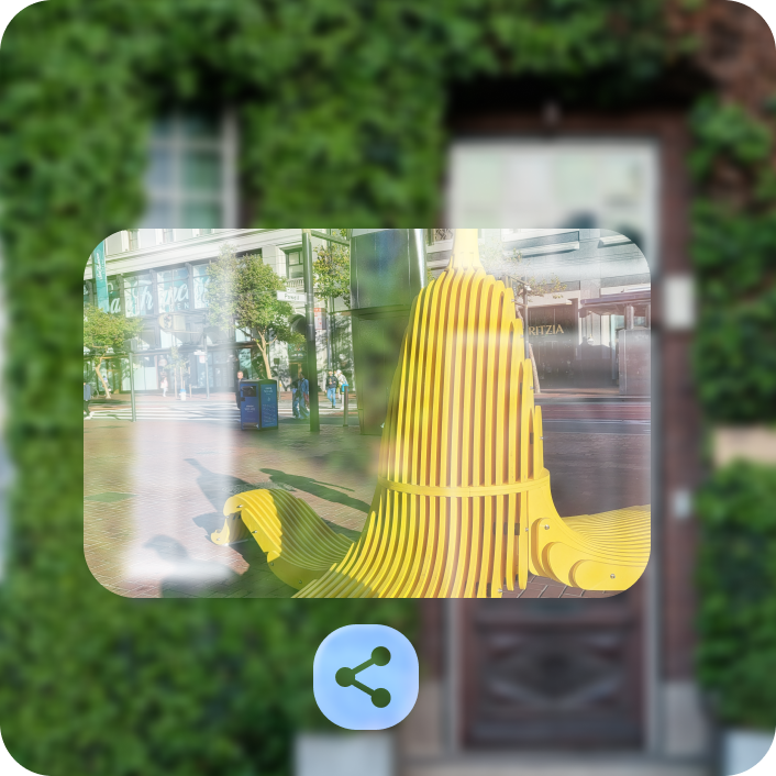
Don't
Anatomy
Buttons are composed of a label and optional icon leading or trailing icon.
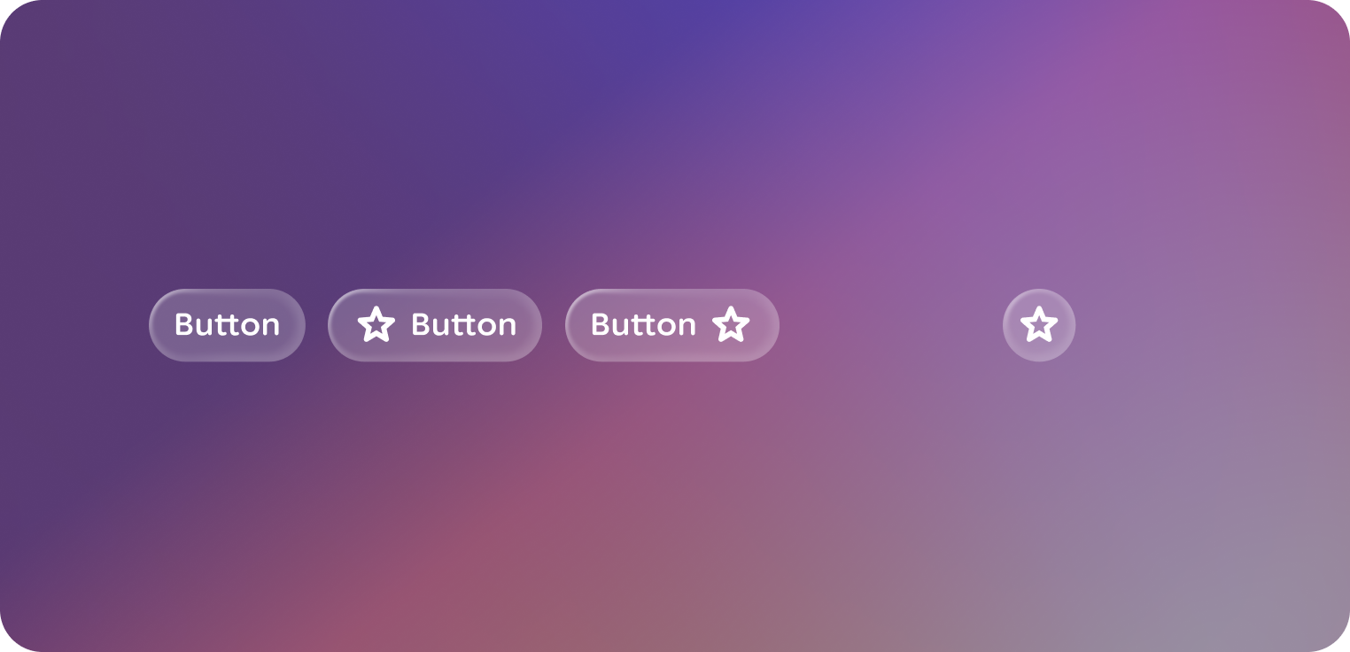
Icon buttons are composed of only a recognizable icon.
Both have a togglable variant.
Default
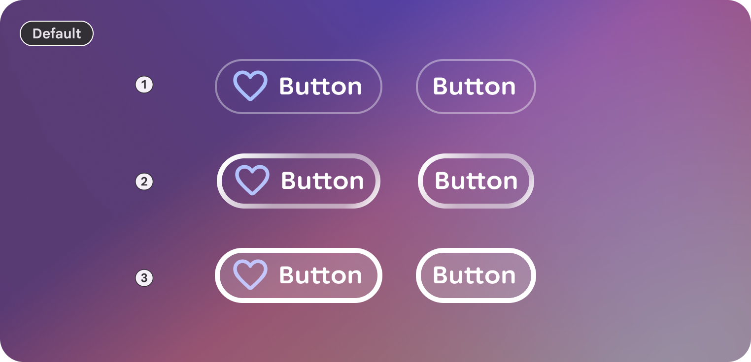 1. Rest
2. Focused
3. Pressed
4. Disabled
5. Disabled & focused
Large
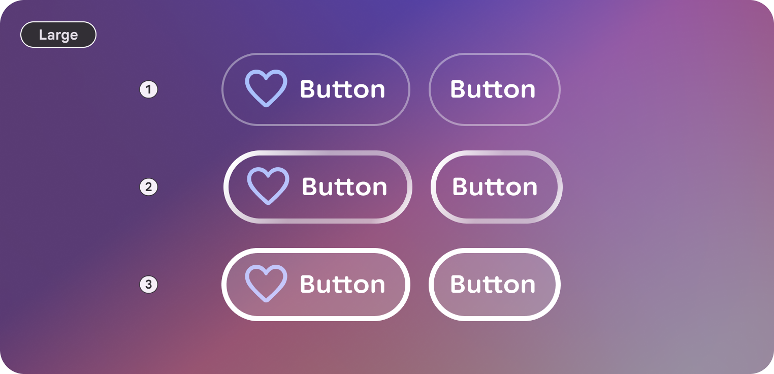 1. Rest
2. Focused
3. Pressed
4. Disabled
5. Disabled & focused
Icon
 1. Rest
2. Focused
3. Pressed
4. Disabled
5. Disabled & focused
Icon
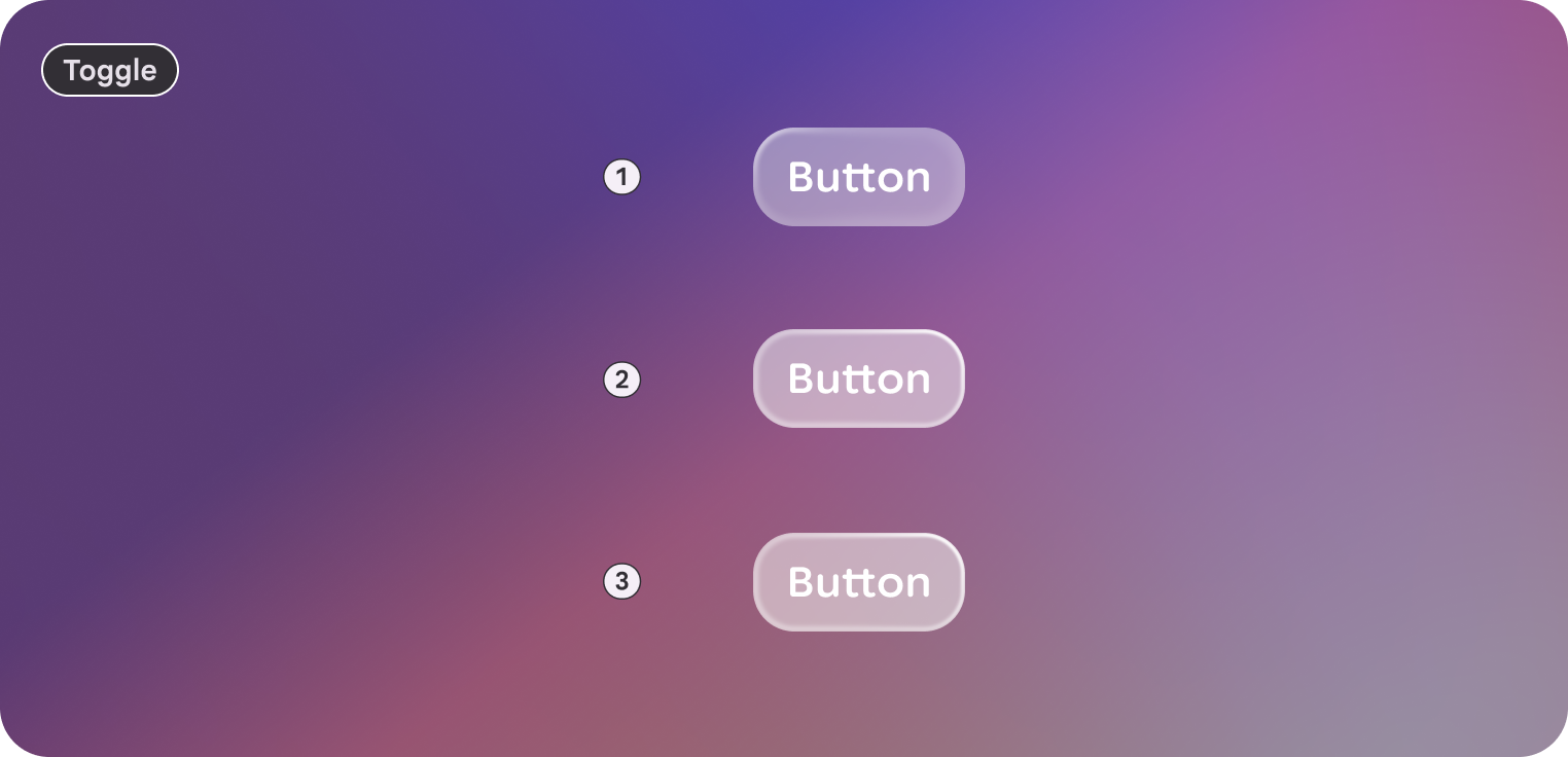 1. Rest
2. Focused
3. Pressed
4. Disabled
5. Disabled & focused
Customization
Buttons contain a default and large style. Large size can help emphasize importance.
Icons can be used to give greater emphasis, clarification, and recognition to the button in a trailing or leading position.
Default
| Properties | Customization | Defaults |
|---|---|---|
| Shape | Yes | Large, Circle |
| Padding | Yes | 16 dp, 8 dp |
| Border | Yes | Default, 2 dp, #606460 |
| Text | Yes | Body Small |
| Leading icon | Yes | 32 dp |
| Trailing icon | Yes | 32 dp |
| Size | Yes | 48 dp min height |
| Depth | Yes | 0 |
| Gap | Yes | Between label and icon: Extra small |
Large
| Properties | Customization | Defaults |
|---|---|---|
| Shape | Yes | Large, Circle |
| Padding | Yes | 16 dp, 16 dp |
| Border | Yes | 2 dp, #606460 |
| Text | Yes | Body Small |
| Leading icon | Yes | 32 dp |
| Trailing icon | Yes | 32 dp |
| Size | Yes | 72 dp min height |
| Depth | Yes | 0 |
| Gap | Yes | Between label and icon: Extra small |
Icon
| Properties | Customization | Defaults |
|---|---|---|
| Shape | Yes | Large, Circle |
| Padding | Yes | Small, Small |
| Border | Yes | Default |
| Icon | Yes | Default = 32 dp, On Surface |
| Size | Yes | 48 dp min height |
| Depth | Yes | 0 |
Toggable
| Properties | Customization | Defaults |
|---|---|---|
| Selected | Yes | Boolean |
| Default corners | Yes | 16 dp, 8 dp |
| Selected corners | Yes | Default focus |
| Selected Surface color | Yes | Outline |
| All other properties | Yes | Same as buttons |
Toggable icon
| Properties | Customization | Defaults |
|---|---|---|
| Selected | Yes | Boolean |
| Default corners | Yes | 100 dp |
| Selected corners | Yes | 20 dp |
| Selected Surface color | Yes | Outline |
| All other properties | Yes | Same as buttons |