Your application might have multi-step tasks for users. For example, your app might need to guide users through purchasing additional content, setting up a complex configuration setting, or confirming a decision. All these tasks require walking users through one or more ordered steps or decisions.
The deprecated androidx.leanback library provides classes to implement multi-step
user tasks. This page discusses how to use the
GuidedStepSupportFragment class
to guide a user through a series of decisions to accomplish a task by using
GuidedStepSupportFragment.
Provide details for a step
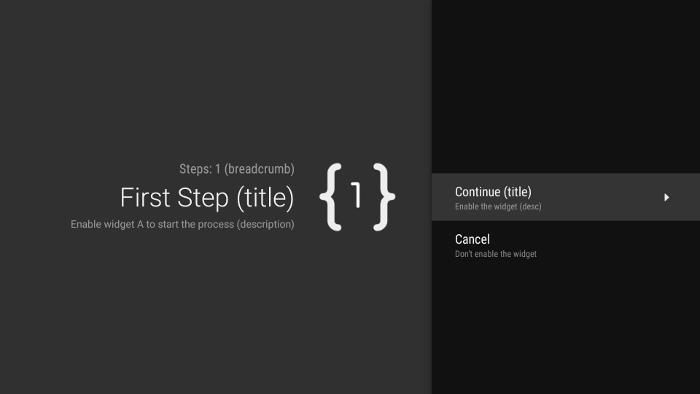
A GuidedStepSupportFragment represents a single step in a series
of steps. Visually, it provides a guidance view with a
list of possible actions or decisions for the step.

Figure 1. An example guided step.
For each step in your multi-step task, extend
GuidedStepSupportFragment and provide context information about
the step and actions the user can take. Override
onCreateGuidance()
and return a new
GuidanceStylist.Guidance that contains context
information, such as the step title, description, and icon, as shown in the following example:
Kotlin
override fun onCreateGuidance(savedInstanceState: Bundle?): GuidanceStylist.Guidance {
    return GuidanceStylist.Guidance(
            getString(R.string.guidedstep_first_title),
            getString(R.string.guidedstep_first_description),
            getString(R.string.guidedstep_first_breadcrumb),
            activity.getDrawable(R.drawable.guidedstep_main_icon_1)
    )
}
Java
@Override
public GuidanceStylist.Guidance onCreateGuidance(Bundle savedInstanceState) {
    String title = getString(R.string.guidedstep_first_title);
    String breadcrumb = getString(R.string.guidedstep_first_breadcrumb);
    String description = getString(R.string.guidedstep_first_description);
    Drawable icon = getActivity().getDrawable(R.drawable.guidedstep_main_icon_1);
    return new GuidanceStylist.Guidance(title, description, breadcrumb, icon);
}
Add your GuidedStepSupportFragment subclass to your desired
activity by calling
GuidedStepSupportFragment.add()
in your activity’s onCreate() method.
If your activity contains only GuidedStepSupportFragment
objects, use GuidedStepSupportFragment.addAsRoot()
instead of add() to add the first GuidedStepSupportFragment. Using
addAsRoot() helps ensure that if the user presses the Back button on the TV remote when viewing
the first GuidedStepSupportFragment, both the
GuidedStepSupportFragment and the parent activity close.
Note: Add
GuidedStepSupportFragment objects programmatically,
not in your layout XML files.
Create and handle user actions
Add user actions by overriding
onCreateActions().
In your override, add a new GuidedAction for each
action item and provide the action string, description, and ID. Use
GuidedAction.Builder to add new actions.
Kotlin
override fun onCreateActions(actions: MutableList<GuidedAction>, savedInstanceState: Bundle?) {
    super.onCreateActions(actions, savedInstanceState)

    // Add "Continue" user action for this step
    actions.add(GuidedAction.Builder()
            .id(CONTINUE)
            .title(getString(R.string.guidedstep_continue))
            .description(getString(R.string.guidedstep_letsdoit))
            .hasNext(true)
            .build())
    ...
Java
@Override
public void onCreateActions(List<GuidedAction> actions, Bundle savedInstanceState) {
    // Add "Continue" user action for this step
    actions.add(new GuidedAction.Builder()
           .id(CONTINUE)
           .title(getString(R.string.guidedstep_continue))
           .description(getString(R.string.guidedstep_letsdoit))
           .hasNext(true)
           .build());
...
Actions aren't limited to single-line selections. Here are additional types of actions you can create:
-
Add an information label action to provide additional information about user choices by setting
infoOnly(true). WheninfoOnlyis true, users can't select the action. -
Add an editable text action by setting
editable(true). Wheneditableis true, the user can enter text in a selected action using the remote or a connected keyboard. OverrideonGuidedActionEditedAndProceed()to get the modified text the user entered. You can also overrideonGuidedActionEditCanceled()to know when the user cancels input. -
Add a set of actions that behave like checkable radio buttons by using
checkSetId()with a common ID value to group actions into a set. All actions in the same list with the same check-set ID are considered linked. When the user selects one of the actions within that set, that action becomes checked and all other actions become unchecked. -
Add a date-picker action by using
GuidedDatePickerAction.Builderinstead ofGuidedAction.BuilderinonCreateActions(). OverrideonGuidedActionEditedAndProceed()to get the modified date value the user entered. - Add an action that uses subactions to let the user pick from an extended list of choices. Subactions are described in the Add subactions section.
- Add a button action that appears to the right of the actions list and is easily accessible. Button actions are described in the Add button actions section.
You can also add a visual indicator that selecting an action
leads to a new step by setting
hasNext(true).
For all the different attributes that you can set, see
GuidedAction.
To respond to actions, override
onGuidedActionClicked() and process the passed-in
GuidedAction. Identify the selected action by
examining GuidedAction.getId().
Add subactions
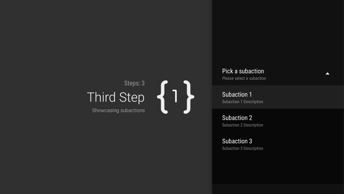
Some actions could require you to give the user an additional set of choices. A
GuidedAction can specify a list of
subactions that display as a menu of child actions.

Figure 2. Guided step subactions.
The subaction list can contain regular actions or radio button actions, but not date-picker or editable text actions. Also, a subaction can't have its own set of subactions, because the system doesn't support more than one level of subactions.
To add subactions, first create and populate a list of
GuidedAction objects that act as subactions, as shown in the following example:
Kotlin
subActions.add(GuidedAction.Builder()
        .id(SUBACTION1)
        .title(getString(R.string.guidedstep_subaction1_title))
        .description(getString(R.string.guidedstep_subaction1_desc))
        .build())
...
Java
List<GuidedAction> subActions = new ArrayList<GuidedAction>();
subActions.add(new GuidedAction.Builder()
       .id(SUBACTION1)
       .title(getString(R.string.guidedstep_subaction1_title))
       .description(getString(R.string.guidedstep_subaction1_desc))
       .build());
...
In onCreateActions(), create a top-level
GuidedAction that displays the
list of subactions when selected:
Kotlin
    ...
    actions.add(GuidedAction.Builder()
            .id(SUBACTIONS)
            .title(getString(R.string.guidedstep_subactions_title))
            .description(getString(R.string.guidedstep_subactions_desc))
            .subActions(subActions)
            .build())
    ...
Java
@Override
public void onCreateActions(List<GuidedAction> actions, Bundle savedInstanceState) {
...
    actions.add(new GuidedAction.Builder()
           .id(SUBACTIONS)
           .title(getString(R.string.guidedstep_subactions_title))
           .description(getString(R.string.guidedstep_subactions_desc))
           .subActions(subActions)
           .build());
...
}
Finally, respond to subaction selections by overriding
onSubGuidedActionClicked():
Kotlin
override fun onSubGuidedActionClicked(action: GuidedAction): Boolean {
    // Check for which action was clicked and handle as needed
    when(action.id) {
        SUBACTION1 -> {
            // Subaction 1 selected
        }
    }
    // Return true to collapse the subactions menu or
    // false to keep the menu expanded
    return true
}
Java
@Override
public boolean onSubGuidedActionClicked(GuidedAction action) {
   // Check for which action was clicked and handle as needed
   if (action.getId() == SUBACTION1) {
       // Subaction 1 selected
   }
   // Return true to collapse the subactions menu or
   // false to keep the menu expanded
   return true;
}
Add button actions
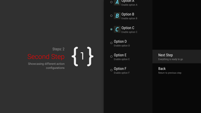
If your guided step has a large list of actions, users might have to scroll through the list to access the most commonly used actions. Use button actions to separate commonly used actions from the action list. Button actions appear next to the action list and are easy to navigate to.

Figure 3. Guided step button actions.
Button actions are created and handled just like regular actions, but you create
button actions in
onCreateButtonActions()
instead of onCreateActions(). Respond to button actions in
onGuidedActionClicked().
Use button actions for simple actions, such as navigation actions between steps. Don't use the date-picker action or other editable actions as button actions. Also, button actions cannot have subactions.
Group guided steps into a guided sequence
A GuidedStepSupportFragment
represents a single step. To create an ordered sequence of steps, group multiple
GuidedStepSupportFragment objects together using
GuidedStepSupportFragment.add() to add
the next step in the sequence to the fragment stack.
Kotlin
override fun onGuidedActionClicked(action: GuidedAction) {
    val fm = fragmentManager
    when(action.id) {
        CONTINUE -> GuidedStepSupportFragment.add(fm, SecondStepFragment())
    }
}
Java
@Override
public void onGuidedActionClicked(GuidedAction action) {
    FragmentManager fm = getFragmentManager();
    if (action.getId() == CONTINUE) {
       GuidedStepSupportFragment.add(fm, new SecondStepFragment());
    }
...
If the user presses the Back button on the TV remote, the device shows the previous
GuidedStepSupportFragment on the fragment stack. If you
provide your own GuidedAction that
returns to the previous step, you can implement the Back behavior by calling
getFragmentManager().popBackStack().
If you need to return the user to an even earlier step in the sequence, use
popBackStackToGuidedStepSupportFragment()
to return to a specific GuidedStepSupportFragment in the fragment stack.
When the user finishes the last step in the sequence, use
finishGuidedStepSupportFragments() to remove all
GuidedStepSupportFragment instances
from the current stack and return to the original parent activity. If the
first GuidedStepSupportFragment is added
using addAsRoot(), calling
finishGuidedStepSupportFragments() also closes the parent activity.
Customize step presentation
The GuidedStepSupportFragment class can use custom
themes that control presentation aspects such as title text formatting or step transition
animations. Custom themes must inherit from
Theme_Leanback_GuidedStep and can provide
overriding values for attributes defined in
GuidanceStylist and
GuidedActionsStylist.
To apply a custom theme to your GuidedStepSupportFragment,
do one of the following:
-
Apply the theme to the parent activity by setting the
android:themeattribute to the activity element in the Android manifest. Setting this attribute applies the theme to all child views and is the most straightforward way to apply a custom theme if the parent activity contains onlyGuidedStepSupportFragmentobjects. -
If your activity already uses a custom theme and you don’t want to apply
GuidedStepSupportFragmentstyles to other views in the activity, add theLeanbackGuidedStepTheme_guidedStepThemeattribute to your existing custom activity theme. This attribute points to the custom theme that only theGuidedStepSupportFragmentobjects in your activity use. -
If you use
GuidedStepSupportFragmentobjects in different activities that are part of the same overall multi-step task and want to use a consistent visual theme across all steps, overrideGuidedStepSupportFragment.onProvideTheme()and return your custom theme.
For more information on how to add styles and themes, see Styles and Themes.
The GuidedStepSupportFragment class uses special
stylist classes to access and apply theme attributes.
The GuidanceStylist class uses theme information
to control presentation of the left guidance view, while the
GuidedActionsStylist class uses theme information
to control presentation of the right actions view.
To customize the visual style of your steps beyond what theme customization provides, subclass
GuidanceStylist or
GuidedActionsStylist and return your subclass in
GuidedStepSupportFragment.onCreateGuidanceStylist() or
GuidedStepSupportFragment.onCreateActionsStylist().
For details on what you can customize in these subclasses, see the documentation on
GuidanceStylist and
GuidedActionsStylist.

