TV devices provide a limited set of navigation controls for apps. Creating an effective navigation scheme for your TV app depends on understanding these limited controls as well as users' limitations while operating your app. As you build your Android app for TV, pay special attention to how the user navigates when using remote control buttons instead of a touch screen.
Principles
The goal is for navigation to feel natural and familiar without dominating the user interface or diverting attention from content. The following principles help set a baseline for a consistent and intuitive user experience across TV apps.
Make it fast and easy to get to content. Users want to access content quickly, using a minimal number of clicks. Organize your information in a way that requires the fewest screens.
Follow best practices and recommendations to make navigation predictable to users. Don't reinvent navigation patterns unnecessarily, as this leads to confusion and unpredictability.
Make navigation simple enough to seamlessly support widely adopted user behaviors. Don’t over-complicate by adding unnecessary layers of navigation.
Controllers
Controllers come in a variety of styles, from a minimalist remote control to complex game controllers. All controllers include a directional pad (D-pad) plus select, home, and back buttons. Other buttons vary by model.
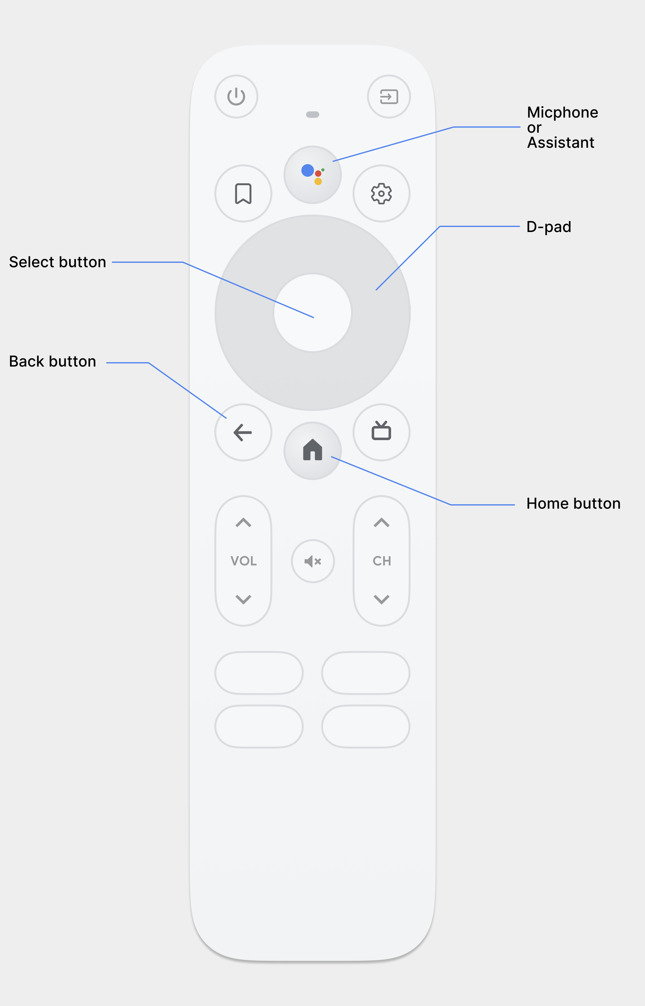
D-pad
The primary navigation method on TV is through the D-pad, which includes
up, down, left, and right directional
hardware buttons. The D-pad transfers focus from one object to the nearest
object in the direction of the button pressed.
Select button
Selects the on-screen item with focus.
Home button
Takes the user to the system Home screen.
Back button
Gives users a way to return to the previous view.
Microphone button
Invokes either Google Assistant or voice input.
D-pad navigation
On a TV device, users navigate using either a D-pad or arrow keys. This type of control limits movement to up, down, left, and right. To build a great TV-optimized app, you must provide a navigation scheme where the user can quickly learn how to navigate your app using these limited controls.
The Android framework handles directional navigation between layout elements automatically, so you typically do not need to do anything extra for your app. However, you should thoroughly test navigation with a D-pad controller to discover any navigation problems.
Follow these guidelines to test that your app's navigation system works well with a D-pad on a TV device:
- Ensure that a user with a D-pad controller can navigate to all visible controls on the screen.
- For scrolling lists with focus, make sure that the D-pad up and down buttons scroll the list and that the select button selects an item in the list. Verify that users can select an element in the list and that the list still scrolls when an element is selected.
- Ensure that switching between controls is straightforward and predictable.
Modify directional navigation
The Android framework automatically applies a directional navigation scheme based on the relative position of focusable elements in your layouts. Test the generated navigation scheme in your app using a D-pad controller. After testing, if you decide that you want users to move through your layouts in a specific way, you can set up explicit directional navigation for your controls.
The following code sample shows how to define the next control to receive focus
for a TextView layout object:
<TextView android:id="@+id/Category1" android:nextFocusDown="@+id/Category2" />
The following table lists all of the available navigation attributes for Android user interface widgets:
| Attribute | Function |
|---|---|
nextFocusDown |
Defines the next view to receive focus when the user navigates down. |
nextFocusLeft |
Defines the next view to receive focus when the user navigates left. |
nextFocusRight |
Defines the next view to receive focus when the user navigates right. |
nextFocusUp |
Defines the next view to receive focus when the user navigates up. |
To use one of these explicit navigation attributes, set the value to the
android:id of another widget in the layout. Be sure to set up the
navigation order as a loop, so that the last control directs focus back to the
first one.
Provide clear focus and selection
The success of an app's navigation scheme on TV devices depends on how easy it is for a user to determine what user interface element is in focus. If you do not provide a clear indication of the focused item, and therefore what item a user can take action on, they can quickly become frustrated and exit your app. For the same reason, it is important to always have an item in focus that a user can take action on immediately after your app starts or any time it is idle.
In your app layout and implementation, use color, size, animation, or a combination of these attributes to help users easily determine what actions they can take next. Use a uniform scheme for indicating focus across your application.
Android provides Drawable state list resources to implement highlights for focused and selected controls. The following code example demonstrates how to enable visual behavior for a button to indicate that a user has navigated to the control and then selected it:
<!-- res/drawable/button.xml -->
<?xml version="1.0" encoding="utf-8"?>
<selector xmlns:android="http://schemas.android.com/apk/res/android">
    <item android:state_pressed="true"
          android:drawable="@drawable/button_pressed" /> <!-- pressed -->
    <item android:state_focused="true"
          android:drawable="@drawable/button_focused" /> <!-- focused -->
    <item android:state_hovered="true"
          android:drawable="@drawable/button_focused" /> <!-- hovered -->
    <item android:drawable="@drawable/button_normal" /> <!-- default -->
</selector>
The following layout XML sample code applies the previous state list drawable to
a Button:
<Button
    android:layout_height="wrap_content"
    android:layout_width="wrap_content"
    android:background="@drawable/button" />
Make sure to provide sufficient padding within the focusable and selectable controls so that the highlights around them are clearly visible.
Back button navigation
For consistency across apps on the platform, ensure the behavior of the back button follows these guidelines.
Use predictable back button behavior
To create an easy and predictable navigation experience, when the user presses the remote's back button, take them to the previous destination.
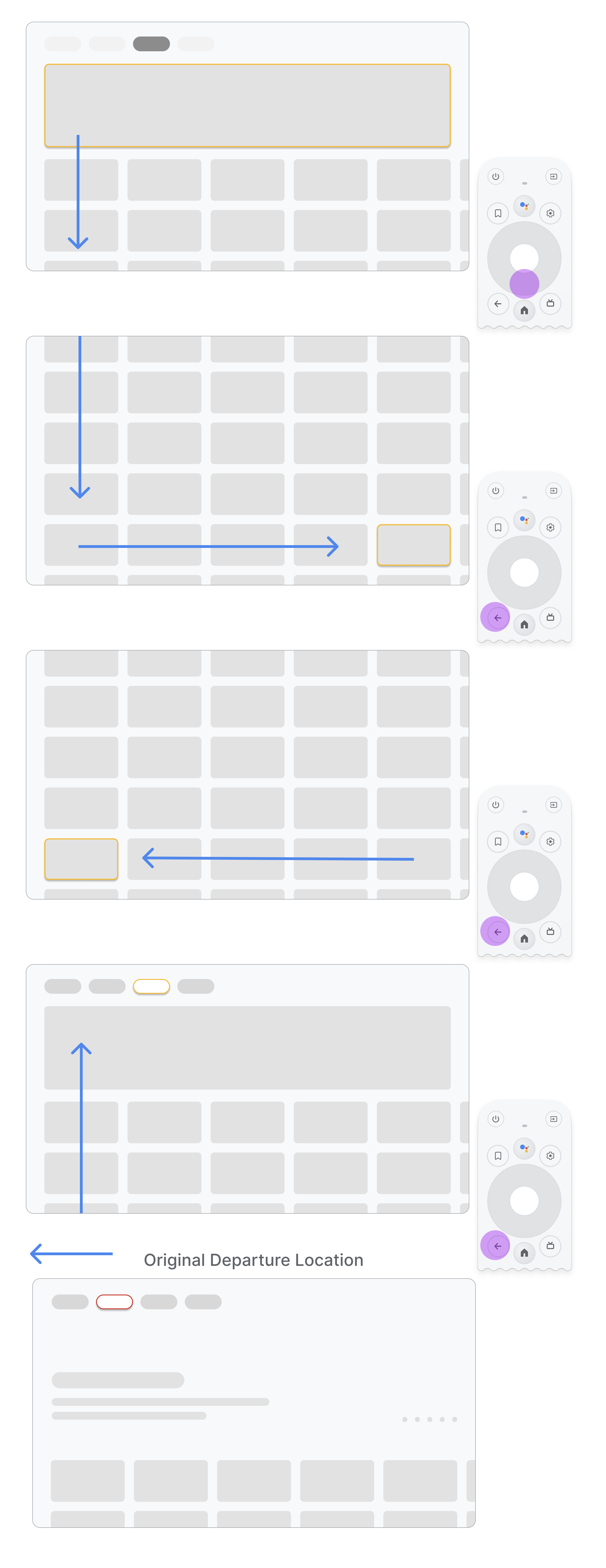
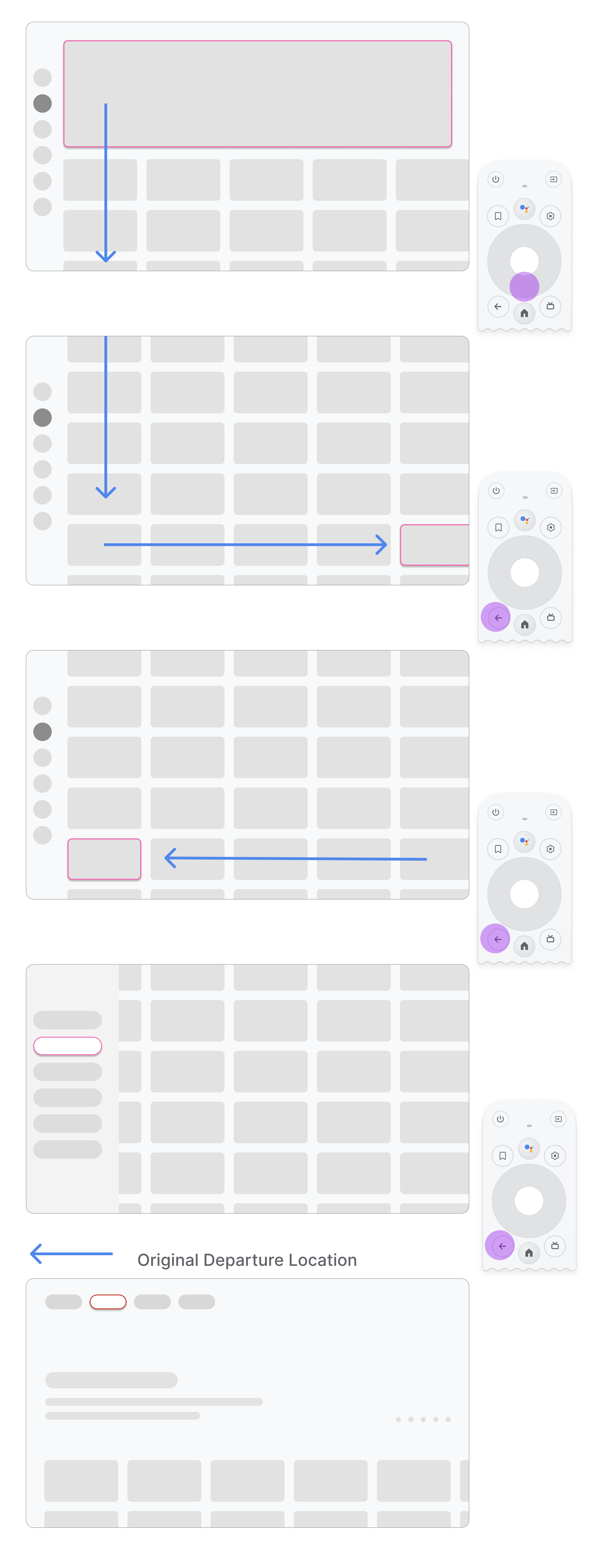
If the user navigates from a menu item to a card on the middle of the page and then presses the back button, the result depends on whether the app uses top navigation or left navigation:
- App uses top navigation: take the user back to the top of the page by scrolling quickly and activating focus on the menu.
- App uses left navigation: activate the left side menu and focus on the currently active menu item.
Ensure that the back button isn't gated by confirmation screens or part of an infinite loop.
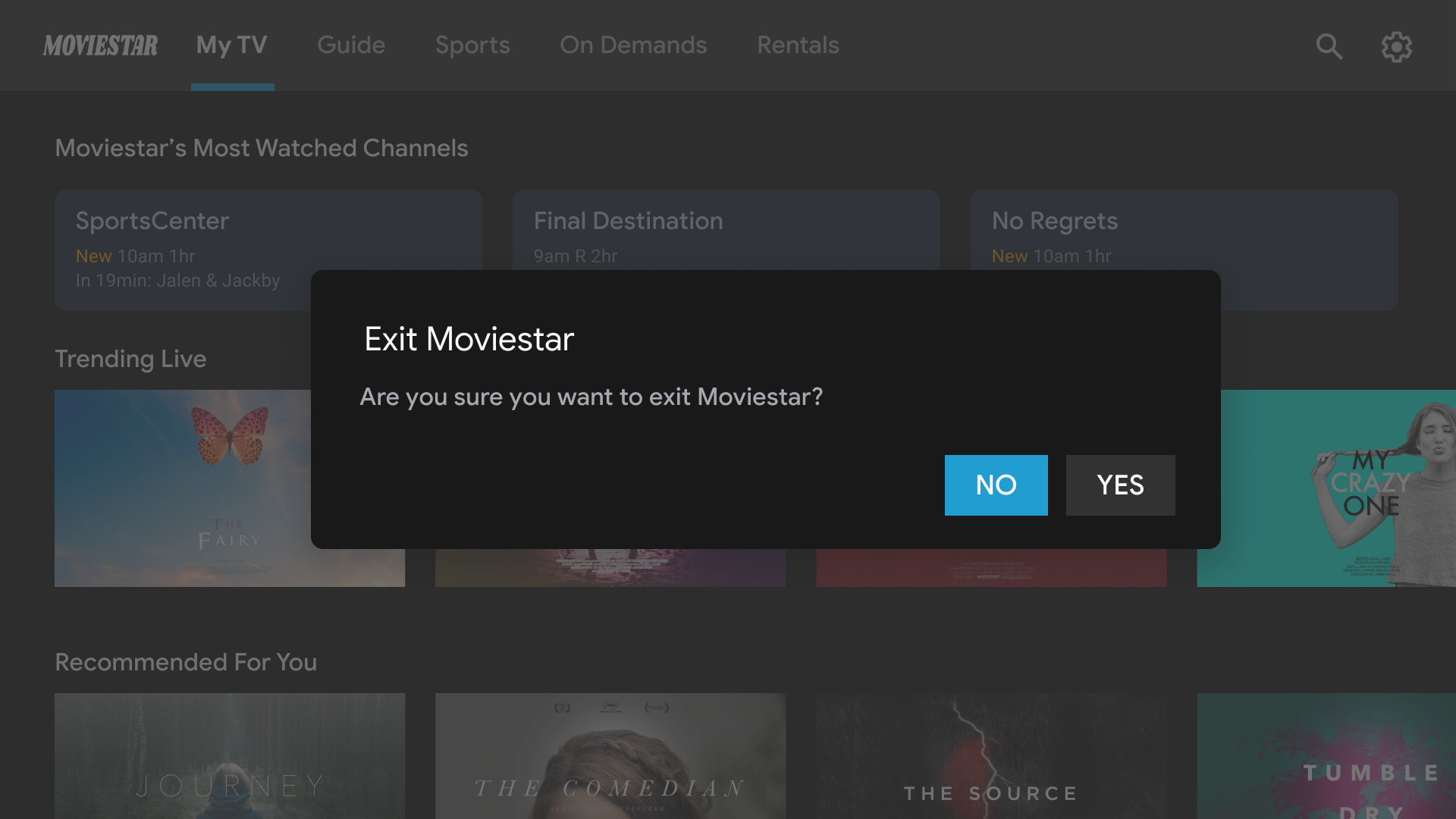
Don't.
Avoid exit gating. Let users exit out of the app without
confirmation.
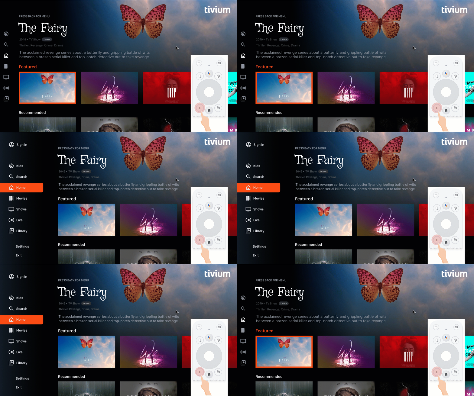
Don't.
Never enter the infinite loop of closing and opening the
menu. Ideally, pressing the back button exits out of the app. Don't
show an exit button on the menu unless it's a special case, such
as a kids profile.
Don't display an up or back button
Unlike on handheld devices, the back button on the remote is used to navigate backward on a TV. It's not necessary to show a virtual back button on the screen:
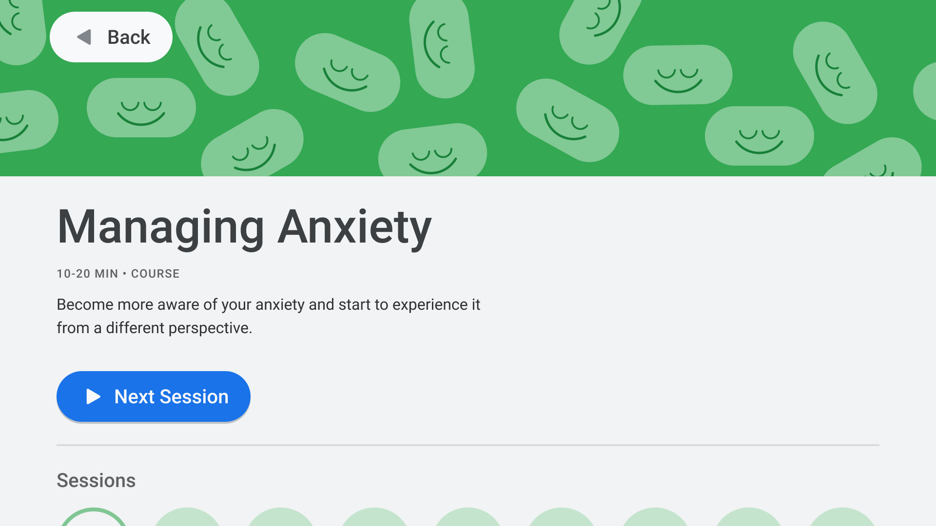
Don't.
Show a cancel button if necessary
If the only visible actions are confirming, destructive, or purchase actions, it's good practice to have a Cancel button that returns to the previous destination:
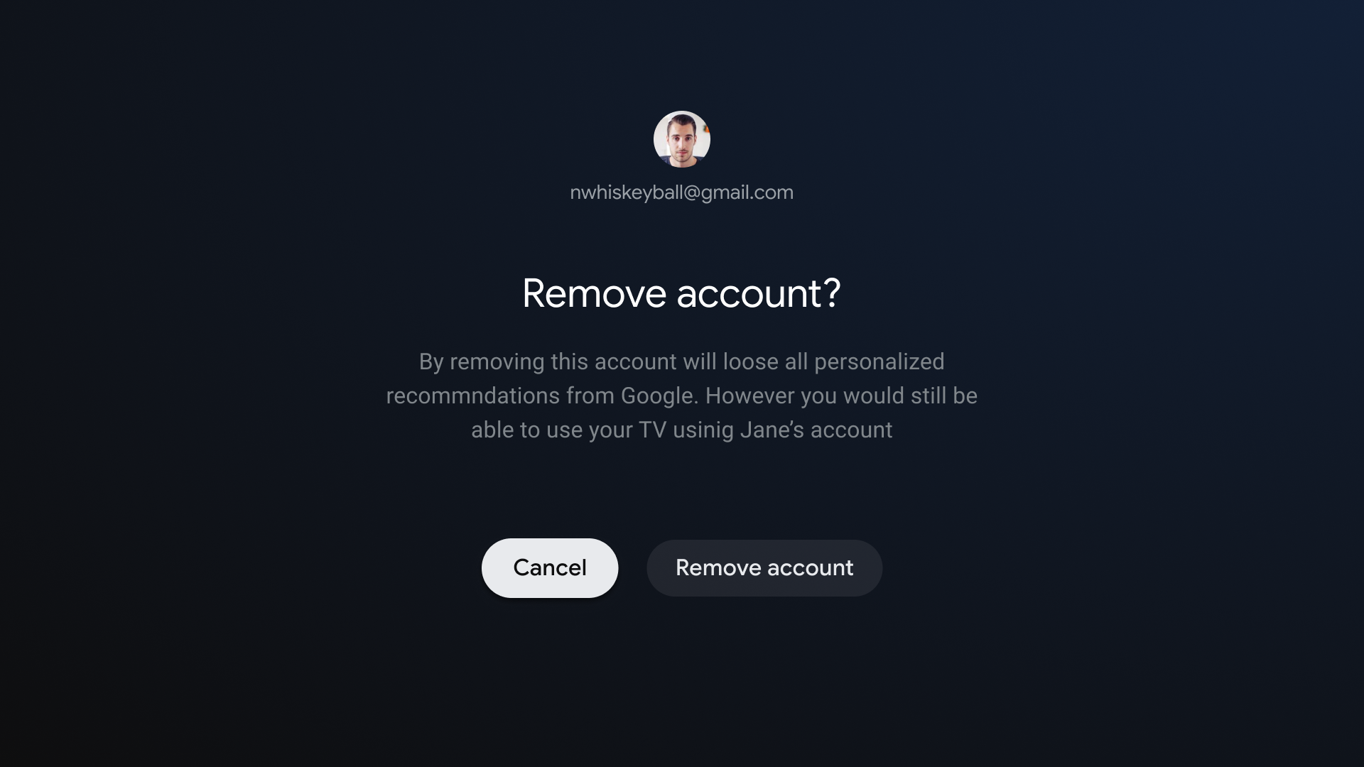
Do.
Implement back navigation
The Android framework generally handles back navigation well, as it does for the D-pad. If you use the Navigation component, you can support a variety of navigation graphs. Occasionally, you might need to implement some custom behavior, such as having the back button reset the focus to the beginning of a long list.
ComponentActivity,
the base class for FragmentActivity
and AppCompatActivity,
lets you control the behavior of the back button by using its
OnBackPressedDispatcher,
which you can retrieve by calling getOnBackPressedDispatcher().
For more information, see Provide custom back navigation.
Playback controls on TV
Video playback is one of the most important features on TV. It's important that video players in apps across Android TV behave the same. Refer to the playback controls guidelines for TV.
Live tab navigation
In addition to complying with the TV app quality requirements, apps with a live TV feed integrated on the Live tab must also meet frictionless playback and direct-back requirements, as described in the following sections.
Frictionless playback
Frictionless playback applies to in-app behavior following any Live/Linear channel deep link from Google TV and Android TV.
Users who click a Live/Linear channel deep link from Google TV and Android TV must be led directly to channel playback, without any blocking or delaying screens from the target app. Sign-in flows, sign-up flows, branding videos, and other delays are not permitted.
However, if the deep link initiates the target app loading from a cold boot, this boot-up delay before playback is permitted. An app boot-up branding video or animation is also permitted in this case. Such a cold boot experience is unlikely to occur more than once per session.
Also, if tuning into the deep-linked channel takes a few seconds, displaying channel and/or service branding is permitted. However, its duration should only be as long as it takes to load the channel (and similar to average channel load times within the app).
If the user is signed out or isn't subscribed, you can block playback for a paid channel to complete a sign-in or sign-up flow.
Direct-back
When users launch an app from a deep link on the Live tab, then press the back button, they must be returned to the Live tab in a single back press, regardless of how much time has elapsed. This direct-back behavior is required for all Live tab deep links on Google TV and Android TV.
Live tab deep links are distinguished by an appended deep link parameter:
?exit_on_back=[true|false]. Apps must parse this parameter to determine
whether the app was launched from the Live tab. If exit_on_back is true,
apps must implement the direct-back behavior.
Note that if the user presses any button other than back button as the first button press after the deep link, then the direct-back requirement doesn't apply, and only the standard back button behavior is required.
For example, suppose after following a deep link the user presses the D-pad's select button, which brings up a controls overlay. The user waits for the overlay to disappear, and then presses the back button. Since the first button pressed after following the deep link was the D-pad select button, the direct-back requirement does not apply. Instead, the normal app back stack logic applies.
Repeated presses of the back button must lead the user to the app root and then back to Google TV or Android TV, without any infinite loops. For more information, see the Predictable back button behavior section.
Navigation architecture
Fixed start destination
The first screen the user sees when they launch the app from the launcher is also the last screen the user sees when they return to the launcher after pressing the back button.
Deep linking simulates manual navigation
Whether deep linking or manually navigating to a specific destination, users can use the back button to navigate through destinations back to the start destination.
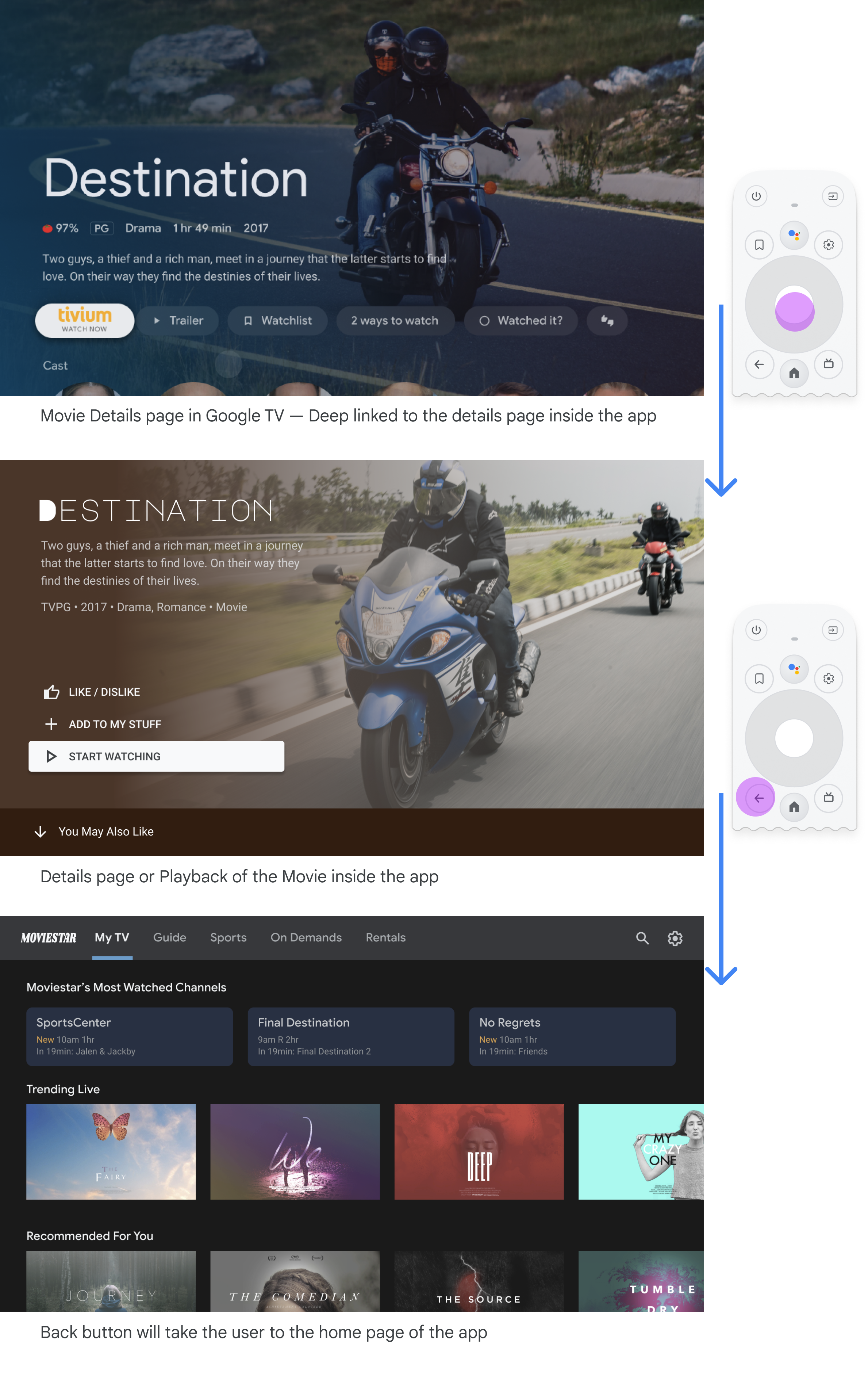
Deep linking into an app from another app simulates manual navigation. For example, if the user goes directly to a details page on the Moviestar app from Google TV and then presses the back button, they are taken to the home page of the Moviestar app.
Clear path to all focusable elements
Let users navigate your UI with clear direction. If there isn't a straight path to get to a control, consider relocating it.
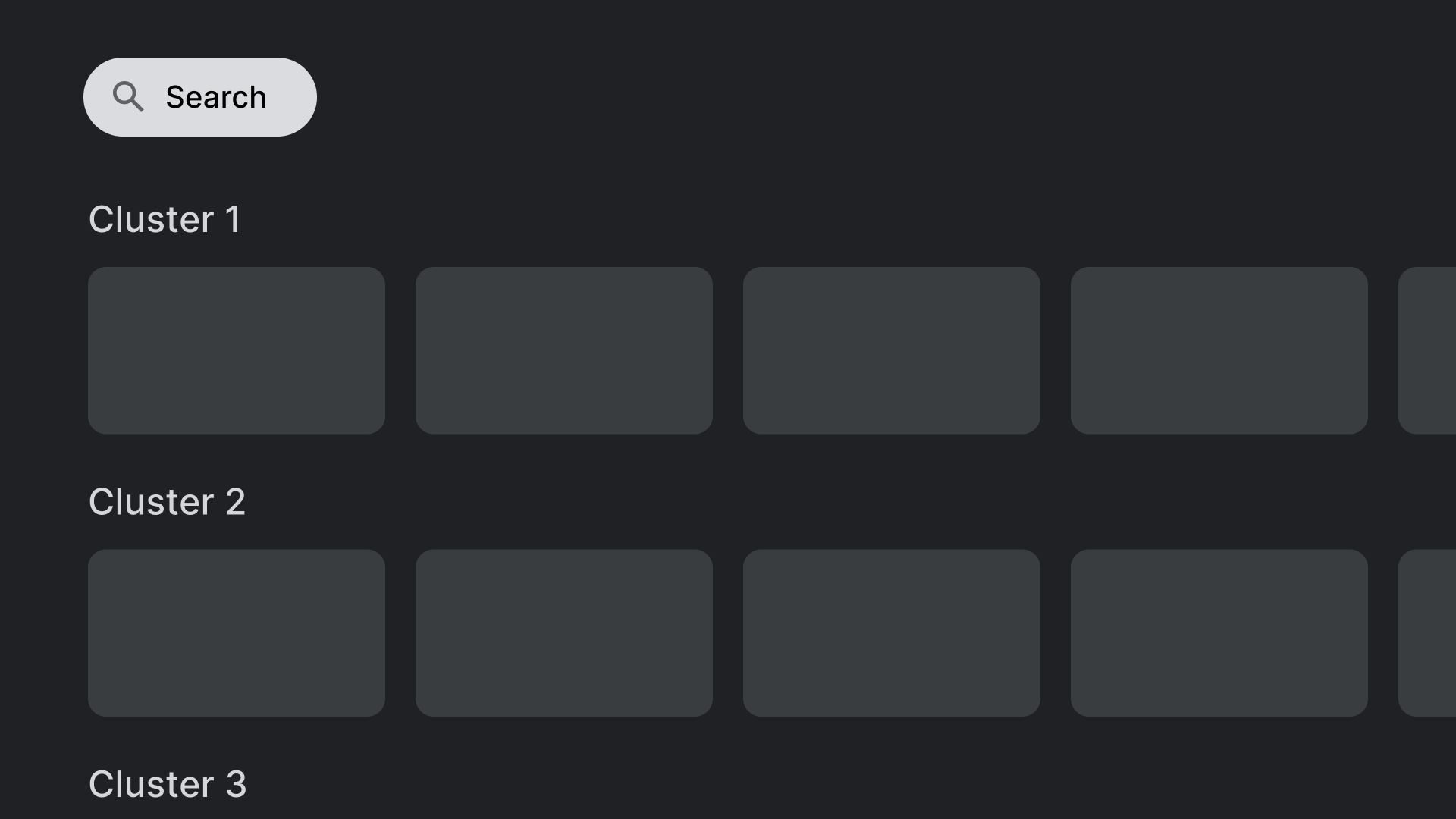
Do.
Place controls, like the search action shown here, in locations that don't overlap
with other clickable elements.
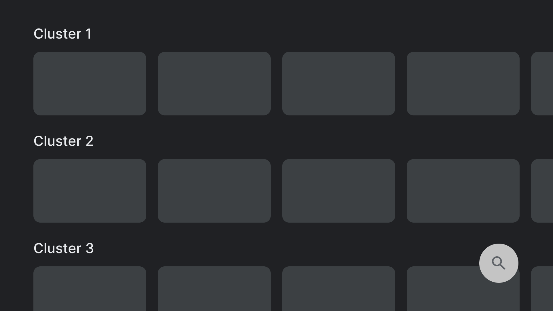
Don't.
Avoid layouts that contain controls in hard-to-reach places. Reaching
the search action shown here is not easy to manage with the D-pad.
Axes
Design your layout to take advantage of both horizontal and vertical axes. Give each direction a specific function, making it fast to navigate large hierarchies.
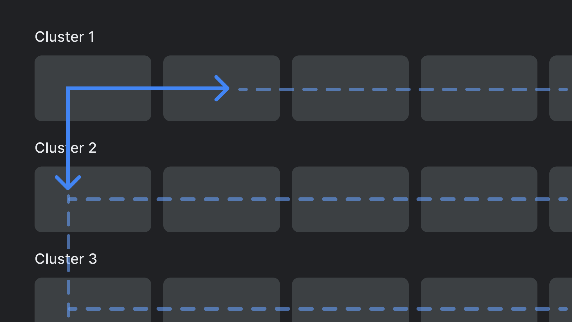
Do.
Categories can be traversed on the vertical axis, and items within each
category can be browsed on the horizontal axis.
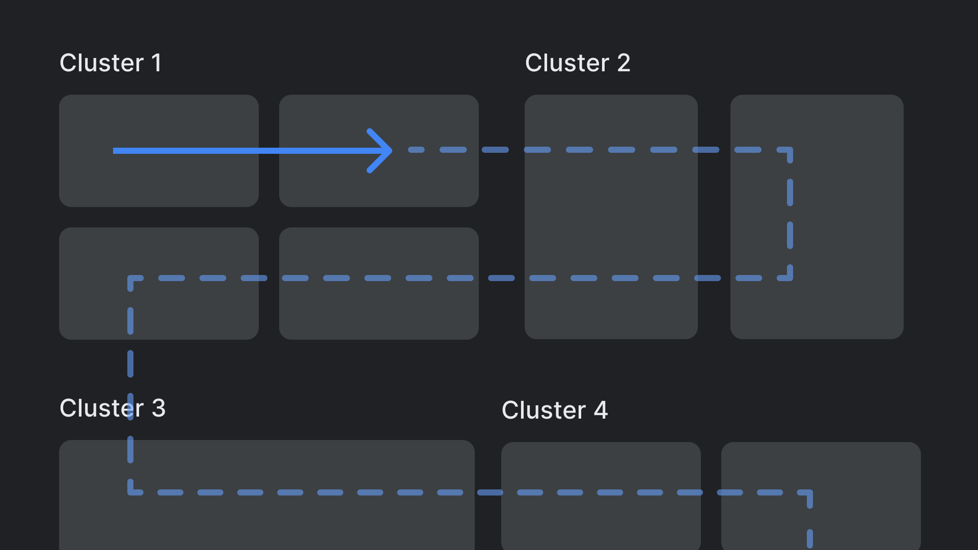
Don't.
Avoid complex and nested layout hierarchies.
