
大屏幕使用入门
大屏设备可为您提供更多应用开发机会。平板电脑、可折叠设备和 ChromeOS 设备配备的大屏幕可以展示内容,提升多任务处理效率,并实现在小屏幕上无法实现的界面。
想象一下您的应用在大屏设备上的表现
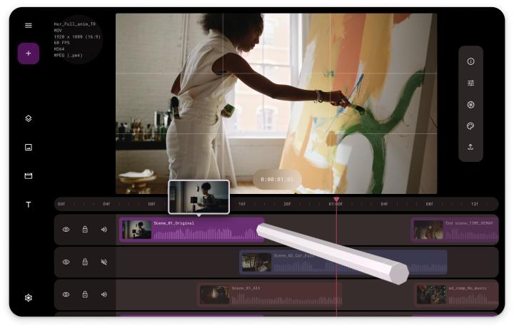
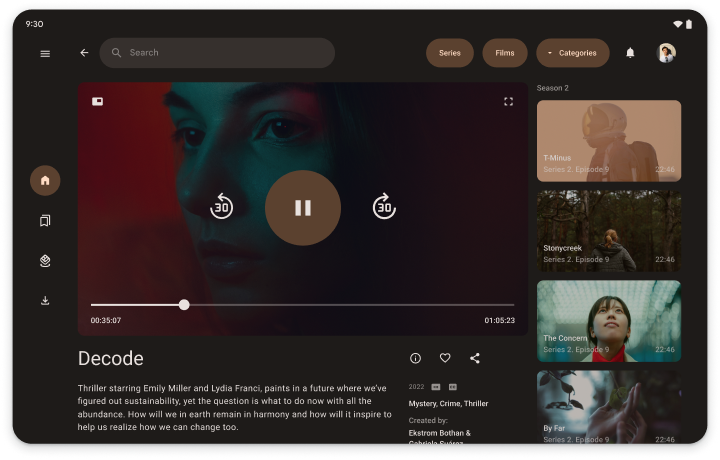
效率更高的应用、更具吸引力的媒体应用、更具沉浸感的游戏。想象一下,您可以利用大屏幕的宽阔显示空间做些什么。
工作效率
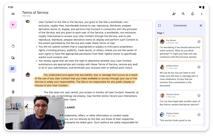
充足的工作空间提供工具、文字和整洁有序的互动功能,让应用更加高效。
如需查看更多大屏幕设计,请访问界面设计库。
为所有人打造产品/服务
大屏设备是一个快速增长的市场细分。让您的应用能够在标准手机以外的所有大屏设备上运行。让尽可能多的用户使用您的应用。为所有人打造适合的各种设备。
在应用质量指南的帮助下

如要开始进行大屏设备开发,请遵循自适应应用质量指南。该指南全面讲述了需遵守的要求,旨在帮助您让应用在所有尺寸的显示屏(包括大屏设备)上提供绝佳的体验。
应用质量等级
质量指南分为三个层级:自适应就绪、自适应优化和自适应差异化。您可从自适应准备就绪开始,逐步完成各个层级,向应用中添加适合大屏设备的功能。如果您已有应用,请使用质量指南测试来确定您的应用支持的层级,然后逐级实现相关功能,最终将您的应用打造成与众不同的大屏设备应用。
…以及经过验证的规范布局
大屏幕规范化布局(列表详情、信息流和辅助窗格)是通用的常用界面设计。在应用中实现布局,以提供经过优化的大屏幕体验,让您的用户爱不释手。