
Dialog 组件会在主应用内容上方的层上显示弹出式消息或请求用户输入。它会创建干扰性的界面体验,以吸引用户注意力。
对话框的用例包括:
- 确认用户操作,例如删除文件。
- 请求用户输入信息,例如在待办事项应用中。
- 显示供用户选择的选项列表,例如在个人资料设置中选择国家/地区。
本主题提供了以下实现:
版本兼容性
此实现要求将项目 minSDK 设置为 API 级别 21 或更高级别。
依赖项
创建提醒对话框
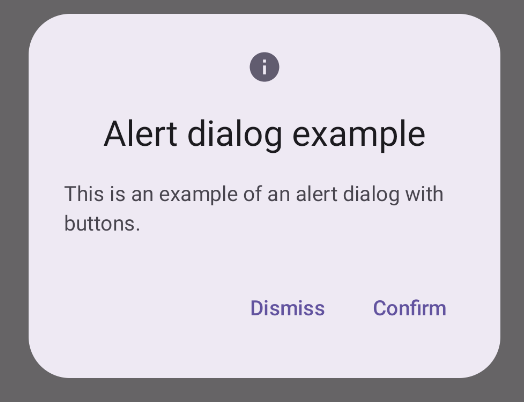
AlertDialog 可组合项提供了一个便捷的 API,用于创建 Material Design 主题对话框。以下示例在提醒对话框中实现了两个按钮,一个用于关闭对话框,另一个用于确认其请求:
此实现暗示父级可组合项会以这种方式将参数传递给子级可组合项:
结果
要点
AlertDialog 具有用于处理对话框的特定元素的特定参数。其中包括:
title:对话框顶部显示的文本。text:在对话框中居中显示的文本。icon:对话框顶部显示的图形。onDismissRequest:用户关闭对话框(例如点按对话框以外的任意位置)时调用的函数。dismissButton:用作关闭按钮的可组合项。confirmButton:用作确认按钮的可组合项。当用户点击其中一个按钮时,对话框会关闭。当用户点击“确认”时,它会调用一个同时处理确认的函数。在此示例中,这些函数分别为
onDismissRequest()和onConfirmRequest()。如果您的对话框需要一组更复杂的按钮,您不妨使用
Dialog可组合项并以更自由的方式填充它。
创建对话框
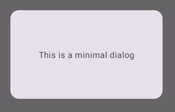
Dialog 是一种基本可组合项,不为内容提供任何样式或预定义槽。这是一个简单的容器,您应使用 Card 等容器对其进行填充。以下是一些对话框的关键参数:
onDismissRequest:在用户关闭对话框时调用的 lambda。properties:一个DialogProperties实例,可提供一些额外的自定义范围。
创建基本对话框
以下示例是 Dialog 可组合项的基本实现。请注意,它使用 Card 作为辅助容器。如果没有 Card,Text 组件将单独显示在应用主要内容上方。
结果
请注意,对话框打开时,其下方的应用主要内容会变暗并灰显:
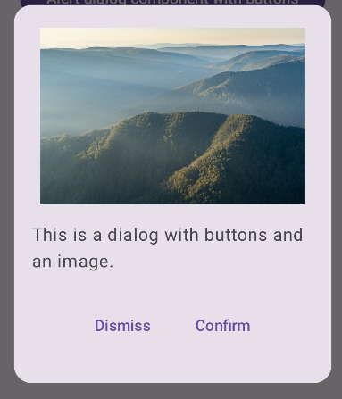
创建高级对话框
以下是 Dialog 可组合项的更高级实现。在本例中,该组件手动实现了与前面的 AlertDialog 示例类似的接口。
结果
包含本指南的集合
本指南属于以下精选快速入门集合,这些集合涵盖了更广泛的 Android 开发目标:
显示文本
文字对任何界面都属于核心内容。了解在应用中呈现文本的不同方式,以提供愉悦的用户体验。
请求用户输入
了解如何实现用户通过输入文本和使用其他输入方式与您的应用互动的方式。
显示互动组件
了解如何使用可组合函数根据 Material Design 设计系统轻松创建美观的界面组件。
有问题或反馈
请访问我们的常见问题解答页面,了解简短指南,或与我们联系,告诉我们您的想法。