マテリアル デザインにおいて、スキャフォールドは複雑なユーザー インターフェースの標準化されたプラットフォームを提供する基本構造です。アプリバーやフローティング アクション ボタンなどの UI のさまざまな部分をまとめ、アプリのデザインに一貫性を持たせます。
例
Scaffold コンポーザブルは、マテリアル デザイン ガイドラインに沿ってアプリの構造をすばやく構築するために使用できる簡単な API を提供します。Scaffold は、複数のコンポーザブルをパラメータとして受け取ります。次に例を示します。
topBar: 画面上部のアプリバー。bottomBar: 画面下部にあるアプリバー。floatingActionButton: 画面の右下に表示されるボタン。重要なアクションを表示できます。
トップとボトムの両方のアプリバーを実装する方法の詳細な例については、アプリバーのページをご覧ください。
また、他のコンテナと同様に、Scaffold コンテンツを渡すこともできます。innerPadding 値を content ラムダに渡して、子コンポーザブルで使用できます。
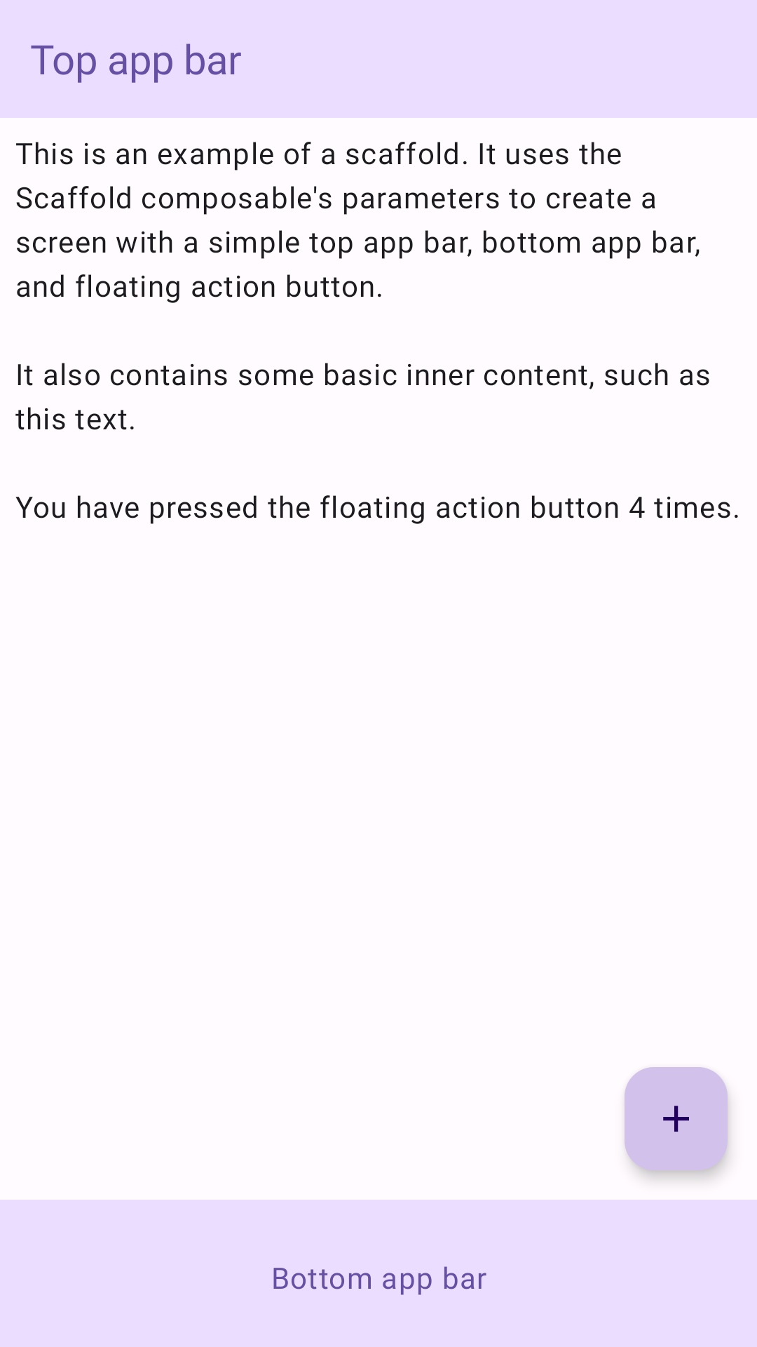
次の例は、Scaffold の実装方法の完全な例を示しています。これには、トップ アプリバー、ボトム アプリバー、Scaffold の内部状態を操作するフローティング アクション ボタンが含まれます。
@Composable
fun ScaffoldExample() {
var presses by remember { mutableIntStateOf(0) }
Scaffold(
topBar = {
TopAppBar(
colors = topAppBarColors(
containerColor = MaterialTheme.colorScheme.primaryContainer,
titleContentColor = MaterialTheme.colorScheme.primary,
),
title = {
Text("Top app bar")
}
)
},
bottomBar = {
BottomAppBar(
containerColor = MaterialTheme.colorScheme.primaryContainer,
contentColor = MaterialTheme.colorScheme.primary,
) {
Text(
modifier = Modifier
.fillMaxWidth(),
textAlign = TextAlign.Center,
text = "Bottom app bar",
)
}
},
floatingActionButton = {
FloatingActionButton(onClick = { presses++ }) {
Icon(Icons.Default.Add, contentDescription = "Add")
}
}
) { innerPadding ->
Column(
modifier = Modifier
.padding(innerPadding),
verticalArrangement = Arrangement.spacedBy(16.dp),
) {
Text(
modifier = Modifier.padding(8.dp),
text =
"""
This is an example of a scaffold. It uses the Scaffold composable's parameters to create a screen with a simple top app bar, bottom app bar, and floating action button.
It also contains some basic inner content, such as this text.
You have pressed the floating action button $presses times.
""".trimIndent(),
)
}
}
}
これを実装すると次のようになります。