Dialog コンポーネントは、メインアプリ コンテンツの上にあるレイヤで、ポップアップ メッセージを表示したり、ユーザー入力をリクエストしたりします。ユーザーの注意を引くために邪魔な UI エクスペリエンスを生み出します。
ダイアログのユースケースには次のようなものがあります。
- ファイルの削除などのユーザー操作を確認する。
- ToDo リスト アプリなどでユーザー入力をリクエストする。
- プロファイル設定で国を選択するなど、ユーザーが選択するためのオプションのリストを表示する。

通知ダイアログ
AlertDialog コンポーザブルは、マテリアル デザインをテーマにしたダイアログを作成するための便利な API を提供します。AlertDialog には、ダイアログの特定の要素を処理するための特定のパラメータがあります。その例は以下のとおりです。
title: ダイアログの上部に表示されるテキスト。text: ダイアログの中央に表示されるテキスト。icon: ダイアログの上部に表示されるグラフィック。onDismissRequest: ユーザーがダイアログの外側をタップするなどしてダイアログを閉じるときに呼び出される関数。dismissButton: 閉じるボタンとして機能するコンポーザブル。confirmButton: 確認ボタンとして機能するコンポーザブル。
次の例では、アラート ダイアログに 2 つのボタンを実装しています。1 つはダイアログを閉じるボタン、もう 1 つはリクエストを確認するボタンです。
@OptIn(ExperimentalMaterial3Api::class)
@Composable
fun AlertDialogExample(
onDismissRequest: () -> Unit,
onConfirmation: () -> Unit,
dialogTitle: String,
dialogText: String,
icon: ImageVector,
) {
AlertDialog(
icon = {
Icon(icon, contentDescription = "Example Icon")
},
title = {
Text(text = dialogTitle)
},
text = {
Text(text = dialogText)
},
onDismissRequest = {
onDismissRequest()
},
confirmButton = {
TextButton(
onClick = {
onConfirmation()
}
) {
Text("Confirm")
}
},
dismissButton = {
TextButton(
onClick = {
onDismissRequest()
}
) {
Text("Dismiss")
}
}
)
}
この実装は、次のように子コンポーザブルに引数を渡す親コンポーザブルを暗黙的に示唆しています。
@Composable
fun DialogExamples() {
// ...
val openAlertDialog = remember { mutableStateOf(false) }
// ...
when {
// ...
openAlertDialog.value -> {
AlertDialogExample(
onDismissRequest = { openAlertDialog.value = false },
onConfirmation = {
openAlertDialog.value = false
println("Confirmation registered") // Add logic here to handle confirmation.
},
dialogTitle = "Alert dialog example",
dialogText = "This is an example of an alert dialog with buttons.",
icon = Icons.Default.Info
)
}
}
}
}
これを実装すると次のようになります。
![[閉じる] ボタンと [確認] ボタンの両方がある開いているアラート ダイアログ。](https://developer.android.com/static/develop/ui/compose/images/components/dialog-alert.png?authuser=4&hl=ja)
Dialog コンポーザブル
Dialog は、コンテンツのスタイル設定や事前定義されたスロットを提供しない基本的なコンポーザブルです。これは比較的簡単なコンテナであり、Card などのコンテナを挿入する必要があります。ダイアログの主なパラメータは次のとおりです。
onDismissRequest: ユーザーがダイアログを閉じたときに呼び出されるラムダ。properties: カスタマイズの追加スコープを提供するDialogPropertiesのインスタンス。
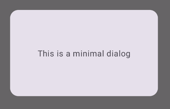
基本的な例
次の例は、Dialog コンポーザブルの基本的な実装です。セカンダリ コンテナとして Card を使用しています。Card がないと、Text コンポーネントはメインアプリ コンテンツの上に単独で表示されます。
@Composable
fun MinimalDialog(onDismissRequest: () -> Unit) {
Dialog(onDismissRequest = { onDismissRequest() }) {
Card(
modifier = Modifier
.fillMaxWidth()
.height(200.dp)
.padding(16.dp),
shape = RoundedCornerShape(16.dp),
) {
Text(
text = "This is a minimal dialog",
modifier = Modifier
.fillMaxSize()
.wrapContentSize(Alignment.Center),
textAlign = TextAlign.Center,
)
}
}
}
この実装は次のようになります。なお、ダイアログを開くと、そのダイアログの下にあるメインアプリ コンテンツが暗くなり、グレー表示されます。
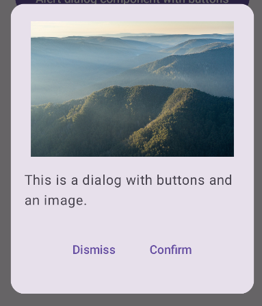
高度な例
以下は、Dialog コンポーザブルの高度な実装です。この場合、コンポーネントは上記の AlertDialog の例に類似したインターフェースを手動で実装します。
@Composable
fun DialogWithImage(
onDismissRequest: () -> Unit,
onConfirmation: () -> Unit,
painter: Painter,
imageDescription: String,
) {
Dialog(onDismissRequest = { onDismissRequest() }) {
// Draw a rectangle shape with rounded corners inside the dialog
Card(
modifier = Modifier
.fillMaxWidth()
.height(375.dp)
.padding(16.dp),
shape = RoundedCornerShape(16.dp),
) {
Column(
modifier = Modifier
.fillMaxSize(),
verticalArrangement = Arrangement.Center,
horizontalAlignment = Alignment.CenterHorizontally,
) {
Image(
painter = painter,
contentDescription = imageDescription,
contentScale = ContentScale.Fit,
modifier = Modifier
.height(160.dp)
)
Text(
text = "This is a dialog with buttons and an image.",
modifier = Modifier.padding(16.dp),
)
Row(
modifier = Modifier
.fillMaxWidth(),
horizontalArrangement = Arrangement.Center,
) {
TextButton(
onClick = { onDismissRequest() },
modifier = Modifier.padding(8.dp),
) {
Text("Dismiss")
}
TextButton(
onClick = { onConfirmation() },
modifier = Modifier.padding(8.dp),
) {
Text("Confirm")
}
}
}
}
}
}
これを実装すると次のようになります。