Section header
Stay organized with collections
Save and categorize content based on your preferences.
Overview
Section headers define the titles, actions, and visual indicators for individual content groups within the sectioned item template. Because headers are fully interactive, they support inline navigation shortcuts, settings triggers, and custom brand icons. Making the header directly tappable allows drivers to navigate to deeper content, trigger sorting options, or consolidate long lists without excessive scrolling.
Composition
A section header supports the following components:
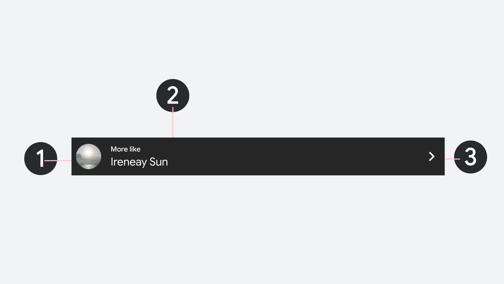
Leading image or icon
Title: Primary header text and secondary overline text should be restricted to 1 line.
Trailing action button (optional)
1. Leading image or icon
2. Title and overline text
3. Trailing action button
Content and code samples on this page are subject to the licenses described in the Content License. Java and OpenJDK are trademarks or registered trademarks of Oracle and/or its affiliates.
Last updated 2026-05-19 UTC.
[[["Easy to understand","easyToUnderstand","thumb-up"],["Solved my problem","solvedMyProblem","thumb-up"],["Other","otherUp","thumb-up"]],[["Missing the information I need","missingTheInformationINeed","thumb-down"],["Too complicated / too many steps","tooComplicatedTooManySteps","thumb-down"],["Out of date","outOfDate","thumb-down"],["Samples / code issue","samplesCodeIssue","thumb-down"],["Other","otherDown","thumb-down"]],["Last updated 2026-05-19 UTC."],[],[]]