
Overview
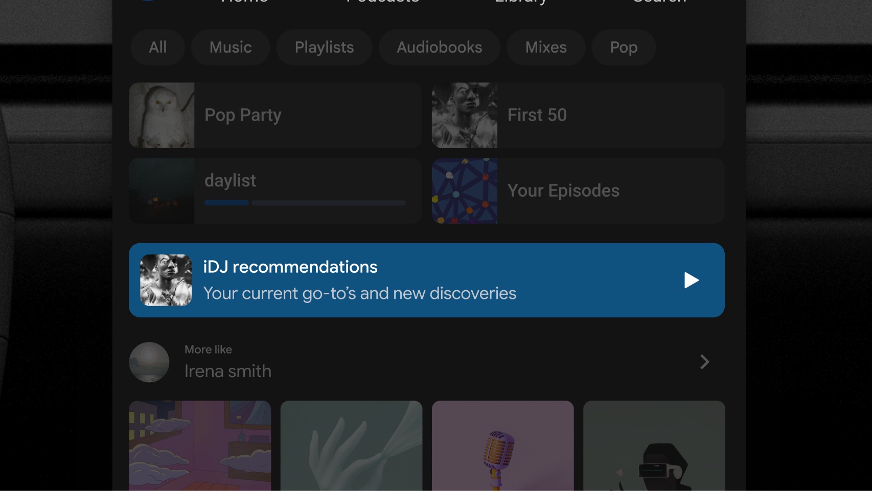
Banners can help showcase special app experiences, new features, or important messages. While functionally similar to standard rows, banners add distinct visual prominence through customizable background fills and will always be visually separated from surrounding content.
Composition
If a banner is dismissible, the host automatically renders the final item in the trailing elements list as a standardized, close icon button.
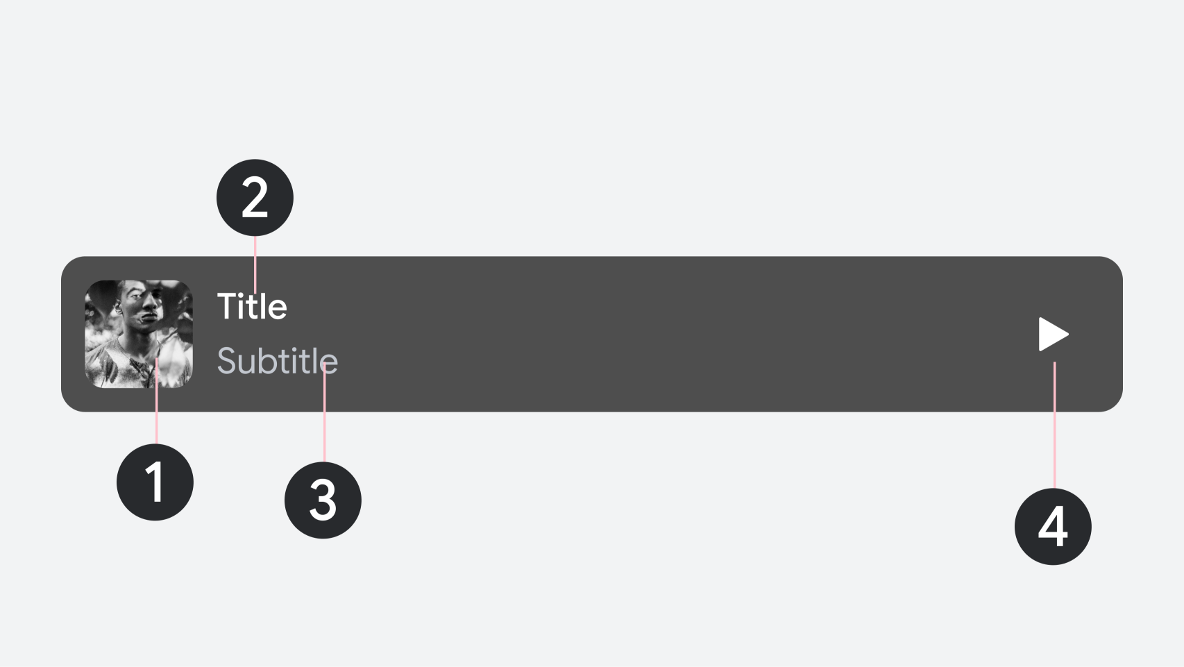
1. Leading image
2. Primary text
3. Secondary text (optional)
4. Trailing element (optional)
UX requirements
To ensure a safe and consistent experience across all apps, follow these design requirements:
Requirement level |
Content |
|---|---|
MUST |
Display only one banner per section. Place banners in a dedicated section that contains no other component types. |
SHOULD |
Apply custom background fills, button accent colors, and distinct corner radii to separate banners from standard content rows. |
SHOULD |
Avoid placing banner sections directly adjacent to one another to preserve their visual prominence. |