

12L ist eine spezielle Funktionserweiterung, die Android 12 auf großen Displays noch besser macht. Wir haben die System-UI für große Displays optimiert und verbessert, Multitasking leistungsfähiger und intuitiver gemacht und die Kompatibilität von Apps verbessert, damit sie standardmäßig besser aussehen. Außerdem haben wir einige Entwickler-APIs hinzugefügt.
Laden Sie den 12L-Emulator herunter oder installieren Sie 12L auf einem Partnergerät, um loszulegen.
Das ist neu.
Ein für große Bildschirme optimiertes Betriebssystem
In 12L wurde die System-UI optimiert, um sie auf großen Displays noch schöner und benutzerfreundlicher zu machen – ob in Benachrichtigungen, Schnelleinstellungen, auf dem Sperrbildschirm, in der Übersicht, auf der Startseite oder anderswo.
Auf großen Bildschirmen nutzt die Benachrichtigungsleiste den vorhandenen Platz und zeigt die Schnelleinstellungen und Benachrichtigungen in einem neuen zweispaltigen Layout an. Auch auf dem Sperrbildschirm wird ein größeres, zweispaltiges Layout genutzt, um Benachrichtigungen und die Uhrzeit anzuzeigen. System-Apps wie die Einstellungen wurden ebenfalls optimiert.
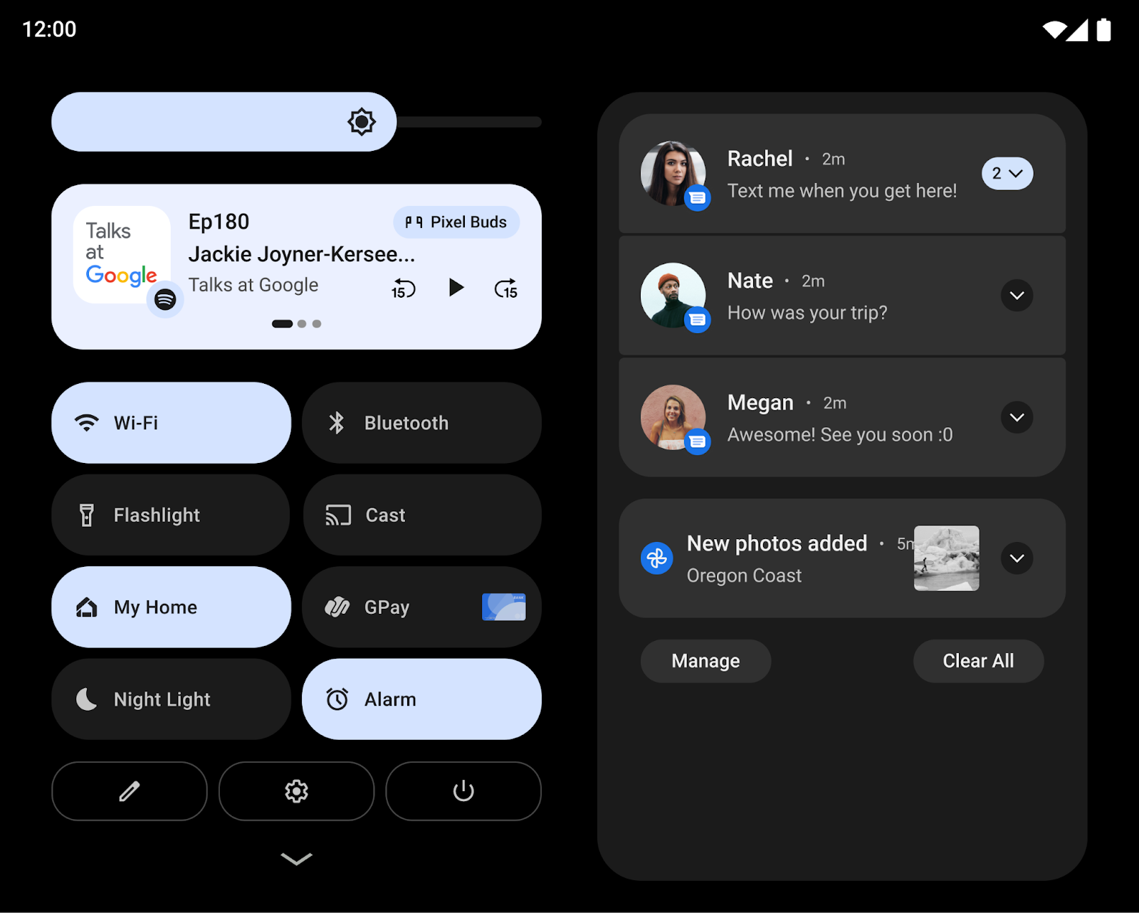
Außerdem haben wir dafür gesorgt, dass wichtige Interaktionen auf größeren Bildschirmen einfacher sind. So werden beispielsweise die Muster- und PIN-Steuerelemente auf dem Sperrbildschirm bei Tablets jetzt an der Seite des Bildschirms angezeigt, sodass Nutzer schneller darauf zugreifen können. Sie können einfach auf die andere Seite des Bildschirms tippen, um die PIN-/Muster-Abfrage dorthin zu verschieben.
Bei Faltgeräten haben wir das Startbildschirmraster optimiert und den Übergang beim Auf- und Zuklappen verbessert, sodass Nutzer nahtlos von einem einzelnen Außendisplay zum größeren aufgeklappten Display wechseln können. So wird die Kontinuität gestärkt und gleichzeitig die Auswahl der Nutzer beibehalten.
Für Entwickler: Änderung bei der Projektion von Medieninhalten
Ab Android 12L wird das virtuelle Display, wenn es auf der Oberfläche gerendert wird, mit einem Verfahren, das der Option centerInside von ImageView ähnelt, an die Oberfläche angepasst.
Der neue Skalierungsansatz verbessert die Bildschirmübertragung auf Fernseher und andere große Displays, da die Größe des Oberflächenbilds maximiert wird, während das richtige Seitenverhältnis beibehalten wird.
Weitere Informationen finden Sie unter Projektion von Medieninhalten auf großen Bildschirmen.
Leistungsstarkes und intuitives Multitasking
Nutzer erledigen auf den größeren Displays von Tablets, Chromebooks und faltbaren Smartphones oft mehrere Aufgaben gleichzeitig. Mit den neuen Produktivitätsfunktionen in Android 12L wird Multitasking noch leistungsstärker und intuitiver.
Mit 12L wird eine neue Taskleiste eingeführt, mit der sich Apps einfacher starten und wechseln lassen. Touchgesten machen die Verwendung der Taskleiste noch schneller. Sie können Apps per Drag-and-drop in den Splitscreen-Modus ziehen und nach oben wischen, um zum Startbildschirm zurückzukehren. Bei der Bedienung über Gesten können Nutzer mit einer Schnellwechselgeste durch die zuletzt verwendeten Apps blättern. Nutzer können die Taskleiste jederzeit durch langes Drücken ein- oder ausblenden.
Apps im Splitscreen-Modus auszuführen ist eine beliebte Methode für Multitasking. In 12L ist der Splitscreen-Modus jetzt noch einfacher zu finden und zu verwenden. Nutzer können ihre bevorzugten Apps jetzt direkt über die Taskleiste per Drag-and-drop in den Splitscreen-Modus ziehen. Alternativ können sie auch die neue Aktion „Splitscreen“ in der Übersicht verwenden, um den Splitscreen-Modus mit einem Tippen zu starten.
Damit die Nutzung des Splitscreen-Modus für Nutzer einheitlicher wird, können unter Android 12 und höher alle Apps in den Multi-Window-Modus wechseln, unabhängig davon, ob sie die Größe ändern können.
Für Entwickler: Apps im Splitscreen-Modus testen
Da der Splitscreen-Modus immer zugänglicher wird und Nutzer mit Android 12 alle Apps im Splitscreen-Modus starten können, empfehlen wir Ihnen dringend, Ihre Apps im Splitscreen-Modus zu testen.
Für Entwickler: Dynamische Änderungen der Inset-Größen verarbeiten
Die neue Taskleiste wird Anwendungen als Inset gemeldet, obwohl in 12L keine neue Inset-API eingeführt wird.
Bei Verwendung der Bedienung über Gesten kann die Taskleiste dynamisch ein- und ausgeblendet werden. Wenn Ihre App die Inset-Informationen bereits zum Zeichnen der Benutzeroberfläche verwendet, muss sie berücksichtigen, dass sich die Größe des Insets ändern kann, während sich die App im fortgesetzten Zustand befindet. In diesen Fällen muss Ihre App setOnApplyWindowInsetsListener aufrufen und Änderungen an den Abmessungen des Insets verarbeiten, wie unter Systemleisten-Insets beschrieben.
Verbesserte Kompatibilität
Viele Apps sind bereits für Geräte mit großen Bildschirmen optimiert und bieten durch responsive Layouts, Unterstützung für den Mehrfenstermodus, Kontinuität bei Änderungen der Bildschirmgröße und des Gerätestatus und mehr eine hervorragende Nutzererfahrung.
Für Apps, die noch nicht optimiert sind, haben wir den Kompatibilitätsmodus visuell und in Bezug auf die Stabilität verbessert, um die Nutzerfreundlichkeit zu erhöhen und dafür zu sorgen, dass diese Apps standardmäßig besser aussehen.
Wir haben die Benutzeroberfläche für Letterboxing verbessert, indem wir eine Reihe von Optionen eingeführt haben, die Gerätehersteller über Overlay-Konfigurationen anpassen können. Gerätehersteller können jetzt beispielsweise das Seitenverhältnis der App konfigurieren, abgerundete Ecken auf das App-Fenster anwenden und die Transparenz der Statusleiste festlegen.
Für Entwickler: Apps im Kompatibilitätsmodus testen
Wenn Ihre App noch nicht für Änderungen der Bildschirmgröße und der Geräteausrichtung optimiert ist, wird sie möglicherweise im Kompatibilitätsmodus gestartet. Wir empfehlen, Ihre App mit den 12L-Kompatibilitätsmodi zu testen, um sicherzustellen, dass sie richtig aussieht und funktioniert.
Weitere Informationen finden Sie unter Gerätekompatibilitätsmodus.
Weitere Updates und Ressourcen für große Bildschirme
Änderungen bei Google Play auf großen Bildschirmen
Damit Nutzer auf ihren Tablets, faltbaren Smartphones und ChromeOS-Geräten leichter die besten Apps finden, werden bei Google Play Apps, die für ihre Geräte optimiert sind, jetzt besonders hervorgehoben.
Es wurden neue Prüfungen hinzugefügt, um die Qualität jeder App anhand unserer Qualitätsrichtlinien für Apps für große Bildschirme zu bewerten und so dafür zu sorgen, dass auf diesen Geräten die bestmöglichen Apps angezeigt werden. Wenn eine App nicht für große Bildschirme optimiert ist, sehen Nutzer mit großen Bildschirmen jetzt einen Hinweis auf der Seite des Google Play Store-Eintrags der App, damit sie Apps finden, die auf ihrem Gerät am besten funktionieren.
Außerdem werden in Google Play demnächst App-Bewertungen speziell für große Bildschirme eingeführt, wie im August 2021 angekündigt. Nutzer können dann bewerten, wie Ihre App auf ihren Geräten mit großen Bildschirmen funktioniert.
Einbetten von Aktivitäten mit Jetpack WindowManager
Durch das Einbetten von Aktivitäten können Sie den zusätzlichen Anzeigebereich großer Displays nutzen, indem Sie mehrere Aktivitäten gleichzeitig anzeigen, z. B. für das Muster „Liste – Detail“. Dazu ist nur wenig oder gar kein Refactoring Ihrer App erforderlich. Sie legen fest, wie Ihre App ihre Aktivitäten anzeigt – nebeneinander oder gestapelt –, indem Sie eine XML-Konfigurationsdatei erstellen oder Jetpack WindowManager API-Aufrufe ausführen. Das System übernimmt den Rest und bestimmt die Darstellung basierend auf der von Ihnen erstellten Konfiguration. Wenn Ihre App mehrere Aktivitäten verwendet, empfehlen wir, die Einbettung von Aktivitäten auszuprobieren. Weitere Informationen finden Sie unter Aktivitätseinbettung.
Anfrage zur Geräteausrichtung
Im Gegensatz zu Standard-Smartphones werden Falt-Smartphones und Tablets häufig sowohl im Quer- als auch im Hochformat verwendet. Tablets werden oft im Querformat angedockt, während Falt-Smartphones je nach Faltung ausgerichtet werden können.
Einige Apps fordern eine feste Ausrichtung im Hoch- oder Querformat an und erwarten, dass sie unabhängig von der Ausrichtung des Geräts in ihrer bevorzugten Ausrichtung bleiben (siehe das Manifestattribut screenOrientation). Das wird in 12L weiterhin unterstützt, Gerätehersteller haben jedoch die Möglichkeit, die Anfrage der App nach einer bevorzugten Ausrichtung zu überschreiben.
Unter Android 12 (API-Level 31) und höher können Gerätehersteller einzelne Gerätebildschirme (z. B. den Tablet-großen Bildschirm eines faltbaren Geräts) so konfigurieren, dass die Ausrichtungsspezifikation ignoriert wird und eine App im Hochformat auf Displays im Querformat aufrecht, aber mit Letterboxing angezeigt wird. Wenn die Spezifikation ignoriert wird, kann Android die Absicht des Entwicklers, eine App immer in einem festen Seitenverhältnis darzustellen, besser umsetzen und gleichzeitig die App für eine optimale Nutzerfreundlichkeit ausrichten.
Für eine optimale Nutzerfreundlichkeit sollten Sie Ihre Apps jedoch mit responsiven Layouts gestalten, die den verfügbaren Bildschirmplatz sowohl im Hoch- als auch im Querformat auf Bildschirmen mit mehr als 600 dp voll ausnutzen.
Apps vorbereiten
Da die 12L-Funktionen auf immer mehr Geräten mit großen Bildschirmen verfügbar sind, ist jetzt der richtige Zeitpunkt, um Ihre Apps zu testen und für große Bildschirme zu optimieren.
Richten Sie den 12L-Emulator ein oder installieren Sie 12L auf einem Partnergerät, um loszulegen. Sie können sich die neuesten Änderungen an der System-UI für große Bildschirme ansehen, Ihre Apps mit der Taskleiste und dem Splitscreenmodus testen, Ihre App im Kompatibilitätsmodus testen und sogar das Einbetten von Aktivitäten mit den Jetpack WindowManager-APIs ausprobieren.
Wenn Sie gerade erst mit der Entwicklung für große Displays beginnen, finden Sie in den Leitfäden für große Displays und faltbare Geräte die neuesten Informationen und Techniken für die Entwicklung von Apps für diese Geräte.
Was getestet werden sollte
Nachdem Sie virtuelle Geräte für 12L erstellt haben, sollten Sie Ihre App mit einigen gängigen Anwendungsfällen für große Bildschirme testen, um sicherzustellen, dass sie wie gewünscht reagiert. Hier sind einige empfohlene Bereiche mit Links zu weiteren Informationen zu den zugehörigen Ressourcen, mit denen Sie Ihre App für große Bildschirme optimieren können:
| Was getestet werden sollte | Ressourcen |
|---|---|
|
Displaygrößen, Geräteposition und Drehung Prüfen Sie, wie Ihre App reagiert, wenn sich die Größe des Bildschirms aufgrund von Änderungen der Geräteausrichtung ändert, z. B. wenn ein faltbares Gerät aufgeklappt oder in den Tischmodus versetzt wird. Drehen Sie das Gerät in jedem dieser Zustände, um sicherzustellen, dass Ihre App optimal reagiert. |
Dokumentation Beispiele Codelabs Technische Vorträge |
|
Interaktion mit der Taskleiste und Splitscreen-Modus Prüfen Sie, wie Ihre App reagiert, wenn sie mit der Taskleiste auf großen Bildschirmen angezeigt wird. Prüfen Sie, ob die Benutzeroberfläche Ihrer App durch die Taskleiste abgeschnitten oder blockiert wird. Versuchen Sie, den Splitscreen- und den Multi-Window-Modus über die Taskleiste aufzurufen und zu beenden, und testen Sie, ob Sie über die Taskleiste schnell zwischen Ihrer App und anderen Apps wechseln können. Wenn Ihre App eine feste Ausrichtung hat und nicht in der Größe angepasst werden kann, prüfen Sie, wie sie auf Anpassungen im Kompatibilitätsmodus wie Letterboxing reagiert. |
Dokumentation Beispiele Technische Vorträge |
|
Mehrfenstermodus
Prüfen Sie, wie Ihre App reagiert, wenn sie im Mehrfenstermodus auf großen Displays (sw >= 600 dp) ausgeführt wird, insbesondere wenn Ihre App
Wenn Ihre App
Wenn Ihre App Display APIs wie |
Dokumentation Beispiele Technische Vorträge |
|
Projektion von Medieninhalten Wenn Ihre App die Projektion von Medieninhalten verwendet, prüfen Sie, wie sie reagiert, wenn Medien auf Geräten mit großen Displays wiedergegeben, gestreamt oder übertragen werden. Berücksichtigen Sie auch Änderungen der Gerätehaltung bei faltbaren Geräten. |
Dokumentation Beispiele Technische Vorträge |
|
Kameravorschau Prüfen Sie bei Kamera-Apps, wie die Benutzeroberfläche der Kameravorschau auf großen Bildschirmen reagiert, wenn Ihre App im Mehrfenster- oder Splitscreen-Modus auf einen Teil des Bildschirms beschränkt ist. Prüfen Sie außerdem, wie Ihre App reagiert, wenn sich die Ausrichtung eines faltbaren Geräts ändert. |
Dokumentation |