التعامل مع أشكال ساعات مختلفة
تنظيم صفحاتك في مجموعات
يمكنك حفظ المحتوى وتصنيفه حسب إعداداتك المفضّلة.
تجربة ميزة "الكتابة"
إنّ Jetpack Compose على Wear OS هو مجموعة الأدوات المقترَحة لواجهة المستخدم في Wear OS.
تستخدم التطبيقات على نظام التشغيل Wear OS أساليب التنسيق نفسها المستخدَمة على أجهزة Android الأخرى،
ولكن يجب تصميمها مع مراعاة القيود الخاصة بالساعات.
ملاحظة: لا تنقل الوظيفة وواجهة المستخدم بالضبط من تطبيق متوافق مع الأجهزة الجوّالة إلى Wear OS وتتوقع
تجربة مستخدم جيدة.
إذا كنت تصمّم تطبيقك لجهاز مستطيل محمول باليد، قد يتم اقتصاص المحتوى بالقرب من زوايا الشاشة
على الساعات المستديرة. إذا كنت تستخدم قائمة عمودية قابلة للتنقّل، لن يشكّل ذلك مشكلة، لأنّه يمكن للمستخدم التمرير لعرض المحتوى في المنتصف. ومع ذلك، يمكن أن يؤدي ذلك إلى
تقديم تجربة سيئة للمستخدمين على الشاشات الفردية.
في حال استخدام الإعدادات التالية لتنسيق الإعلان، يتم عرض النص بشكل غير صحيح على الأجهزة التي
تحتوي على شاشات دائرية:
<androidx.constraintlayout.widget.ConstraintLayout
xmlns:android="http://schemas.android.com/apk/res/android"
xmlns:app="http://schemas.android.com/apk/res-auto"
xmlns:tools="http://schemas.android.com/tools"
android:layout_width="match_parent"
android:layout_height="match_parent">
<TextView
android:id="@+id/text"
android:layout_width="0dp"
android:layout_height="0dp"
android:text="@string/very_long_hello_world"
app:layout_constraintBottom_toBottomOf="parent"
app:layout_constraintEnd_toEndOf="parent"
app:layout_constraintStart_toStartOf="parent"
app:layout_constraintTop_toTopOf="parent" />
</androidx.constraintlayout.widget.ConstraintLayout>
لحلّ هذه المشكلة، استخدِم التنسيقات في
مكتبة واجهة مستخدم Wear OS المتوافقة مع الأجهزة المستديرة.
- يمكنك استخدام
BoxInsetLayout
لمنع اقتصاص المشاهد بالقرب من حواف الشاشات المستديرة.
- يمكنك استخدام
WearableRecyclerView
لإنشاء تنسيق منحني عندما تريد عرض
قائمة عمودية من العناصر المحسَّنة للشاشات المستديرة وتعديلها.
لمزيد من المعلومات حول تصميم التطبيقات، يُرجى الاطّلاع على
إرشادات تصميم Wear OS.
استخدام BoxInsetLayout
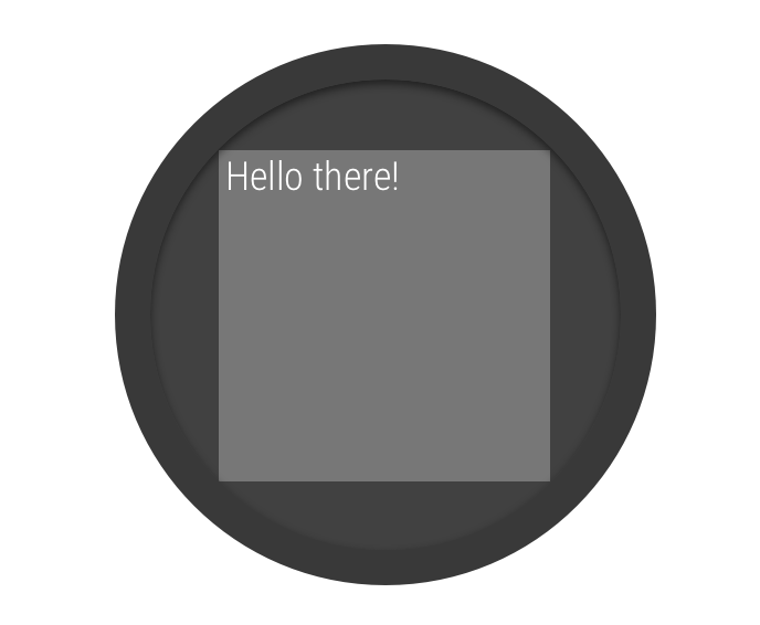
الشكل 2: نافذة مضمّنة على شاشة مستديرة
تتيح لك فئة
BoxInsetLayout
في مكتبة واجهة مستخدم Wear OS تحديد تنسيق يناسب الشاشات المستديرة. تتيح لك هذه الفئة
محاذاة المشاهدات بسهولة في وسط الشاشة أو بالقرب من أطرافها.
يوضّح المربّع الرمادي في الشكل 2 المنطقة التي يمكن فيها للعنصر BoxInsetLayout
وضع طرق العرض الفرعية تلقائيًا على الشاشات المستديرة بعد تطبيق
الأجزاء المضمّنة للنوافذ المطلوبة. لكي يتم عرضها داخل هذه المنطقة، تحدّد الاطِّلاعات الفرعية
سمة layout_boxedEdges
بالقيم التالية:
- مجموعة من
top
وbottom
left
وright
على سبيل المثال، تضع القيمة
"left|top"
حواف العنصر الفرعي اليمنى والعلوية
داخل المربّع الرمادي في الشكل 2.
- تضع قيمة
"all"
كل محتوى الطفل داخل
المربّع الرمادي في الشكل 2. هذا هو الأسلوب الأكثر شيوعًا مع
ConstraintLayout
في الداخل.
يستخدم التنسيق المعروض في الشكل 2 العنصر <BoxInsetLayout>
ويناسب الشاشات المستديرة:
<androidx.wear.widget.BoxInsetLayout
xmlns:android="http://schemas.android.com/apk/res/android"
xmlns:app="http://schemas.android.com/apk/res-auto"
android:layout_height="match_parent"
android:layout_width="match_parent"
android:padding="15dp">
<androidx.constraintlayout.widget.ConstraintLayout
android:layout_width="match_parent"
android:layout_height="match_parent"
android:padding="5dp"
app:layout_boxedEdges="all">
<TextView
android:layout_height="wrap_content"
android:layout_width="match_parent"
android:text="@string/sometext"
android:textAlignment="center"
app:layout_constraintEnd_toEndOf="parent"
app:layout_constraintStart_toStartOf="parent"
app:layout_constraintTop_toTopOf="parent" />
<ImageButton
android:background="@android:color/transparent"
android:layout_height="50dp"
android:layout_width="50dp"
app:layout_constraintBottom_toBottomOf="parent"
app:layout_constraintStart_toStartOf="parent"
android:src="@drawable/cancel" />
<ImageButton
android:background="@android:color/transparent"
android:layout_height="50dp"
android:layout_width="50dp"
app:layout_constraintBottom_toBottomOf="parent"
app:layout_constraintEnd_toEndOf="parent"
android:src="@drawable/ok" />
</androidx.constraintlayout.widget.ConstraintLayout>
</androidx.wear.widget.BoxInsetLayout>
لاحِظ أجزاء التنسيق التي تم تمييزها بالخط الغامق:
-
android:padding="15dp"
يحدِّد هذا السطر مساحة تمويه لعنصر <BoxInsetLayout>
.
-
android:padding="5dp"
يحدِّد هذا السطر مساحة تمويه لعنصر ConstraintLayout
الداخلي.
-
app:layout_boxedEdges="all"
يضمن هذا السطر وضع العنصر ConstraintLayout
وعناصره الثانوية في مربّع داخل المنطقة التي تحدّدها مربّعات
النافذة على الشاشات المستديرة.
استخدام تنسيق منحني
تتيح لك فئة
WearableRecyclerView
في مكتبة واجهة مستخدم Wear OS
تفعيل تخطيط منحني محسَّن للشاشات المستديرة.
لتفعيل تنسيق منحني للقوائم القابلة للتنقّل في
تطبيقك، اطّلِع على مقالة
إنشاء قوائم على Wear OS.
يخضع كل من المحتوى وعيّنات التعليمات البرمجية في هذه الصفحة للتراخيص الموضحّة في ترخيص استخدام المحتوى. إنّ Java وOpenJDK هما علامتان تجاريتان مسجَّلتان لشركة Oracle و/أو الشركات التابعة لها.
تاريخ التعديل الأخير: 2025-07-26 (حسب التوقيت العالمي المتفَّق عليه)
[[["يسهُل فهم المحتوى.","easyToUnderstand","thumb-up"],["ساعَدني المحتوى في حلّ مشكلتي.","solvedMyProblem","thumb-up"],["غير ذلك","otherUp","thumb-up"]],[["لا يحتوي على المعلومات التي أحتاج إليها.","missingTheInformationINeed","thumb-down"],["الخطوات معقدة للغاية / كثيرة جدًا.","tooComplicatedTooManySteps","thumb-down"],["المحتوى قديم.","outOfDate","thumb-down"],["ثمة مشكلة في الترجمة.","translationIssue","thumb-down"],["مشكلة في العيّنات / التعليمات البرمجية","samplesCodeIssue","thumb-down"],["غير ذلك","otherDown","thumb-down"]],["تاريخ التعديل الأخير: 2025-07-26 (حسب التوقيت العالمي المتفَّق عليه)"],[],[],null,["# Handle different watch shapes\n\nTry the Compose way \nJetpack Compose on Wear OS is the recommended UI toolkit for Wear OS. \n[Try Compose on Wear OS →](/training/wearables/compose) \n\n\nApps on Wear OS use the same layout techniques as other Android devices\nbut need to be designed with watch-specific constraints.\n\n\n**Note:** Don't port the exact functionality and UI from a mobile app to Wear OS and expect\na good user experience.\n\n\nIf you design your app for a rectangular handheld device, content near the corners of the screen\nmight be cropped on round watches. If you are using a scrollable vertical list, this is less of\nan issue, as the user can scroll to center the content. However, for single screens, it can\nprovide a bad user experience.\n\n\nIf you use the following settings for your layout, text displays incorrectly on devices\nwith round screens: \n\n```xml\n\u003candroidx.constraintlayout.widget.ConstraintLayout\n xmlns:android=\"http://schemas.android.com/apk/res/android\"\n xmlns:app=\"http://schemas.android.com/apk/res-auto\"\n xmlns:tools=\"http://schemas.android.com/tools\"\n android:layout_width=\"match_parent\"\n android:layout_height=\"match_parent\"\u003e\n\n \u003cTextView\n android:id=\"@+id/text\"\n android:layout_width=\"0dp\"\n android:layout_height=\"0dp\"\n android:text=\"@string/very_long_hello_world\"\n app:layout_constraintBottom_toBottomOf=\"parent\"\n app:layout_constraintEnd_toEndOf=\"parent\"\n app:layout_constraintStart_toStartOf=\"parent\"\n app:layout_constraintTop_toTopOf=\"parent\" /\u003e\n\n\u003c/androidx.constraintlayout.widget.ConstraintLayout\u003e\n```\n\n\nTo solve this problem, use layouts in the [Wear OS UI Library](/training/wearables/views) that support round devices.\n\n- You can use a [`BoxInsetLayout`](/reference/androidx/wear/widget/BoxInsetLayout) to prevent views from being cropped near the edges of round screens.\n- You can use a [WearableRecyclerView](/reference/androidx/wear/widget/WearableRecyclerView) to create a curved layout when you want to display and manipulate a vertical list of items optimized for round screens.\n\n\nFor more information about designing apps, read the\n[Wear OS design guidelines](/training/wearables/design).\n\nUse a BoxInsetLayout\n--------------------\n\n\n**Figure 2.** Window insets on a round screen.\n\n\nThe [`BoxInsetLayout`](/reference/androidx/wear/widget/BoxInsetLayout) class in the Wear OS UI Library lets\nyou define a layout that works for round screens. This class lets you\neasily align views on the center or near the edges of the screen.\n\n\nThe gray square in figure 2 shows the area where the `BoxInsetLayout`\ncan automatically place its child views on round screens after applying\nthe required window insets. To be displayed inside this area, child\nviews specify the `layout_boxedEdges` attribute with the following values:\n\n- A combination of `top`, `bottom`, `left`, and `right`. For example, a `\"left|top\"` value positions the child's left and top edges inside the gray square in figure 2.\n- The `\"all\"` value positions all the child's content inside the gray square in figure 2. This is the most common approach with a [`ConstraintLayout`](/reference/androidx/constraintlayout/widget/ConstraintLayout) inside.\n\n\nThe layout shown in figure 2 uses the `\u003cBoxInsetLayout\u003e`\nelement and works on round screens: \n\n```xml\n\u003candroidx.wear.widget.BoxInsetLayout\n xmlns:android=\"http://schemas.android.com/apk/res/android\"\n xmlns:app=\"http://schemas.android.com/apk/res-auto\"\n android:layout_height=\"match_parent\"\n android:layout_width=\"match_parent\"\n android:padding=\"15dp\"\u003e\n\n \u003candroidx.constraintlayout.widget.ConstraintLayout\n android:layout_width=\"match_parent\"\n android:layout_height=\"match_parent\"\n android:padding=\"5dp\"\n app:layout_boxedEdges=\"all\"\u003e\n\n \u003cTextView\n android:layout_height=\"wrap_content\"\n android:layout_width=\"match_parent\"\n android:text=\"@string/sometext\"\n android:textAlignment=\"center\"\n app:layout_constraintEnd_toEndOf=\"parent\"\n app:layout_constraintStart_toStartOf=\"parent\"\n app:layout_constraintTop_toTopOf=\"parent\" /\u003e\n\n \u003cImageButton\n android:background=\"@android:color/transparent\"\n android:layout_height=\"50dp\"\n android:layout_width=\"50dp\"\n app:layout_constraintBottom_toBottomOf=\"parent\"\n app:layout_constraintStart_toStartOf=\"parent\"\n android:src=\"@drawable/cancel\" /\u003e\n\n \u003cImageButton\n android:background=\"@android:color/transparent\"\n android:layout_height=\"50dp\"\n android:layout_width=\"50dp\"\n app:layout_constraintBottom_toBottomOf=\"parent\"\n app:layout_constraintEnd_toEndOf=\"parent\"\n android:src=\"@drawable/ok\" /\u003e\n\n \u003c/androidx.constraintlayout.widget.ConstraintLayout\u003e\n\n\u003c/androidx.wear.widget.BoxInsetLayout\u003e\n```\n\n\nNotice the parts of the layout marked in bold:\n\n-\n `android:padding=\"15dp\"`\n\n\n This line assigns padding to the `\u003cBoxInsetLayout\u003e`\n element.\n-\n `android:padding=\"5dp\"`\n\n\n This line assigns padding to the inner `ConstraintLayout` element.\n-\n `app:layout_boxedEdges=\"all\"`\n\n\n This line ensures that the `ConstraintLayout` element\n and its children are boxed inside the area defined by the window\n insets on round screens.\n\nUse a curved layout\n-------------------\n\nThe [WearableRecyclerView](/reference/androidx/wear/widget/WearableRecyclerView) class in the Wear OS UI Library\nlets you opt-in to a curved layout optimized for round screens.\nTo enable a curved layout for scrollable lists in your\napp, see [Create lists on Wear OS](/training/wearables/ui/lists#creating)."]]