
앱은 모든 크기의 Wear OS 기기에서 잘 작동해야 하며, 사용 가능한 경우 추가 공간을 활용하고 작은 화면에서도 멋지게 보여야 합니다. 이 가이드에서는 이러한 사용자 환경을 달성하기 위한 권장사항을 제공합니다.
적응형 레이아웃의 디자인 원칙에 관해 자세히 알아보려면 디자인 안내를 참고하세요.
Material 3을 사용하여 반응형 레이아웃 빌드
레이아웃에는 백분율 기반 여백이 있어야 합니다. Compose는 기본적으로 절대값으로 작동하므로 Horologist 라이브러리의rememberResponsiveColumnPadding를 사용하여 패딩을 계산하고 이를 ScreenScaffold의 contentPadding 매개변수와 TransformingLazyColumn의 contentPadding 매개변수에 전달합니다.
다음 코드 스니펫은 TransformingLazyColumn 구성요소를 사용하여 다양한 Wear OS 화면 크기에서 보기 좋은 콘텐츠를 만듭니다.
val columnState = rememberTransformingLazyColumnState() val transformationSpec = rememberTransformationSpec() ScreenScaffold( scrollState = columnState ) { contentPadding -> TransformingLazyColumn( state = columnState, contentPadding = contentPadding ) { item { ListHeader( modifier = Modifier .fillMaxWidth() .transformedHeight(this, transformationSpec) .minimumVerticalContentPadding(ListHeaderDefaults.minimumTopListContentPadding), transformation = SurfaceTransformation(transformationSpec) ) { Text(text = "Header") } } // ... other items item { Button( modifier = Modifier .fillMaxWidth() .transformedHeight(this, transformationSpec) .minimumVerticalContentPadding(ButtonDefaults.minimumVerticalListContentPadding), transformation = SurfaceTransformation(transformationSpec), onClick = { /* ... */ }, icon = { Icon( imageVector = Icons.Default.Build, contentDescription = "build", ) }, ) { Text( text = "Build", maxLines = 1, overflow = TextOverflow.Ellipsis, ) } } } }
이 예에서는 ScreenScaffold 및 AppScaffold도 보여줍니다.
이러한 요소는 앱과 개별 화면(탐색 경로) 간에 조정되어 올바른 스크롤 동작과 TimeText 위치를 보장합니다.
상단 및 하단 패딩의 경우 다음 사항도 참고하세요.
- 올바른 패딩을 결정하기 위한 첫 번째 및 마지막
ItemType의 사양입니다. Text헤더에는 패딩이 없어야 하므로 목록의 첫 번째 항목에ListHeader를 사용합니다.
전체 사양은 Figma 디자인 키트에서 확인할 수 있습니다. 자세한 내용과 예시는 다음을 참고하세요.
- Horologist 라이브러리 - Wear OS용으로 최적화되고 차별화된 앱을 빌드하는 데 도움이 되는 도우미를 제공합니다.
- ComposeStarter 샘플 - 이 가이드에 설명된 원칙을 보여주는 예시입니다.
- JetCaster 샘플: Horologist 라이브러리를 사용하여 다양한 화면 크기에서 작동하는 앱을 빌드하는 더 복잡한 예시입니다.
앱에서 스크롤 레이아웃 사용
화면을 구현할 때 이 페이지의 앞부분에 나온 스크롤 레이아웃을 기본 선택사항으로 사용합니다. 이를 통해 사용자는 디스플레이 환경설정이나 Wear OS 기기 화면 크기와 관계없이 앱의 구성요소에 도달할 수 있습니다.
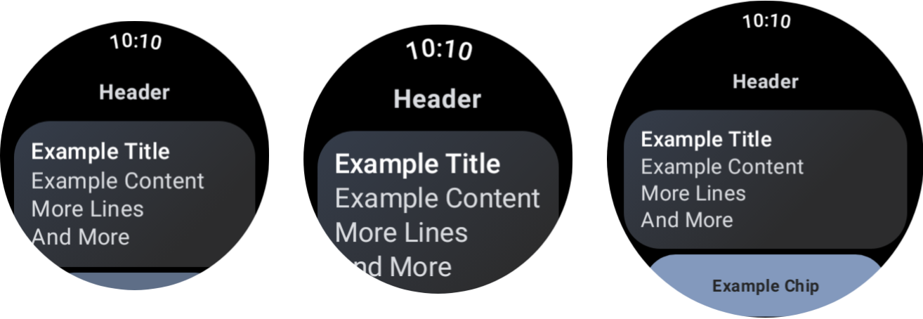
다양한 기기 크기와 글꼴 크기 조정의 효과
대화상자
대화상자는 스크롤 가능해야 합니다(매우 타당한 이유가 없는 한).
AlertDialog 구성요소는 반응형이며 콘텐츠가 표시 영역 높이를 초과하는 경우 기본적으로 스크롤할 수 있습니다.
맞춤 화면에는 스크롤하지 않는 레이아웃이 필요할 수 있음
일부 화면은 스크롤하지 않는 레이아웃에 적합할 수 있습니다. 미디어 앱의 기본 플레이어 화면과 피트니스 앱의 운동 화면이 그 예입니다.
이러한 경우 Figma 디자인 키트에 제공된 표준 안내를 살펴보고 올바른 여백을 사용하여 화면 크기에 반응하는 디자인을 구현하세요.
중단점을 통해 차별화된 환경 제공
더 큰 디스플레이를 사용하면 추가 콘텐츠와 기능을 도입할 수 있습니다. 이러한 차별화된 환경을 구현하려면 화면 크기 중단점을 사용하여 화면 크기가 225dp를 초과할 때 다른 레이아웃을 표시하세요.
const val LARGE_DISPLAY_BREAKPOINT = 225 @Composable fun isLargeDisplay() = LocalConfiguration.current.screenWidthDp >= LARGE_DISPLAY_BREAKPOINT // ... // ... use in your Composables: if (isLargeDisplay()) { // Show additional content. } else { // Show content only for smaller displays. } // ...
디자인 안내에는 이러한 기회가 더 많이 나와 있습니다.
미리보기를 사용하여 화면 및 글꼴 크기 조합 테스트
Compose 미리보기를 사용하면 다양한 Wear OS 화면 크기에 맞게 개발할 수 있습니다. 기기 및 글꼴 크기 조정 미리보기 정의를 모두 사용하여 다음을 확인합니다.
- 크기 조정의 극단적인 경우(예: 가장 큰 글꼴과 가장 작은 화면의 조합)에 화면이 어떻게 표시되는지
- 차별화된 환경이 중단점에서 작동하는 방식
앱의 모든 화면에 WearPreviewDevices 및 WearPreviewFontScales를 사용하여 미리보기를 구현해야 합니다.
@WearPreviewDevices @WearPreviewFontScales @Composable fun ComposeListPreview() { ComposeList() }
스크린샷 테스트
미리보기 테스트 외에도 스크린샷 테스트를 사용하면 다양한 기존 하드웨어 크기에 대해 테스트할 수 있습니다. 이는 이러한 기기를 즉시 사용할 수 없고 다른 화면 크기에서는 문제가 표시되지 않을 수 있는 경우에 특히 유용합니다.
스크린샷 테스트는 코드베이스의 특정 위치에서 회귀를 식별하는 데도 도움이 됩니다.
샘플에서는 스크린샷 테스트에 Roborazzi를 사용합니다.
- Roborazzi를 사용하도록 프로젝트 및 앱
build.gradle파일을 구성합니다. - 앱에 있는 각 화면의 스크린샷 테스트를 만듭니다. 예를 들어 다음 코드는 목록이 포함된 화면의 스크린샷 테스트를 보여줍니다.
@RunWith(ParameterizedRobolectricTestRunner::class) class ComposeListScreenTest( override val device: WearDevice ) : WearScreenshotTest() { override val tolerance = 0.02f @Test fun myScreenTest() = runTest { AppScaffold { ComposeList() } } companion object { @JvmStatic @ParameterizedRobolectricTestRunner.Parameters fun devices() = WearDevice.entries } }
몇 가지 중요한 사항을 참고하세요.
WearDevice.entries에는 가장 인기 있는 Wear OS 기기의 정의가 포함되어 있으므로 대표적인 범위의 화면 크기에서 테스트가 실행됩니다.
골든 이미지 생성
화면 이미지를 생성하려면 터미널에서 다음 명령어를 실행합니다.
./gradlew recordRoborazziDebug
이미지 확인
기존 이미지에 대한 변경사항을 확인하려면 터미널에서 다음 명령어를 실행하세요.
./gradlew verifyRoborazziDebug
스크린샷 테스트의 전체 예는 ComposeStarter 샘플을 참고하세요.