
Jetpack Compose est un kit d'outils moderne permettant de créer une interface utilisateur Android native. Il simplifie et accélère le développement d'UI pour Android en utilisant moins de code, des outils puissants et des API en Kotlin intuitives.
Dans ce tutoriel, vous allez créer un composant d'interface utilisateur simple avec des fonctions déclaratives. Pour ce faire, vous n'allez pas modifier les mises en page XML ni utiliser l'éditeur de mise en page. À la place, vous allez appeler des fonctions modulables pour définir les éléments souhaités, et le compilateur Compose se chargera du reste.

-
4 leçons
Leçon 1 : Fonctions modulables
Jetpack Compose repose sur des fonctions modulables. Ces fonctions vous permettent de définir l'interface utilisateur de votre application de façon programmatique. Elles vous permettent de décrire son apparence et de spécifier des dépendances de données, et de ne pas avoir à vous soucier du processus de construction de l'interface utilisateur (initialisation d'un élément, rattachement à un parent, etc.). Pour créer une fonction modulable, il vous suffit d'ajouter l'annotation @Composable au nom de la fonction.

Ajouter un élément textuel
Pour commencer, téléchargez la dernière version d'Android Studio, puis créez une application en sélectionnant Nouveau projet, puis sous Téléphone et tablette, sélectionnez Activité vide. Nommez votre application ComposeTutorial, puis cliquez sur Terminer. Le modèle par défaut contient déjà des éléments Compose, mais dans ce tutoriel, vous allez en créer un pas à pas.
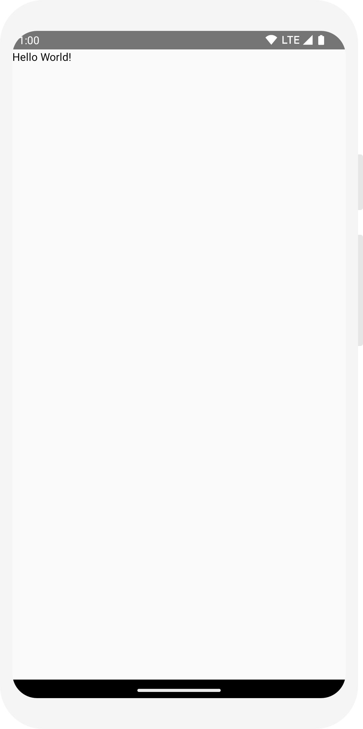
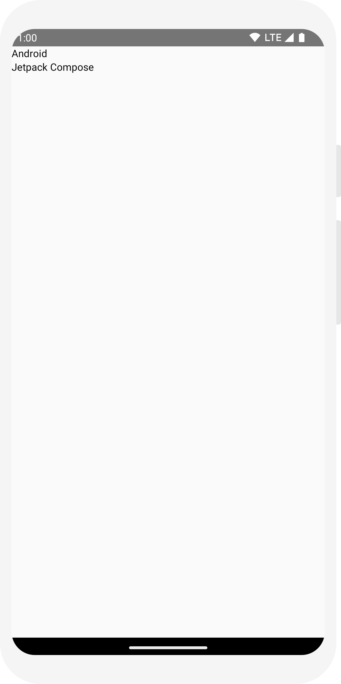
Tout d'abord, affichez un message "Hello World!" en ajoutant un élément textuel dans la méthode onCreate. Pour ce faire, définissez un bloc de contenu et appelez la fonction modulable Text. Le bloc setContent définit la mise en page de l'activité dans laquelle les fonctions modulables sont appelées. Les fonctions modulables ne peuvent être appelées qu'à partir d'autres fonctions modulables.
Jetpack Compose utilise un plug-in de compilation en Kotlin pour transformer ces fonctions modulables en éléments d'interface utilisateur de l'application. Par exemple, la fonction modulable Text définie par la bibliothèque Compose UI affiche un libellé de texte à l'écran.
import android.os.Bundle
import androidx.activity.ComponentActivity
import androidx.activity.compose.setContent
import androidx.compose.material3.Text

class MainActivity : ComponentActivity() {
    override fun onCreate(savedInstanceState: Bundle?) {
        super.onCreate(savedInstanceState)
        setContent {
            Text("Hello world!")
        }
    }
}
Définir une fonction modulable
Pour rendre une fonction modulable, ajoutez l'annotation @Composable.
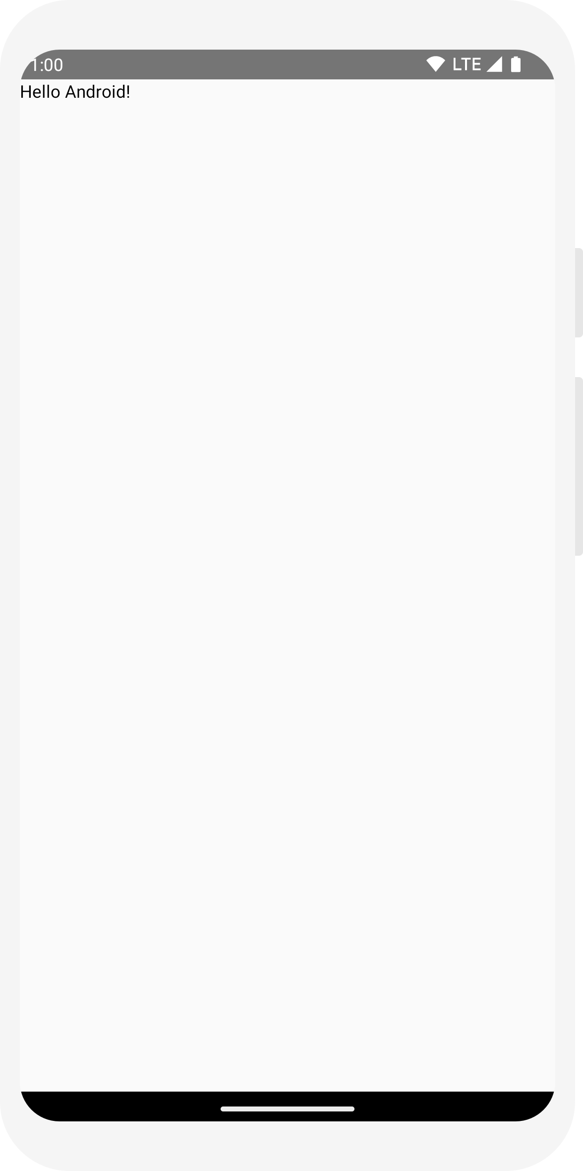
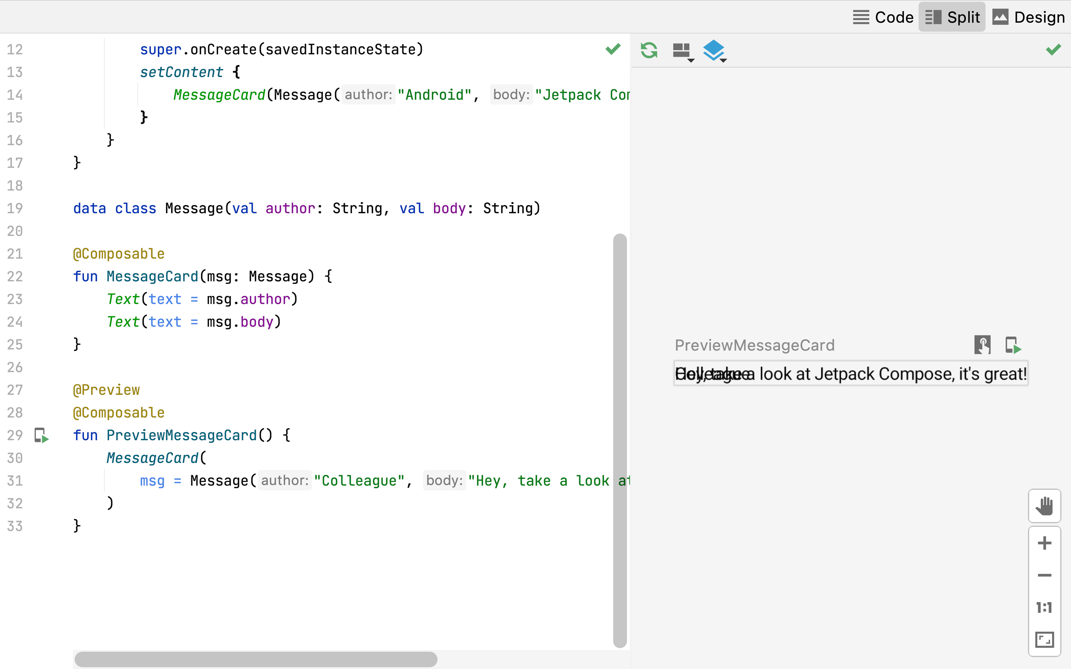
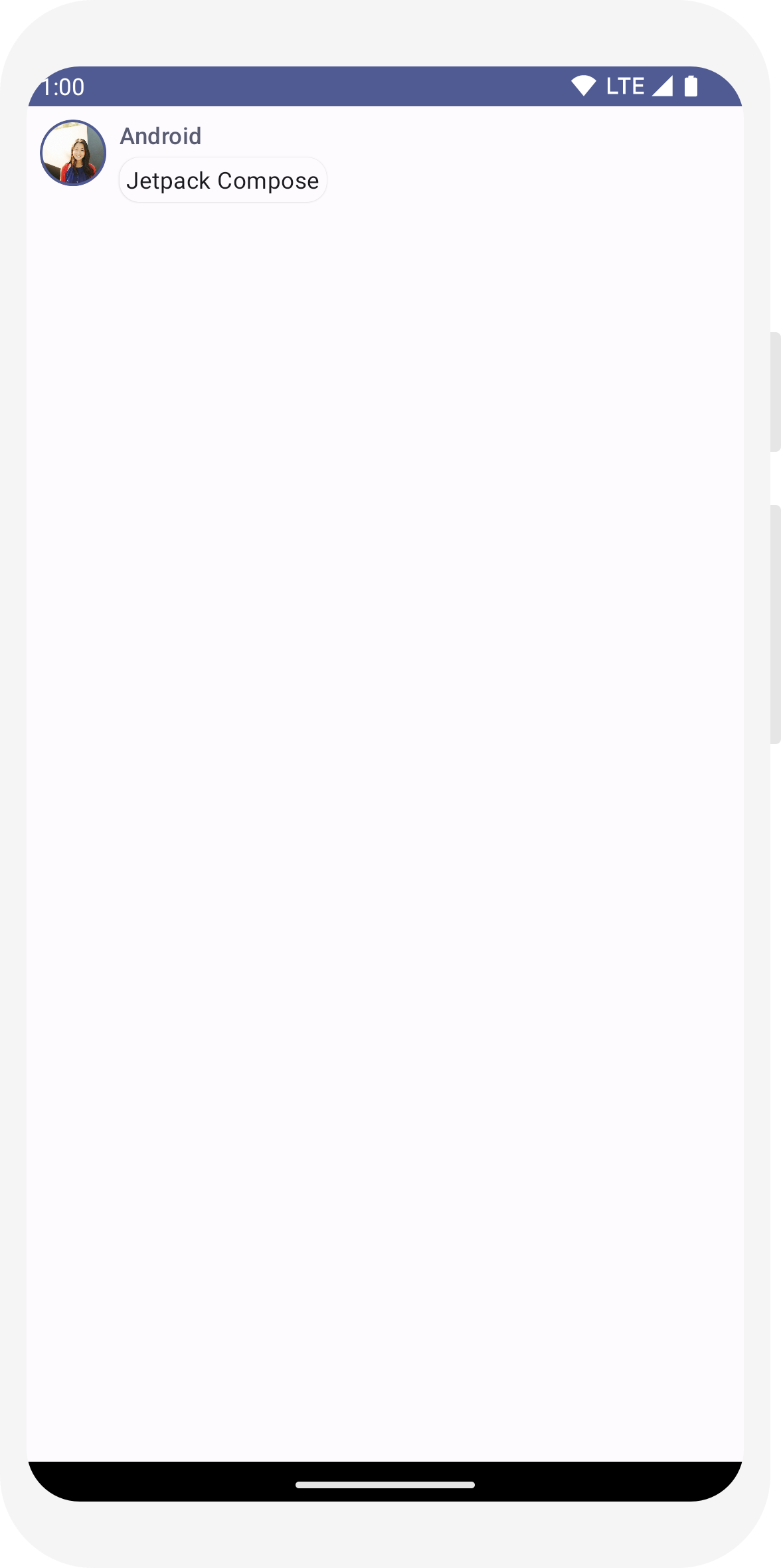
Pour tester cette fonction, définissez une fonction MessageCard qui transmet un nom et l'utilise pour configurer l'élément textuel.
// ...
import androidx.compose.runtime.Composable

class MainActivity : ComponentActivity() {
    override fun onCreate(savedInstanceState: Bundle?) {
        super.onCreate(savedInstanceState)
        setContent {
            MessageCard("Android")
        }
    }
}

@Composable
fun MessageCard(name: String) {
    Text(text = "Hello $name!")
}
Prévisualiser votre fonction dans Android Studio
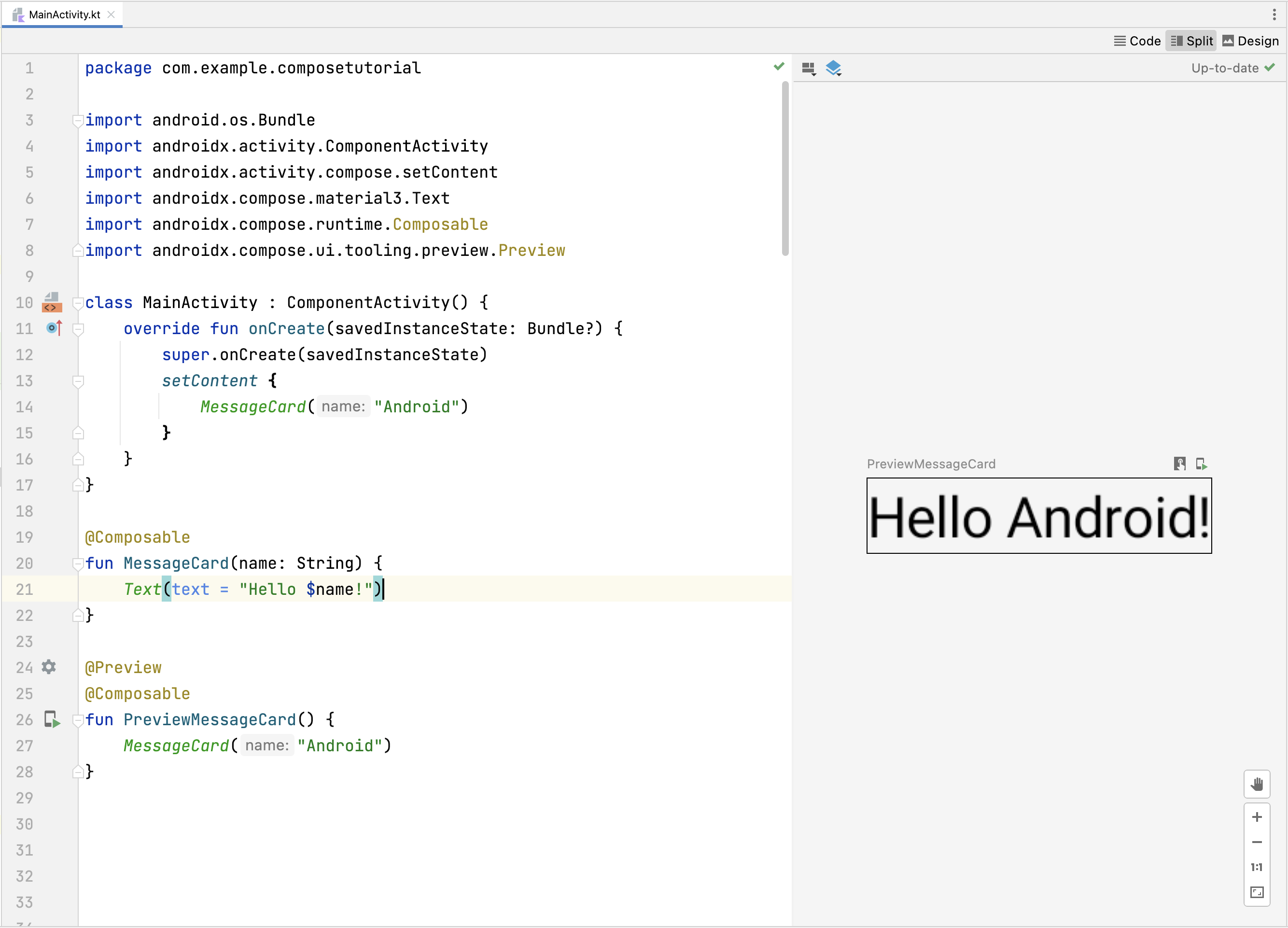
L'annotation @Preview vous permet de prévisualiser vos fonctions modulables dans Android Studio sans avoir à créer ni à installer l'application sur un appareil ou un émulateur Android. L'annotation doit être utilisée sur une fonction modulable qui n'accepte aucun paramètre. De ce fait, vous ne pouvez pas prévisualiser la fonction MessageCard directement. Créez plutôt une deuxième fonction nommée PreviewMessageCard, qui appelle MessageCard avec un paramètre approprié. Ajoutez l'annotation @Preview avant @Composable.
// ...
import androidx.compose.ui.tooling.preview.Preview

@Composable
fun MessageCard(name: String) {
    Text(text = "Hello $name!")
}

@Preview
@Composable
fun PreviewMessageCard() {
    MessageCard("Android")
}
Recréer votre projet. L'application elle-même ne change pas, car la nouvelle fonction PreviewMessageCard n'est appelée nulle part. Toutefois, Android Studio ajoute une fenêtre d'aperçu que vous pouvez développer en cliquant sur la vue fractionnée (interface/code). Cette fenêtre affiche un aperçu des éléments de l'interface utilisateur créés par des fonctions modulables marquées de l'annotation @Preview. Pour mettre à jour les aperçus à tout moment, cliquez sur le bouton Actualiser en haut de la fenêtre d'aperçu.
import android.os.Bundle
import androidx.activity.ComponentActivity
import androidx.activity.compose.setContent
import androidx.compose.material3.Text

class MainActivity : ComponentActivity() {
    override fun onCreate(savedInstanceState: Bundle?) {
        super.onCreate(savedInstanceState)
        setContent {
            Text("Hello world!")
        }
    }
}
// ...
import androidx.compose.runtime.Composable

class MainActivity : ComponentActivity() {
    override fun onCreate(savedInstanceState: Bundle?) {
        super.onCreate(savedInstanceState)
        setContent {
            MessageCard("Android")
        }
    }
}

@Composable
fun MessageCard(name: String) {
    Text(text = "Hello $name!")
}
// ...
import androidx.compose.ui.tooling.preview.Preview

@Composable
fun MessageCard(name: String) {
    Text(text = "Hello $name!")
}

@Preview
@Composable
fun PreviewMessageCard() {
    MessageCard("Android")
}
Leçon 2 : Mises en page
Les éléments de l'interface utilisateur sont organisés de façon hiérarchique, avec des éléments contenus dans d'autres éléments. Dans Compose, vous créez une hiérarchie d'interface utilisateur en appelant des fonctions modulables à partir d'autres fonctions modulables.

Ajouter plusieurs éléments textuels
Jusqu'à présent, vous avez créé votre première fonction modulable ainsi qu'un aperçu. Pour découvrir d'autres fonctionnalités de Jetpack Compose, vous allez créer un écran de messagerie simple contenant une liste de messages pouvant être développés avec quelques animations.
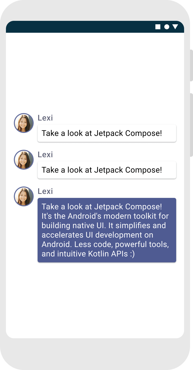
Commencez par enrichir le composable du message en affichant le nom de son auteur et un contenu de message. Vous devez d'abord modifier la configuration du composable pour accepter un objet Message au lieu d'un String, puis ajouter un autre composable Text dans le composable MessageCard. Veillez également à mettre à jour l'aperçu.
// ...

class MainActivity : ComponentActivity() {
    override fun onCreate(savedInstanceState: Bundle?) {
        super.onCreate(savedInstanceState)
        setContent {
            MessageCard(Message("Android", "Jetpack Compose"))
        }
    }
}

data class Message(val author: String, val body: String)

@Composable
fun MessageCard(msg: Message) {
    Text(text = msg.author)
    Text(text = msg.body)
}

@Preview
@Composable
fun PreviewMessageCard() {
    MessageCard(
        msg = Message("Lexi", "Hey, take a look at Jetpack Compose, it's great!")
    )
}

Ce code crée deux éléments textuels dans la vue de contenu. Cependant, comme vous n'avez pas fourni d'informations sur leur organisation, les éléments de texte sont superposés, ce qui les rend illisibles.
Utiliser une colonne
// ...
import androidx.compose.foundation.layout.Column

@Composable
fun MessageCard(msg: Message) {
    Column {
        Text(text = msg.author)
        Text(text = msg.body)
    }
}
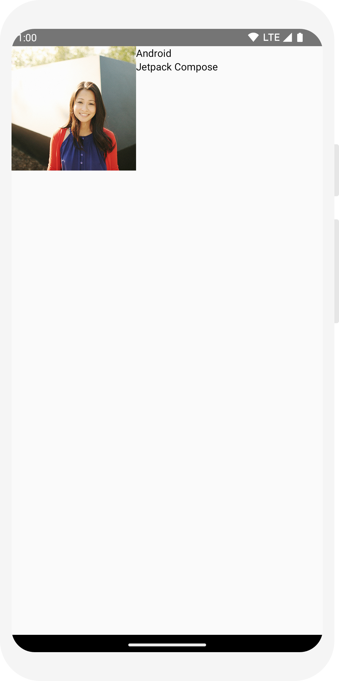
Ajouter un élément image
Enrichissez votre vignette de message en ajoutant une photo de profil de l'expéditeur. Utilisez le gestionnaire de ressources pour importer une image de votre bibliothèque photo ou utilisez celle-ci. Ajoutez un composable Row pour avoir une conception bien structurée et un composable Image imbriqué.
// ...
import androidx.compose.foundation.Image
import androidx.compose.foundation.layout.Row
import androidx.compose.ui.res.painterResource

@Composable
fun MessageCard(msg: Message) {
    Row {
        Image(
            painter = painterResource(R.drawable.profile_picture),
            contentDescription = "Contact profile picture",
        )

       Column {
            Text(text = msg.author)
            Text(text = msg.body)
        }

    }

}
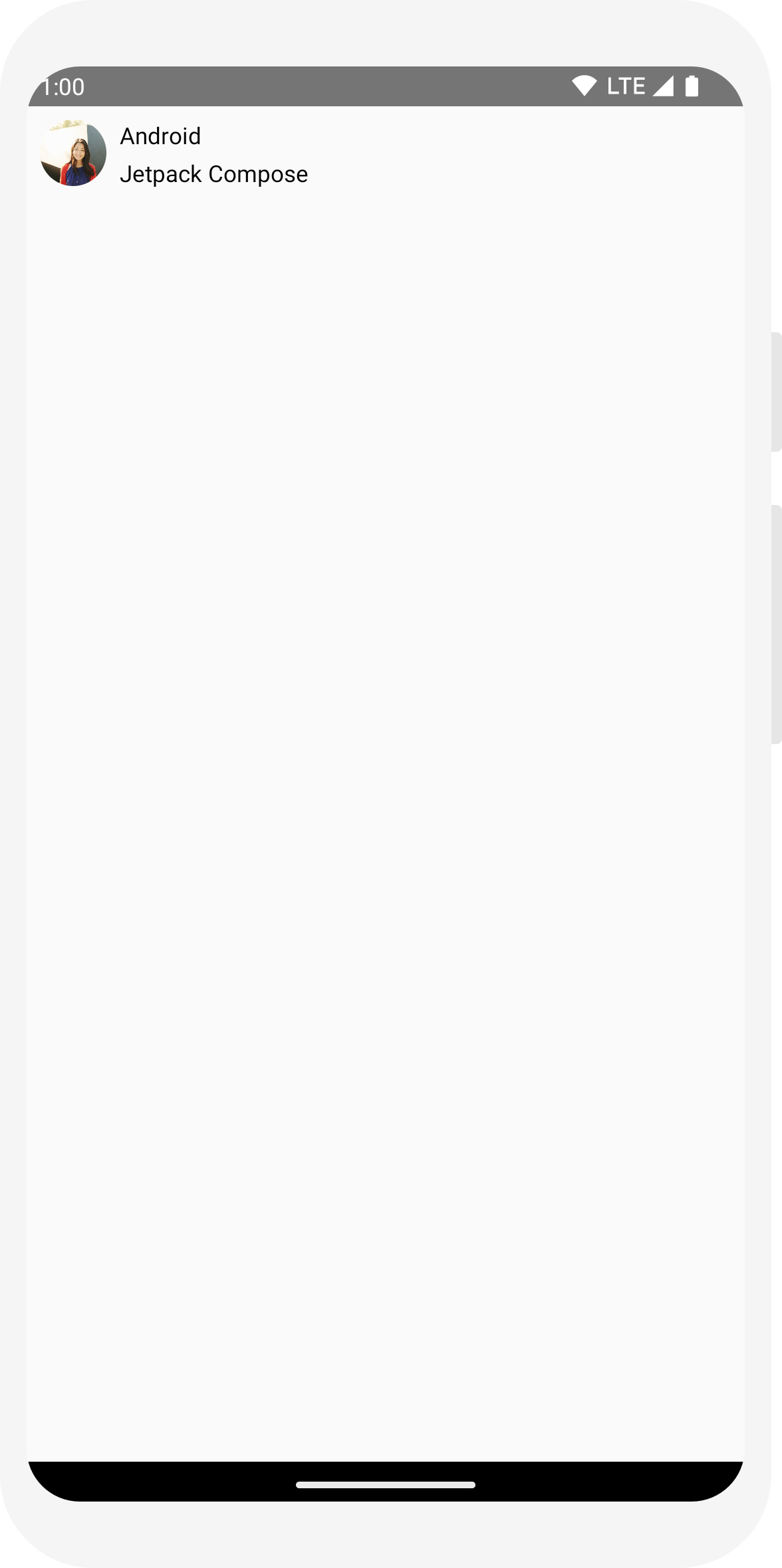
Configurer votre mise en page
La structure de votre message est correcte, mais ses éléments ne sont pas bien espacés et l'image est trop grande. Pour agrémenter ou configurer un composable, Compose utilise des modificateurs. Ils vous permettent de modifier la taille, la mise en page et l'apparence du composable, ou d'ajouter des interactions de haut niveau (par exemple, pour rendre un élément cliquable). Vous pouvez les enchaîner pour créer des composables plus riches. Vous allez maintenant en utiliser pour améliorer la mise en page.
// ...
import androidx.compose.foundation.layout.Spacer
import androidx.compose.foundation.layout.height
import androidx.compose.foundation.layout.padding
import androidx.compose.foundation.layout.size
import androidx.compose.foundation.layout.width
import androidx.compose.foundation.shape.CircleShape
import androidx.compose.ui.Modifier
import androidx.compose.ui.draw.clip
import androidx.compose.ui.unit.dp

@Composable
fun MessageCard(msg: Message) {
    // Add padding around our message
    Row(modifier = Modifier.padding(all = 8.dp)) {
        Image(
            painter = painterResource(R.drawable.profile_picture),
            contentDescription = "Contact profile picture",
            modifier = Modifier
                // Set image size to 40 dp
                .size(40.dp)
                // Clip image to be shaped as a circle
                .clip(CircleShape)
        )

        // Add a horizontal space between the image and the column
        Spacer(modifier = Modifier.width(8.dp))

        Column {
            Text(text = msg.author)
            // Add a vertical space between the author and message texts
            Spacer(modifier = Modifier.height(4.dp))
            Text(text = msg.body)
        }
    }
}
// ...

class MainActivity : ComponentActivity() {
    override fun onCreate(savedInstanceState: Bundle?) {
        super.onCreate(savedInstanceState)
        setContent {
            MessageCard(Message("Android", "Jetpack Compose"))
        }
    }
}

data class Message(val author: String, val body: String)

@Composable
fun MessageCard(msg: Message) {
    Text(text = msg.author)
    Text(text = msg.body)
}

@Preview
@Composable
fun PreviewMessageCard() {
    MessageCard(
        msg = Message("Lexi", "Hey, take a look at Jetpack Compose, it's great!")
    )
}
// ...
import androidx.compose.foundation.layout.Column

@Composable
fun MessageCard(msg: Message) {
    Column {
        Text(text = msg.author)
        Text(text = msg.body)
    }
}
// ...
import androidx.compose.foundation.Image
import androidx.compose.foundation.layout.Row
import androidx.compose.ui.res.painterResource

@Composable
fun MessageCard(msg: Message) {
    Row {
        Image(
            painter = painterResource(R.drawable.profile_picture),
            contentDescription = "Contact profile picture",
        )

       Column {
            Text(text = msg.author)
            Text(text = msg.body)
        }

    }

}
// ...
import androidx.compose.foundation.layout.Spacer
import androidx.compose.foundation.layout.height
import androidx.compose.foundation.layout.padding
import androidx.compose.foundation.layout.size
import androidx.compose.foundation.layout.width
import androidx.compose.foundation.shape.CircleShape
import androidx.compose.ui.Modifier
import androidx.compose.ui.draw.clip
import androidx.compose.ui.unit.dp

@Composable
fun MessageCard(msg: Message) {
    // Add padding around our message
    Row(modifier = Modifier.padding(all = 8.dp)) {
        Image(
            painter = painterResource(R.drawable.profile_picture),
            contentDescription = "Contact profile picture",
            modifier = Modifier
                // Set image size to 40 dp
                .size(40.dp)
                // Clip image to be shaped as a circle
                .clip(CircleShape)
        )

        // Add a horizontal space between the image and the column
        Spacer(modifier = Modifier.width(8.dp))

        Column {
            Text(text = msg.author)
            // Add a vertical space between the author and message texts
            Spacer(modifier = Modifier.height(4.dp))
            Text(text = msg.body)
        }
    }
}
Leçon 3 : Material Design
Compose est conçu pour respecter les principes du langage Material Design. Bon nombre de ses éléments d'interface utilisateur mettent en œuvre Material Design directement. Dans cette leçon, vous allez styliser votre application à l'aide de widgets Material Design.

Utiliser le langage Material Design
Votre message dispose maintenant d'une mise en page, mais elle n'est pas encore satisfaisante.
Jetpack Compose propose une implémentation prête à l'emploi de Material Design 3 et de ses éléments d'interface utilisateur. Vous allez améliorer l'apparence de notre composable MessageCard à l'aide du style Material Design.
Pour commencer, encapsulez la fonction MessageCard avec le thème Material créé dans votre projet (ComposeTutorialTheme) et un Surface.
Faites-le à la fois dans la @Preview et dans la fonction setContent. Vos composables pourront ainsi hériter des styles définis dans le thème de votre application afin d'assurer la cohérence à l'échelle de celle-ci.
Material Design repose sur trois piliers : Color, Typography et Shape.
Vous allez les ajouter un par un.
Remarque : Le modèle Activité Compose vide génère un thème par défaut pour votre projet et vous permet de personnaliser MaterialTheme.
Si vous n'avez pas nommé votre projet ComposeTutorial, vous trouverez votre thème personnalisé dans le fichier Theme.kt du sous-package ui.theme.
// ...

class MainActivity : ComponentActivity() {
    override fun onCreate(savedInstanceState: Bundle?) {
        super.onCreate(savedInstanceState)
        setContent {
            ComposeTutorialTheme {
                Surface(modifier = Modifier.fillMaxSize()) {
                    MessageCard(Message("Android", "Jetpack Compose"))
                }
            }
        }
    }
}

@Preview
@Composable
fun PreviewMessageCard() {
    ComposeTutorialTheme {
        Surface {
            MessageCard(
                msg = Message("Lexi", "Take a look at Jetpack Compose, it's great!")
            )
        }
    }
}

Couleur
Utilisez MaterialTheme.colorScheme pour appliquer un style en utilisant les couleurs du thème encapsulé. Vous pouvez utiliser ces valeurs du thème partout où une couleur est nécessaire. Cet exemple utilise des couleurs de thématisation dynamiques (définies par les préférences de l'appareil).
Vous pouvez définir dynamicColor sur false dans le fichier MaterialTheme.kt pour modifier ces préférences.
Ajoutez un style au titre et une bordure à l'image.
// ...
import androidx.compose.foundation.border
import androidx.compose.material3.MaterialTheme

@Composable
fun MessageCard(msg: Message) {
   Row(modifier = Modifier.padding(all = 8.dp)) {
       Image(
           painter = painterResource(R.drawable.profile_picture),
           contentDescription = null,
           modifier = Modifier
               .size(40.dp)
               .clip(CircleShape)
               .border(1.5.dp, MaterialTheme.colorScheme.primary, CircleShape)
       )

       Spacer(modifier = Modifier.width(8.dp))

       Column {
           Text(
               text = msg.author,
               color = MaterialTheme.colorScheme.secondary
           )

           Spacer(modifier = Modifier.height(4.dp))
           Text(text = msg.body)
       }
   }
}

Typographie
Les styles de typographie Material sont disponibles dans le MaterialTheme. Il vous suffit de les ajouter aux composables Text.
// ...

@Composable
fun MessageCard(msg: Message) {
   Row(modifier = Modifier.padding(all = 8.dp)) {
       Image(
           painter = painterResource(R.drawable.profile_picture),
           contentDescription = null,
           modifier = Modifier
               .size(40.dp)
               .clip(CircleShape)
               .border(1.5.dp, MaterialTheme.colorScheme.primary, CircleShape)
       )
       Spacer(modifier = Modifier.width(8.dp))

       Column {
           Text(
               text = msg.author,
               color = MaterialTheme.colorScheme.secondary,
               style = MaterialTheme.typography.titleSmall
           )

           Spacer(modifier = Modifier.height(4.dp))

           Text(
               text = msg.body,
               style = MaterialTheme.typography.bodyMedium
           )
       }
   }
}

Forme
Avec Shape, vous pouvez apporter les touches finales. Commencez par encapsuler le corps du message autour d'un composable Surface. Cela permet de personnaliser la forme et le niveau du corps du message. Une marge intérieure est également ajoutée au message pour optimiser la mise en page.
// ...
import androidx.compose.material3.Surface

@Composable
fun MessageCard(msg: Message) {
   Row(modifier = Modifier.padding(all = 8.dp)) {
       Image(
           painter = painterResource(R.drawable.profile_picture),
           contentDescription = null,
           modifier = Modifier
               .size(40.dp)
               .clip(CircleShape)
               .border(1.5.dp, MaterialTheme.colorScheme.primary, CircleShape)
       )
       Spacer(modifier = Modifier.width(8.dp))

       Column {
           Text(
               text = msg.author,
               color = MaterialTheme.colorScheme.secondary,
               style = MaterialTheme.typography.titleSmall
           )

           Spacer(modifier = Modifier.height(4.dp))

           Surface(shape = MaterialTheme.shapes.medium, shadowElevation = 1.dp) {
               Text(
                   text = msg.body,
                   modifier = Modifier.padding(all = 4.dp),
                   style = MaterialTheme.typography.bodyMedium
               )
           }
       }
   }
}
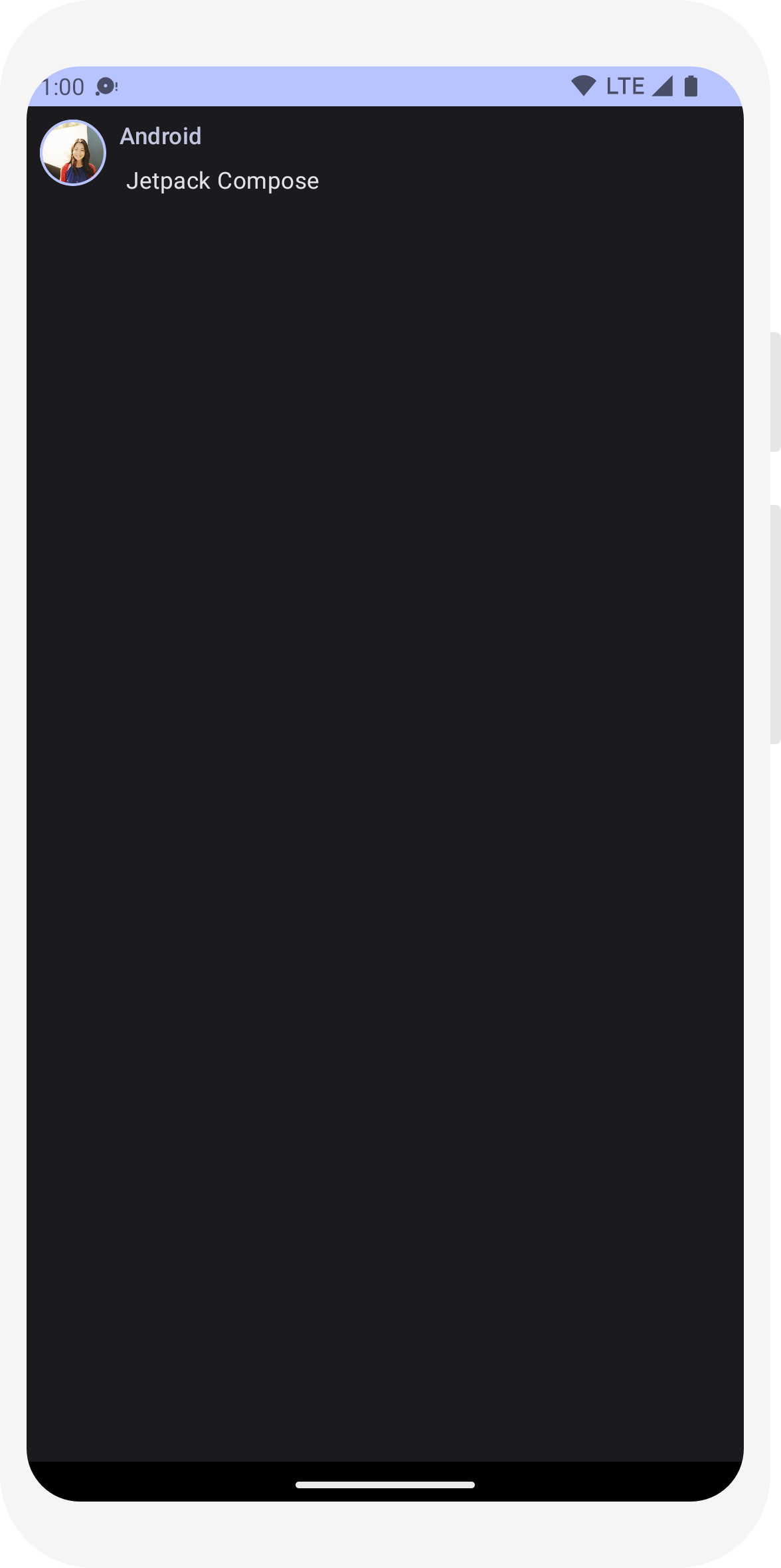
Activer le thème sombre
Vous pouvez activer le thème sombre (ou le mode Nuit) pour éviter un affichage trop lumineux, notamment la nuit, ou simplement économiser la batterie de l'appareil. Grâce à sa prise en charge de Material Design, Jetpack Compose peut gérer le thème sombre par défaut. Si vous utilisez Material Design, les couleurs, le texte et les arrière-plans s'adaptent automatiquement à l'arrière-plan sombre.
Vous pouvez créer plusieurs aperçus dans votre fichier en tant que fonctions distinctes ou ajouter plusieurs annotations à la même fonction.
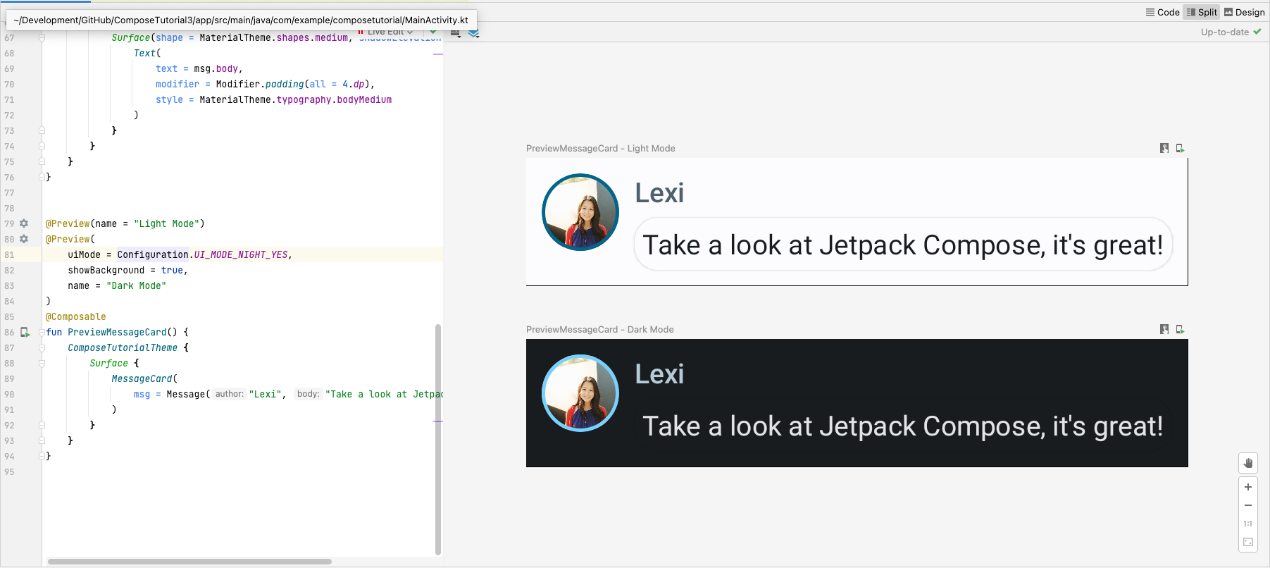
Ajoutez une nouvelle annotation d'aperçu et activez le mode Nuit.
// ...
import android.content.res.Configuration

@Preview(name = "Light Mode")
@Preview(
    uiMode = Configuration.UI_MODE_NIGHT_YES,
    showBackground = true,
    name = "Dark Mode"
)
@Composable
fun PreviewMessageCard() {
   ComposeTutorialTheme {
    Surface {
      MessageCard(
        msg = Message("Lexi", "Hey, take a look at Jetpack Compose, it's great!")
      )
    }
   }
}
Les couleurs disponibles pour les thèmes clair et sombre sont définis dans le fichier Theme.kt généré par l'IDE.
Jusqu'à présent, vous avez créé un élément d'interface utilisateur de message qui affiche une image et deux textes avec des styles différents, compatible à la fois avec les thèmes sombre et clair.
// ...
import android.content.res.Configuration

@Preview(name = "Light Mode")
@Preview(
    uiMode = Configuration.UI_MODE_NIGHT_YES,
    showBackground = true,
    name = "Dark Mode"
)
@Composable
fun PreviewMessageCard() {
   ComposeTutorialTheme {
    Surface {
      MessageCard(
        msg = Message("Lexi", "Hey, take a look at Jetpack Compose, it's great!")
      )
    }
   }
}
// ...

class MainActivity : ComponentActivity() {
    override fun onCreate(savedInstanceState: Bundle?) {
        super.onCreate(savedInstanceState)
        setContent {
            ComposeTutorialTheme {
                Surface(modifier = Modifier.fillMaxSize()) {
                    MessageCard(Message("Android", "Jetpack Compose"))
                }
            }
        }
    }
}

@Preview
@Composable
fun PreviewMessageCard() {
    ComposeTutorialTheme {
        Surface {
            MessageCard(
                msg = Message("Lexi", "Take a look at Jetpack Compose, it's great!")
            )
        }
    }
}
// ...
import androidx.compose.foundation.border
import androidx.compose.material3.MaterialTheme

@Composable
fun MessageCard(msg: Message) {
   Row(modifier = Modifier.padding(all = 8.dp)) {
       Image(
           painter = painterResource(R.drawable.profile_picture),
           contentDescription = null,
           modifier = Modifier
               .size(40.dp)
               .clip(CircleShape)
               .border(1.5.dp, MaterialTheme.colorScheme.primary, CircleShape)
       )

       Spacer(modifier = Modifier.width(8.dp))

       Column {
           Text(
               text = msg.author,
               color = MaterialTheme.colorScheme.secondary
           )

           Spacer(modifier = Modifier.height(4.dp))
           Text(text = msg.body)
       }
   }
}
// ...

@Composable
fun MessageCard(msg: Message) {
   Row(modifier = Modifier.padding(all = 8.dp)) {
       Image(
           painter = painterResource(R.drawable.profile_picture),
           contentDescription = null,
           modifier = Modifier
               .size(40.dp)
               .clip(CircleShape)
               .border(1.5.dp, MaterialTheme.colorScheme.primary, CircleShape)
       )
       Spacer(modifier = Modifier.width(8.dp))

       Column {
           Text(
               text = msg.author,
               color = MaterialTheme.colorScheme.secondary,
               style = MaterialTheme.typography.titleSmall
           )

           Spacer(modifier = Modifier.height(4.dp))

           Text(
               text = msg.body,
               style = MaterialTheme.typography.bodyMedium
           )
       }
   }
}
// ...
import androidx.compose.material3.Surface

@Composable
fun MessageCard(msg: Message) {
   Row(modifier = Modifier.padding(all = 8.dp)) {
       Image(
           painter = painterResource(R.drawable.profile_picture),
           contentDescription = null,
           modifier = Modifier
               .size(40.dp)
               .clip(CircleShape)
               .border(1.5.dp, MaterialTheme.colorScheme.primary, CircleShape)
       )
       Spacer(modifier = Modifier.width(8.dp))

       Column {
           Text(
               text = msg.author,
               color = MaterialTheme.colorScheme.secondary,
               style = MaterialTheme.typography.titleSmall
           )

           Spacer(modifier = Modifier.height(4.dp))

           Surface(shape = MaterialTheme.shapes.medium, shadowElevation = 1.dp) {
               Text(
                   text = msg.body,
                   modifier = Modifier.padding(all = 4.dp),
                   style = MaterialTheme.typography.bodyMedium
               )
           }
       }
   }
}
// ...
import android.content.res.Configuration

@Preview(name = "Light Mode")
@Preview(
    uiMode = Configuration.UI_MODE_NIGHT_YES,
    showBackground = true,
    name = "Dark Mode"
)
@Composable
fun PreviewMessageCard() {
   ComposeTutorialTheme {
    Surface {
      MessageCard(
        msg = Message("Lexi", "Hey, take a look at Jetpack Compose, it's great!")
      )
    }
   }
}
Leçon 4 : Listes et animations
Les listes et les animations sont incontournables dans les applications. Dans cette leçon, vous allez découvrir que créer des listes et ajouter des animations est un jeu d'enfant avec Compose.

Créer une liste de messages
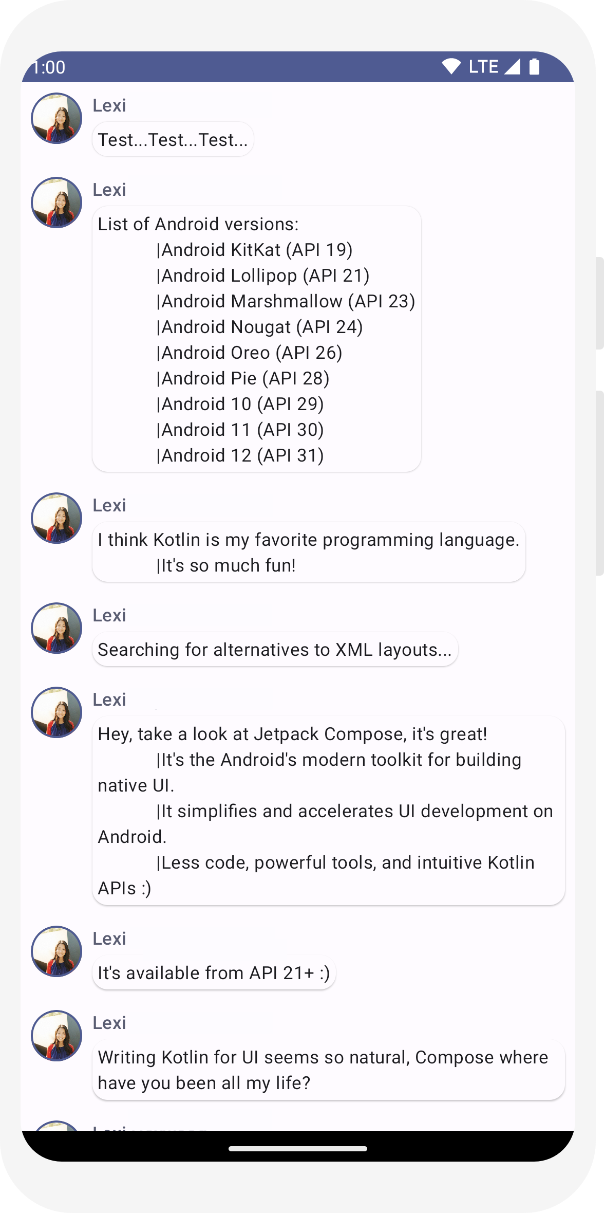
Une discussion composée d'un seul message peut sembler un peu vide. Enrichissons-là ! Vous devez créer une fonction Conversation qui affichera plusieurs messages. Pour ce cas d'utilisation, utilisez LazyColumn et LazyRow de Compose. Ces composables n'affichent que les éléments visibles à l'écran. Ils sont donc très efficaces pour les longues listes.
Dans cet extrait de code, vous pouvez voir que LazyColumn dispose d'items enfants. Elle utilise un List comme paramètre, et son lambda reçoit un paramètre que nous avons nommé message (mais nous aurions pu lui donner un tout autre nom) qui est une instance de Message
En résumé, ce lambda est appelé pour chaque élément de l'objet List fourni. Copiez cet exemple d'ensemble de données dans votre projet pour lancer rapidement la conversation.
// ...
import androidx.compose.foundation.lazy.LazyColumn
import androidx.compose.foundation.lazy.items

@Composable
fun Conversation(messages: List<Message>) {
    LazyColumn {
        items(messages) { message ->
            MessageCard(message)
        }
    }
}

@Preview
@Composable
fun PreviewConversation() {
    ComposeTutorialTheme {
        Conversation(SampleData.conversationSample)
    }
}
Animer les messages en les développant
La conversation devient plus intéressante. C'est l'heure des animations ! Vous avez la possibilité de développer un message pour en afficher un plus long, ce qui anime la taille du contenu et la couleur de l'arrière-plan. Pour stocker cet état d'interface utilisateur local, vous devez savoir si un message a été développé ou non. Pour effectuer le suivi de ce changement d'état, vous devez utiliser les fonctions remember et mutableStateOf.
Les fonctions modulables peuvent stocker l'état local en mémoire à l'aide de remember et suivre les modifications apportées à la valeur transmise à mutableStateOf. Les composables (et leurs enfants) utilisant cet état sont redessinés automatiquement lorsque la valeur est mise à jour. C'est ce qu'on appelle la recomposition.
En utilisant les API d'état de Compose, telles que remember et mutableStateOf, toute modification de l'état met automatiquement à jour l'interface utilisateur.
Remarque:Vous devez ajouter les importations suivantes pour utiliser correctement l'API Kotlin
syntaxe de propriété déléguée (mot clé by). Alt+Entrée ou Option+Entrée les ajoute
pour vous.
      import androidx.compose.runtime.getValue
      import androidx.compose.runtime.setValue
// ...
import androidx.compose.foundation.clickable
import androidx.compose.runtime.getValue
import androidx.compose.runtime.mutableStateOf
import androidx.compose.runtime.remember
import androidx.compose.runtime.setValue

class MainActivity : ComponentActivity() {
   override fun onCreate(savedInstanceState: Bundle?) {
       super.onCreate(savedInstanceState)
       setContent {
           ComposeTutorialTheme {
               Conversation(SampleData.conversationSample)
           }
       }
   }
}

@Composable
fun MessageCard(msg: Message) {
    Row(modifier = Modifier.padding(all = 8.dp)) {
        Image(
            painter = painterResource(R.drawable.profile_picture),
            contentDescription = null,
            modifier = Modifier
                .size(40.dp)
                .clip(CircleShape)
                .border(1.5.dp, MaterialTheme.colorScheme.primary, CircleShape)
        )
        Spacer(modifier = Modifier.width(8.dp))

        // We keep track if the message is expanded or not in this
        // variable
        var isExpanded by remember { mutableStateOf(false) }

        // We toggle the isExpanded variable when we click on this Column
        Column(modifier = Modifier.clickable { isExpanded = !isExpanded }) {
            Text(
                text = msg.author,
                color = MaterialTheme.colorScheme.secondary,
                style = MaterialTheme.typography.titleSmall
            )

            Spacer(modifier = Modifier.height(4.dp))

            Surface(
                shape = MaterialTheme.shapes.medium,
                shadowElevation = 1.dp,
            ) {
                Text(
                    text = msg.body,
                    modifier = Modifier.padding(all = 4.dp),
                    // If the message is expanded, we display all its content
                    // otherwise we only display the first line
                    maxLines = if (isExpanded) Int.MAX_VALUE else 1,
                    style = MaterialTheme.typography.bodyMedium
                )
            }
        }
    }
}
Configurez maintenant la modification de l'arrière-plan du contenu en fonction de isExpanded lorsque l'on clique sur le message. Vous utiliserez le modificateur clickable pour gérer les événements de clic sur le composable. Au lieu de simplement activer/désactiver la couleur d'arrière-plan de Surface, vous pouvez animer la couleur d'arrière-plan en modifiant progressivement sa valeur, qui passe de MaterialTheme.colorScheme.surface à MaterialTheme.colorScheme.primary, et inversement. Pour ce faire, vous utiliserez la fonction animateColorAsState. Enfin, vous utiliserez le modificateur animateContentSize pour animer la taille du conteneur de messages de manière fluide :
// ...
import androidx.compose.animation.animateColorAsState
import androidx.compose.animation.animateContentSize

@Composable
fun MessageCard(msg: Message) {
    Row(modifier = Modifier.padding(all = 8.dp)) {
        Image(
            painter = painterResource(R.drawable.profile_picture),
            contentDescription = null,
            modifier = Modifier
                .size(40.dp)
                .clip(CircleShape)
                .border(1.5.dp, MaterialTheme.colorScheme.secondary, CircleShape)
        )
        Spacer(modifier = Modifier.width(8.dp))

        // We keep track if the message is expanded or not in this
        // variable
        var isExpanded by remember { mutableStateOf(false) }
        // surfaceColor will be updated gradually from one color to the other
        val surfaceColor by animateColorAsState(
            if (isExpanded) MaterialTheme.colorScheme.primary else MaterialTheme.colorScheme.surface,
        )

        // We toggle the isExpanded variable when we click on this Column
        Column(modifier = Modifier.clickable { isExpanded = !isExpanded }) {
            Text(
                text = msg.author,
                color = MaterialTheme.colorScheme.secondary,
                style = MaterialTheme.typography.titleSmall
            )

            Spacer(modifier = Modifier.height(4.dp))

            Surface(
                shape = MaterialTheme.shapes.medium,
                shadowElevation = 1.dp,
                // surfaceColor color will be changing gradually from primary to surface
                color = surfaceColor,
                // animateContentSize will change the Surface size gradually
                modifier = Modifier.animateContentSize().padding(1.dp)
            ) {
                Text(
                    text = msg.body,
                    modifier = Modifier.padding(all = 4.dp),
                    // If the message is expanded, we display all its content
                    // otherwise we only display the first line
                    maxLines = if (isExpanded) Int.MAX_VALUE else 1,
                    style = MaterialTheme.typography.bodyMedium
                )
            }
        }
    }
}
// ...
import androidx.compose.foundation.lazy.LazyColumn
import androidx.compose.foundation.lazy.items

@Composable
fun Conversation(messages: List<Message>) {
    LazyColumn {
        items(messages) { message ->
            MessageCard(message)
        }
    }
}

@Preview
@Composable
fun PreviewConversation() {
    ComposeTutorialTheme {
        Conversation(SampleData.conversationSample)
    }
}
// ...
import androidx.compose.foundation.clickable
import androidx.compose.runtime.getValue
import androidx.compose.runtime.mutableStateOf
import androidx.compose.runtime.remember
import androidx.compose.runtime.setValue

class MainActivity : ComponentActivity() {
   override fun onCreate(savedInstanceState: Bundle?) {
       super.onCreate(savedInstanceState)
       setContent {
           ComposeTutorialTheme {
               Conversation(SampleData.conversationSample)
           }
       }
   }
}

@Composable
fun MessageCard(msg: Message) {
    Row(modifier = Modifier.padding(all = 8.dp)) {
        Image(
            painter = painterResource(R.drawable.profile_picture),
            contentDescription = null,
            modifier = Modifier
                .size(40.dp)
                .clip(CircleShape)
                .border(1.5.dp, MaterialTheme.colorScheme.primary, CircleShape)
        )
        Spacer(modifier = Modifier.width(8.dp))

        // We keep track if the message is expanded or not in this
        // variable
        var isExpanded by remember { mutableStateOf(false) }

        // We toggle the isExpanded variable when we click on this Column
        Column(modifier = Modifier.clickable { isExpanded = !isExpanded }) {
            Text(
                text = msg.author,
                color = MaterialTheme.colorScheme.secondary,
                style = MaterialTheme.typography.titleSmall
            )

            Spacer(modifier = Modifier.height(4.dp))

            Surface(
                shape = MaterialTheme.shapes.medium,
                shadowElevation = 1.dp,
            ) {
                Text(
                    text = msg.body,
                    modifier = Modifier.padding(all = 4.dp),
                    // If the message is expanded, we display all its content
                    // otherwise we only display the first line
                    maxLines = if (isExpanded) Int.MAX_VALUE else 1,
                    style = MaterialTheme.typography.bodyMedium
                )
            }
        }
    }
}
// ...
import androidx.compose.animation.animateColorAsState
import androidx.compose.animation.animateContentSize

@Composable
fun MessageCard(msg: Message) {
    Row(modifier = Modifier.padding(all = 8.dp)) {
        Image(
            painter = painterResource(R.drawable.profile_picture),
            contentDescription = null,
            modifier = Modifier
                .size(40.dp)
                .clip(CircleShape)
                .border(1.5.dp, MaterialTheme.colorScheme.secondary, CircleShape)
        )
        Spacer(modifier = Modifier.width(8.dp))

        // We keep track if the message is expanded or not in this
        // variable
        var isExpanded by remember { mutableStateOf(false) }
        // surfaceColor will be updated gradually from one color to the other
        val surfaceColor by animateColorAsState(
            if (isExpanded) MaterialTheme.colorScheme.primary else MaterialTheme.colorScheme.surface,
        )

        // We toggle the isExpanded variable when we click on this Column
        Column(modifier = Modifier.clickable { isExpanded = !isExpanded }) {
            Text(
                text = msg.author,
                color = MaterialTheme.colorScheme.secondary,
                style = MaterialTheme.typography.titleSmall
            )

            Spacer(modifier = Modifier.height(4.dp))

            Surface(
                shape = MaterialTheme.shapes.medium,
                shadowElevation = 1.dp,
                // surfaceColor color will be changing gradually from primary to surface
                color = surfaceColor,
                // animateContentSize will change the Surface size gradually
                modifier = Modifier.animateContentSize().padding(1.dp)
            ) {
                Text(
                    text = msg.body,
                    modifier = Modifier.padding(all = 4.dp),
                    // If the message is expanded, we display all its content
                    // otherwise we only display the first line
                    maxLines = if (isExpanded) Int.MAX_VALUE else 1,
                    style = MaterialTheme.typography.bodyMedium
                )
            }
        }
    }
}
Étapes suivantes
Félicitations, vous avez terminé le tutoriel sur Compose. Vous avez créé un écran de chat simple qui présente efficacement une liste de messages animés et extensibles contenant une image et du texte. Il a été conçu selon les principes de Material Design, avec un thème sombre et des aperçus, le tout en moins de 100 lignes de code !
Voici ce que vous avez appris :
- Définir des fonctions modulables
- Ajouter différents éléments à votre composable
- Structurer votre composant d'interface utilisateur à l'aide de composables de mise en page
- Étendre des composables à l'aide de modificateurs
- Créer une liste efficace
- Suivre et modifier l'état
- Ajouter une interaction utilisateur sur un composable
- Animer des messages lors de leur développement
Si vous souhaitez approfondir certaines de ces étapes, consultez les ressources ci-dessous.