Your app's user interface (UI) should focus on articulating the benefits of using Health Connect, and explain key concepts in a way that enhances user knowledge of what an integration entails.
Your user experience (UX) should adhere to three guiding principles:
- Consistency: Ensure that flows are aligned throughout the integration process.
- Transparency: Be up front in explaining how Health Connect works alongside your app.
- Clarity: Make it easy for users to access Health Connect via your app.
Use clear language
It's important to use language that's easy to understand, and helps users form a picture of how Health Connect works in conjunction with your app, and other apps.
Don't ask users to "Connect to Health Connect" - this confounds a user's understanding of how apps work together through Health Connect.
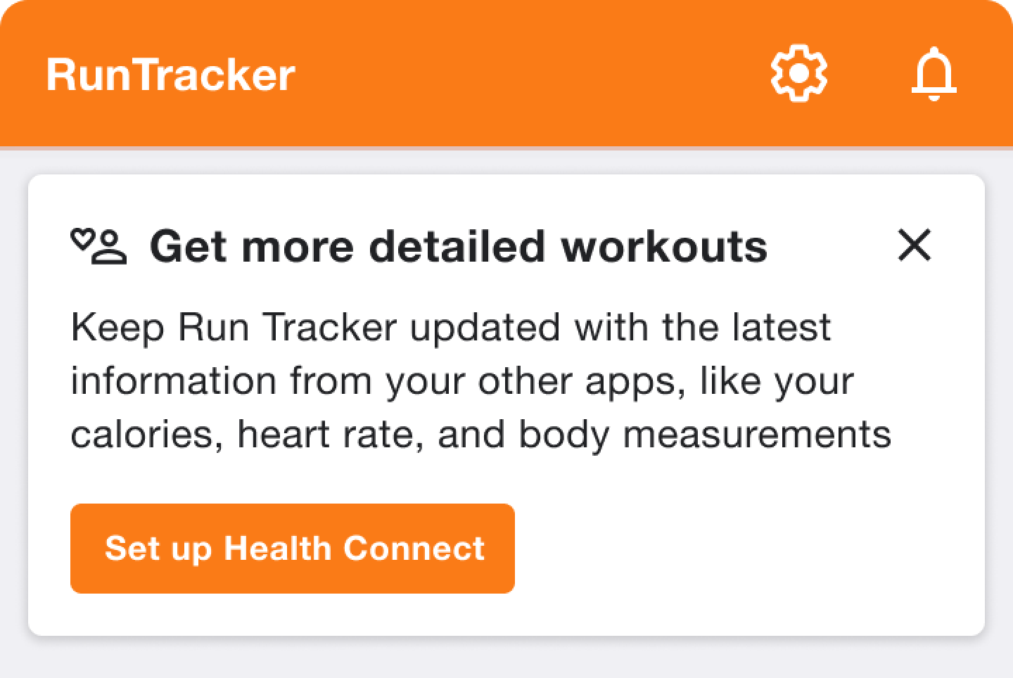
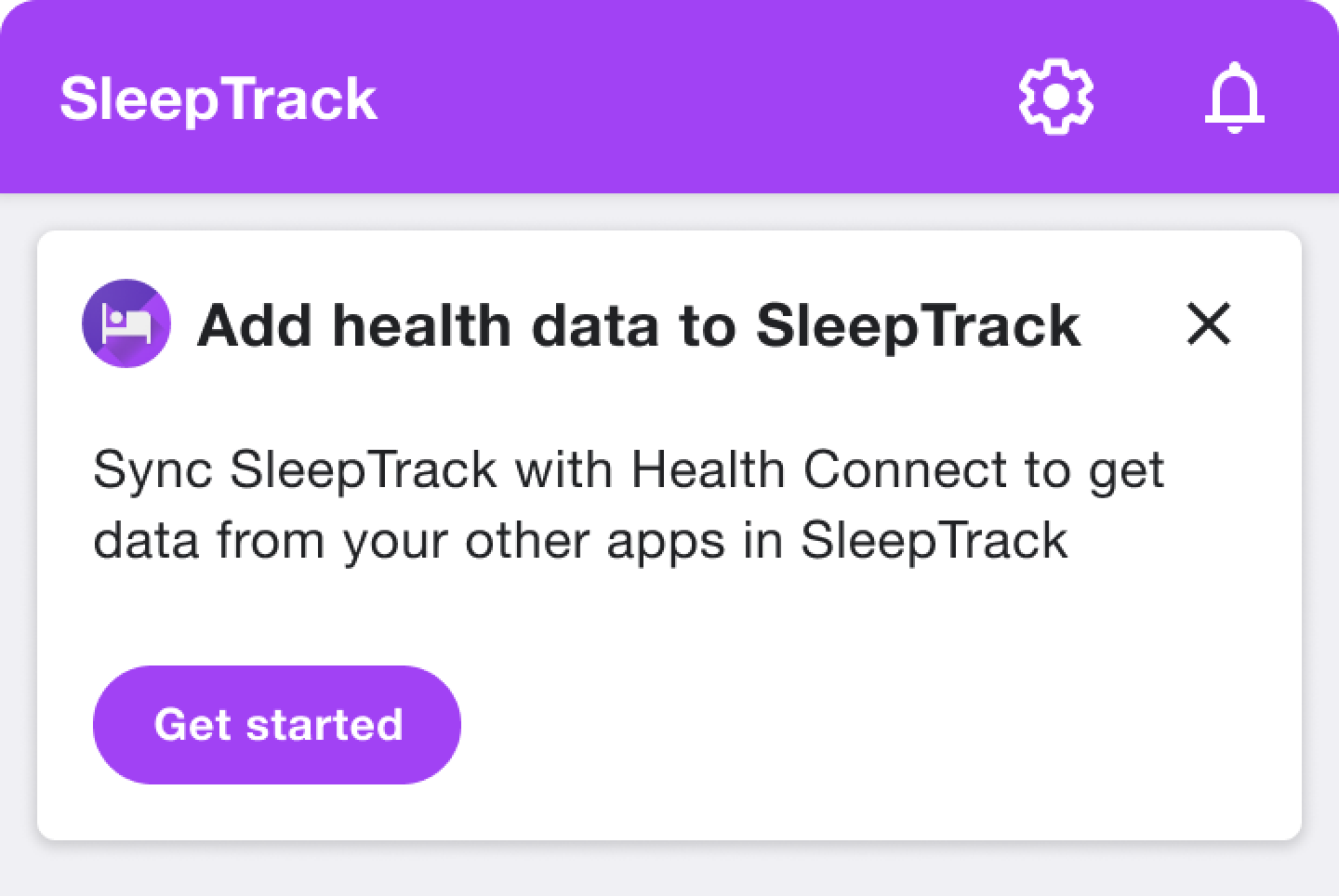
Use verb phrases such as "Set up" or "Get started" as button labels. In your permissions screens, you should issue clear instructions, such as "Choose data to share."
Key concepts
Your app should use the same terminology as Health Connect when explaining key concepts such as storage, data access and permissions.
Here's a table that explains Health Connect's core functionality:
Concept |
Description |
Example UI content |
Access |
Access refers to any kind of interaction with health data. Access acts as a binary switch for an app. When access is removed, your app has no way of interacting with users' health data. |
"Allow MindFul to access your health data?" "Remove access for all apps?" |
Permissions |
Permissions are at the heart of Health Connect's value proposition. They give users granular control over the data they share between apps. |
"Tap an app to manage its permissions." |
Read and write |
A simple permissions model allows users to specify which apps can read or write a given data type, including updating. |
"Allow RunTracker to write data." |
Storage |
When an app has write permissions, the data is stored in Health Connect. This mental model, that Health Connect is a "destination" for storing and managing data, helps users know where to find their data. |
"This includes data stored in Health Connect by your other apps." |
Promote Health Connect
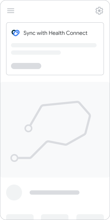
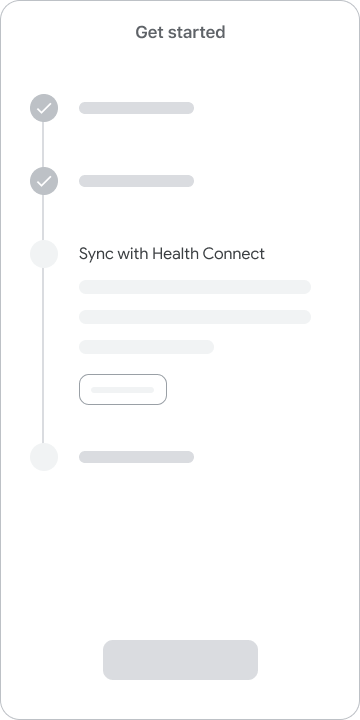
How you promote Health Connect in your app depends on the unique UX patterns and design conventions that you've adopted. Popular techniques include promotional cards in home screens, and integration with app setup flows.
Promo cards

Onboarding integration

Focus on the user benefits
The first time you introduce Health Connect to users, your app should offer a meaningful reason for them to make use of the integration.
Rather than listing Health Connect's features, you should focus on explaining how users benefit from said features.

Do this

