
Premiers pas avec les grands écrans
Les grands écrans vous permettent de repousser les limites du développement d'applications. Les grands écrans des tablettes, des appareils pliables et des appareils ChromeOS affichent davantage de contenu, facilitent l'usage multitâche et accueillent des interfaces utilisateur impossibles à afficher sur les petits écrans.
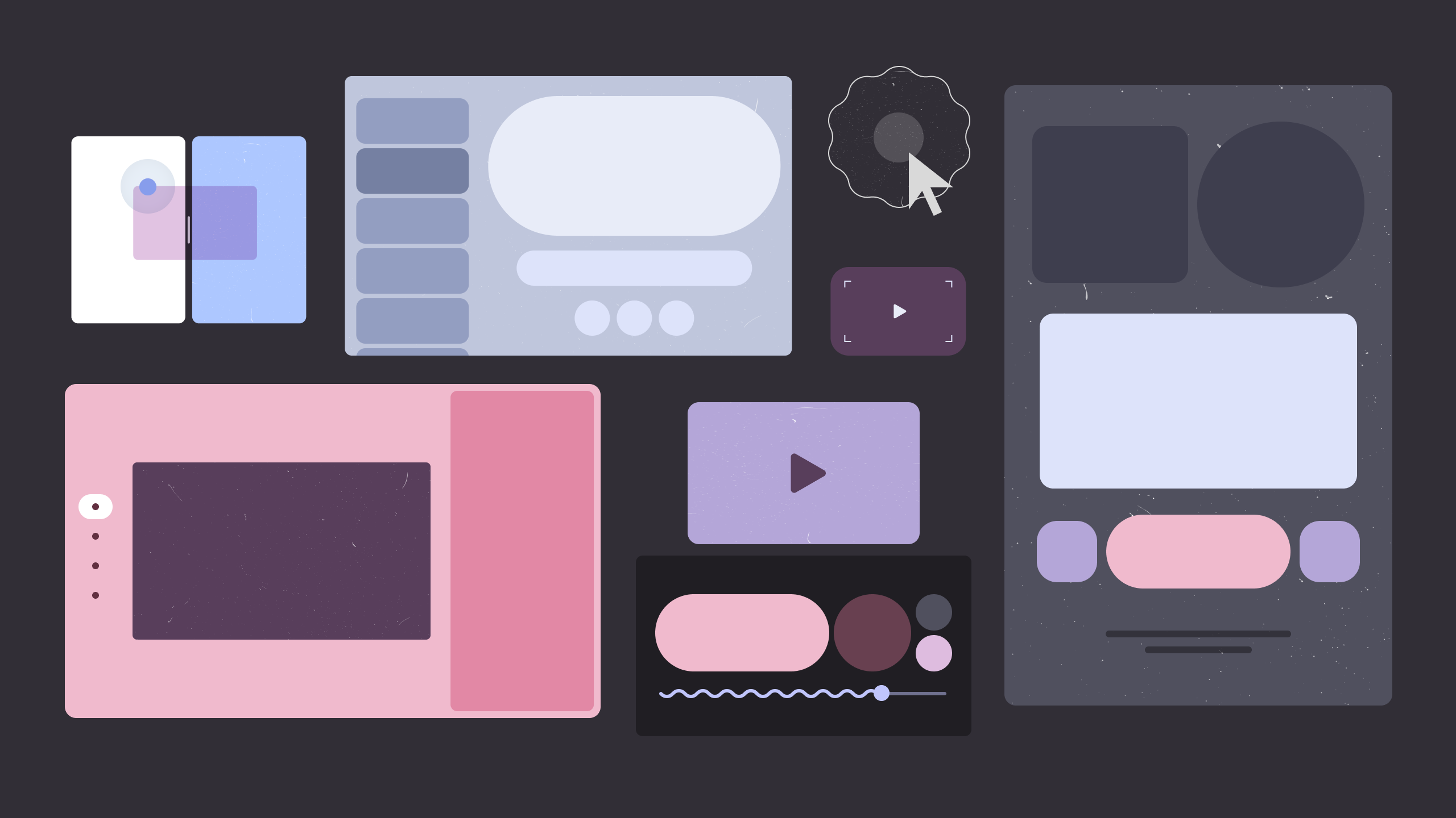
Imaginez votre application sur grand écran
Une application de productivité plus intuitive, une application multimédia plus attrayante, un jeu plus immersif… Imaginez tout ce que vous pouvez faire avec l'espace disponible sur des écrans de grande taille.
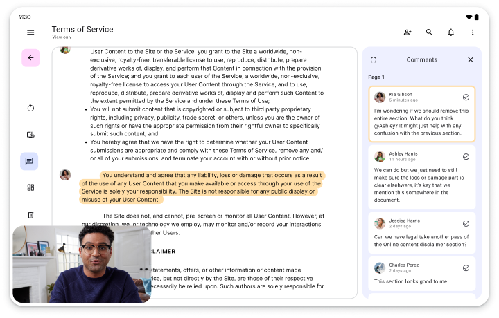
Productivité
Améliorez la productivité de vos utilisateurs grâce à un vaste espace de travail qui permet d'afficher des outils, du texte et un espace interactif épuré.
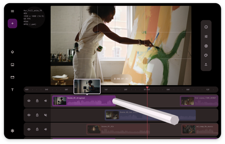
Créativité
Avec les écrans de grande taille, donnez vie aux idées les plus ambitieuses. Affichez des palettes, des sélecteurs et des panneaux à portée de doigt ou de stylet pour un contrôle naturel qui stimule la créativité.
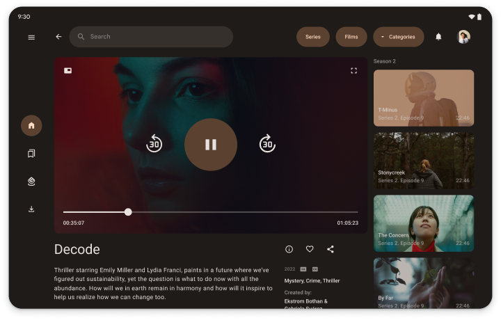
Contenus multimédias
Approfondissez l'expérience de visionnage ou d'écoute en affichant du contenu connexe, comme des titres similaires, des biographies d'artistes, des playlists ou des paroles de chansons.
Pour découvrir d'autres conceptions adaptées aux grands écrans, consultez la galerie de conception d'UI.
Créez des applis adaptées à tout le monde…
Les appareils à grand écran constituent un segment de marché en pleine croissance. Faites en sorte que votre application puisse s'exécuter sur tous les facteurs de forme d'écran, sans vous limiter aux téléphones standards, pour la rendre disponible au plus grand nombre d'utilisateurs possible. Faites des choix de conception adaptés à tous les appareils et à tous les utilisateurs.
… à l'aide des consignes relatives à la qualité des applications
Pour commencer à développer des applications destinées aux grands écrans, suivez les consignes relatives à la qualité des applications adaptatives. Vous y trouverez toutes les exigences à respecter pour optimiser votre application sur toutes les tailles d'écran, y compris les grands écrans.
Niveaux de qualité de l'application
Les consignes relatives à la qualité sont classées en trois catégories : Adaptation aux écrans, Optimisation pour les écrans et Différenciation pour les écrans. Afin d'ajouter des fonctionnalités pour grands écrans à votre application, passez progressivement d'un niveau à l'autre, en commençant par Adaptation aux grands écrans. Si votre application existe déjà, reportez-vous aux tests des consignes relatives à la qualité pour déterminer le niveau d'adéquation de votre application pour les grands écrans. Ensuite, implémentez les fonctionnalités niveau par niveau jusqu'à ce que votre application soit spécifiquement différenciée pour les grands écrans.
Niveau 3
Compatible avec le streaming adaptatif
Ouvrez le champ des possibles sur grand écran. Adaptez votre application aux orientations portrait et paysage, mais aussi au mode multifenêtre. Créez des mises en page qui occupent tout l'espace disponible.
Niveau 2
Optimisation adaptative
Renforcez l'engagement utilisateur. Adaptez votre application aux écrans de toutes tailles grâce aux mises en page responsives et adaptatives. Prenez en charge les claviers, souris, pavés tactiles et stylets.
Niveau 1
Différenciation adaptative
Démarquez-vous de la concurrence sur les plates-formes de téléchargement d'applications. Ajoutez des fonctionnalités conçues spécifiquement pour les grands écrans pour proposer une expérience utilisateur complètement différente des téléphones standards. Par exemple, vous pouvez adapter l'interface pour les appareils pliables lorsqu'ils sont posés sur une table ou toute autre surface.
… et mises en page standards éprouvées
Les mises en page standards sur grand écran (liste détaillée, flux et volet secondaire) sont des options d'interface utilisateur polyvalentes et populaires. Implémentez-les dans votre application pour optimiser l'expérience utilisateur sur grand écran.
Premiers pas
Choisissez un niveau d'optimisation et faites vos premiers pas avec les grands écrans (sans exception) sans attendre !