wyświetlać wyskakujące okienka z wiadomościami lub prośbami o wprowadzenie danych przez użytkownika;
Zadbaj o dobrą organizację dzięki kolekcji
Zapisuj i kategoryzuj treści zgodnie ze swoimi preferencjami.
Komponent Dialog wyświetla wyskakujące okienka lub prosi o wprowadzenie danych przez użytkownika na warstwie nad główną treścią aplikacji. Tworzy ono przerwanie w interfejsie, aby przyciągnąć uwagę użytkownika.
Dostępne przypadki użycia dialogu:
potwierdzenie działania użytkownika, na przykład usunięcia pliku;
Proszenie o wprowadzenie danych przez użytkownika, np. w aplikacji do zarządzania listą zadań.
Wyświetlanie listy opcji do wyboru przez użytkownika, np. wybór kraju w konfiguracji profilu.
Ta implementacja wymaga, aby minimalna wersja pakietu SDK projektu była ustawiona na poziom API 21 lub wyższy.
Zależności
Okno tworzenia alertu
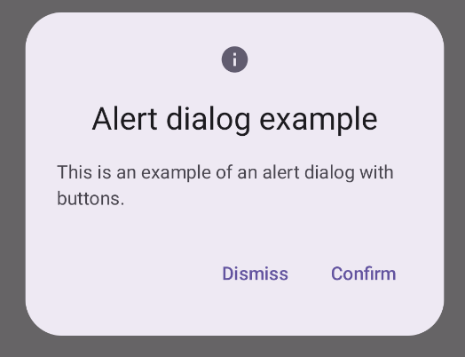
Komponent AlertDialog udostępnia wygodne API do tworzenia dialogów w stylu Material Design. W tym przykładzie w oknie alertu są 2 przyciski: jeden do zamykania okna i drugi do potwierdzania prośby:
Ta implementacja zakłada funkcję kompozytową nadrzędną, która przekazuje argumenty funkcji kompozytowej podrzędnej w ten sposób:
Wyniki
Rysunek 1. Okno alertu z przyciskami.
Najważniejsze punkty
AlertDialog ma określone parametry do obsługi poszczególnych elementów dialogu. Należą do nich:
title: tekst, który pojawia się u góry okna dialogowego.
text: tekst wyśrodkowany w dialogu.
icon: grafika wyświetlana u góry okna.
onDismissRequest: funkcja wywoływana, gdy użytkownik zamyka okno,
np. przez kliknięcie poza nim.
dismissButton: kompozyt służący jako przycisk zamknięcia.
confirmButton: komponent służący jako przycisk potwierdzenia.
Gdy użytkownik kliknie jeden z przycisków, okno dialogowe się zamknie. Gdy użytkownik kliknie „Potwierdź”, wywołuje funkcję, która również obsługuje potwierdzenie. W tym przykładzie są to funkcje onDismissRequest() i onConfirmRequest().
Jeśli dialog wymaga bardziej złożonego zestawu przycisków, możesz skorzystać z komponentu Dialog i wypełnić go w bardziej swobodny sposób.
Tworzenie okna
Dialog to podstawowy komponent, który nie zapewnia żadnego stylizowania ani wstępnie zdefiniowanych miejsc na treści. Jest to prosty kontener, który należy wypełnić kontenerem takim jak Card. Oto niektóre z najważniejszych parametrów dialogu:
onDismissRequest: funkcja lambda wywoływana, gdy użytkownik zamknie okno.
properties: instancja DialogProperties, która zapewnia dodatkowe możliwości dostosowywania.
Tworzenie podstawowego dialogu
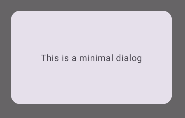
Ten przykład pokazuje podstawową implementację kompozytu Dialog. Pamiętaj, że jako kontener pomocniczy używa Card. Bez elementu Card element Text wyświetlałby się sam nad główną treścią aplikacji.
Wynik
Pamiętaj, że gdy okno jest otwarte, główna treść aplikacji pod nim jest przyciemniona i wygaszona:
Rysunek 2. Minimalny dialog.
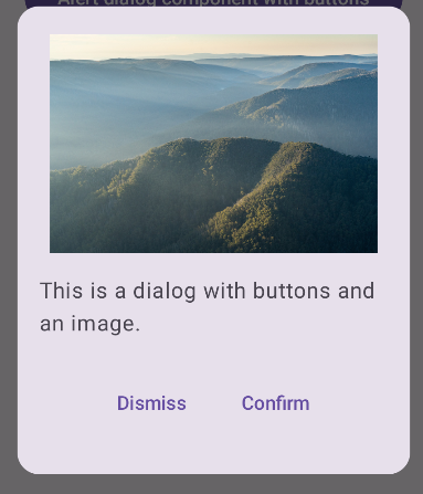
Tworzenie zaawansowanego okna
Poniżej przedstawiamy bardziej zaawansowane wdrożenie komponentu Dialog. W tym przypadku komponent ręcznie implementuje interfejs podobny do tego z poprzedniego przykładu.AlertDialog
Wynik
Rysunek 3. Okno z obrazem.
Kolekcje zawierające ten przewodnik
Ten przewodnik należy do tych kolekcji krótkich przewodników, które obejmują szersze zagadnienia związane z tworzeniem aplikacji na Androida:
Tekst wyświetlany
Tekst jest centralnym elementem każdego interfejsu użytkownika. Dowiedz się, jak możesz wyświetlać tekst w aplikacji, aby zapewnić użytkownikom przyjemne wrażenia.
Dowiedz się, jak funkcje składane mogą ułatwić tworzenie atrakcyjnych komponentów interfejsu użytkownika na podstawie systemu projektowania Material Design.
Treść strony i umieszczone na niej fragmenty kodu podlegają licencjom opisanym w Licencji na treści. Java i OpenJDK są znakami towarowymi lub zastrzeżonymi znakami towarowymi należącymi do firmy Oracle lub jej podmiotów stowarzyszonych.
Ostatnia aktualizacja: 2025-02-06 UTC.
[[["Łatwo zrozumieć","easyToUnderstand","thumb-up"],["Rozwiązało to mój problem","solvedMyProblem","thumb-up"],["Inne","otherUp","thumb-up"]],[["Brak potrzebnych mi informacji","missingTheInformationINeed","thumb-down"],["Zbyt skomplikowane / zbyt wiele czynności do wykonania","tooComplicatedTooManySteps","thumb-down"],["Nieaktualne treści","outOfDate","thumb-down"],["Problem z tłumaczeniem","translationIssue","thumb-down"],["Problem z przykładami/kodem","samplesCodeIssue","thumb-down"],["Inne","otherDown","thumb-down"]],["Ostatnia aktualizacja: 2025-02-06 UTC."],[],[],null,["\u003cbr /\u003e\n\nThe [`Dialog`](/reference/kotlin/androidx/compose/ui/window/package-summary#Dialog(kotlin.Function0,androidx.compose.ui.window.DialogProperties,kotlin.Function0)) component displays pop-up messages or requests user input on a\nlayer above the main app content. It creates an interruptive UI experience to\ncapture user attention.\n\nAmong the use cases for a dialog are the following:\n\n- Confirming user action, such as when deleting a file.\n- Requesting user input, such as in a to-do list app.\n- Presenting a list of options for user selection, like choosing a country in a profile setup.\n\nThis topic provides the following implementations:\n\n- [Alert](#alert)\n- [Basic dialog](#basic)\n- [Advanced dialog](#advanced)\n\nVersion compatibility\n\nThis implementation requires that your project minSDK be set to API level 21 or\nhigher.\n\nDependencies\n\nCreate an Alert dialog\n\nThe [`AlertDialog`](/reference/kotlin/androidx/compose/material3/package-summary#AlertDialog(kotlin.Function0,kotlin.Function0,androidx.compose.ui.Modifier,kotlin.Function0,kotlin.Function0,kotlin.Function0,kotlin.Function0,androidx.compose.ui.graphics.Shape,androidx.compose.ui.graphics.Color,androidx.compose.ui.graphics.Color,androidx.compose.ui.graphics.Color,androidx.compose.ui.graphics.Color,androidx.compose.ui.unit.Dp,androidx.compose.ui.window.DialogProperties)) composable provides a convenient API for creating a\nMaterial Design themed dialog. The following example implements two buttons in\nan alert dialog, one that dismisses the dialog, and another that confirms its\nrequest:\n\nThis implementation implies a parent composable that passes arguments to the\nchild composable in this way:\n\nResults **Figure 1.** An alert dialog with buttons.\n\nKey points\n\n`AlertDialog` has specific parameters for handling particular elements of the\ndialog. Among them are the following:\n\n- `title`: The text that appears along the top of the dialog.\n- `text`: The text that appears centered within the dialog.\n- `icon`: The graphic that appears at the top of the dialog.\n- `onDismissRequest`: The function called when the user dismisses the dialog, such as by tapping outside of it.\n- `dismissButton`: A composable that serves as the dismiss button.\n- `confirmButton`: A composable that serves as the confirm button.\n\n- When the user clicks either of the buttons, the dialog closes. When the user\n clicks confirm, it calls a function that also handles the confirmation. In\n this example, those functions are `onDismissRequest()` and\n `onConfirmRequest()`.\n\n In cases where your dialog requires a more complex set of buttons, you may\n benefit from using the `Dialog` composable and populating it in a more\n freeform manner.\n\nCreate a dialog\n\n[`Dialog`](/reference/kotlin/androidx/compose/ui/window/package-summary#Dialog(kotlin.Function0,androidx.compose.ui.window.DialogProperties,kotlin.Function0)) is a basic composable that doesn't provide any styling or\npredefined slots for content. It is a straightforward container that you should\npopulate with a container such as `Card`. The following are some of the key\nparameters of a dialog:\n\n- **`onDismissRequest`**: The lambda called when the user closes the dialog.\n- **`properties`** : An instance of [`DialogProperties`](/reference/kotlin/androidx/compose/ui/window/DialogProperties) that provides some additional scope for customization.\n\n| **Caution:** You must manually specify the size and shape of `Dialog`. You also must provide an inner container.\n\nCreate a basic dialog\n\nThe following example is a basic implementation of the `Dialog` composable. Note\nthat it uses a `Card` as the secondary container. Without the `Card`, the `Text`\ncomponent would appear alone above the main app content.\n\nResult\n\nNote that when the dialog is open, the main app content beneath it appears\ndarkened and grayed out:\n**Figure 2.** Minimal dialog.\n\nCreate an advanced dialog\n\nThe following is a more advanced implemented of the `Dialog` composable. In this\ncase, the component manually implements a similar interface to the preceding\n`AlertDialog` example.\n| **Caution:** If you only need to display a two-button dialog as in this example, you should use `AlertDialog` and its more convenient API. However, if you want to create a more complex dialog, perhaps with forms and multiple buttons, you should use `Dialog` with custom content, as in the following example.\n\nResult **Figure 3.** A dialog that includes an image.\n\nCollections that contain this guide\n\nThis guide is part of these curated Quick Guide collections that cover\nbroader Android development goals: \n\nDisplay text \nText is a central piece of any UI. Find out different ways you can present text in your app to provide a delightful user experience. \n[Quick guide collection](/develop/ui/compose/quick-guides/collections/display-text) \n\nRequest user input \nLearn how to implement ways for users to interact with your app by entering text and using other means of input. \n[Quick guide collection](/develop/ui/compose/quick-guides/collections/request-user-input) \n\nDisplay interactive components \nLearn how composable functions can enable you to easily create beautiful UI components based on the Material Design design system. \n[Quick guide collection](/develop/ui/compose/quick-guides/collections/display-interactive-components) \n\nHave questions or feedback \nGo to our frequently asked questions page and learn about quick guides or reach out and let us know your thoughts. \n[Go to FAQ](/quick-guides/faq) [Leave feedback](https://issuetracker.google.com/issues/new?component=1573691&template=1993320)"]]