Material 3 표현형 디자인 언어
컬렉션을 사용해 정리하기
내 환경설정을 기준으로 콘텐츠를 저장하고 분류하세요.
Material 3 Expressive (M3)는 현대적이고 관련성 있으며 고유한 환경에 대한 사용자의 요구를 충족하기 위해 설계되었습니다. 또한 표현성을 통해 디자이너는 인터페이스의 레이아웃과 프레젠테이션에서 특정 감정과 느낌을 반영할 수 있습니다.
색상 및 서체
색상 시스템은 M3의 더 깊은 색조 팔레트와 더 넓은 토큰 세트를 채택하도록 확장되고 있으며, 더 단순한 서체 크기는 더 많은 표현을 위해 가변 글꼴 축을 활용하여 상호작용을 더 표현력 있고 즐겁게 만듭니다.
색상 테마 설정
새로운 토큰을 사용하면 다양한 테마와 디자인 시스템 전체의 컨텍스트에 더 많은 색상을 적용할 수 있습니다.
가변 글꼴
가변 글꼴 및 맞춤설정 가능한 축에 관한 업데이트된 고려사항은 퍼스트 파티를 넘어 유사한 가변 축 세트를 보유한 Roboto Flex와 같은 서드 파티 사용 사례에도 적용됩니다.
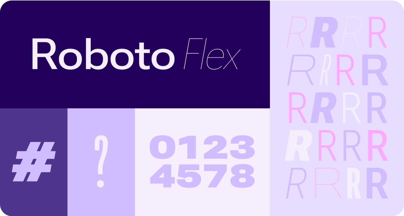
가변 글꼴 축이 움직이는 모습
가변 글꼴 축을 활용하여 표현적인 모션 피드백을 전달하고 상호작용을 더 표현력 있고 사용하기 즐겁게 만듭니다.
사용 사례 예:
- 동적 글꼴 두께
- 동적 글꼴 너비
- 동적 글꼴 두께 및 너비
역할 유형
업데이트되고 최적화된 유형 크기와 함께 Wear에서 특히 눈에 띄는 패턴을 제공하는 새로운 유형 역할도 도입됩니다.
이러한 새로운 유형 역할은 노출 영역 제목의 원호 텍스트, 실시간 공간이 있는 사전 예방적 콘텐츠, 숫자 전용 유형 역할 등 여러 사용 사례를 지원합니다. 이를 통해 현지화할 필요가 없는 문자열의 텍스트 크기를 더 크게 하고 스타일을 더 추가할 수 있습니다.
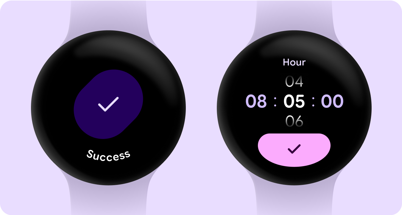
도형 및 모션
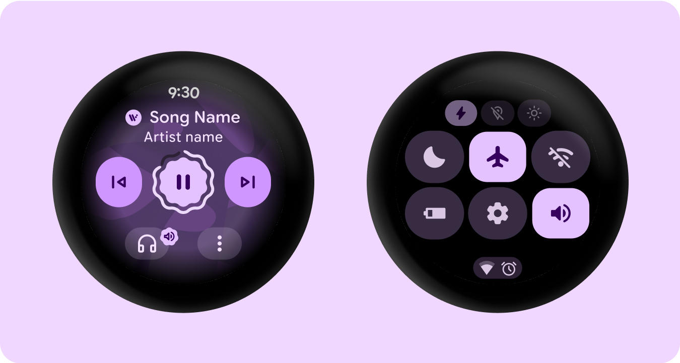
또한 유연한 컨테이너 도형을 활용하여 모서리 반경의 둥글게 처리 및 선명하게 처리를 적용하여 도형 모핑 목록과 버튼 상태를 지원하는 등 훨씬 더 광범위하고 의미 있는 방식으로 도형 언어를 활용하고 있습니다. Wear의 원형 기기용으로 소유 가능한 새로운 아이코닉 디자인 패턴인 가장자리에 맞는 버튼이 도입됩니다.
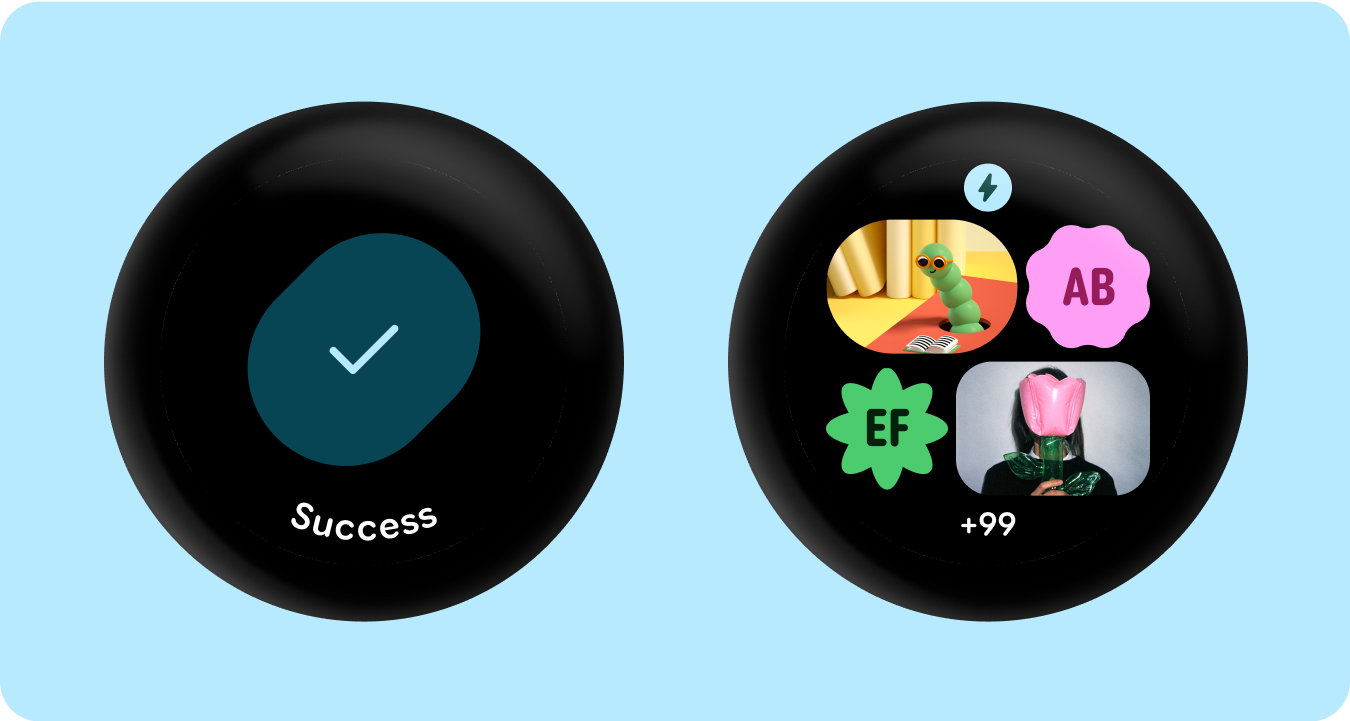
가장자리에 맞는 컨테이너
원형을 수용하고 원형 폼 팩터 내 공간을 극대화하는 도형 컨테이너를 소개합니다.
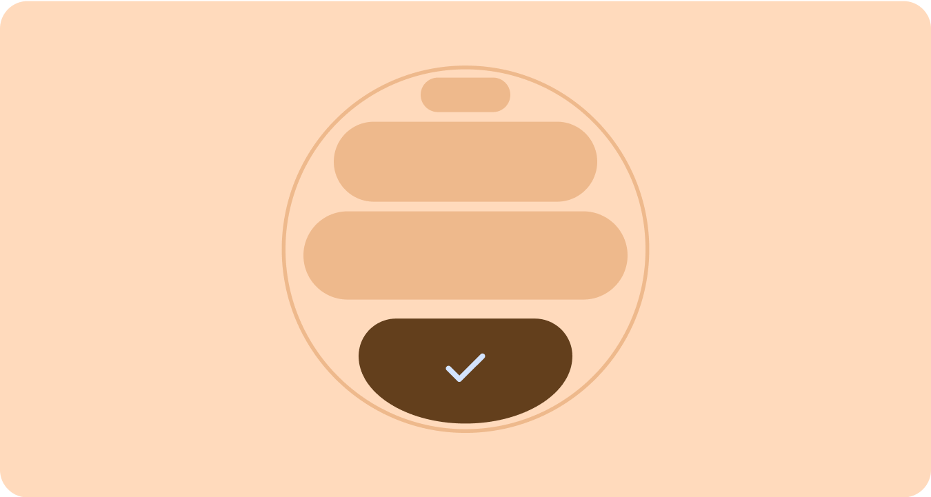
적용된 도형
모서리 반경과 고유한 도형을 컨테이너로 사용하여 표현적인 디자인을 수용합니다. 이는 즐거운 로드 애니메이션, 흥미로운 레이아웃, 도형 모핑 버튼, 적응형 버튼 그룹으로 확장됩니다.
모서리 반지름
Material 3 모서리 도형을 활용하여 컨테이너 도형 간에 다양성, 구별, 관계를 지원합니다.
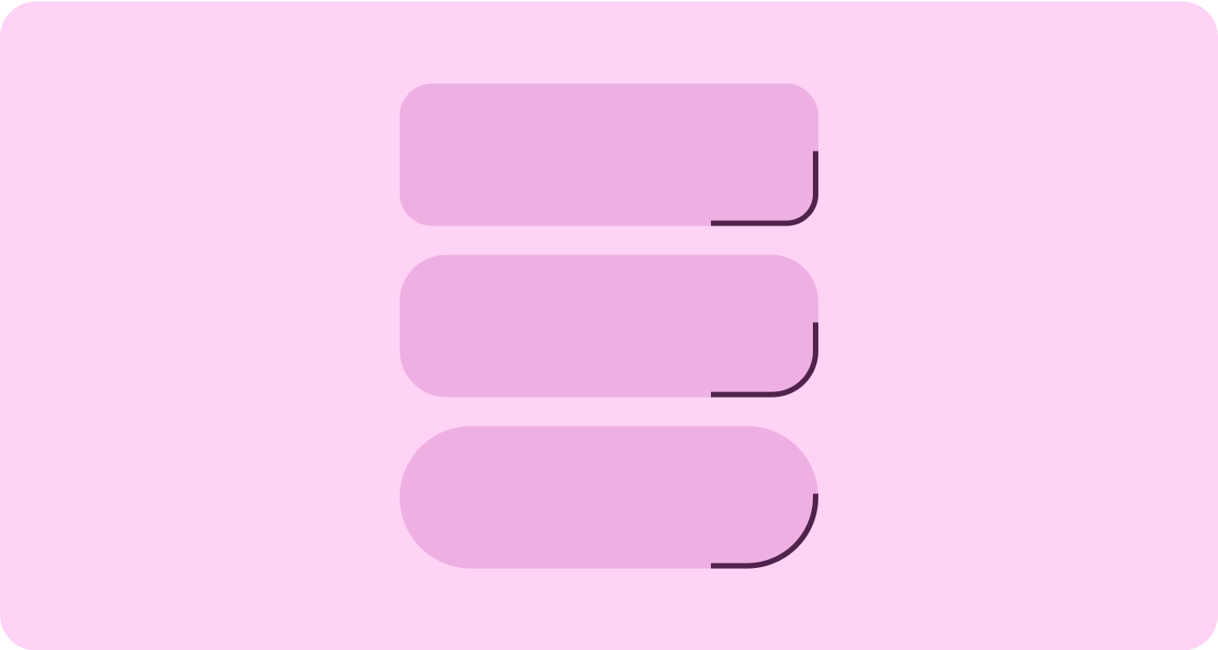
그룹화된 컨테이너
구성요소 컨테이너는 유연한 레이아웃 기법을 사용하여 사용 가능한 공간에 동적으로 적응합니다. 이 공간을 대칭을 위해 균등하게 분배하거나 요소를 전략적으로 배치하여 시각적 계층 구조를 설정하고, 중요한 콘텐츠를 강조하며, 표현적이고 모션이 주도하는 시각적 신호를 통해 사용자 상호작용을 유도할 수 있습니다.
이 페이지에 나와 있는 콘텐츠와 코드 샘플에는 콘텐츠 라이선스에서 설명하는 라이선스가 적용됩니다. 자바 및 OpenJDK는 Oracle 및 Oracle 계열사의 상표 또는 등록 상표입니다.
최종 업데이트: 2025-07-27(UTC)
[[["이해하기 쉬움","easyToUnderstand","thumb-up"],["문제가 해결됨","solvedMyProblem","thumb-up"],["기타","otherUp","thumb-up"]],[["필요한 정보가 없음","missingTheInformationINeed","thumb-down"],["너무 복잡함/단계 수가 너무 많음","tooComplicatedTooManySteps","thumb-down"],["오래됨","outOfDate","thumb-down"],["번역 문제","translationIssue","thumb-down"],["샘플/코드 문제","samplesCodeIssue","thumb-down"],["기타","otherDown","thumb-down"]],["최종 업데이트: 2025-07-27(UTC)"],[],[],null,["# Material 3 Expressive design language\n\nMaterial 3 Expressive (M3) was built to meet user demand for experiences that\nare modern, relevant, and distinct. Expressive also allows designers to mirror\nspecific emotions and feelings in the layout and presentation of the interface.\n\nColor and typography\n--------------------\n\nThe [color system](/design/ui/wear/guides/styles/color/system) is expanding to adopt M3's deeper tonal palettes and a\nwider token set and the simpler typography scale is utilizing variable font axes\nfor more expression, making interactions more expressive and delightful.\n\n### Color theming\n\n\nThe [new tokens](/design/ui/wear/guides/styles/color/roles-tokens) allow for more color to be applied across different themes\nand in context of the design system as a whole. \n\n\u003cbr /\u003e\n\n### Variable fonts\n\n\nThe updated considerations for variable fonts and their customizable axis,\nextend beyond 1P to also serve 3P use cases such as Roboto Flex, which has a\nsimilar set of variable axis. \n\n\u003cbr /\u003e\n\n### Variable font axis in motion\n\n\nUtilizing variable font axis to signal expressive motion feedback and making\ninteractions more expressive and delightful to use.\n\nExample use-cases:\n\n- Dynamic font weight\n- Dynamic font width\n- Dynamic font weight and width \n\n\u003cbr /\u003e\n\n### Type roles\n\n\nAlong with an updated and optimized type scale, we are also introducing new type\nroles that specifically serve notable patterns on Wear.\n\nThese new type roles support several use cases---including Arc Text for surface\ntitles, proactive content with live space, and a type role specifically for\nNumerals---that allow for bigger and more styled text sizes for strings that don't\nneed to be localized. \n\n\u003cbr /\u003e\n\nShape and motion\n----------------\n\nWe are also leaning into shape language in a much more expansive and meaningful\nway by utilizing flexible container shapes to apply rounding and sharpening of\ncorner radius to support shape morphing lists and button states. We're\nintroducing edge-hugging buttons as a new ownable and iconic design pattern for\nround devices on Wear.\n\n### Edge-hugging containers\n\n\nIntroducing shape containers that embrace round and maximize the space within\nthe circular form factor. \n\n\u003cbr /\u003e\n\n### Shape applied\n\n\nUsing corner radius and unique shapes as containers to embrace expressive design\n---extending to delightful loading animations, interesting layouts, shape-morphing\nbuttons and adaptive button groups. \n\n\u003cbr /\u003e\n\n### Corner radius\n\n\nUtilizing Material 3 corner shapes to enable variety, distinction, and\nrelationship between container shapes. \n\n\u003cbr /\u003e\n\n### Grouped containers\n\n\nComponent containers use flexible layout techniques to dynamically adapt to\navailable space. They can distribute this space evenly for symmetry, or\nstrategically arrange elements to establish visual hierarchy, emphasize\nimportant content, and guide user interaction through expressive and motion-lead\nvisual cues. \n\n\u003cbr /\u003e"]]