Design for desktop
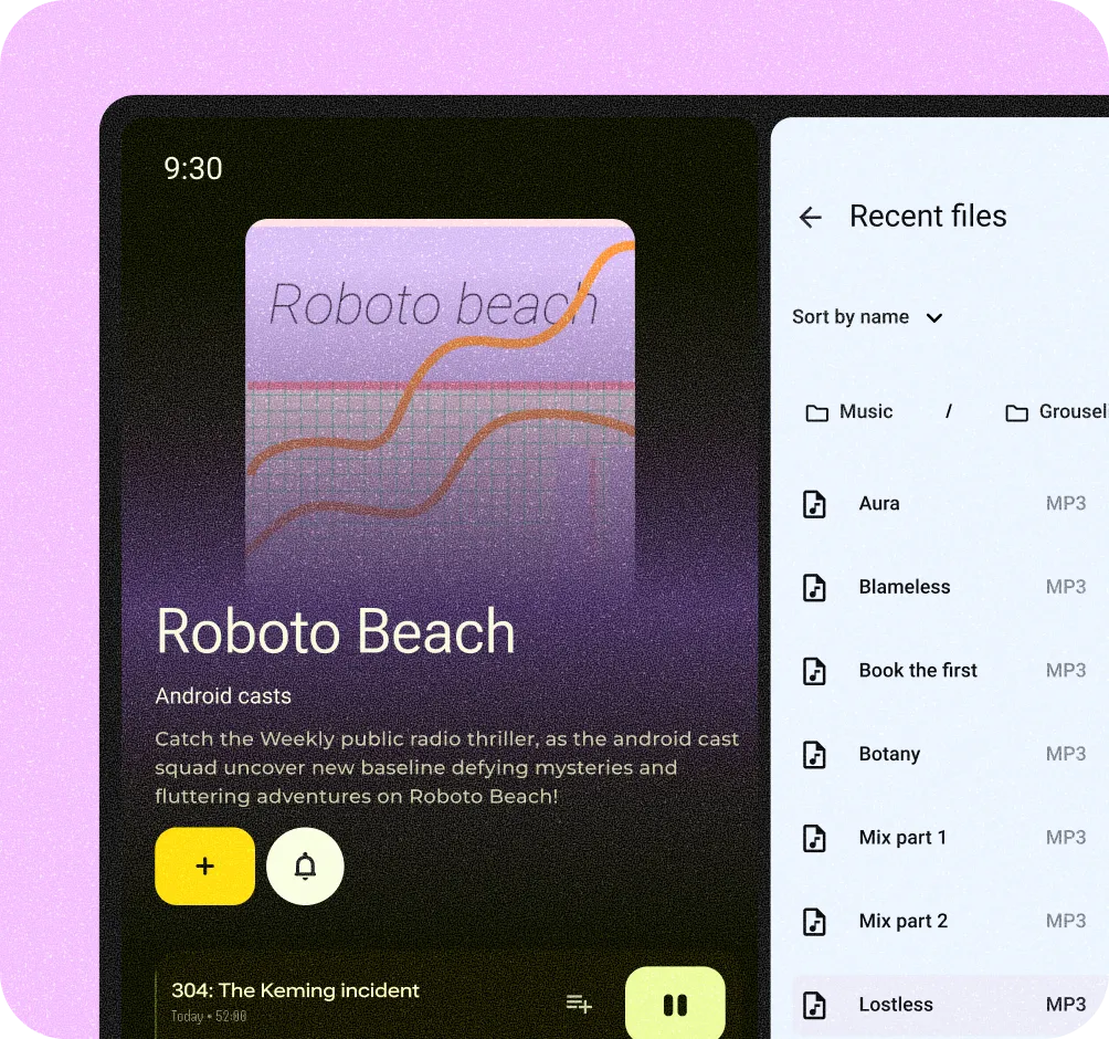
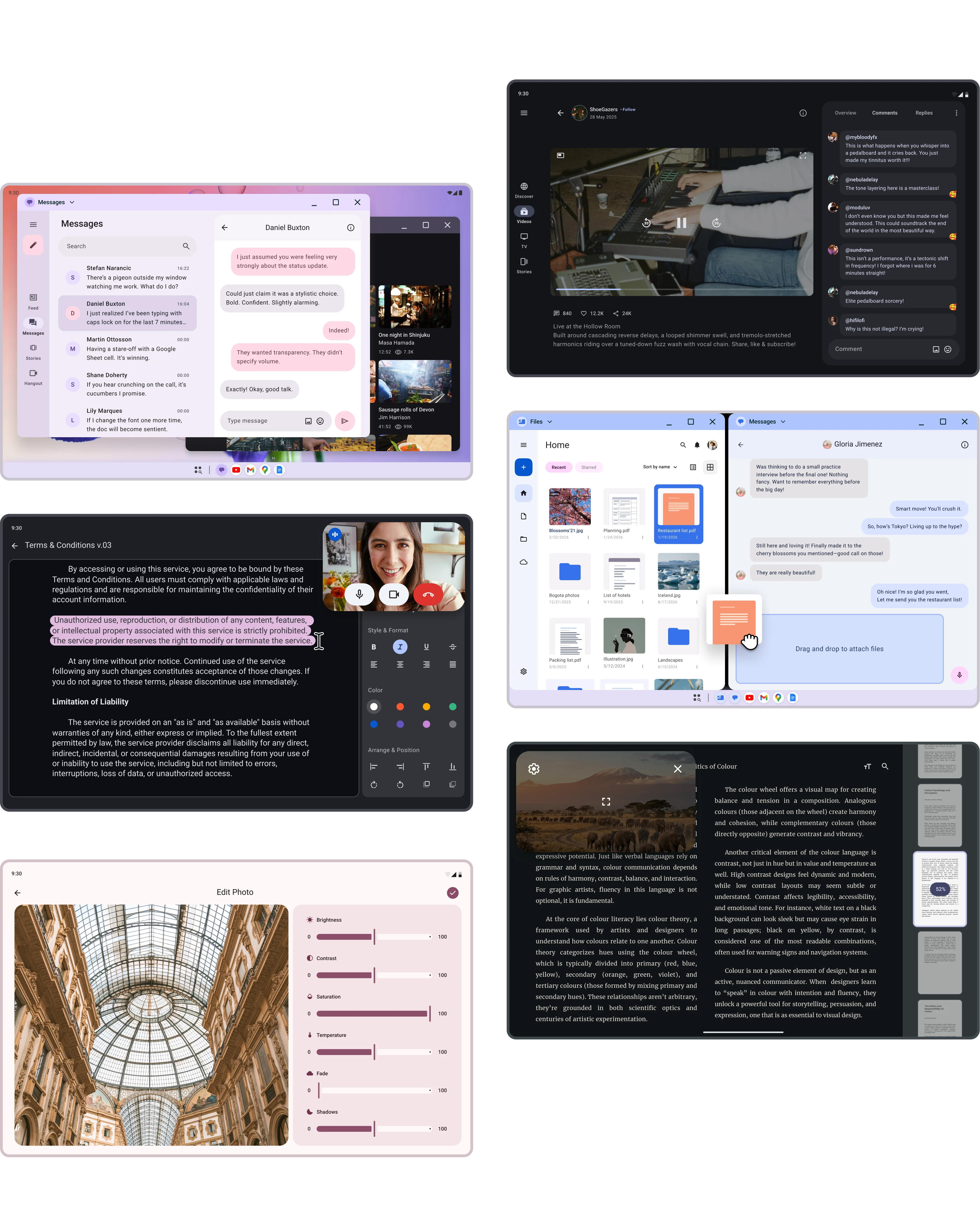
Leverage a larger display to maximize productivity with higher information density, multi-tasking through multi-window capabilities, precise tasks with pointer-based interactions, and physical keyboard support for accessibility and efficient typing.
Get started
Guides
System bars
Bars provided by the system that give users information and controls for interacting with apps.
Enhance your app's productivity
Multi-tasking apps
Desktop apps open in side-by-side free-form windows. A default taskbar enables quick switching between tasks. Users can also organize work by creating multiple desktops.
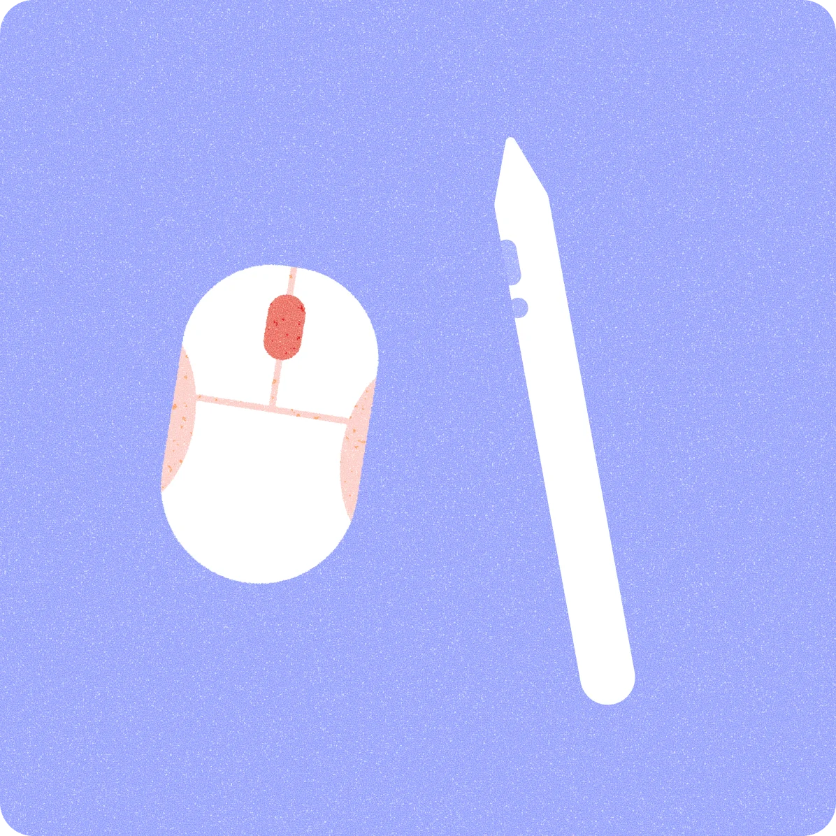
More input options
Since desktop users rely on pointers like mice or touchpads, optimize your app for these inputs. Read more on pointer interaction.
Gallery
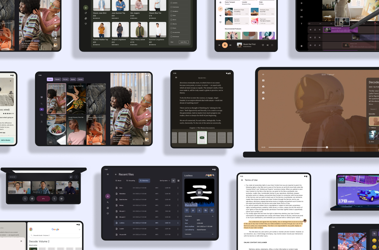
Tour the Android design gallery
Explore inspiring, optimized designs for all screen sizes and devices. Browse UI/UX templates for popular app categories, including media, creativity, games, and more.
Explore our kits
Explore our other Figma-based library kits, plugins, and the Material theme builder. Start building your Android app with modern themes, tools and user-generated dynamic color, or check out our Wear OS kits and TV kits to build for other devices.
Android UI kit
Get started designing for Android faster and easier with an introductory guide, styles, components, and system templates.
Android Design community
Explore the Android Design Figma community page with the latest templates, labs, and kits.


